前端学习—Bootstrap
一、bootstrap简介
1.bootstrap是什么?
Bootstrap是Twitter开源的基于HTML、CSS、JavaScript的前端框架。
它是为实现快速开发Web应用程序而设计的一套前端工具包。
它支持响应式布局,并且在V3版本之后坚持移动设备优先。
bootstrap中文网:http://www.bootcss.com/
2.为什么要使用bootstrap
在bootstrap出现之前,前端页面的开发问题。
- 标签命名:重复、复杂、无意义
- 标签样式:重复冗余、不规范、不和谐
- 页面:错乱、不规范、不和谐
使用bootstrap的有点:各种命名都统一并且规范化。 页面风格统一,画面和谐。
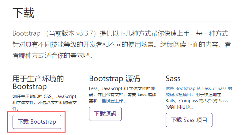
3.bootstrap下载
官方地址:https://getbootstrap.com
中文地址:http://www.bootcss.com/
我们使用V3版本的Bootstrap,我们下载的是用于生产环境的Bootstrap。
4.bootstrap环境搭建
bootstrap目录结构
bootstrap-3.3.7-dist/

├── css  // CSS文件
│   ├── bootstrap-theme.css  // Bootstrap主题样式文件
│   ├── bootstrap-theme.css.map
│   ├── bootstrap-theme.min.css  // 主题相关样式压缩文件
│   ├── bootstrap-theme.min.css.map
│   ├── bootstrap.css
│   ├── bootstrap.css.map
│   ├── bootstrap.min.css  // 核心CSS样式压缩文件
│   └── bootstrap.min.css.map
├── fonts  // 字体文件
│   ├── glyphicons-halflings-regular.eot
│   ├── glyphicons-halflings-regular.svg
│   ├── glyphicons-halflings-regular.ttf
│   ├── glyphicons-halflings-regular.woff
│   └── glyphicons-halflings-regular.woff2
└── js  // JS文件
    ├── bootstrap.js
    ├── bootstrap.min.js  // 核心JS压缩文件
    └── npm.js
注意:
由于Bootstrap的某些组件依赖于jQuery,所以请确保下载对应版本的jQuery文件,来保证Bootstrap相关组件运行正常。
二、bootstrap全局样式
排版、按钮、表格、表单、图片等我们常用的HTML元素,Bootstrap中都提供了全局样式。
我们只要在基本的HTML元素上通过设置class就能够应用上Bootstrap的样式,从而使我们的页面更美观和谐。
1.基本模板
使用以下给出的这份超级简单的 HTML 模版,或者修改这些实例。我们强烈建议你对这些实例按照自己的需求进行修改,而不要简单的复制、粘贴。
<!DOCTYPE html>
<html lang="zh-CN">
  <head>
    <meta charset="utf-8">
    <meta http-equiv="X-UA-Compatible" content="IE=edge">
    <meta name="viewport" content="width=device-width, initial-scale=1">
    <!-- 上述3个meta标签*必须*放在最前面,任何其他内容都*必须*跟随其后! -->
    <title>Bootstrap 101 Template</title>

    <!-- Bootstrap 放bootstrap的css本地文件或者网络文件-->
    <link href="https://cdn.jsdelivr.net/npm/bootstrap@3.3.7/dist/css/bootstrap.min.css" rel="stylesheet">
  </head>
  <body>
    <h1>你好,世界!</h1>

    <!-- jQuery本地或者网络路径 (Bootstrap 的所有 JavaScript 插件都依赖 jQuery,所以必须放在前边) -->
    <script src="https://cdn.jsdelivr.net/npm/jquery@1.12.4/dist/jquery.min.js"></script>

    <!-- 加载 Bootstrap(本地或者网络路径) 的所有 JavaScript 插件。你也可以根据需要只加载单个插件。 -->
    <script src="https://cdn.jsdelivr.net/npm/bootstrap@3.3.7/dist/js/bootstrap.min.js"></script>
  </body>
</html>
2.布局容器
Bootstrap需要为页面内容和栅格系统包裹一个.container容器。bootstrap提供了两个作此用处的类。
注意,由于padding等属性的原因,这两种 容器类不能互相嵌套。
container类
用于固定宽度并支持响应式布局的容器。
<div class="container">
  ...
</div>
container-fluid类
用于100%宽度,占据全部视口viewport的容器。
<div class="container-fluid">
  ...
</div>
3.栅格系统
Bootstrap 提供了一套响应式、移动设备优先的流式栅格系统,随着屏幕或视口(viewport)尺寸的增加,系统会自动分为最多12列。
简介
栅格系统用于通过一系列的行(row)与列(column)的组合来创建页面布局,你的内容就可以放入这些创建好的布局中。
-
“行(row)”必须包含在 .container (固定宽度)或 .container-fluid (100% 宽度)中,以便为其赋予合适的排列(aligment)和内补(padding)。
-
通过“行(row)”在水平方向创建一组“列(column)”。
-
你的内容应当放置于“列(column)”内,并且,只有“列(column)”可以作为行(row)”的直接子元素。
-
当一行(row)中包含的列(column)大于12,多余的列将作为一个整体换行。
媒体查询
在栅格系统中,我们在 Less 文件中使用以下媒体查询(media query)来创建关键的分界点阈值。
/* 超小屏幕(手机,小于 768px) */
/* 没有任何媒体查询相关的代码,因为这在 Bootstrap 中是默认的(还记得 Bootstrap 是移动设备优先的吗?) */

/* 小屏幕(平板,大于等于 768px) */
@media (min-width: @screen-sm-min) { ... }

/* 中等屏幕(桌面显示器,大于等于 992px) */
@media (min-width: @screen-md-min) { ... }

/* 大屏幕(大桌面显示器,大于等于 1200px) */
@media (min-width: @screen-lg-min) { ... }
媒体查询可以捕捉显示屏幕大小,来显示不同页面的定制效果。
//根据屏幕小于700px时,将背景颜色变呈绿色
	<style>
        body {
            margin: 0;
        }
        .c1 {
            background-color: red;
            height: 200px;
        }
        /*媒体查询,捕捉显示屏幕的宽度,来显示不同的定制效果*/
        @media screen and (max-width: 700px) {
            .c1 {
                background-color: green;
            }
        }
    </style>
栅格参数
| 超小屏幕 手机 (<768px) | 小屏幕 平板 (≥768px) | 中等屏幕 桌面显示器 (≥992px) | 大屏幕 大桌面显示器 (≥1200px) | |
|---|---|---|---|---|
| 栅格系统行为 | 总是水平排列 | 开始是堆叠在一起的,当大于这些阈值时将变为水平排列C | ||
.container 最大宽度 |
None (自动) | 750px | 970px | 1170px |
| 类前缀 | .col-xs- |
.col-sm- |
.col-md- |
.col-lg- |
| 列(column)数 | 12 | |||
| 最大列(column)宽 | 自动 | ~62px | ~81px | ~97px |
| 槽(gutter)宽 | 30px (每列左右均有 15px) | |||
| 可嵌套 | 是 | |||
| 偏移(Offsets) | 是 | |||
| 列排序 | 是 |
列偏移
使用 .col-md-offset-* 类可以将列向右侧偏移。这些类实际是通过使用 * 选择器为当前元素增加了左侧的边距(margin)。
<div class="row">
  <div class="col-md-4">.col-md-4</div>
  <div class="col-md-4 col-md-offset-4">列偏移4列</div>
</div>
列嵌套
为了使用内置的栅格系统将内容再次嵌套,可以通过添加一个新的 .row 元素和一系列 .col-sm-* 元素到已经存在的 .col-sm-* 元素内。
被嵌套的行(row)所包含的列(column)的个数不能超过12。
<div class="row">
  <div class="col-sm-9">
    一级表格
    <div class="row">
      <div class="col-xs-8 col-sm-6">
        二级表格,占8列
      </div>
      <div class="col-xs-4 col-sm-6">
        二级表格,占4列
      </div>
    </div>
  </div>
</div>
列排序
通过使用 .col-md-push-* 和 .col-md-pull-* 类就可以很容易的改变列(column)的顺序。
<div class="row">
  <div class="col-md-9 col-md-push-3">.col-md-9 .col-md-push-3</div>
  <div class="col-md-3 col-md-pull-9">.col-md-3 .col-md-pull-9</div>
</div>
4.页面排版
标题
HTML 中的所有标题标签,<h1> 到 <h6> 均可使用。另外,还提供了 .h1 到 .h6 类,为的是给内联(inline)属性的文本赋予标题的样式。
在标题内还可以包含 <small> 标签或赋予 .small 类的元素,可以用来标记副标题。
<h1>h1. Bootstrap heading <small>Secondary text</small></h1>
<h2>h2. Bootstrap heading <small>Secondary text</small></h2>
<h3>h3. Bootstrap heading <small>Secondary text</small></h3>
<h4>h4. Bootstrap heading <small>Secondary text</small></h4>
<h5>h5. Bootstrap heading <small>Secondary text</small></h5>
<h6>h6. Bootstrap heading <small>Secondary text</small></h6>
页面主体
Bootstrap 将全局 font-size 设置为 14px,line-height 设置为 1.428。这些属性直接赋予 <body> 元素和所有段落元素。
<p>...</p>
中心内容
通过添加 .lead 类可以让段落突出显示。
<p class="lead">...</p>
5.内容文本元素
marked text 标记本文
You can use the mark tag to <mark>highlight</mark> text.
被删除的文本
对于被删除的文本使用 <del> 标签。
<del>This line of text is meant to be treated as deleted text.</del>
着重
通过增加 font-weight 值强调一段文本。
<strong>rendered as bold text</strong>
6.对齐
通过文本对齐类,可以简单方便的将文字重新对齐。
<p class="text-left">Left aligned text.</p>
<p class="text-center">Center aligned text.</p>
<p class="text-right">Right aligned text.</p>
<p class="text-justify">Justified text.</p>
<p class="text-nowrap">No wrap text.</p>
7.略缩语
当鼠标悬停在缩写和缩写词上时就会显示完整内容,Bootstrap 实现了对 HTML 的 <abbr> 元素的增强样式。缩略语元素带有 title 属性,外观表现为带有较浅的虚线框,鼠标移至上面时会变成带有“问号”的指针。
基本略缩语
<abbr title="attribute">attr</abbr>
首字母略缩语
<abbr title="HyperText Markup Language" class="initialism">HTML</abbr>
8.引用
在你的文档中引用其他来源的内容。
默认样式引用
将任何 HTML 元素包裹在 <blockquote> 中即可表现为引用样式。对于直接引用,我们建议用 <p> 标签。
<blockquote>
  <p>Lorem ipsum dolor sit amet, consectetur adipiscing elit. Integer posuere erat a ante.</p>
</blockquote>
多种引用样式
添加 <footer> 用于标明引用来源。来源的名称可以包裹进 <cite>标签中。
<blockquote>
  <p>Lorem ipsum dolor sit amet, consectetur adipiscing elit. Integer posuere erat a ante.</p>
  <footer>Someone famous in <cite title="Source Title">Source Title</cite></footer>
</blockquote>
9.列表
无序列表
排列顺序无关紧要的一列元素。
<ul>
  <li>第一个列表元素内容</li>
</ul>
有序列表
排序至关重要的一组列表
<ol>
  <li>第一个列表元素内容</li>
</ol>
无样式列表
移除了默认的 list-style 样式和左侧外边距的一组元素(只针对直接子元素)
<ul class="list-unstyled">
  <li>第一个列表元素内容</li>
</ul>
内联列表
通过设置 display: inline-block; 并添加少量的内补(padding),将所有元素放置于同一行。
<ul class="list-inline">
  <li>第一个列表元素内容</li>
</ul>
10.描述
普通描述
<dl>
  <dt>描述的标题</dt>
  <dd>描述的内容</dd>
</dl>
水平排列描述
<dl class="dl-horizontal">
  <dt>描述的标题</dt>
  <dd>描述的内容</dd>
</dl>
11.代码块
内联代码
给section加上特殊样式
For example, <code><section></code> should be wrapped as inline.
用户输入
给组合键“Ctrl+L“加上特殊的效果展示
To edit settings, press <kbd><kbd>ctrl</kbd> + <kbd>L</kbd></kbd>
变量
用<var> 标签标记变量。
<var>y</var> = <var>m</var><var>x</var> + <var>b</var>
12.表格***
基本实例
为任意 <table> 标签添加 .table 类可以为其赋予基本的样式 — 少量的内补(padding)和水平方向的分隔线。
<table class="table">
  里面写正常表格内部元素,thead和tbody及内容
</table>
条纹状表格
通过 .table-striped 类可以给 <tbody> 之内的每一行增加斑马条纹样式。
<table class="table table-striped">
  里面写正常表格内部元素,thead和tbody及内容
</table>
带边框表格
添加 .table-bordered 类为表格和其中的每个单元格增加边框。
<table class="table table-bordered">
  里面写正常表格内部元素,thead和tbody及内容
</table>
鼠标悬停
通过添加 .table-hover 类可以让 <tbody> 中的每一行对鼠标悬停状态作出响应。
<table class="table table-hover">
  里面写正常表格内部元素,thead和tbody及内容
</table>
状态类
通过这些状态类可以为行或单元格设置颜色。
| Class | 描述 |
|---|---|
.active |
鼠标悬停在行或单元格上时所设置的颜色 |
.success |
标识成功或积极的动作 |
.info |
标识普通的提示信息或动作 |
.warning |
标识警告或需要用户注意 |
.danger |
标识危险或潜在的带来负面影响的动作 |
<tr>
  <td class="active">...</td>
  <td class="success">...</td>
  <td class="warning">...</td>
  <td class="danger">...</td>
  <td class="info">...</td>
</tr>
响应式表格
将任何 .table 元素包裹在 .table-responsive 元素内,即可创建响应式表格,其会在小屏幕设备上(小于768px)水平滚动。当屏幕大于 768px 宽度时,水平滚动条消失。
<div class="table-responsive">
  <table class="table">
    里面写正常表格内部元素,thead和tbody及内容
  </table>
</div>
13.表单
基本实例
input、textarea、select元素设置form_control类值,将这些元素和label元素空间包裹在设置了form-group类的div中设置排列,然后包裹在from表单中
<form>
  <div class="form-group">
    <label for="exampleInputEmail1">Email address</label>
    <input type="email" class="form-control" id="exampleInputEmail1" placeholder="Email">
</form>
  </div>
内联表单
为 <form> 元素添加 .form-inline 类可使其内容左对齐并且表现为 inline-block 级别的控件。只适用于视口(viewport)至少在 768px 宽度时(视口宽度再小的话就会使表单折叠)。
<form class="form-inline">
	写表单中的标签内容
</form>
表单状态
焦点状态:我们将某些表单控件的默认 outline 样式移除,然后对 :focus 状态赋予 box-shadow 属性。
禁用状态:为输入框设置 disabled 属性可以禁止其与用户有任何交互(焦点、输入等)。被禁用的输入框颜色更浅,并且还添加了 not-allowed鼠标状态。
只读状态:为输入框设置 readonly 属性可以禁止用户修改输入框中的内容。
带图标的表单
还可以针对校验状态为输入框添加额外的图标。只需设置相应的 .has-feedback 类并添加正确的图标即可。
反馈图标(feedback icon)只能使用在文本输入框 元素上。
<div class="form-group has-success has-feedback">
    <label class="control-label" for="inputSuccess2">Input with success</label>
    <input type="text" class="form-control" id="inputSuccess2" aria-describedby="inputSuccess2Status">
    <span class="glyphicon glyphicon-ok form-control-feedback" aria-hidden="true"></span>
    <span id="inputSuccess2Status" class="sr-only">(success)		</span>
</div>
14.图片
响应式图片
在 Bootstrap 版本 3 中,通过为图片添加 .img-responsive 类可以让图片支持响应式布局。其实质是为图片设置了 max-width: 100%;、 height: auto; 和 display: block; 属性,从而让图片在其父元素中更好的缩放。
如果需要让使用了 .img-responsive 类的图片水平居中,请使用 .center-block 类,不要用 .text-center。
<img src="..." class="img-responsive" alt="Responsive image">
图片形状
通过为 <img> 元素添加以下相应的类,可以让图片呈现不同的形状。
<img src="..." alt="..." class="img-rounded">  //圆角正方形
<img src="..." alt="..." class="img-circle">  //圆形
<img src="..." alt="..." class="img-thumbnail">  //正方形
15.辅助
情景文本颜色
通过颜色来展示意图,Bootstrap 提供了一组工具类。
<p class="text-muted">...</p>
<p class="text-primary">...</p>
<p class="text-success">...</p>
<p class="text-info">...</p>
<p class="text-warning">...</p>
<p class="text-danger">...</p>
情境背景色
和情境文本颜色类一样,使用任意情境背景色类就可以设置元素的背景。
<p class="bg-primary">...</p>
<p class="bg-success">...</p>
<p class="bg-info">...</p>
<p class="bg-warning">...</p>
<p class="bg-danger">...</p>
快速浮动
通过添加一个类,可以将任意元素向左或向右浮动。!important 被用来明确 CSS 样式的优先级。
<div class="pull-left">...</div>
<div class="pull-right">...</div>
内容块居中
为任意元素设置 display: block 属性并通过 margin 属性让其中的内容居中。
<div class="center-block">...</div>
清除浮动
通过为父元素添加 .clearfix 类可以很容易地清除浮动(float)。
<div class="clearfix">...</div>
显示或隐藏内容
.show 和 .hidden 类可以强制任意元素显示或隐藏(对于屏幕阅读器也能起效)。这些类通过 !important 来避免 CSS 样式优先级问题。
<div class="show">...</div>
<div class="hidden">...</div>
三、常用组件
常用组件链接:https://v3.bootcss.com/components/
1.Glyphicons 字体图标
使用
出于性能的考虑,所有图标都需要一个基类和对应每个图标的类。注意,为了设置正确的内补(padding),务必在图标和文本之间添加一个空格。
<span class="glyphicon glyphicon-search" aria-hidden="true"></span>
<!--glyphicon基类,glyphicon-search图标对应类-->
实例
<button type="button" class="btn btn-default" aria-label="Left Align">
  <span class="glyphicon glyphicon-align-left" aria-hidden="true"></span>
</button>
2.下拉菜单
用于显示链接列表的可切换、有上下文的菜单。下拉菜单的 JavaScript 插件让它具有了交互性。
下拉和上拉菜单实例
使用dropdown和dropup给标签设置下拉和上拉内容
实例
<!--上拉菜单-->
<div class="dropup">
    <!--设置上拉菜单图标-->
  <button class="btn btn-default dropdown-toggle" type="button" id="dropdownMenu2" data-toggle="dropdown" aria-haspopup="true" aria-expanded="false">
    Dropup
    <span class="caret"></span>  <!--上拉菜单的尖角符号-->
  </button>
  <ul class="dropdown-menu" aria-labelledby="dropdownMenu2">
    <li><a href="#">Action</a></li>  <!--井号是为了点击不提交,用于测试-->
    <li><a href="#">Another action</a></li>
    <li><a href="#">Something else here</a></li>
    <li role="separator" class="divider"></li> <!--设置分割符-->
    <li><a href="#">Separated link</a></li>
  </ul>
</div>
3.按钮组
通过按钮组容器把一组按钮放在同一行里。通过与按钮插件联合使用,可以设置为单选框或多选框的样式和行为。
基本实例
Wrap a series of buttons with .btn in .btn-group.
用btn和btn-group类包裹一些列的按钮
<div class="btn-group" role="group" aria-label="...">
  <button type="button" class="btn btn-default">Left</button>
  <button type="button" class="btn btn-default">Middle</button>
  <button type="button" class="btn btn-default">Right</button>
</div>
按钮工具栏
把一组 <div class="btn-group"> 组合进一个 <div class="btn-toolbar"> 中就可以做成更复杂的组件。
<div class="btn-toolbar" role="toolbar" aria-label="...">
  <div class="btn-group" role="group" aria-label="...">...</div>
  <div class="btn-group" role="group" aria-label="...">...</div>
  <div class="btn-group" role="group" aria-label="...">...</div>
</div>
尺寸
只要给 .btn-group 加上 .btn-group-* 类,就省去为按钮组中的每个按钮都赋予尺寸类了,如果包含了多个按钮组时也适用。
<div class="btn-group btn-group-lg" role="group" aria-label="...">...</div>
<div class="btn-group" role="group" aria-label="...">...</div>
<div class="btn-group btn-group-sm" role="group" aria-label="...">...</div>
<div class="btn-group btn-group-xs" role="group" aria-label="...">...</div>
4.输入框俎
5.导航
6.分页
7.标签和徽章
8.页头
9.缩率图
10.进度条
模拟滚动进度条
var $d1 = $("#d1");
var width = 0;
var theID = setInterval(setValue, 200);

function setValue() {
  if (width === 100) {
    clearInterval(theID);
  } else {
    width++;
    $d1.css("width", width+"%").text(width+"%");
  }
}
//注意这个语句需要先引用jquery文件,写在jquery后面。
四、响应式开发
为什么要进行响应式开发
随着移动设备的流行,网页设计必须要考虑到移动端的设计。同一个网站为了兼容PC端和移动端显示,就需要进行响应式开发。
什么是响应式
利用媒体查询,让同一个网站兼容不同的终端(PC端、移动端)呈现不同的页面布局。
媒体查询
用于查询设备是否符合某一特定条件,这些特定条件包括屏幕尺寸、是否可触摸、屏幕精度、横屏竖屏等信息。
常见属性
- device-width, device-height 屏幕宽、高
- width,height 渲染窗口宽、高
- orientation 设备方向
- resolution 设备分辨率
语法
@media mediatype and|not|only (media feature) {
    CSS-Code;
}
不同媒体使用不同的stylesheet
<link rel="stylesheet" media="mediatype and|not|only (media feature)" href="mystylesheet.css">
viewport
手机浏览器是把页面放在一个虚拟的"窗口"(viewport)中,通常这个虚拟的"窗口"(viewport)比屏幕宽,这样就不用把每个网页挤到很小的窗口中(这样会破坏没有针对手机浏览器优化的网页的布局),用户可以通过平移和缩放来看网页的不同部分。
设置viewport
一个常用的针对移动网页优化过的页面的 viewport meta 标签大致如下:
<meta name=”viewport” content=”width=device-width, initial-scale=1, maximum-scale=1″>
- width:控制 viewport 的大小,可以指定的一个值,如果 600,或者特殊的值,如 device-width 为设备的宽度(单位为缩放为 100% 时的 CSS 的像素)。
- height:和 width 相对应,指定高度。
- initial-scale:初始缩放比例,也即是当页面第一次 load 的时候缩放比例。
- maximum-scale:允许用户缩放到的最大比例。
- minimum-scale:允许用户缩放到的最小比例。
- user-scalable:用户是否可以手动缩放。
五、JavaScript插件
1.常用的Bootstrap自带插件
模态框
模态框的HTML代码放置的位置
务必将模态框的HTML代码放在文档的最高层级内(也就是说,尽量作为 body 标签的直接子元素),以避免其他组件影响模态框的展现和/或功能。
<!-- 触发模态框的按钮 -->
<button type="button" class="btn btn-primary btn-lg" data-toggle="modal" data-target="#myModal">
Launch demo modal
</button>
<!-- 模态框 -->
<div class="modal fade" id="myModal" tabindex="-1" role="dialog" aria-labelledby="myModalLabel">
<div class="modal-dialog" role="document">
<div class="modal-content">
<div class="modal-header">
<button type="button" class="close" data-dismiss="modal" aria-label="Close"><span aria-hidden="true">×</span></button>
<h4 class="modal-title" id="myModalLabel">Modal title</h4>
</div>
<div class="modal-body">
...
</div>
<div class="modal-footer">
<button type="button" class="btn btn-default" data-dismiss="modal">Close</button>
<button type="button" class="btn btn-primary">Save changes</button>
</div>
</div>
</div>
</div>
注意
- 通过为模态框设置
.bs-example-modal-lg和.bs-example-modal-sm来控制模态框的大小。 - 通过
.fade类来控制模态框弹出时的动画效果(淡入淡出效果)。 - 通过在
.modal-bodydiv中设置.row可以使用Bootstrap的栅格系统。
调用方式
通过data属性
通过在一个触发弹出模态框的元素(例如:按钮)上添加 data-toggle="modal"属性,然后设置 data-target="#foo"属性或 href="#foo"属性,用来指向被控制的模态框。
<button type="button" data-toggle="modal" data-target="#myModal">显示模态框</button>
通过JS代码调用
$('#myModal').modal("show");  // 显示
$('#myModal').modal("hide")   // 隐藏
常用参数
| 名称 | 可选值 | 默认值 | 描述 |
|---|---|---|---|
| backdrop | true/false/'static' | true | false表示有没有遮罩层,'static'表示点击遮罩层不关闭模态框 |
| keyboard | true/false | true | 键盘上的 esc 键被按下时关闭模态框。 |
| show | true/false | true | 模态框初始化之后就立即显示出来。 |
方法
$('#myModal').modal({
  keyboard: false
})
2.轮播图
html代码
<div id="carousel-example-generic" class="carousel slide" data-ride="carousel">
  <!-- Indicators -->
  <ol class="carousel-indicators">
    <li data-target="#carousel-example-generic" data-slide-to="0" class="active"></li>
    <li data-target="#carousel-example-generic" data-slide-to="1"></li>
    <li data-target="#carousel-example-generic" data-slide-to="2"></li>
  </ol>

  <!-- Wrapper for slides -->
  <div class="carousel-inner" role="listbox">
    <div class="item active">
      <img src="..." alt="...">
      <div class="carousel-caption">
        ...
      </div>
    </div>
    <div class="item">
      <img src="..." alt="...">
      <div class="carousel-caption">
        ...
      </div>
    </div>
    ...
  </div>

  <!-- Controls -->
  <a class="left carousel-control" href="#carousel-example-generic" role="button" data-slide="prev">
    <span class="glyphicon glyphicon-chevron-left" aria-hidden="true"></span>
    <span class="sr-only">Previous</span>
  </a>
  <a class="right carousel-control" href="#carousel-example-generic" role="button" data-slide="next">
    <span class="glyphicon glyphicon-chevron-right" aria-hidden="true"></span>
    <span class="sr-only">Next</span>
  </a>
</div>
图片中添加介绍信息
<div class="item">
  <img src="..." alt="...">
  <div class="carousel-caption">
    <h3>...</h3>
    <p>...</p>
  </div>
</div>
设置切换时间
$('.carousel').carousel({
  interval: 2000
})
