


vue+css实现的伪3d旋转罐+液位动态变化
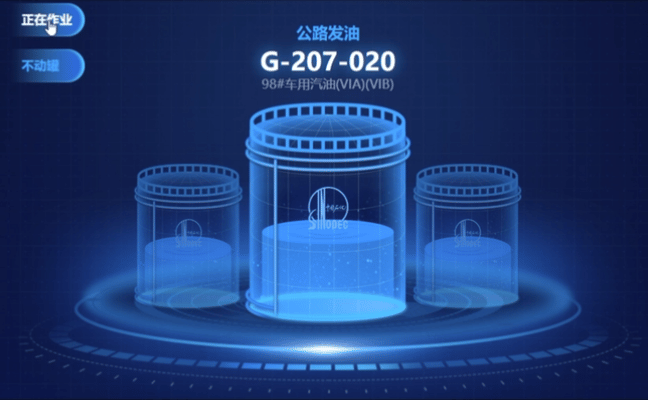
话不多说先看效果:
设计思路:
罐是做了三个位置(中=>左,左=>右,右=>中)的动画效果,每个罐轮流使用一次,来实现旋转的效果。
中间的光亮做了个变形延迟。
罐的透明效果是使用了三层,即最底层是粒子不透明图片,中层是液体组件,最上层是罐体png图片。都是用了绝对定位,请务必设置好位置。
液体组件中液体的动画效果非常简单,只需要 transition: height 1s ease; 并且在液体的行样式动态设置 height: number + '%' 就可。
目前液位高度用的是随机数,后续可根据业务动态获取后台数据联调。
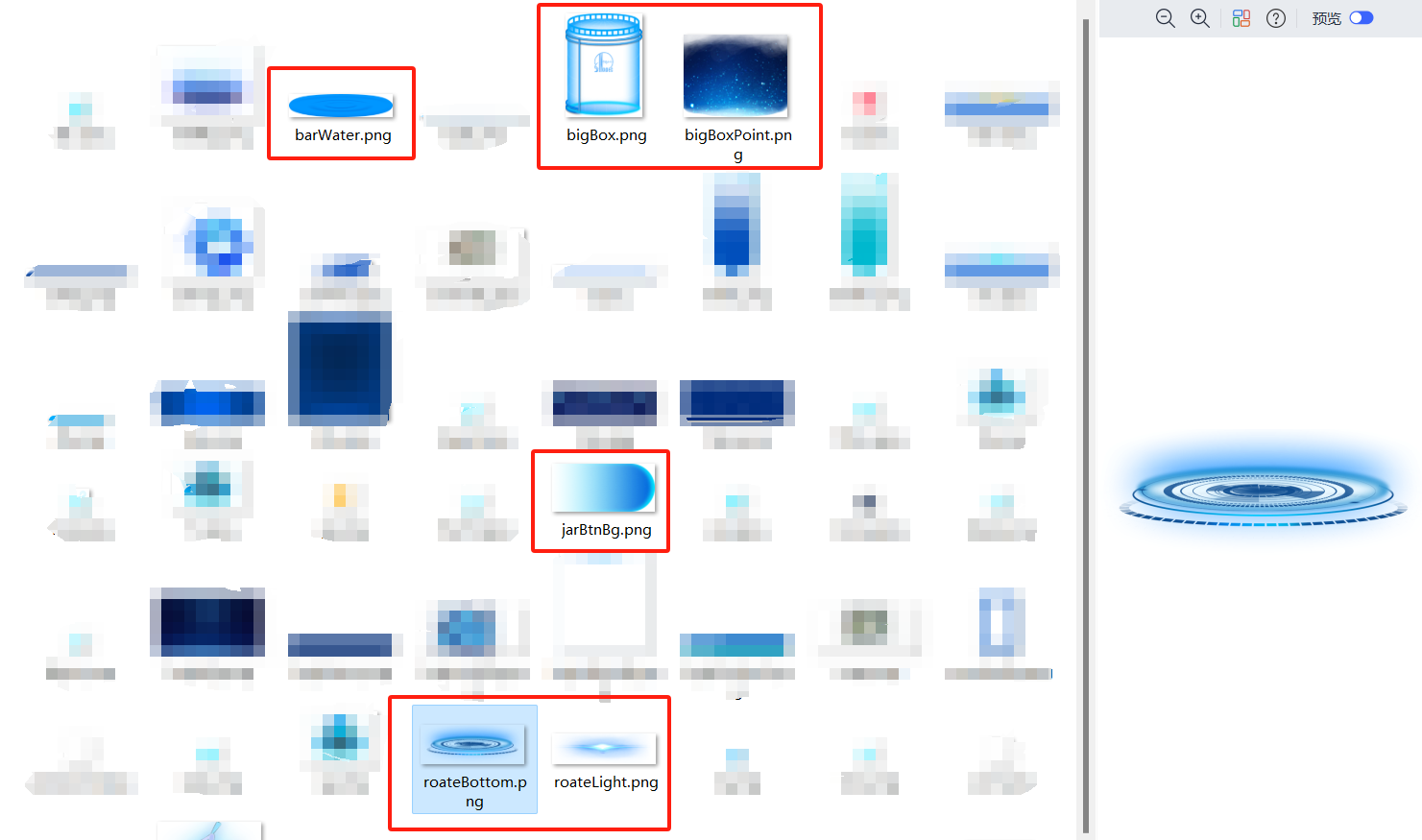
提前准备如下切图:
代码如下:
<div class="centerWrap-top">
          <div class="textWrap">
            <span>公路发油</span>
            <h1>G-207-020</h1>
            <p>98#车用汽油(VIA)(VIB)</p>
          </div>
          <div class="rotateBox">
            <div class="jarBtnGroup">
              <div
                class="jarBtn"
                :class="jarBtnActive == 1 ? 'jarBtnActive' : ''"
                @click="jarBtnFn(1)"
              >
                正在作业
              </div>
              <div
                class="jarBtn"
                :class="jarBtnActive == 2 ? 'jarBtnActive' : ''"
                @click="jarBtnFn(2)"
              >
                不动罐
              </div>
            </div>

            <img class="roateBg" src="@/assets/images/screen/roateBottom.png" />
            <!-- 亮光 -->
            <img
              class="roateLight"
              :class="light ? 'roateLightMove' : ''"
              src="@/assets/images/screen/roateLight.png"
            />
            <!-- --------------左罐-------------- -->
            <div class="smallBoxLeft" :class="rotateLeft">
              <img
                class="smallBoxImg"
                src="@/assets/images/screen/bigBox.png"
              />
              <img
                class="boxPointImg"
                src="@/assets/images/screen/bigBoxPoint.png"
              />
              <jarHomeBox
                :number="jarNumber"
                :barEntityColor="[
                  'rgba(0,155,255,0.75)',
                  'rgba(0,155,255,0.75)',
                ]"
                :barEntityAfterColor="['#00a2ff', '#00d7ff']"
              ></jarHomeBox>
            </div>
            <!-- --------------右罐--------------- -->
            <div class="smallBoxRight" :class="rotateRight">
              <img
                class="smallBoxImg"
                src="@/assets/images/screen/bigBox.png"
              />
              <img
                class="boxPointImg"
                src="@/assets/images/screen/bigBoxPoint.png"
              />
              <jarHomeBox
                :number="jarNumber"
                :barEntityColor="[
                  'rgba(0,155,255,0.75)',
                  'rgba(0,155,255,0.75)',
                ]"
                :barEntityAfterColor="['#00a2ff', '#00d7ff']"
              ></jarHomeBox>
            </div>
            <!-- --------------中间罐-------------- -->
            <div class="bigBox" :class="rotateCenter">
              <img class="bigBoxImg" src="@/assets/images/screen/bigBox.png" />
              <img
                class="boxPointImg"
                src="@/assets/images/screen/bigBoxPoint.png"
              />
              <jarHomeBox
                :number="jarNumber"
                :barEntityColor="[
                  'rgba(0,155,255,0.75)',
                  'rgba(0,155,255,0.75)',
                ]"
                :barEntityAfterColor="['#00a2ff', '#00d7ff']"
              ></jarHomeBox>
            </div>
          </div>
        </div>
import jarHomeBox from "@/components/jarHomeBox.vue"; //油罐组件
export default {
  components: {
    jarHomeBox,
  },
  data() {
    return {
      light: 1, //旋转
      rotateIndex: 0, //旋转次数
      rotateCenter: "",
      rotateLeft: "",
      rotateRight: "",
      jarBtnActive: 1, //旋转罐按钮
      jarNumber: 55, //罐值
    };
 },
  methods: {
    //选择罐
    jarBtnFn(val) {
      this.jarBtnActive = val;
      this.rotateFn();
    },
    //旋转罐
    rotateFn() {
      if (this.rotateIndex == 2) {
        this.rotateIndex = 0;
      } else {
        this.rotateIndex++;
      }
      // 亮光动画
      this.light = true;
      setTimeout(() => {
        this.light = false;
      }, 500);
      this.jarNumber = Math.floor(Math.random() * 100); //随机数
      // 分配三种动画
      if (this.rotateIndex == 0) {
        this.rotateCenter = "rotateJar" + 0;
        this.rotateLeft = "rotateJar" + 1;
        this.rotateRight = "rotateJar" + 2;
      } else if (this.rotateIndex == 1) {
        this.rotateCenter = "rotateJar" + 1;
        this.rotateLeft = "rotateJar" + 2;
        this.rotateRight = "rotateJar" + 0;
      } else if (this.rotateIndex == 2) {
        this.rotateCenter = "rotateJar" + 2;
        this.rotateLeft = "rotateJar" + 0;
        this.rotateRight = "rotateJar" + 1;
      }
    },
}
样式
.centerWrap-top {
      width: 100%;
      height: 60%;
      position: relative;
      //文字部分
      .textWrap {
        width: 100%;
        position: absolute;
        bottom: 370px;
        left: 0;
        text-align: center;
        span {
          font-size: 20px;
          font-family: Microsoft YaHei;
          font-weight: bold;
          color: #02aeff;
          line-height: 38px;
        }
        h1 {
          font-size: 30px;
          font-family: Microsoft YaHei;
          font-weight: bold;
          color: #ffffff;
          line-height: 30px;
          text-shadow: 0 0 20px RGBA(0, 174, 255, 1);
        }
        p {
          font-size: 15px;
          font-family: Microsoft YaHei;
          font-weight: 400;
          color: #ffffff;
          line-height: 24px;
          opacity: 0.5;
        }
      }
      // 旋转罐
      .rotateBox {
        width: 100%;
        height: 100%;
        position: relative;
        .jarBtnGroup {
          .jarBtn {
            width: 90px;
            height: 40px;
            margin-bottom: 15px;
            padding-left: 14px;
            box-sizing: border-box;
            line-height: 40px;
            color: #fff;
            font-size: 16px;
            font-weight: bold;
            font-family: Microsoft YaHei;
            background: url("~@/assets/images/screen/jarBtnBg.png") no-repeat;
            background-size: 100% 100%;
            cursor: pointer;
          }
          .jarBtnActive {
            color: #02aeff;
          }
        }
        // 底盘图片
        .roateBg {
          width: 100%;
          // height: 60%;
          position: absolute;
          bottom: -30px;
          left: 0;
          z-index: 0;
        }
        //亮光
        .roateLight {
          width: 200px;
          height: 48px;
          margin-left: -100px;
          position: absolute;
          bottom: 34px;
          left: 50%;
          z-index: 0;
          transform: scaleX(1.7);
        }
        .roateLightMove {
          animation: roateLightMove 1s ease;
          animation-fill-mode: forwards;
        }
        // 移动1
        @keyframes roateLightMove {
          0% {
            transform: scaleX(0.5);
          }
          100% {
            transform: scaleX(1.7);
          }
        }
        //三个罐常态大小和位置设置
        //左罐
        .smallBoxLeft {
          width: 130px;
          height: 177px;
          margin-left: -235px;
          position: absolute;
          bottom: 110px;
          left: 50%;
          opacity: 0.5;
          z-index: 1;
          // 外层罐图片
          .smallBoxImg {
            width: 100%;
            position: absolute;
            z-index: 11;
          }
          // 粒子背景
          .boxPointImg {
            width: 120px;
            height: 130px;
            position: absolute;
            top: 40px;
            left: 5px;
            z-index: 8;
          }
        }
        //右罐
        .smallBoxRight {
          width: 130px;
          height: 177px;
          margin-left: -280px;
          position: absolute;
          bottom: 110px;
          left: 100%;
          opacity: 0.5;
          z-index: 2;
          // 外层罐图片
          .smallBoxImg {
            width: 100%;
            position: absolute;
            z-index: 11;
          }
          // 粒子背景
          .boxPointImg {
            width: 120px;
            height: 130px;
            position: absolute;
            top: 40px;
            left: 5px;
            z-index: 8;
          }
        }
        //中间罐
        .bigBox {
          width: 200px;
          height: 271px;
          margin-left: -100px;
          position: absolute;
          left: 50%;
          bottom: 90px;
          z-index: 2;
          // 外层罐图片
          .bigBoxImg {
            width: 100%;
            position: absolute;
            z-index: 11;
          }
          // 粒子背景-大罐
          .boxPointImg {
            width: 189px;
            height: 170px;
            position: absolute;
            top: 90px;
            left: 5px;
            z-index: 8;
          }
        }
        //三种移动动画设置
        //中=>左
        .rotateJar0 {
          animation: rotateJar0 1s ease;
          animation-fill-mode: forwards;
          // 粒子背景也要相对变小
          .boxPointImg {
            width: 189px;
            height: 170px;
            position: absolute;
            top: 90px;
            left: 5px;
            z-index: 8;
            animation: bigBoxJarMove 1s ease;
            animation-fill-mode: forwards;
            //变小
            @keyframes bigBoxJarMove {
              0% {
                width: 189px;
                height: 170px;
                position: absolute;
                top: 90px;
                left: 5px;
                z-index: 8;
              }
              100% {
                width: 120px;
                height: 130px;
                position: absolute;
                top: 40px;
                left: 5px;
                z-index: 8;
              }
            }
          }
          // 大罐移动动画
          @keyframes rotateJar0 {
            0% {
              width: 200px;
              height: 271px;
              margin-left: -100px;
              left: 50%;
              bottom: 90px;
              opacity: 1;
            }
            100% {
              width: 130px;
              height: 177px;
              margin-left: -235px;
              bottom: 110px;
              left: 50%;
              opacity: 0.5;
            }
          }
        }
        //左=>右
        .rotateJar1 {
          animation: rotateJar1 1s ease;
          animation-fill-mode: forwards;
          // 粒子背景也要相对变小
          .boxPointImg {
            width: 120px;
            height: 130px;
            position: absolute;
            top: 40px;
            left: 5px;
            z-index: 8;
          }
          // 左面小罐移动动画
          @keyframes rotateJar1 {
            0% {
              width: 130px;
              height: 177px;
              margin-left: -235px;
              bottom: 110px;
              left: 50%;
              opacity: 0.5;
            }
            100% {
              width: 130px;
              height: 177px;
              margin-left: -280px;
              bottom: 110px;
              left: 100%;
              opacity: 0.5;
            }
          }
        }
        //右=>中
        .rotateJar2 {
          animation: rotateJar2 1s ease;
          animation-fill-mode: forwards;
          // 粒子背景也要相对变大
          .boxPointImg {
            width: 120px;
            height: 130px;
            position: absolute;
            top: 40px;
            left: 5px;
            z-index: 8;
            animation: samllBoxJarMove 1s ease;
            animation-fill-mode: forwards;
            //变大
            @keyframes samllBoxJarMove {
              0% {
                width: 120px;
                height: 130px;
                position: absolute;
                top: 40px;
                left: 5px;
                z-index: 8;
              }
              100% {
                width: 189px;
                height: 170px;
                position: absolute;
                top: 90px;
                left: 5px;
                z-index: 8;
              }
            }
          }
          // 右面小罐移动动画
          @keyframes rotateJar2 {
            0% {
              width: 130px;
              height: 177px;
              margin-left: -280px;
              bottom: 110px;
              left: 100%;
              opacity: 0.5;
            }
            100% {
              width: 200px;
              height: 271px;
              margin-left: -100px;
              left: 50%;
              bottom: 90px;
              opacity: 1;
            }
          }
        }
      }
    }
罐组件代码如下:
<!--
 * @LastEditTime: 2023-11-10 11:22:27
 * @Description: 旋转罐
-->

<template>
  <div class="jarBox">
    <!-- 罐子整体+盖 -->
    <div class="bar">
      <!-- 罐顶 -->
      <div class="barBefore"></div>
    </div>
    <!-- 里面液体整体 -->
    <div
      class="barEntity"
      :style="{
        height: number + '%',
        background:
          'linear-gradient(' + barEntityColor[0] + ',' + barEntityColor[1],
      }"
    >
      <!-- 液体顶 -->
      <div class="barEntityBefore"></div>
      <!-- 液体底 -->
      <div
        class="barEntityAfter"
        :style="{
          background:
            'linear-gradient(to bottom left,' +
            barEntityAfterColor[0] +
            ' 10%,' +
            barEntityAfterColor[1],
        }"
      ></div>
    </div>
  </div>
</template>
<script>
export default {
  name: "jarHomeBox",
  components: {},
  props: {
    number: {
      type: Number,
      default: 0,
    },
    // 液体颜色
    barEntityColor: {
      type: Array,
      default: () => {
        return ["rgba(218, 34, 255, 0.3)", "#9733EE"];
      },
    },
    // 液体底或罐底颜色
    barEntityAfterColor: {
      type: Array,
      default: () => {
        return ["rgba(218, 34, 255, 0.5)", "#9733EE"];
      },
    },
  },
  mounted() {},
};
</script>

<style scoped lang="scss">
.jarBox {
  position: absolute;
  top: 24%;
  left: 10%;
  height: 68%;
  width: 80%;
  z-index: 9;

  // 罐子整体
  .bar {
    position: relative;
    height: 100%;
    width: 100%;
    background: transparent;
    // 罐顶
    .barBefore {
      position: absolute;
      top: -10px;
      content: "";
      width: 100%;
      height: 18px;
      border-radius: 50%;
      z-index: 3;
    }
  }
  // 液体
  .barEntity {
    position: absolute;
    bottom: 0;
    width: 100%;
    height: 0;
    z-index: 2;
    transition: height 1s ease; //简简单单过度效果就可以解决,搞了那么一圈用动画,真费劲
    // 液体顶
    .barEntityBefore {
      position: absolute;
      top: -16px;
      // content: "";
      width: 100%;
      height: 30px;
      border-radius: 50%;
      background: url("~@/assets/images/screen/barWater.png") no-repeat;
      background-size: 100% 100%;
      z-index: 2;
    }
    // 罐底
    .barEntityAfter {
      position: absolute;
      bottom: -11px;
      content: "";
      width: 100%;
      height: 24px;
      border-radius: 50%;
      z-index: 1;
    }
  }
}
</style>
