


纯css星空效果
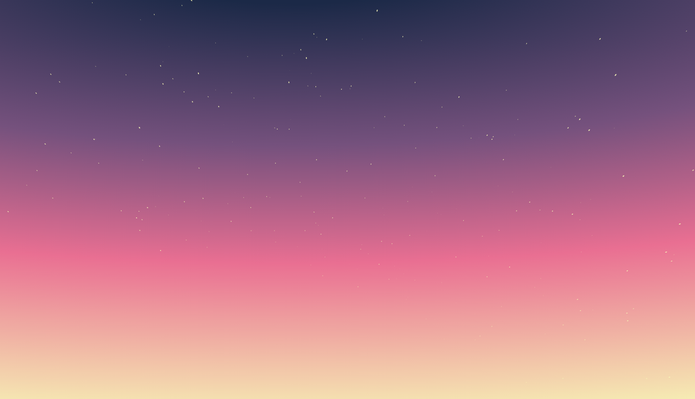
vue2版的
<!--
 * @Description: 星空
 * @Autor: 赵婧
 * @Date: 2022-09-07 17:27:44
 * @LastEditors: 赵婧
 * @LastEditTime: 2022-10-21 10:17:58
-->
<template>
  <div class="body">
    <div class="stars" ref="starsRef">
      <div class="star" v-for="(item, index) in starsCount" :key="index"></div>
    </div>
  </div>
</template>
<script>
export default {
  data() {
    return {
      starsCount: 800, //星星数量
      distance: 900 //间距
    };
  },
  mounted() {
    let starNodes = Array.from(this.$refs.starsRef.children);
    starNodes.forEach(item => {
      let speed = 0.2 + Math.random() * 1;
      let thisDistance = this.distance + Math.random() * 300;
      item.style.transformOrigin = `0 0 ${thisDistance}px`;
      item.style.transform = `
        translate3d(0,0,-${thisDistance}px)
        rotateY(${Math.random() * 360}deg)
        rotateX(${Math.random() * -50}deg)
        scale(${speed},${speed})`;
    });
  }
};
</script>

<style lang="css" scoped>
.body {
  position: absolute;
  width: 100%;
  height: 100%;
  margin: 0;
  padding: 0;
  background: radial-gradient(
    200% 100% at bottom center,
    #f7f7b6,
    #db6f8e,
    #1b2947
  );
  background: radial-gradient(
    200% 105% at top center,
    #1b2947 10%,
    #75517d 40%,
    #e96f92 65%,
    #f7f7b6
  );
  background-attachment: fixed;
  overflow: hidden;
}

@keyframes rotate {
  0% {
    transform: perspective(400px) rotateZ(20deg) rotateX(-40deg) rotateY(0);
  }
  100% {
    transform: perspective(400px) rotateZ(20deg) rotateX(-40deg)
      rotateY(-360deg);
  }
}
.stars {
  transform: perspective(500px);
  transform-style: preserve-3d;
  position: absolute;
  perspective-origin: 50% 100%;
  left: 45%;
  animation: rotate 90s infinite linear;
  bottom: 0;
}
.star {
  width: 2px;
  height: 2px;
  background: #f7f7b6;
  position: absolute;
  left: 0;
  top: 0;
  backface-visibility: hidden;
}
</style>
