CSS 绘制 按钮 样式
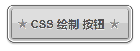
效果图:
源代码:
<!DOCTYPE html>
<html lang="en">
  <head>
    <meta charset="UTF-8" />
    <meta name="viewport" content="width=device-width, initial-scale=1.0" />
    <title>css 绘制 按钮</title>
    <style>
      a {
        margin-left: 100px;
        display: block;
        width: 250px;
        height: 62px;
        margin: 28px;
        border-radius: 4px;
        text-shadow: 0 1px #eee;
        font-family: arial;
        font-size: 24px;
        font-weight: bold;
        color: #535253;
        text-decoration: none;
        text-transform: uppercase;
        text-indent: 52px;
        line-height: 63px;
        box-shadow: 0 29px rgba(222, 222, 222, 1) inset, 0 1px 2px 1px #656565,
          0 0 0 6px #cacaca, 0 0 0 8px #fff, 0 0 0 10px #696969,
          0 2px 3px 11px #cbcbcb;
        background: linear-gradient(
          rgba(219, 219, 219, 0.9) 48%,
          rgba(169, 169, 169, 0.6) 48%
        );
      }
      a:before,
      a:after {
        font-size: 27px;
        color: #888;
        content: "★";
        text-shadow: 0 1px #fff;
      }
      a:before {
        margin-left: -40px;
      }
      a:after {
        margin-left: 10px;
      }
    </style>
  </head>
  <body>
    <a href=""> CSS 绘制 按钮</a>
  </body>
</html>
来自网络转载

 浙公网安备 33010602011771号