
1024用css画一个爱心送给心爱的她吧!
鲁迅:女人是要靠哄的!
那么就用CSS画一个爱心送给她吧!
CSS 无疑是很强大的,利用它的属性可以画出各种各样的图案,也可以实现一些简单的动画,这个爱心呢,也能用CSS画出来。
盘盘需要用到什么?
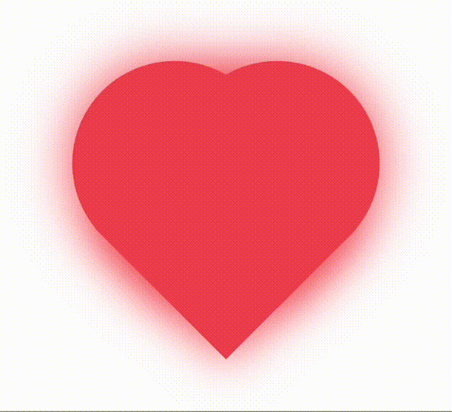
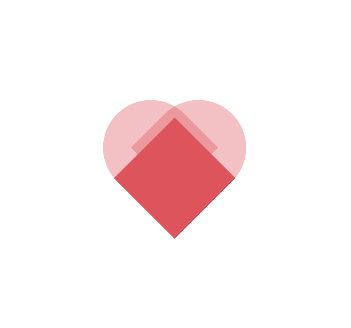
easy!几个div加上border-radius就可以实现一个,大家可以仔细想想,先放张效果图:
分析分析
上面有提到border-radius,这个属性会让元素形成一个圆角,值越大弧度就越大。
回过头来看 ❤️ ,稍微分析、解构一下,是不是就是这样子?
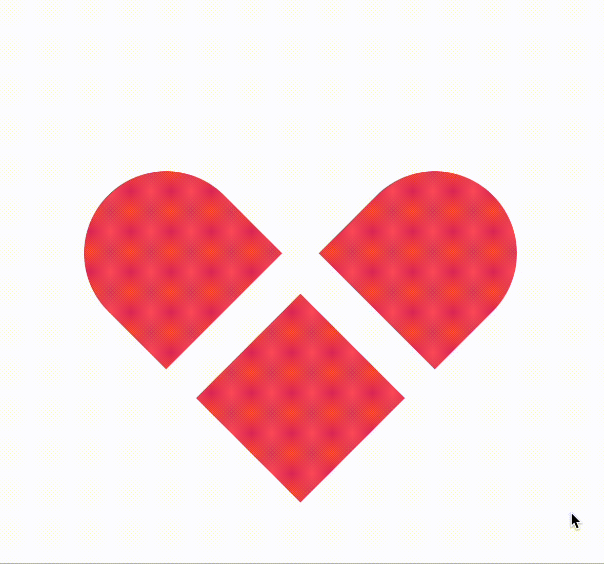
是由三个div构成的:
-
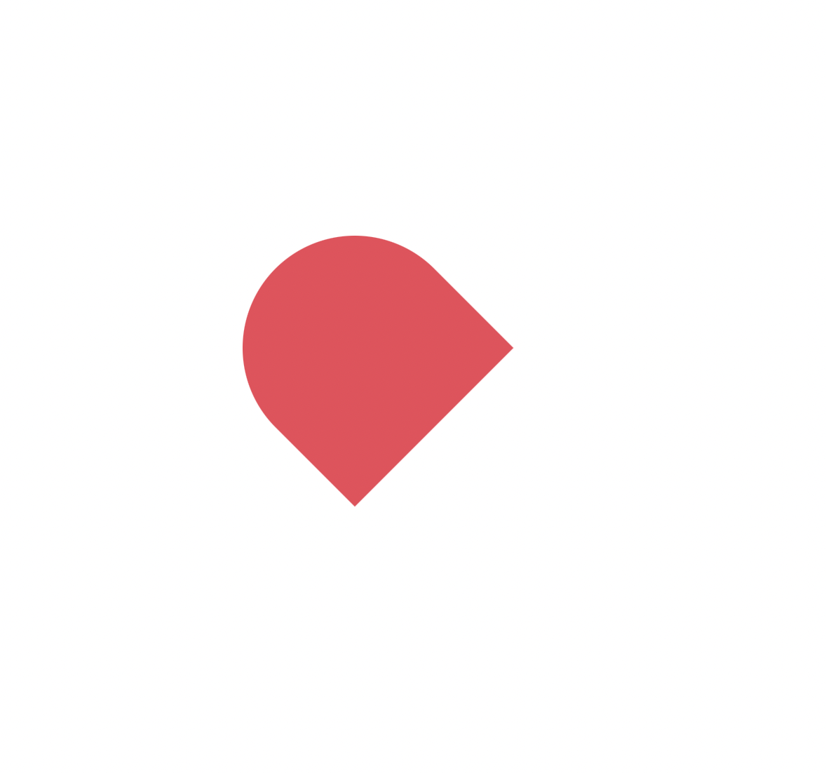
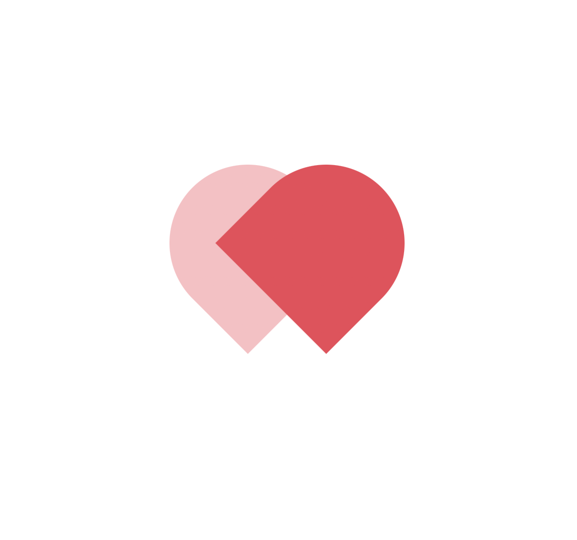
左边一个圆角div
-
右边再来一个
-
底部画个没有圆角的div
再画个动画
爱心爱心,是要动起来的,怎么动?跳动!那么跳动的效果是怎么实现的呢?
仔细瞧瞧开头的GIF,是不是整个元素在变大-变小-变大-变小的过程中,这不是元素缩放嘛,脑海中是不是立马想起scale()。
@keyframes shake {
  0% {
    transform: scale(1.1, 1.1);
  }

  to {
    transform: scale(.9, .9);
  }
}
.heart-bar {
  animation-name: shake;
  animation-duration: .5s;
  animation-iteration-count: infinite;
}
当然,周围还有阴影的动画
@keyframes shadow {
  to {
    box-shadow: 0 0 50px #ef4657;
  }
}
.item-heart {
  animation-name: shadow;
  animation-duration: .5s;
  animation-iteration-count: infinite;
}
画完了
点击查看代码
    @keyframes shake {
      0% {
        transform: scale(1.1, 1.1);
      }

      to {
        transform: scale(.9, .9);
      }
    }

    @keyframes shadow {
      to {
        box-shadow: 0 0 50px #ef4657;
      }
    }
    .flex-center {
      display: flex;
      align-items: center;
      justify-content: center;
    }

    .heart-bar,
    .item-heart {
      position: absolute;
      animation-duration: .5s;
    }

    .heart-bar {
      top: 50%;
      left: 50%;
      width: 200px;
      height: 200px;
      margin: -110px 0 0 -100px;
      animation-name: shake;
      animation-iteration-count: infinite;
    }

    .item-heart {
      width: 100%;
      height: 100%;
      background: #ef4657;
      animation-name: shadow;
      animation-iteration-count: infinite;
    }
    .top-left,
    .top-right {
      border-radius: 100px 100px 0 0;
    }

    .top-left {
      transform: translate(-50px, 0) rotate(-45deg);
    }

    .top-right {
      transform: translate(50px, 0) rotate(45deg);
    }

    .bottom {
      transform: translate(0, 64px) rotate(45deg) scale(.9, .9);
    }

/**html*/
<body>
  <div class="heart-bar flex-center">
    <div class="item-heart top-left"></div>
    <div class="item-heart top-right"></div>
    <div class="item-heart bottom"></div>
  </div>
</body>
最后,给大家可以扫一下下方的二维码,查看更多动画效果,大都是使用CSS实现的。


 浙公网安备 33010602011771号