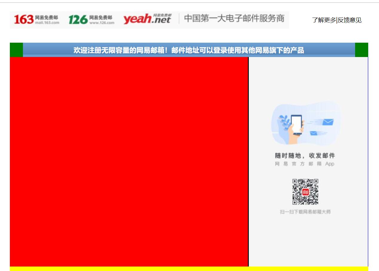
一、 这次完成了content部分的右边图片以及content的top部分的边角填充
<!DOCTYPE html> <html lang="en"> <head> <meta charset="UTF-8"> <title>D139_FrameworkeOfNeteasyInterface</title> <style> .header{ width:960px; height:80px; /*background-color: red;*/ margin: 0 auto; overflow: hidden; padding-top:14px; box-sizing: border-box;/*这里我们采用内上边距的办法将logo挤下去达到垂直居中的目的*/ /*同时这个box-sizing的属性就是将这个header固定住,不让他因为内边距而变化大小了*/ } .content{ width: 960px; height: 600px; background-color: blue; margin: 0 auto; } .footer{ width: 960px; height: 48px; background-color: yellow; margin: 0 auto ; } .header .logo{ width:748px; height: 47px; background:url("image/netEasyLogo.jpg") no-repeat 0 0;/*从图片的坐标(0,0)开始铺,no-repeat就是只铺这一张不要多铺*/ /*margin-top: 12px;*/ float:left; } .header .links{ height: 42px; width: 150px; /*background-color: red;*/ float:right; } .header .logo a { width:156px; height:45px;/*测量出那一块区域,然后这一块区域都是超级链接*/ /*background-color: red;*/ display: inline-block;/*转换为行内块级标签*/ } .header .links a{ text-decoration:none;/*去掉下划线*/ font-size: 16px; color:black; line-height: 45px;/*这里复习了文字不能居中,使用这个属性让它和links盒子的高度一致,那就做到文字在盒子中居中*/ text-align: right;/*复习了文字右对齐*/ } .content{ width: 960px; height: 600px; } .content .top{ width: 960px; height: 38px; /*background-color: red;*/ background: url("image/wangyi_center.jpg") 0 0;/*让这张小图片把top这个区域全部铺满*/ } .content .bottom{ width: 960px; height: 562px; /*background-color: green;*/ } /*下面这两个属性设置,就是为了content的top部的两边能使用我们指定的格式,我们采用的盒子嵌套盒子来进行背景的演示*/ .content .top .left{ width:960px; height: 38px; background:url("image/line_left.jpg") no-repeat left 0 ; /*display: inline;*/ } .content .top .left .right{ width:960px; height: 38px; background:url("image/line_left.jpg") no-repeat right 0 ; } .content .top .left .right h3{ color: white; line-height:38px;/*设置行高就是为了让文字能够在top条中垂直居中*/ text-align: center;/*文字水平居中,当然我们也可以设置margin-left来设置左边距,但是一旦分辨率改变将导致网页变形*/ } .content .bottom .article{ width:638px; height: 562px; background-color: red; float:left;/*这里填写了这个float属性才行,并且右面的盒子也需要float属性,div是行内标签,不写float会另起一行*/ } .content .bottom .aside{ width: 320px;/*这里我们本来写的322,但是发现写上322就会造成aside这个图片溢出到下面了,原来是左边距有2px.这样*/ /*320+2+638=960就正好了,溢出原因就是float属性导致的,达到了962,就装不下了*/ height: 562px; /*background-color: green;*/ background:url("image/content_aside.jpg") no-repeat 0; float:right; border-left:2px black solid; } </style> </head> <body> <div class="header"> <div class="logo" > <a href="https://www.163.com/" title="网易163免费邮箱"></a><a href="https://www.126.com/" title="网易126免费邮箱"></a><a href="#" title="网易yeah免费邮箱"></a> <!--复习了a标签的使用,title就是指鼠标放到超链接上就会显示的文字--> </div> <div class="links"> <a href="http://www.baidu.com">了解更多</a>|<a href="#">反馈意见</a> </div> </div> <div class="content"> <div class="top"> <div class="left"> <div class="right"><h3>欢迎注册无限容量的网易邮箱!邮件地址可以登录使用其他网易旗下的产品</h3></div> </div> </div> <div class="bottom"> <div class="article"></div> <div class="aside"></div> </div> </div> <div class="footer"></div> </body> </html>
三、源码:
D139_FrameworkeOfNeteasyInterface.html
地址:
https://github.com/ruigege66/HTML_learning/blob/master/D139_FrameworkeOfNeteasyInterface.html
2.CSDN:https://blog.csdn.net/weixin_44630050(心悦君兮君不知-睿)
3.博客园:https://www.cnblogs.com/ruigege0000/
4.欢迎关注微信公众号:傅里叶变换,个人账号,仅用于技术交流,后台回复“礼包”获取Java大数据学习视频礼包