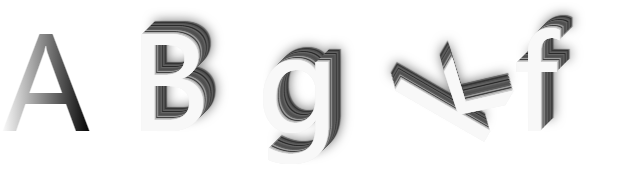
歪歪扭扭的字母
css3中transform属性实现的4种功能(旋转、缩放、倾斜、移动)-css教程-PHP中文网 https://www.php.cn/css-tutorial-409036.html
(3)计算3D变形
3D缩放变形使用的4X4矩阵
transform:matrix3d(sx,0,0,0,0,sy,0,0,0,0,sz,0,0,0,0,1);
<!DOCTYPE html>
<html>
<head>
<meta charset="utf-8">
<title></title>
</head>
<body>
<div>
<span class="text-gradient">A</span>
</div>
<div>
<span class="effect01">B</span>
</div>
<div class="rotated_60">
<span class="effect01 ">g</span>
</div>
<div class="rotated_60_l ">
<span class="effect01 scale3d_08_05_1">k</span>
</div>
<div class="rotated_60 ">
<span class="effect01 scale3d_08_05_1">f</span>
</div>
</body>
<style>
/* 颜色渐变 */
.text-gradient {
background-image: linear-gradient(to right, #FFFFFF, #000000);
-webkit-background-clip: text;
color: transparent;
font-size: 128px;
}
/* 立体感 */
.effect01 {
/* background-color: #7ABCFF; */
font-size: 128px;
color: #f8f8f8;
text-shadow:
0px 0px 0 #eeeeee,
1px -1px 0 #cecece,
2px -2px 0 #b0b0b0,
3px -3px 0 #424242,
4px -4px 0 #9c9c9c,
5px -5px 0 #5a5a5a,
6px -6px 0 #4f4f4f,
7px -7px 0 #545454,
8px -8px 0 #666666,
9px -9px 0 #2b2b2b,
10px -10px 0 #616161,
11px -11px 0 #4f4f4f,
12px -12px 0 #343434,
13px -13px 12px rgba(0, 0, 0, 0.55),
13px -13px 1px rgba(0, 0, 0, 0.5);
}
.rotated {
transform: rotate(45deg);
/* Equal to rotateZ(45deg) */
background-color: pink;
}
.rotated_60_l {
transform: rotate(-60deg);
}
.rotated_300 {
transform: rotate(300deg);
}
.scale3d_08_05_1 {
transform: scale3d(0.8, 0.5, 1);
}
div {
width: 128px;
height: 128px;
margin: 0;
float: left;
border: #000000 2px;
}
</style>
</html>

 浙公网安备 33010602011771号