CSS3:选择器整理,附css的骚操作,实现表单验证、ios切换按钮……
CSS的选择器很多,整理一下,方便熟悉使用。
基础的标签选择器、#id、.class、*通配符选择器这些常见的就不讲了。
主要记录一些不常用的且实用的,更多参考w3school手册
条件选择器:
- :has 包含指定的元素
- :is 指定条件的元素
- :not 非指定条件的元素
- :where 指定条件的元素
- :scope 指定元素作为参考点
- :any-link 所有包含href的链接元素
- :local-link 所有包含href且属于绝对地址的链接元素
伪元素:
- ::before 在元素前插入的内容
- ::after 在元素后插入的内容
行为选择器:
- :active 鼠标激活元素
- :hover 鼠标悬浮的元素
- ::selection 鼠标选中的元素
状态选择器(表单):
- :focus 输入聚焦的表单元素
- :required 输入必填的表单元素
- :valid 输入合法的表单元素
- :in-range 输入范围以内的表单元素
- :out-of-range 输入范围以外的表单元素
- :checked 选中的表单元素
- :optional 可选的表单元素
- :enabled 事件启用的表单元素
- :disabled 事件禁用的表单元素
- :read-only 只读的表单元素
- :read-write 可读可写的表单元素
- :focus-visible 输入聚焦的表单元素
- :blank 输入为空的表单元素
- :user-invalid 输入合法的表单元素
- :placeholder-show 占位显示的表单元素
属性选择器:
- [attr] 指定属性的元素
- 【attr = val】属性等于指定值的元素
- 【attr * = val 】属性包含指定值的元素
- 【attr^ = val】属性以指定值开始的元素
- 【attr$ = val 】属性以指定值结束的元素
+ 和 ~:都是作用于当前节点后的同胞兄弟元素
- + 针对紧随该节点的元素 如
input:checked + div {}被选中input后面紧随的第一个div - ~ 针对后面的所有节点 如
input:checked ~ div {}
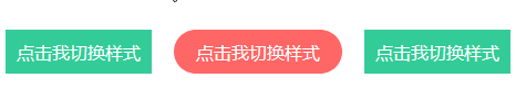
 1 <div class="bruce flex-ct-y" data-title="使用+或~选择指定元素">
 2     <div class="specify-selector">
 3         <div class="button">
 4             <input id="btn1" type="radio" name="btns" hidden>
 5             <label for="btn1">点击我切换样式</label>
 6         </div>
 7         <div class="button">
 8             <input id="btn2" type="radio" name="btns" hidden>
 9             <label for="btn2">点击我切换样式</label>
10         </div>
11         <div class="button">
12             <input id="btn3" type="radio" name="btns" hidden>
13             <label for="btn3">点击我切换样式</label>
14         </div>
15     </div>
16 </div>
 1 .specify-selector {
 2     display: flex;
 3     .button {
 4         & + .button {
 5             margin-left: 20px;
 6         }
 7         label {
 8             display: block;
 9             padding: 0 10px;
10             height: 40px;
11             background-color: #3c9;
12             cursor: pointer;
13             line-height: 40px;
14             font-size: 16px;
15             color: #fff;
16             transition: all 300ms;
17         }
18         input:checked + label {
19             padding: 0 20px;
20             border-radius: 20px;
21             background-color: #f66;
22         }
23     }
24 }
:hover作用于鼠标悬浮的节点,可替代mouseenter和mouseleave鼠标事件,加上transition让点解的动画更丝滑,下面有一个复杂的hover例子:
- 给节点标记一个用户属性data-name
- 当鼠标悬浮在该节点上触发:hover
- 通过attr()获取data-name的内容
- 将data-name的内容赋值到伪元素的content上

1 <ul class="hover-tips">
2     <li data-name="姨妈红"></li>
3     <li data-name="基佬紫"></li>
4     <li data-name="箩底橙"></li>
5     <li data-name="姣婆蓝"></li>
6     <li data-name="柠檬黄"></li>
7     <li data-name="翡翠绿"></li>
8 </ul>
 scss语法
 1 $color-list: #f66 #66f #f90 #09f #fee914 #3c9;//罗列颜色值
 2 .hover-tips {
 3     display: flex;
 4     justify-content: space-between;
 5     width: 200px;
 6     li {
 7         position: relative;
 8         padding: 2px;
 9         border: 2px solid transparent;
10         border-radius: 100%;
11         width: 24px;
12         height: 24px;
13         background-clip: content-box;
14         cursor: pointer;
15         transition: all 300ms;
16         &::before,
17         &::after {
18             position: absolute;
19             left: 50%;
20             bottom: 100%;
21             opacity: 0;
22             transform: translate3d(0, -30px, 0);
23             transition: all 300ms;
24         }
25         &::before {
26             margin: 0 0 12px -35px;
27             border-radius: 5px;
28             width: 70px;
29             height: 30px;
30             background-color: rgba(#000, .5);
31             line-height: 30px;
32             text-align: center;
33             color: #fff;
34             content: attr(data-name);//使用data-name的值
35         }
36         &::after {
37             margin-left: -6px;
38             border: 6px solid transparent;
39             border-top-color: rgba(#000, .5);
40             width: 0;
41             height: 0;
42             content: "";
43         }
44         @each $color in $color-list {
45             $index: index($color-list, $color);
46             &:nth-child(#{$index}) {
47                 background-color: $color;
48                 &:hover {
49                     border-color: $color;
50                 }
51             }
52         }
53         &:hover {
54             &::before,
55             &::after {
56                 opacity: 1;
57                 transform: translate3d(0, 0, 0);
58             }
59         }
60     }
61 }
:valid和invalid使用举例,很多UI组件里面判断表单输入内容是否合法,其实用简单的CSS就可以实现啦,大大减少表单验证的代码,input的属性和选择搭配,完美组合。
- placeholder :占位,提示输入文本
- pattern:正则表达,在输入内容时会触发正则验证,正则与JS(/reg/)里使用不同,这里只需要表达式进行(reg)
- :valid:作用于验证通过的表单节点(输入合法触发:valid)
- :invalid:作用于验证不通过的表单节点(输入不合法触发:invalid)
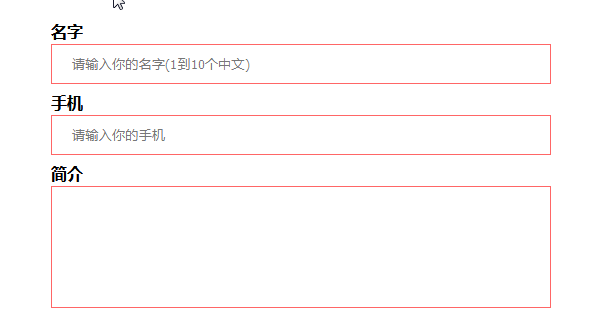
 1 <div class="bruce flex-ct-x" data-title="使用:valid和:invalid校验表单内容">
 2     <form class="form-validation">
 3         <div>
 4             <label>名字</label>
 5             <input type="text" placeholder="请输入你的名字(1到10个中文)" pattern="^[\u4e00-\u9fa5]{1,10}$" required>
 6         </div>
 7         <div>
 8             <label>手机</label>
 9             <input type="text" placeholder="请输入你的手机" pattern="^1[3456789]\d{9}$" required>
10         </div>
11         <div>
12             <label>简介</label>
13             <textarea required></textarea>
14         </div>
15     </form>
16 </div>
 1 .form-validation {
 2     width: 500px;
 3     div + div {
 4         margin-top: 10px;
 5     }
 6     label {
 7         display: block;
 8         padding-bottom: 5px;
 9         font-weight: bold;
10         font-size: 16px;
11     }
12     input,
13     textarea {
14         display: block;
15         padding: 0 20px;
16         border: 1px solid #ccc;
17         width: 100%;
18         height: 40px;
19         outline: none;
20         caret-color: #09f;
21         transition: all 300ms;
22         &:valid {
23             border-color: #3c9;//绿色
24         }
25         &:invalid {
26             border-color: #f66;//红色
27         }
28     }
29     textarea {
30         height: 122px;
31         resize: none;
32         line-height: 30px;
33         font-size: 16px;
34     }
35 }
:checked 作用于选项选中的表单节点 表单中radio或checkbox可用,移动端ios开关按钮来试一试吧!

1 <div class="bruce" data-title="iOS开关按钮">
2     <input class="ios-switch" type="checkbox">
3 </div>
 1 .btn {
 2     border-radius: 31px;
 3     width: 102px;
 4     height: 62px;
 5     background-color: #e9e9eb;
 6 }
 7 .ios-switch {
 8     position: relative;
 9     appearance: none;
10     cursor: pointer;
11     transition: all 100ms;
12     @extend .btn; /*@extend 指令告诉 Sass 一个选择器的样式从另一选择器继承。*/
13     &::before {
14         position: absolute;
15         content: "";
16         transition: all 300ms cubic-bezier(.45, 1, .4, 1);
17         @extend .btn;
18     }
19     &::after {
20         position: absolute;
21         left: 4px;
22         top: 4px;
23         border-radius: 27px;
24         width: 54px;
25         height: 54px;
26         background-color: #fff;
27         box-shadow: 1px 1px 5px rgba(#000, .3);
28         content: "";
29         transition: all 300ms cubic-bezier(.4, .4, .25, 1.35);
30     }
31     &:checked {
32         background-color: #5eb662;
33         &::before {
34             transform: scale(0);
35         }
36         &::after {
37             transform: translateX(40px);
38         }
39     }
40 }
佳物不独来,万物同相携。
