
Html和CSS布局技巧-多列布局(二)
二、多列布局
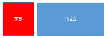
(1)左列定宽,右列自适应
该布局方式非常常见,适用于定宽的一侧常为导航,自适应的一侧为内容的布局
<!-- 利用float+margin实现 -->
注:IE6会有3px的bug
<style media="screen">
    .left{float: left;width: 100px;background: #f00;height: 100%;}
    .right{margin-left: 105px;background: #5a9bd5;height: 100%;}
</style>
<body>
    <div class="parent" style="height: 100px;">
        <div class="left"></div>
        <div class="right"></div>
    </div>
</body>
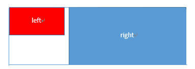
<!-- 利用float+margin(fix)实现 -->
<style media="screen">
    .left {float: left;width: 100px;background: #f00;height: 30px;}
    .right-fix{
        width: 100%;
        height: 100%;
        margin-left: -102px;
        float: right;
        border: 1px solid #000;
    }
    .right {margin-left: 105px;background: #5a9bd5;height: 100%;}
</style>
<body>
    <div class="parent" style="height:100px;">
        <div class="left">left</div>
        <div class="right-fix">
            <div class="right">right</div>
        </div>
    </div>
</body>
<!-- 使用float+overflow实现 -->
<style media="screen">
    .left{
        width: 100px;
        float: left;
        background: #f00;
        margin-right: 10px;
    }
    .right{overflow: hidden;background: #ff0;}
</style>
<body>
    <div class="parent" style="height:100px;">
        <div class="left" >left</div>
        <div class="right">right</div>
    </div>
</body>
overflow:hidden,触发bfc模式,浮动无法影响,隔离其他元素,IE6不支持,左侧left设置margin-left当作left与right之间的边距,右侧利用overflow:hidden 进行形成bfc模式
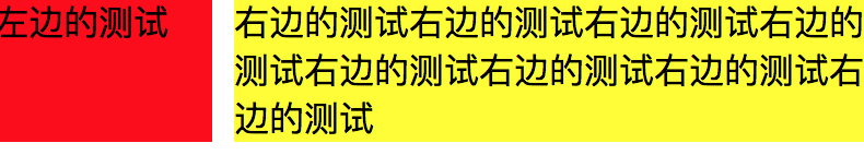
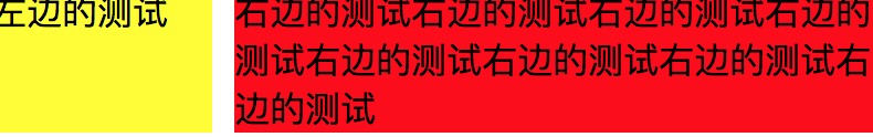
如果我们需要将两列设置为等高,可以用下述方法将“背景”设置为等高,其实并不是内容的等高
<!-- 使用float+overflow实现 -->
<style media="screen">
.left{
    width:100px;
    float:left;
    background: #f00;
    margin-right: 10px;
}
.right{overflow:hidden;background: #ff0;}
.parent{overflow:hidden;}
.left,.right{padding-bottom:9999px;margin-bottom:-9999px;}

</style>
<body>
    <div class="parent" >
        <div class="left" >左边的测试</div>
        <div class="right">右边的测试右边的测试右边的测试右边的测试右边的测试右边的测试右边的测试右边的测试</div>
    </div>
</body>
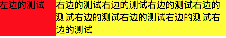
<!-- 使用table实现 -->
<style media="screen">
    .parent{display: table;table-layout: fixed;width: 100%;}
    .left{width: 100px;background: #f00;}
    .right{background: #ff0;}
    .right,.left{display: table-cell;}
</style>
<body>
    <div class="parent" >
        <div class="left" >左边的测试</div>
        <div class="right">右边的测试右边的测试右边的测试右边的测试右边的测试右边的测试右边的测试右边的测试</div>
    </div>
</body>
<!-- 使用flex实现 -->
<style media="screen">
        .parent{display: flex;}
        .left{width: 100px;background: #ff0;margin-left:10px;}
        .right{flex:1;background: #f00}
</style>
<body>
    <div class="parent" >
        <div class="left" >左边的测试</div>
        <div class="right">右边的测试右边的测试右边的测试右边的测试右边的测试右边的测试右边的测试右边的测试</div>
    </div>
</body>


利用右侧容器的flex:1,均分了剩余的宽度,也实现了同样的效果。而align-items 默认值为stretch,故二者高度相等
(2) 两列定宽,一列自适应
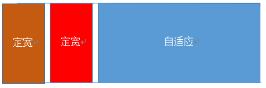
基本html结构为父容器为parent,自容器为left,center,right.其中,left,center定宽,right自适应
<!-- 使用float+margin实现 -->
<style media="screen">
    .left,.center{float:left;width: 200px;background: #f00;}
    .left+.center{margin-left: 10px;}
    .right{background: #5a9bd5;margin-left: 420px;}
</style>
<body>
    <div class="parent" >
        <div class="left" >left</div>
        <div class="center" >center</div>
        <div class="right">右边的测试右边的测试右边的测试右边的测试右边的测试右边的测试右边的测试右边的测试</div>
    </div>
</body>
<!-- 使用float+overflow实现 -->
<style media="screen">
    .left,.center{float:left;width: 200px;background: #f00;}
    .right{overflow: hidden;}
</style>
<!-- 使用table实现 -->
<style media="screen">
    .parent{display: table;table-layout:fixed;width: 100%;}
    .left,.center,.right{display: table-cell;}
    .left,.center{ width: 200px;}
</style>
<!-- 使用flex实现 -->
<style media="screen">
    .parent{display: flex;}
    .left,.center{width: 100px;}
    .right{flex:1}
</style>
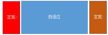
(3) 两侧定宽,中栏自适应
<!-- 利用float+margin实现 -->
<style media="screen">
    .left{width:100px;float:left;background: #f00;}
    .center-fix{float:left;width:100%;margin-right:-200px;}
    .center{margin-right: 210px;margin-left: 10px;background: #5a9bd5}
    .right{width: 100px;float:right;background: #c65a11}
</style>
<body>
    <div class="parent" >
        <div class="left" >left</div>
        <div class="center-fix" >
            <div class="center">center自适应center自适应center自适应center自适应center自适应center自适应center自适应center自适应center自适应</div>
        </div>
        <div class="right">右边的测试右边的测试右边的测试右边的测试右边的测试右边的测试右边的测试右边的测试</div>
    </div>
</body>
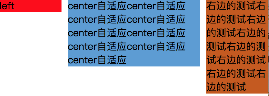
<!-- 利用table实现 -->
<style media="screen">
    .parent{width: 100%;display: table;table-layout: fixed;}
    .left,.center,.right{display: table-cell;}
    .left{width: 100px;}
    .right{width: 100px;}
</style>
<body>
    <div class="parent" >
        <div class="left" >left</div>
        <div class="center" >
            center自适应center自适应center自适应center自适应center自适应center自适应center自适应center自适应center自适应
        </div>
        <div class="right">右边的测试右边的测试右边的测试右边的测试右边的测试右边的测试右边的测试右边的测试</div>
    </div>
</body>
<!-- 利用table实现 -->
<style media="screen">
    .parent{display: flex;}
    .left{width: 100px;}
    .center{flex: 1}
    .right{width: 100px;}
</style>
(4) 一列不定宽,一列自适应
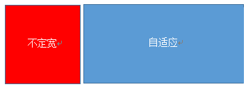
<!-- 利用float+overflow实现 -->
<style media="screen">
    .left{float:left;margin-right: 10px;}
    .right{overflow: hidden;}
</style>
<!-- 利用flex实现 -->
<style media="screen">
    .parent{display: flex;}
    .right{flex:1}
</style>
(5) 多列等分布局
多列等分布局常出现在内容中,多数为功能的,同阶级内容的并排显示等。
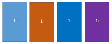
<!-- 利用float实现 -->
<style media="screen">
    .parent{margin-left: -20px;}
    .column {float: left;width: 25%;padding-left: 20px;box-sizing: border-box;}
    .column:nth-child(1) div{background: #5a9bd5}
    .column:nth-child(2) div{background: #c65a11}
    .column:nth-child(3) div{background: #0170c0}
    .column:nth-child(4) div{background: #6f31a0}
</style>
<body>
    <div class="parent">
        <div class="column"><div>1</div></div>
        <div class="column"><div>1</div></div>
        <div class="column"><div>1</div></div>
        <div class="column"><div>1</div></div>
    </div>
</body>
<!-- 利用table实现 -->
<style media="screen">
    .parent-fix{margin-left: -20px;}
    .parent{display: table;table-layout: fixed;width: 100%;}
    .column{display: table-cell;padding-left: 20px;}
</style>
<body>
    <div  class="parent-fix">
        <div class="parent">
            <div class="column">1</div>
            <div class="column">1</div>
            <div class="column">1</div>
            <div class="column">1</div>
        </div>
    </div>
</body>
<!-- 利用flex实现 -->
<style media="screen">
    .parent{ display: flex;}
    .column{ flex: 1}
    .column+.column{margin-left:20px;}
</style>
<body>
    <div  class="parent-fix">
        <div class="parent">
            <div class="column">1</div>
            <div class="column">1</div>
            <div class="column">1</div>
            <div class="column">1</div>
        </div>
    </div>
</body>

 浙公网安备 33010602011771号