18-css中clear:both的解释及常用父级塌陷现象的解决方法
关于clear:both的解释
例1:没有加clear,只是全部float
代码:
<!DOCTYPE html>
<html lang="en">
<head>
    <meta charset="UTF-8">
    <meta http-equiv="x-ua-compatible" content="IE=edge">
    <meta name="viewport" content="width=device-width, initial-scale=1">
    <title>Title</title>
    <style>
        .item1 {
            width: 200px;
            height: 200px;
            background-color: gold;
            float: left;
        }
        .item2 {
            width: 200px;
            height: 300px;
            background-color: wheat;
            float: left;
            /*clear: both;*/
        }
        .item3 {
            width: 100px;
            height: 200px;
            background-color: grey;
            float: left;
        }
    </style>
</head>
<body>
    <div class="item1"></div>
    <div class="item2"></div>
    <div class="item3"></div>
</body>
</html>
效果:

例2:item2加上clear:left
代码:
<!DOCTYPE html>
<html lang="en">
<head>
    <meta charset="UTF-8">
    <meta http-equiv="x-ua-compatible" content="IE=edge">
    <meta name="viewport" content="width=device-width, initial-scale=1">
    <title>Title</title>
    <style>
        .item1 {
            width: 200px;
            height: 200px;
            background-color: gold;
            float: left;
        }
        .item2 {
            width: 200px;
            height: 300px;
            background-color: wheat;
            float: left;
            clear: left;
            /*clear: both;*/
        }
        .item3 {
            width: 100px;
            height: 200px;
            background-color: grey;
            float: left;
        }
    </style>
</head>
<body>
    <div class="item1"></div>
    <div class="item2"></div>
    <div class="item3"></div>
</body>
</html>
效果:

理解:按照文档流进行加载,item1肯定在开头,当加载到item2的时候,看item1是float的,所以item2应该紧跟在item1的后面即在第一行,但是由于item2有设置clear:left,所以item2的左边不能有浮动元素,所以item2切换到下一行,item2加载完后,再加载item3,item3看item2是float的,所以紧跟在item2的后面。
例3:item2 加上clear:both
代码:
<!DOCTYPE html>
<html lang="en">
<head>
    <meta charset="UTF-8">
    <meta http-equiv="x-ua-compatible" content="IE=edge">
    <meta name="viewport" content="width=device-width, initial-scale=1">
    <title>Title</title>
    <style>
        .item1 {
            width: 200px;
            height: 200px;
            background-color: gold;
            float: left;
        }
        .item2 {
            width: 200px;
            height: 300px;
            background-color: wheat;
            float: left;
            /*clear: left;*/
            clear: both;
        }
        .item3 {
            width: 100px;
            height: 200px;
            background-color: grey;
            float: left;
        }
    </style>
</head>
<body>
    <div class="item1"></div>
    <div class="item2"></div>
    <div class="item3"></div>
</body>
</html>
效果:

理解:按照文档流进行加载,item1肯定在开头,当加载到item2的时候,看item1是float的,所以item2应该紧跟在item1的后面即在第一行,但是由于item2有设置clear:both,所以此时item2的左边和右边都不能有浮动元素,因为此时左边有item1,但是右边没有浮动元素(当前时间item3还没有被加载,所以右边是没有内容的) ,所以item2切换到下一行,item2加载完后,再加载item3,item3看item2是float的,所以紧跟在item2的后面。
误解:item2左右不能有浮动元素,所以item3不能再item2的右边,这种理解错误的原因是没有安装加载顺序来考虑,只有一个加载完了之后才会加载另一个。
之所以设置为clear:both,是因为item2的右边也可能有浮动元素(比如item1的float:right)
代码----------(这个例子可能不太合适):
<!DOCTYPE html>
<html lang="en">
<head>
    <meta charset="UTF-8">
    <meta http-equiv="x-ua-compatible" content="IE=edge">
    <meta name="viewport" content="width=device-width, initial-scale=1">
    <title>Title</title>
    <style>
        .item1 {
            width: 200px;
            height: 200px;
            background-color: gold;
            float: right;
        }
        .item2 {
            width: 200px;
            height: 300px;
            background-color: wheat;
            float: left;
            /*clear: left;*/
            clear: both;
        }
        .item3 {
            width: 100px;
            height: 200px;
            background-color: grey;
            float: left;
        }
    </style>
</head>
<body>
    <div class="item1"></div>
    <div class="item2"></div>
    <div class="item3"></div>
</body>
</html>
效果:

或者item0(float:left)、item1(float:right)
代码----------(这个例子可能不太合适):
<!DOCTYPE html>
<html lang="en">
<head>
    <meta charset="UTF-8">
    <meta http-equiv="x-ua-compatible" content="IE=edge">
    <meta name="viewport" content="width=device-width, initial-scale=1">
    <title>Title</title>
    <style>
        .item0 {
            width: 200px;
            height: 200px;
            background-color: gold;
            float: left;
        }
        .item1 {
            width: 200px;
            height: 200px;
            background-color: gold;
            float: right;
        }
        .item2 {
            width: 200px;
            height: 300px;
            background-color: wheat;
            float: left;
            /*clear: left;*/
            clear: both;
        }
        .item3 {
            width: 100px;
            height: 200px;
            background-color: grey;
            float: left;
        }
    </style>
</head>
<body>
    <div class="item0"></div>
    <div class="item1"></div>
    <div class="item2"></div>
    <div class="item3"></div>
</body>
</html>
效果:

解决父级坍塌现象的方法
实现方式一:使用clear:both
示例
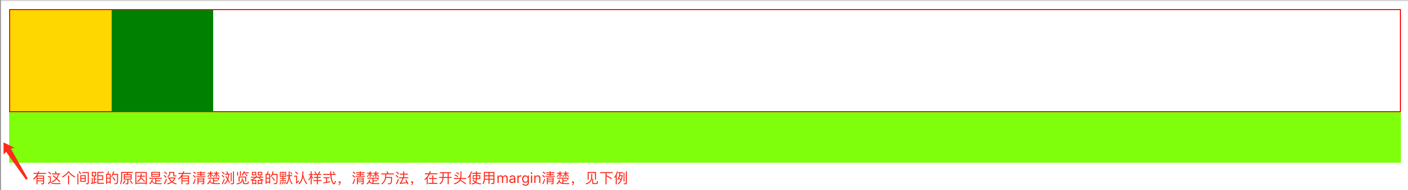
<!DOCTYPE html>
<html lang="en">
<head>
    <meta charset="UTF-8">
    <title>Title</title>

    <style>
        .box{
            border: 1px solid red;
        }
        .c1{
            width: 100px;
            height: 100px;
            background-color: gold;
            float: left;
        }
        .c2{
            width: 100px;
            height: 100px;
            background-color: green;
            float: left;
        }
        .c3{
            clear: both; /* c3没有设置高度(高度为0),但是是标准流中存在的一个元素!所以下面footer的元素,在这个标准流后面添加,,
                            满足两点要求:c3是一个块级标签,同时也有clear:both这个属性*/
        }
        .footer{
            background-color: #7fff0c;
            height: 50px;
        }
    </style>
</head>
<body>
    <div class="box">
        <div class="c1"></div>
        <div class="c2"></div>
        <div class="c3"></div> <!--实现方式一,不推荐使用这种方式,因为这种实现在看代码的时候div是没有意义,所以使用伪类 -->
    </div>
    <div class="footer"></div>
</body>
</html>
效果
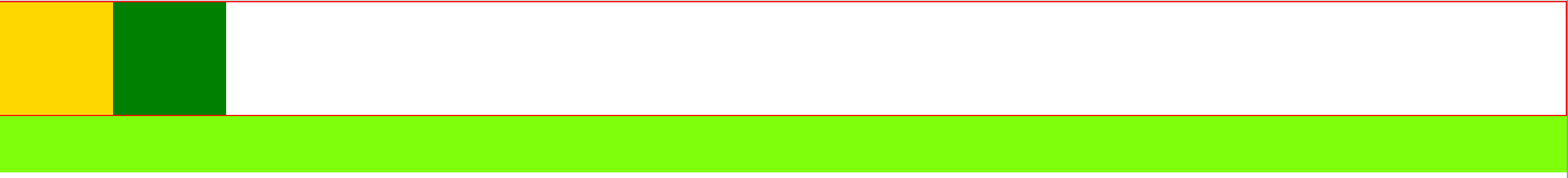
实现方式二:使用伪类(推荐)
示例
<!DOCTYPE html>
<html lang="en">
<head>
    <meta charset="UTF-8">
    <title>Title</title>

    <style>
        * {
            margin: 0;
        }
        .box{
            border: 1px solid red;
        }
        .c1{
            width: 100px;
            height: 100px;
            background-color: gold;
            float: left;
        }
        .c2{
            width: 100px;
            height: 100px;
            background-color: green;
            float: left;
        }
        .clearfix:after{  /*命名为:clearfix是为了重用,后面有遇到需要清除样式的需求的话,class加上clearfix即可!*/
            content: "";
            display: block;
            clear: both;
        }
        .footer{
            background-color: #7fff0c;
            height: 50px;
        }
    </style>
</head>
<body>
    <div class="box clearfix">  <!--注意clearfix要放在这块,而不是放在c2这个class后面-->
        <div class="c1"></div>
        <div class="c2"></div>
    </div>
    <div class="footer"></div>
</body>
</html>
效果
做有积累的事~~

 浙公网安备 33010602011771号