
CSS3动画
动画
动画(animation)是CSS3中具有颠覆性的特征之一,可通过设置多个节点来精确控制一个或一组动画,常用来实现复杂的动画效果。
相比较过渡,动画可以实现更多变化,更多控制,连续自动播放等效果。
动画的基本使用,制作动画分为两步:
1.先定义动画
2.再使用(调用)动画
1. @keyframes定义动画
使用@keyframes规则,你可以创建动画,keyframes就是关键帧的意思
@keyframes 动画名 {
    from|0%{
    	css样式
    }
    percent{
    	css样式
    }
    to|100%{
    	css样式
    }
}
percent:为百分比值,表示动画进度,可以添加多个百比,可以理解为每一个百分比样式对应一个关键帧。这些关键帧就是动画序列
动画序列
- 0% 是动画的开始,100% 是动画的结束
- 请用百分比或关键字来规定变化发生的时间,关键词 "from" 和 "to",等同于 0% 和 100%。
2. 执行动画
执行动画必须指定动画名和持续时
/* 调用动画 */
animation-name: 动画名称;
/* 持续时间 */
animation-duration: 持续时间;
        @keyframes move {
            /* 开始状态 */
            0% {
                transform: translateX(0px);
            }
            /* 结束状态 */
            100% {
                transform: translateX(1000px);
            }
        }

        div {
            width: 200px;
            height: 200px;
            background-color: rgb(62, 132, 175);
            /* 2. 调用动画 */
            /* 动画名称 */
            animation-name: move;
            /* 持续时间 */
            animation-duration: 2s;
        }
动画常用属性
| 属性 | 描述 |
|---|---|
| @keyframes | 定义动画 |
| animation | 所有动画属性的简写属性,除了animation-play-state属性 |
| animation-name | 动画名称,必须 |
| animation-duration | 动画周期,默认是0,必须 |
| animation-timing-function | 动画的速度曲线,默认是“ease” |
| animation-delay | 动画延迟开始时间,默认是0 |
| animation-iteration-count | 动画被播放的次数,默认是1,还有infinite(无限次) |
| animation-direction | 每个动画周期结束后,动画是否逆向播放,默认是“normal“,alternate逆播放 |
| animation-play-state | 动画是否正在运行或暂停。默认是"running","paused"是暂停 |
| animation-fill-mode | 默认回到初始状态backwards,forwards是保持 |
| timing-function值 | 描述 |
|---|---|
| ease | 逐渐变慢(默认) |
| linear | 匀速 |
| ease-in | 加速 |
| ease-out | 减速 |
| ease-in-out | 先加速后减速 |
| steps(步数) | 指定了时间函数中的间隔数量(步长),是离散地一步一步地变化的,不是连续变化 |
| direction值 | 描述 |
|---|---|
| normal | 默认值为normal表示顺序播放 |
| alternate | 动画第奇数次顺序播放,第偶数次逆序播放 |
复合属性animation
一般更常用复合属性animation
/* animation:动画名称 持续时间 运动曲线 延迟时间 播放次数 是否逆向播放 播放完后是否回到起始状态; */
animation: name duration [timing-function] [delay] [iteration-count] [direction] [fill-mode];
- 简写属性里面不包含 animation-play-state
- 暂停动画:animation-play-state: puased; 经常和鼠标经过等其他配合使用
- 想要动画走回来 ,而不是直接跳回来:animation-direction : alternate
- 盒子动画结束后,停在结束位置: animation-fill-mode : forwards
动画实现呼吸效果
<div class="box"></div>
        .box {
            width: 100px;
            height: 100px;
            margin: 40px auto;
            border-radius: 50%;
            background-color:rgba(255, 255, 255, 0.6) ;
            animation: breathe 2700ms ease-in-out infinite alternate;
        }

        @keyframes breathe {
            0% {
                opacity: .2;
                background-color:rgba(255, 255, 255, 0.6) ;
                box-shadow: 0 1px 2px rgba(255, 255, 255, 0.4)
            }

            100% {
                opacity: 1;
                background-color:rgba(255, 89, 0, 0.6) ;
                box-shadow: 0 1px 30px rgba(255, 89, 0, 0.6)
            }
        }

练习1:实现大数据热点图中的波纹效果
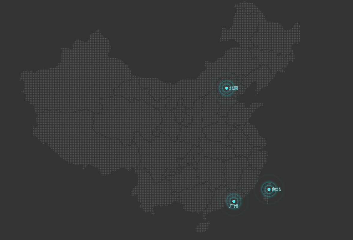
点击查看代码
<!DOCTYPE html>
<html lang="en">
<head>
    <meta charset="UTF-8">
    <meta http-equiv="X-UA-Compatible" content="IE=edge">
    <meta name="viewport" content="width=device-width, initial-scale=1.0">
    <title>Document</title>
    <style>
        body{
            /* 因为图片是白色透明底的,如果背景也是白色的话就看不到图片,所以将背景设置成深灰色 */
            background-color: #333;
        }
        .bg{
            position: relative;
            /* 这里设置容纳图片的div与图片一样大 */
            width: 747px;
            height: 617px;
            background-image: url(media/map.png);
            background-repeat: no-repeat;
            margin: auto;
        }
        /* .city1,.city2,.city3的共有样式 */
        .city1,.city2,.city3{
            /* 设置绝对定位方便移动实心点 */
            position: absolute;
            top: 228px;
            right: 191px;
            width: 8px;
            height: 8px;
            background-color: aqua;
            border-radius: 50%;
        }
        /* 不同城市的实心点位置不同,要覆盖之前共有的top和right属性 */
        .city2{
            top: 498px;
            right: 78px;
        }
        .city3{
            top: 530px;
            right: 172px;
        }
        /* 属性选择器权重与类选择器一样 */
        [class^="pluse"]{
            /* 设置绝对定位放置三个pluse挤下来,即要让他们层叠在一起 */
            position: absolute;
            /* 虽然pluse与父盒子city一样大,表面上看是重合在一起,没有将子盒子移动到父盒子中心的必要,但这样子盒子的中心在左上角,在之后波纹变大时会以左上角为中心变大。以下3行不仅能让子盒子移到父盒子中心,还能让子盒子的中心在自己及父元素的中心位置 */
            top:50%;
            left: 50%;
            transform: translate(-50%,-50%);
            /*  */
            width: 8px;
            height: 8px;
            border-radius: 50%;
            /* 注意要设置infinite无限次播放动画 */
            animation: pluse 1.2s linear infinite;
        }
        /* 注意设置延迟时间 */
        .pluse2{
            animation-delay: .3s;
        }
        .pluse3{
            animation-delay: .6s;
        }
        @keyframes pluse{
            /* 设置了波纹逐渐减弱最后消失的效果 */
            0%{
                width: 8px;
                height: 8px;
                box-shadow: 0px 0px 8px rgb(0, 255, 255,1);
            }
            70%{
                /* 因为设置的是匀速linear,所以波纹大小为8*7=56 */
                width: 56px;
                height: 56px;
                box-shadow: 0px 0px 8px rgb(0, 255, 255,.3);
            }
            100%{
                /* 8*10=80 */
                width: 80px;
                height: 80px;
                box-shadow: 0px 0px 8px rgb(0, 255, 255,0);
            }
        }
    </style>
</head>
<body>
    <div class="bg">
        <div class="city1">
            <div class="dot"></div>
            <div class="pluse1"></div>
            <div class="pluse2"></div>
            <div class="pluse3"></div>
        </div>
        <div class="city2">
            <div class="dot"></div>
            <div class="pluse1"></div>
            <div class="pluse2"></div>
            <div class="pluse3"></div>
        </div><div class="city3">
            <div class="dot"></div>
            <div class="pluse1"></div>
            <div class="pluse2"></div>
            <div class="pluse3"></div>
        </div>
    </div>
</body>
</html>
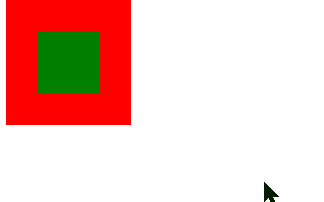
补充说明代码注释中那很长的一段
<head>
    <style>
        .fa{
            position: absolute;
            height: 100px;
            width: 100px;
            background-color: red;
        }
        .son{
            position: absolute;
            height: 50px;
            width: 50px;
            background-color: green;
        }
        .son:hover{
            height: 100px;
            width: 100px;
        }
    </style>
</head>
<body>
    <div class="fa">
        <div class="son"></div>
    </div>
</body>
为加上那3行代码,子盒子变大的参考点是子元素左上角

.son中加上以下3行代码,子盒子变大的参考点是自己的中心
top:50%;
left:50%;
transform: translate(-50%,-50%);
练习2:实现人或动物的连续动作
这里实现北极熊行走的效果
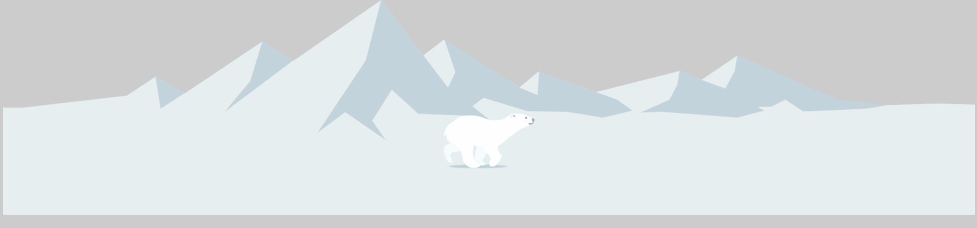
点击查看代码
<!DOCTYPE html>
<html lang="en">
<head>
    <meta charset="UTF-8">
    <meta http-equiv="X-UA-Compatible" content="IE=edge">
    <meta name="viewport" content="width=device-width, initial-scale=1.0">
    <title>Document</title>
    <style>
        body{
            /* 背景不要是白色,否则看不到熊 */
            background-color: #ccc;
        }
        .bg{
            position: relative;
            height: 336px;
            background: url(media/bg1.png) no-repeat;
            animation: bg 10s linear infinite;
        }
        .box{
            position: absolute;
            width: 200px;
            height: 100px;
            top:50%;
            /* 不要写成background-image: url(media/bear.png) no-repeat; 这样把单个属性写成了复合属性,不生效*/
            background: url(media/bear.png) no-repeat;
            /* 多个动画间用逗号分隔 */
            animation: bear .8s steps(8) infinite,move 1s linear forwards ;
            background-position: 0 0;
        }
		/* 熊奔跑动画 */
        @keyframes bear {
            0%{
                background-position-x:0;
            }
            100%{
                /* 为什么是-1600px而不是-(1600-200)=-1400px */
                background-position-x:-1600px;
            }
        }
		/* 熊移动到屏幕中央动画 */
        @keyframes move{
            0%{
                left:0;

            }
            100%{
                /* 跑到屏幕中央 */
                left:50%;
                transform: translateX(-50%);
            }
        }
		/* 背景移动动画 */
        @keyframes bg {
            0%{
                background-position-x:0;
            }
            100%{
                /* 为啥这里就不能是图片宽度3840px,而要3840-body宽度1520=2320px才不出现空白区域? */
                background-position-x:-2320px;
            }
        }
    </style>
</head>
<body>
    <div class="bg">
        <div class="box">
            <!-- <img src="media/bear.png" alt=""> -->
        </div>
    </div>
</body>
</html>
实时效果反馈
1.动画属性中,iteration-count: infinite 属性的作用是:
A 设置动画效果时间
B 设置动画效果速率
C 设置动画的开始时间
D 设置动画无限循环
答案
1=>D

 浙公网安备 33010602011771号