
Vue+Echarts--父组件+子组件(基础)
基本的思路就是:在父组件获取后端数据,然后传到子组件,子组件创建图表进行展示。
1、获取后端数据
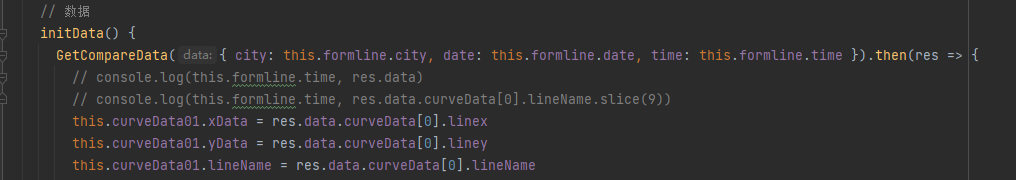
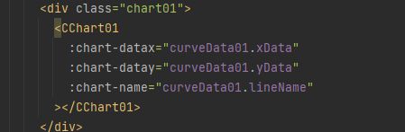
2、将数据传给子组件,并将子组件引入到父组件
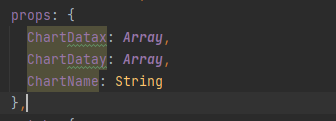
3、子组件接收数据
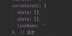
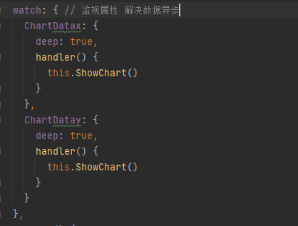
4、处理数据
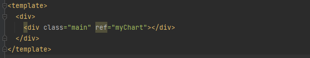
5、挂载到盒子上
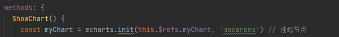
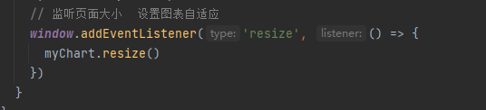
6、创建图表
7、图表自适应
8、全部子组件代码
<template>
<div>
<div class="main" ref="myChart"></div>
</div>
</template>
<script>
import * as echarts from 'echarts' // 引入echarts图表
require('echarts/theme/macarons') // 图表主题
export default {
name: 'CChart01',
props: {
ChartDatax: Array, // 接收数据+数据类型
ChartDatay: Array,
ChartName: String
},
watch: { // 监视属性 解决数据异步
ChartDatax: {
deep: true,
handler() {
this.ShowChart()
}
},
ChartDatay: {
deep: true,
handler() {
this.ShowChart()
}
}
},
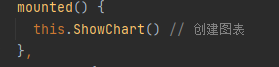
mounted() {
this.ShowChart() // 创建图表
},
methods: {
ShowChart() {
const myChart = echarts.init(this.$refs.myChart, 'macarons') // 挂载节点
const option = { // 配置项
tooltip: {
backgroundColor: '#00b8ff'
},
legend: {
textStyle: { color: '#ffffff' }
},
grid: {
left: '3%',
right: '4%',
bottom: '10%',
containLabel: true
}, // 图表在div中的位置
xAxis: {
type: 'category',
data: this.ChartDatax,
boundaryGap: false,
axisLine: {
lineStyle: {
width: 2, // 线的大小
type: 'solid' // 轴线的类型
},
onZero: false
},
axisLabel: { // 文字倾斜
rotate: 80,
textStyle: {
fontSize: 12,
fontWeight: 'bold'
}
// 坐标轴刻度标签的相关设置。
// interval: 0,
}
},
yAxis: {
name: '温度(℃)',
nameTextStyle: {
fontSize: 14,
padding: [10, 10, 10, 10],
fontWeight: 'bold'
},
type: 'value',
axisLine: {
lineStyle: {
width: 1, // 线的大小
type: 'solid' // 轴线的类型
},
onZero: false
},
axisLabel: {
textStyle: {
fontWeight: 'bold',
fontSize: 12
},
// 坐标轴刻度标签的相关配置
interval: 0
},
splitArea: {
show: false
}
},
dataZoom: [
{
type: 'slider',
height: 20,
xAxisIndex: 0,
filterMode: 'none',
textStyle: { color: '#ffffff' }
},
{
type: 'inside',
height: 20,
xAxisIndex: 0,
filterMode: 'none',
textStyle: { color: '#ffffff' }
}
],
series: {
name: this.ChartName + '(℃)', // 图表名称
type: 'line',
data: this.ChartDatay, // 数据
symbolSize: 6, // 点的大小
emphasis: {
focus: 'series' // 聚焦当前的区域高亮
}
}
}
myChart.setOption(option)
// 监听页面大小 设置图表自适应
window.addEventListener('resize', () => {
myChart.resize()
})
}
}
}
</script>
<style scoped lang="scss">
.main { // 样式,不设置高宽,图表不显示
width: 800px;
height: 600px;
margin: 0 auto;
border: 1px solid skyblue;
}
</style>
这种写法有利有弊,好处就在于便于理解,写法简单,展示图表没有问题。
弊端在于,想展示的数据过多的话,就会造成大量的代码冗杂。不灵活。要展示的折线数量事固定死的,不能应对高质量需求。

 浙公网安备 33010602011771号