css2.1是目前世界上应用最广泛的版本,2011年开始css被分为多个模块单独升级,统称为CSS3,现在已经有很多模块升级到了CSS4。
div(块级元素):高度是由内部文档流元素高度的总和决定的。文档流:文档内元素的流动方向,内联元素是从左往右,块级元素是从上往下。
span(内联元素):高度是由其中文字高度决定的,内联元素设置width和height是无效的,上下的margin和padding也无效,要将它们设为display:inline-block才有效。
左右两列布局
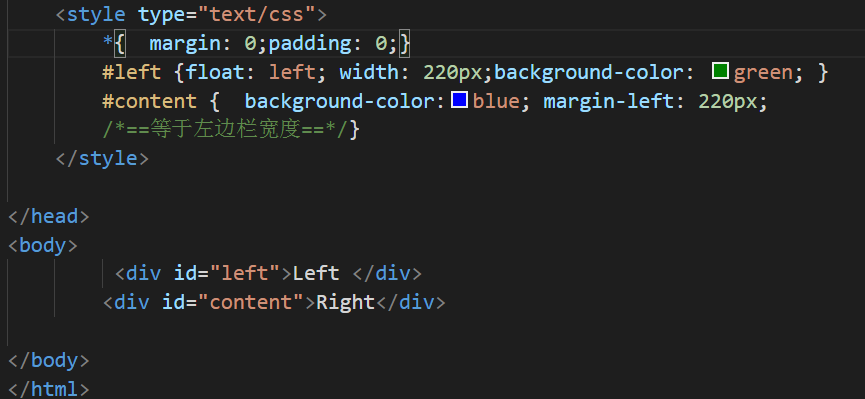
方法一:浮动布局
采用的是左边浮动,右边加上一个margin-left值,实现左边固定,右边自适应的布局效果
![]()
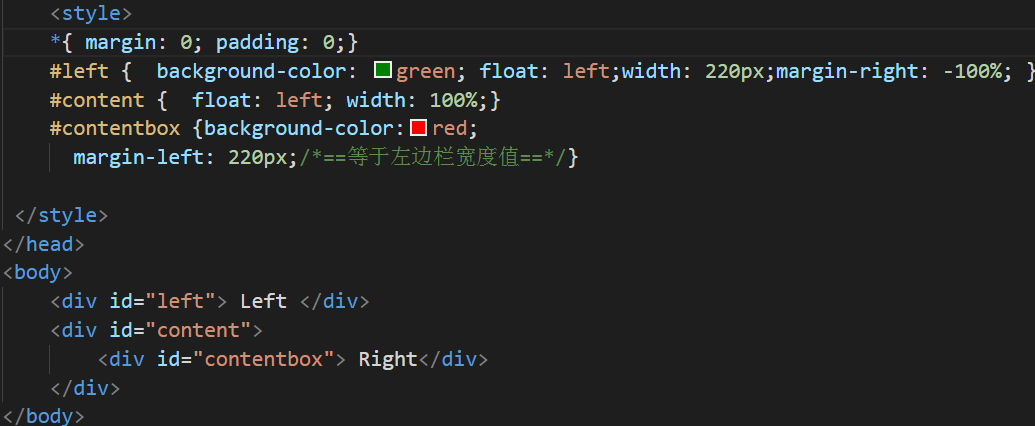
方法二:浮动和负边距实现
采用的是浮动和负边距来实现左边固定宽度右边自适应宽度的布局效果
![]()
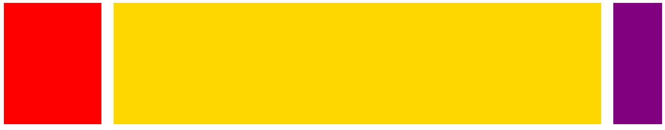
一:Flex三栏布局
<!DOCTYPE html>
<html lang="en">
<head>
<style>
.container {display: flex; }
.main {flex-grow: 1; height: 250px;}
.left {order:-1; flex: 0 1 200px; margin-right: 25px; height: 250px;background-color:red;}
.right{ flex: 0 1 100px;margin-left: 25px;height:250px;background-color: purple;}
</style>
</head>
<body>
<div class="container">
<div class="main"></div>
<div class="left"></div>
<div class="right"></div>
</div>
</body>
</html>
效果如下
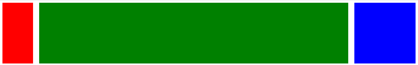
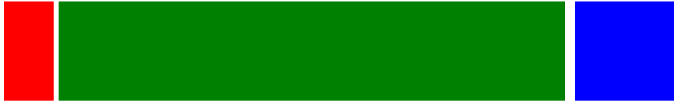
二:BFC三栏布局
<!DOCTYPE html>
<html lang="en">
<head>
<style>
.left { float: left;height: 200px;width: 100px; margin-right: 20px; }
.right { width: 200px; height: 200px; float: right;margin-left: 20px; background-color: blue; }
.main { height: 200px; overflow: hidden; background-color: green; }
</style>
</head>
<body>
<div class="container">
<div class="left"></div>
<div class="right"></div>
<div class="main"></div>
</div>
</body>
</html>
效果如下图;
![]()
三:绝对定位三栏布局
<!DOCTYPE html>
<html lang="en">
<head>
<style>
.container { position: relative; }
.main {height: 300px; margin: 0 100px; }
.left {position: absolute; width: 100px; height: 300px; left: 0; top: 0; background-color:springgreen; }
.right { position: absolute; width: 100px;height: 300px;background-color: blue;right: 0; top: 0; }
</style>
</head>
<body>
<div class="container">
<div class="main"></div>
<div class="left"></div>
<div class="right"></div>
</div>
</body>
</html>
效果如下图
![]()
四:双飞翼三栏布局
<!DOCTYPE html>
<html lang="en">
<head>
<style>
.content { float: left;width: 100%;}
.main { height: 200px; margin-left: 110px; margin-right: 220px; }
.left { float: left; height: 200px; width: 100px;margin-left: -100%; background-color: red; }
.right {width: 200px;height: 200px; float: right; margin-left: -200px; background-color: blue;}
</style>
</head>
<body>
<div class="content">
<div class="main"></div>
</div>
<div class="left"></div>
<div class="right"></div>
</body>
</html>
![]()
双飞翼布局是将一个网页分为左列,中列和右列三部分效果是:左列和右列宽度恒定,中间列的宽度根据浏览器窗口的大小自适应。
下面介绍元素水平居中 的几种方法
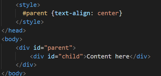
1:常规流中inline元素
为父元素设置text-aglin:center
![]()
2:常规流中为block元素
为父元素设置宽度。设置左右为margin:auto;
![]()
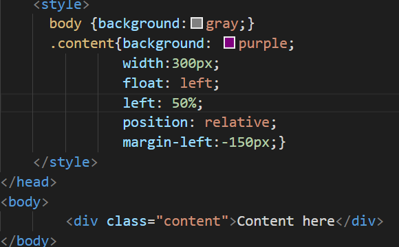
3:如果居中的元素为浮动元素
1)为元素设置宽度
2)Position:relative;
3)浮动偏移量设置为50%
4)浮动方向上的margin设置为元素一半的负一倍
![]()
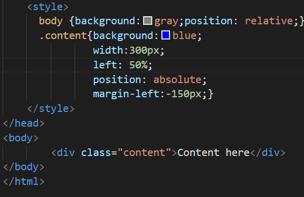
4居中元素为绝对定位元素
1)为元素设置宽度
2)设置偏移量为50%
3)偏移方向外边距设置为元素宽度一半的负一倍
![]()
5居中元素为绝对定位元素
1)为元素设置宽度
2)设置左右偏移量都为0;
3)设置左右外边距为auto;
![]()
以上几种方法都可以实现元素水平居中。
水平垂直居中的三种重要方法
一:使用绝对定位给4个方向都为0;用margin自动,实现box居中
示例代码:
.box {
    position: absolute;
    top: 0;
    right: 0;
    bottom: 0;
    left: 0;
    width: 100px;
    height: 100px;
    margin: auto;
}
二:采用绝对定位,定位时上边距与左边距都给50%,在利用margin属性减去当前盒子的一半宽度与高度,实现居中效果
示例代码
.box{
    position: absolute;
    top: 50%;
    left: 50%;
    width: 100px;
    height: 100px;
    margin: -50px 0 0 -50px;
}
三:利用transform:translate(-50%, -50%)方法实现居中,此方法适用于不知width、height的情况下
示例代码:
.box {
    position: absolute;
    top: 50%;
    left: 50%;
    width: 100px;
    height: 100px;
    transform: translate(-50%, -50%);
}

视图效果:
![]()
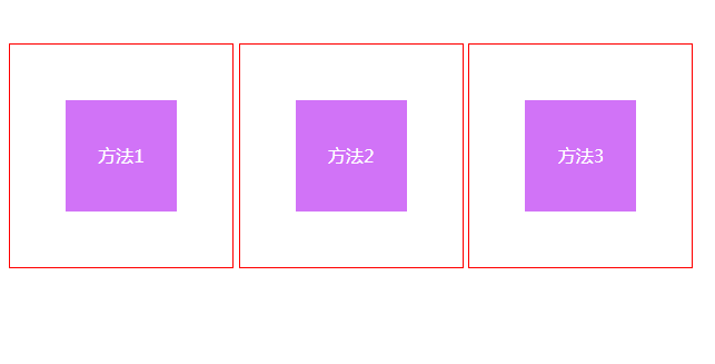
五:另外CSS中有一些值得我们关注的几个点:
1:适当时候给你要写的css标签加上border border:1px solid red; 让你知道它在哪、它的大小、形状,方便调试。
2:若非必要,尽量不写宽高,这两个属性会引出很多bug,要宽高的时候可以用padding,但img最好先写宽度,因为可以先占位,
因为引用图片时浏览器不知道图片大小,所有等图片下载完成,它后面的元素又要重新排位置。
3:span元素设置padding时将它设为display:inline-block,因为内联元素不能设置宽高:(inline-block具有inline的同行特性,也具有
block的高度特性)。