css第一趴
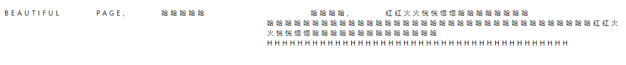
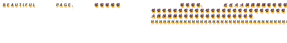
我还是喜欢美好潇洒的页面
1. css语法
选择器,声明

2.css选择器
简单选择器(根据名称,id,类来选取元素)
组合器选择器(根据他们之间的特定关系来选取元素)
伪类选择器(根据特定状态选取元素)
伪元素选择器(选取元素的一部分并设置其样式)
属性选择器(根据属性或属性值来选取元素)
2.1 所有简单css选择器

-- 元素选择器,
p {
  text-align: center;
  color: red;
}

-- id选择器 应用于 id = "para1" 的元素
#para1 {
  text-align: left;
  color: red;
}

-- 类选择器 应用于 class = "center" 的元素
.class {
  text-align: left;
  color: blue;
}

-- 组合选择器, p且class=center受影响
p.class {
  text-align: center;
  color: red;
}

-- 元素可以应用多个class,
<p class='center large'>应用多个class</p>

-- 通用选择器,选择页面上的所有元素
* {
  text-align: center;
  color: red;
}

-- 分组选择器,为一些元素,设置相同的样式, 用逗号分隔
h1,h2,p {
  text-align: left;
  color: red;
}
3.css使用
3.1 外部css
<!DOCTYPE html>
<html>
<head>
<link rel="stylesheet" type="text/css" href="mystyle.css">
</head>
<body>

<h1>This is a heading</h1>
<p>This is a paragraph.</p>

</body>
</html>
h1 {
  color: red;
  text-align: center;
}
p {
  text-align: center;
  color: red;
}
.standardList {
  color: red
}
4. css注释
/*
   声明用;结束
*/
p {
   text-align: center; /* 文字居中 */
}
5. css颜色
5.1 css背景色
为元素设置背景色 backgroud-color
<p class = 'important'>show pages<p>
.important {
    font-weight: bold;
    background-color: bisque; /*设置元素的背景颜色*/
}
5.2 css文本颜色 color
.important {
    font-weight: bold;
    color: cadetblue;   /*设置字体的颜色*/
    background-color: bisque;
}
5.3 css边框颜色 border
.important {
    font-weight: bold;
    color: cadetblue;
    background-color: bisque;
    border: 2px solid skyblue; /*设置边框颜色*/
}
6.css背景
6.1 背景颜色 background-color
6.2 透明度 opacity
范围0~1 ,值越低 ,越透明
6.3 背景图像 background-image
<p class='background_funny'>
  哈哈哈哈哈哈
</p>
.background_funny {
  background-image: url('/pic/funny.jpg'); /*路径为绝对路径,根目录为最外层*/
}
6.4 背景重复 background-repeat
/*
* 可以横向重复,纵向重复,不重复,横纵重复等
*/
6.5 指定背景图像的位置 background-position
body {
    background-image: url('/pic/zhuzi.jpg');
    background-repeat: no-repeat;
    background-position: right top;  //指定背景图像的位置,靠右上
}
6.6 背景随页面滚动 background-attachment
/**/
body {
    background-image: url('/pic/zhuzi.jpg');
    background-repeat: no-repeat;
    background-position: right top;
    background-attachment: fixed;  /*fixed 固定  scroll 滚动*/
}
6.7 背景尺寸 background-size
body {
    background-image: url('/pic/zhuzi.jpg');
    background-repeat: repeat;
    background-position: right top;
    background-attachment: fixed;
    background-size: 10% 50%;  /* 可以设置像素,可以设置百分比,可以设置完全填充 */
}
6.8 何处放置背景图像 background-origin
/* 使用到再看 */
6.9 简写背景属性
body {
  background: #ffffff url("tree.png") no-repeat right top;
}
顺序
background-color
background-image
background-repeat
background-attachment
background-position
7 边框
7.1 指定显示的边框类型 border-style
dotted - 定义点线边框
dashed - 定义虚线边框
solid - 定义实线边框
double - 定义双边框
groove - 定义 3D 坡口边框。效果取决于 border-color 值
ridge - 定义 3D 脊线边框。效果取决于 border-color 值
inset - 定义 3D inset 边框。效果取决于 border-color 值
outset - 定义 3D outset 边框。效果取决于 border-color 值
none - 定义无边框
hidden - 定义隐藏边框
7.2 边框宽度 border-width
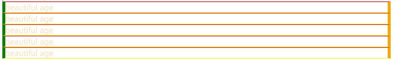
.textShow1 {
    border-style: solid;
    border-width: 1px 5px;  /*上下为1px 左右为5px*/
}

7.3 边框颜色 border-color
.textShow1 {
    border-style: solid;
    border-width: 1px 5px;
    border-color: red orange yellow green;  /*上 右 下 左*/
}
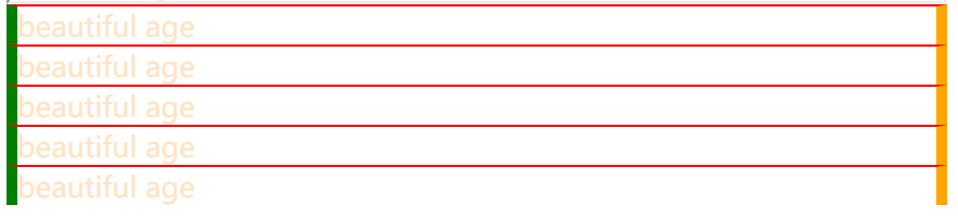
7.4 单独的边 border-top
.textShow1 {
    border-style: solid;
    border-width: 1px 5px;
    border-color: red orange yellow green;
    border-bottom-style: hidden;
}
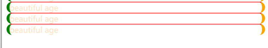
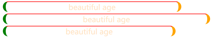
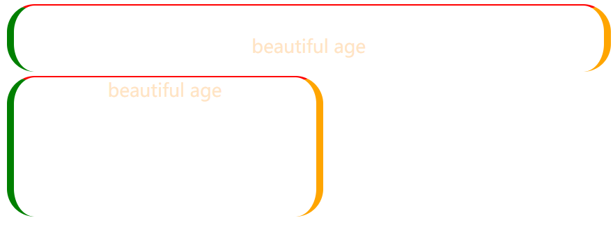
7.5 圆角边框 border-radius
.textShow1 {
    border-style: solid;
    border-width: 1px 5px;
    border-color: red orange yellow green;
    border-bottom-style: hidden;
    border-radius: 20px  /*左右两边*/
}
8. 外边距 margin
用于在任何定义的边框之外,为元素周围创建空间
auto - 浏览器来计算外边距
length - 以 px、pt、cm 等单位指定外边距
% - 指定以包含元素宽度的百分比计的外边距
inherit - 指定应从父元素继承外边距
.textShow1 {
    border-style: solid;
    border-width: 1px 5px;
    border-color: red orange yellow green;
    border-bottom-style: hidden;
    border-radius: 20px;
    margin: 2px 0px 0px 0px;
    margin-top: 3px;
}

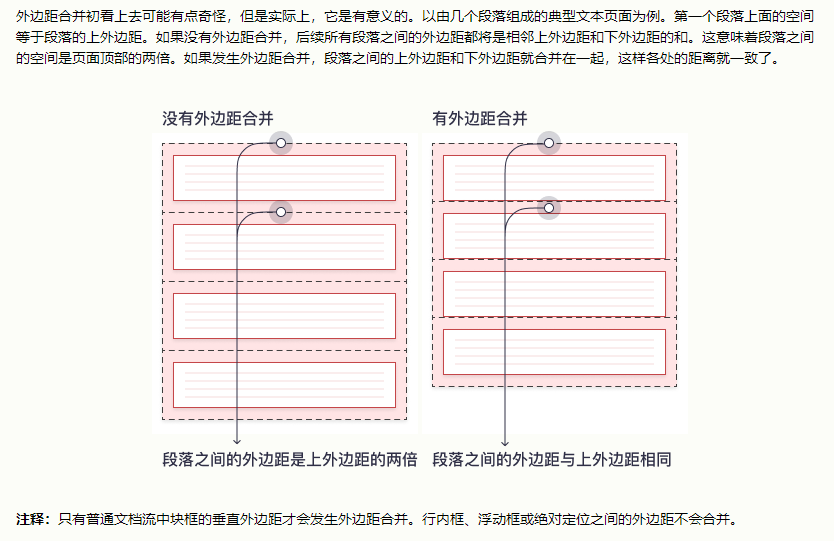
8.1 外边距合并
当两个垂直外边距相遇时,它们将形成一个外边距,合并后的外边距的高度等于其中的大者


8.2 css内边距 padding
用于在任何定义的边界内的元素内容周围生成空间
length - 以 px、pt、cm 等单位指定内边距
% - 指定以包含元素宽度的百分比计的内边距
inherit - 指定应从父元素继承内边距
提示:不允许负值。
.padding1 {
    padding-top: 20px;
    padding-bottom: 10px;
    padding-left: 10px;
    padding-right: 10px;
}

8.3 内边距和元素宽度
/* 元素实际宽度是300 +25*2 */
div {
  width: 300px;
  padding: 25px;
}
/* 元素实际宽度是300 box-sizing 将元素保持宽度,如果增加内边距,会使内部可用空间减少*/
div {
  width: 300px;
  padding: 25px;
  box-sizing: border-box;
}
.padding2 {
    width: 300px;

}
.padding3 {
    width: 300px;
    padding-left: 25px;
    padding-right: 25px;

}
.padding4 {
    width: 300px;
    padding-left: 25px;
    padding-right: 25px;
    box-sizing: border-box;
}
9. 高度,宽度 height width
设置元素的高度和宽度,不包括内边距,边框和外边距,设置的是元素内边距,边框和外边距内的区域的高度或宽度
auto - 默认。浏览器计算高度和宽度。
length - 以 px、cm 等定义高度/宽度。
% - 以包含块的百分比定义高度/宽度。
initial - 将高度/宽度设置为默认值。
inherit - 从其父值继承高度/宽度。
.padding2 {
    width: 50%;
    height: 100px;
}
9.1 max-width 设置元素的最大宽度
浏览器窗口小于width,下面会出滚动条,使用max-width,不会出滚动条,会自适应缩短width,展示全内容
.padding2 {
    width: 600px;
    height: 100px;
}
.padding2 {
    max-width: 600px;
    height: 100px;
}


10 框模型(盒模型)
内容 内边距 边框 外边距
内外边距是透明的,边框可以设置颜色

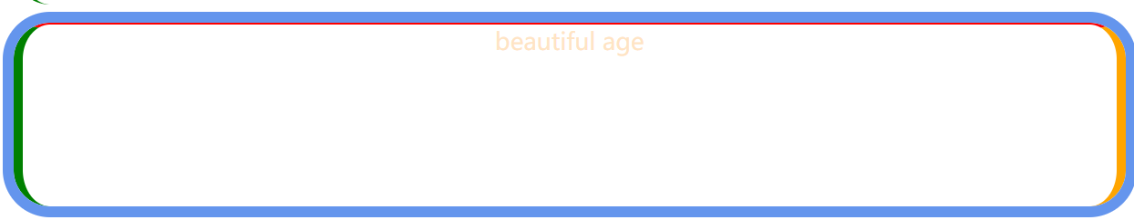
11 轮廓 outline
轮廓是在边框外绘制的一条线,凸显元素, 不是元素尺寸的一部分
outline-style 属性指定轮廓的样式,并可设置如下值:

dotted - 定义点状的轮廓。
dashed - 定义虚线的轮廓。
solid - 定义实线的轮廓。
double - 定义双线的轮廓。
groove - 定义 3D 凹槽轮廓。
ridge - 定义 3D 凸槽轮廓。
inset - 定义 3D 凹边轮廓。
outset - 定义 3D 凸边轮廓。
none - 定义无轮廓。
hidden - 定义隐藏的轮廓。
11.1 轮廓宽度 outline-width
thin(通常为 1px)
medium(通常为 3px)
thick (通常为 5px)
特定尺寸(以 px、pt、cm、em 计)
11.2 轮廓颜色 outline-color
11.3 轮廓偏移 outline-offset
在元素的轮廓和边框之间添加空间
.padding2 {
    max-width: 600px;
    height: 100px;

    outline-style: solid;
    outline-width: 6px;
    outline-color: cornflowerblue;
    outline-offset: 8px;

}

12 文本
12.1 文本颜色 color
12.2 文本对齐 text-align
设置文本的对齐方式
left  左对齐
right  右对齐
center  居中对齐
justify  两端对齐
12.2.1 direction和unicode-bidi 更改元素的文本方向
.text1 {
    color: bisque;
    direction: rtl;
    unicode-bidi: bidi-override;
}

12.2.2 垂直对齐 vertical-align , 垂直对齐,不是垂直居中
不是垂直居中,是如何对齐
img.middle {
  vertical-align: middle;
}
12.3 文本装饰 text-decoration
用于设置或删除文本装饰,text-decoration:none; 通常用于从链接删除下划线
h1 {
  text-decoration: overline;
}

h2 {
  text-decoration: line-through;
}

h3 {
  text-decoration: underline;
}

12.4 文本转换 text-transform
用于指定文本中的大写和小写字母,可将所有内容转换为大写或小写字母,或将每个单词的首字母大写
body {
    text-transform: uppercase;
}

12.5 文字间距 text-indent
text-indent 用于指定文本第一行的缩进
letter-spacing 用于指定文本中字符之间的间距
line-height 用于指定行之间的间距
word-spacing 用于指定文本中单词之间的间距
white-space 指定元素内部空白的处理方式
white-space:normal
文首的空格忽略,文本内部的换行符自动转成了空格。
white-space:nowrap
不换行,即使超出容器宽度
white-space:pre
与原文本一致,空格和换行符保留
white-space:pre-wrap
同pre,与pre区别在超出容器宽度时,会换行
white-space:pre-line
保留换行符,其他同normal
12.6 文字阴影 text-shadow
为文本添加阴影,最简单的用法是只指定水平和垂直阴影
text-shadow : 水平 垂直 模糊效果 颜色
.text_design{
    text-indent: 20px; /*首行缩进*/
    letter-spacing: 5px; /*字符间距*/
    line-height: 20px; /*行间距*/
    word-spacing: 60px; /*单词间的间距*/
    white-space: pre; /*内部空白处理方式*/

    text-shadow: 2px 6px 1px orange;  /*text-shadow : 水平 垂直 模糊效果 颜色*/

}
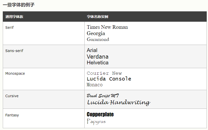
13 字体
在 CSS 中,有五个通用字体族:

衬线字体(Serif)- 在每个字母的边缘都有一个小的笔触。它们营造出一种形式感和优雅感。
无衬线字体(Sans-serif)- 字体线条简洁(没有小笔画)。它们营造出现代而简约的外观。
等宽字体(Monospace)- 这里所有字母都有相同的固定宽度。它们创造出机械式的外观。
草书字体(Cursive)- 模仿了人类的笔迹。
幻想字体(Fantasy)- 是装饰性/俏皮的字体。
所有不同的字体名称都属于这五个通用字体系列之一。

提示:在计算机屏幕上,无衬线字体被认为比衬线字体更易于阅读。
13.1 字体 font-family
规定文本的字体,font-family 属性应包含多个字体名称作为“后备”系统,以确保浏览器/操作系统之间的最大兼容性,请以您需要的字体开始,并以通用系列结束(如果没有其他可用字体,则让浏览器选择通用系列中的相似字体)。字体名称应以逗号分隔。
请以您需要的字体开始,并以通用系列结束(如果没有其他可用字体,则让浏览器选择通用系列中的相似字体)。字体名称应以逗号分隔。
.p1 {
  font-family: "Times New Roman", Times, serif;
}
13.2 斜体文本 font-style
主要用于指定斜体文本
normal - 文字正常显示
italic - 文本以斜体显示
oblique - 文本为“倾斜”(倾斜与斜体非常相似,但支持较少)
13.3 字体粗细 font-weight
p.normal {
  font-weight: normal;
}

p.thick {
  font-weight: bold;
}
13.4 字体变体 font-variant
是否以small-caps字体(小型大写字母)显示文本
在 small-caps 字体中,所有小写字母都将转换为大写字母。但是,
转换后的大写字母的字体大小小于文本中原始大写字母的字体大小
p.normal {
  font-variant: normal;
}

p.small {
  font-variant: small-caps;
}
.text_design{
    text-indent: 20px; /*首行缩进*/
    letter-spacing: 5px; /*字符间距*/
    line-height: 20px; /*行间距*/
    word-spacing: 60px; /*单词间的间距*/
    white-space: pre; /*内部空白处理方式*/

    text-shadow: 2px 6px 1px orange;

    font-family: Arial, Verdana, "Times New Roman", serif;
    font-style: italic;
    font-weight: bold;
    font-variant: small-caps;
}
13.5 字体大小 font-size
14. 图标
15. 链接
可以如同文本,使用任何css属性,可以根据链接处于什么状态来设置链接的不同样式
a:link- 正常的,未访问的链接a:visited- 用户访问过的链接a:hover- 用户将鼠标悬停在链接上时a:active- 链接被点击时
a:link {  /*未访问*/
    color: black;
    text-decoration: none;
    background: orange;
}
a:visited {  /*已访问*/
    color: blue;
    text-decoration: none;
    background: orange;

}
a:hover {  /*悬停*/
    color: yellow;
    text-decoration: underline;
    background-image: url("../pic/mouse_usual.png");
}
a:active {  /*点击*/
    color: greenyellow;
    text-decoration: underline;
}
a:link, a:visited {
background-color: #f44336;
color: white;
padding: 14px 25px;
text-align: center;
text-decoration: none;
display: inline-block;
}
a:hover, a:active {
background-color: red;
}

15.1 改变鼠标光标 cursor
<!DOCTYPE html>
<html>
<body>

<p>请把鼠标移动到单词上,以查看指针效果:</p>
<span style="cursor:auto">auto</span><br>
<span style="cursor:crosshair">crosshair</span><br>
<span style="cursor:default">default</span><br>
<span style="cursor:e-resize">e-resize</span><br>
<span style="cursor:help">help</span><br>
<span style="cursor:move">move</span><br>
<span style="cursor:n-resize">n-resize</span><br>
<span style="cursor:ne-resize">ne-resize</span><br>
<span style="cursor:nw-resize">nw-resize</span><br>
<span style="cursor:pointer">pointer</span><br>
<span style="cursor:progress">progress</span><br>
<span style="cursor:s-resize">s-resize</span><br>
<span style="cursor:se-resize">se-resize</span><br>
<span style="cursor:sw-resize">sw-resize</span><br>
<span style="cursor:text">text</span><br>
<span style="cursor:w-resize">w-resize</span><br>
<span style="cursor:wait">wait</span><br>

</body>
</html>
16. css列表 list-style
ul 和 li 不同的元素,可以设置不同的样式
在 HTML 中,列表主要有两种类型:

无序列表(<ul>)- 列表项用的是项目符号标记
有序列表(<ol>)- 列表项用的是数字或字母标记
CSS 列表属性使您可以:

为有序列表设置不同的列表项标记
为无序列表设置不同的列表项标记
将图像设置为列表项标记
为列表和列表项添加背景色
list-style-type(如果指定了 list-style-image,那么在由于某种原因而无法显示图像时,会显示这个属性的值)list-style-position(指定列表项标记应显示在内容流的内部还是外部)list-style-image(将图像指定为列表项标记)
.ul_css {
    list-style-type: upper-roman; /*若无法展示图像,会展示这个*/
    list-style-image: url('../pic/mouse_usual.png'); /*将图像指定为列表项标记:*/
    list-style-position: outside; /*指定项目符号的位置*/
}

删除默认设置
ul {
  list-style-type: none;
  margin: 0;
  padding: 0;
}
.ul_css {
    list-style-type: upper-roman;
    list-style-position: outside; /*指定项目符号的位置*/
    background-color: darkgrey;
    padding-top: 10px;
    padding-bottom: 10px;

}

.li_css {
    margin: 10px;
    list-style-image: url('../pic/mouse_usual.png'); /*将图像指定为列表项标记:*/
    list-style-position: outside; /*指定项目符号的位置*/
    background-color: darkgrey;
}


17 表格 table
17.1 表格边框 border
17.1.1 全宽表格 width = 100%
17.1.2 合并表格边框
border-collapse:collapse; /*边框两条合成一条*/
17.2 表格宽度和高度
table {
  width: 100%;
}

th {
  height: 50px;
}
17.3 水平对齐 text-align
17.4 垂直对齐 vertical-align
17.5 表格内边距 padding
17.6 水平分割线 border-bottom
17.7 可悬停表格 鼠标悬停,该行加重
tr:hover {background-color: #f5f5f5;}
17.8 斑马纹
17.9 表格颜色 <th>
17.10 响应式表格 overflow-x:auto
若无法显示全部内容,则表格会显示滚动条
在 <table> 元素周围添加带有 overflow-x:auto 的容器元素(例如 <div>),以实现响应式效果:


 浙公网安备 33010602011771号