
有图例的echarts散点图(用dataset)
效果如下:
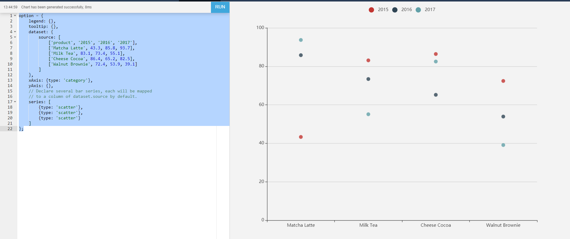
代码如下:
option = {
    legend: {},
    tooltip: {},
    dataset: {
        source: [
            ['product', '2015', '2016', '2017'],
            ['Matcha Latte', 43.3, 85.8, 93.7],
            ['Milk Tea', 83.1, 73.4, 55.1],
            ['Cheese Cocoa', 86.4, 65.2, 82.5],
            ['Walnut Brownie', 72.4, 53.9, 39.1]
        ]
    },
    xAxis: {type: 'category'},
    yAxis: {},
    // Declare several bar series, each will be mapped
    // to a column of dataset.source by default.
    series: [
        {type: 'scatter'},
        {type: 'scatter'},
        {type: 'scatter'}
    ]
};

 浙公网安备 33010602011771号