小程序 自定义cell 自定义group
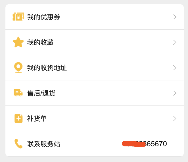
工作中很多地方都会用到列表类的样式,比如个人中心 比如用户信息列表,如果编辑收货地址等,针对这些页面,可以使用we-ui的一些组件来实现,由于抱着学习的态度,所以就自动动手封装了一套group和cell,目前来将用起来还算比较好用,特分享出来供大家交流
效果图:
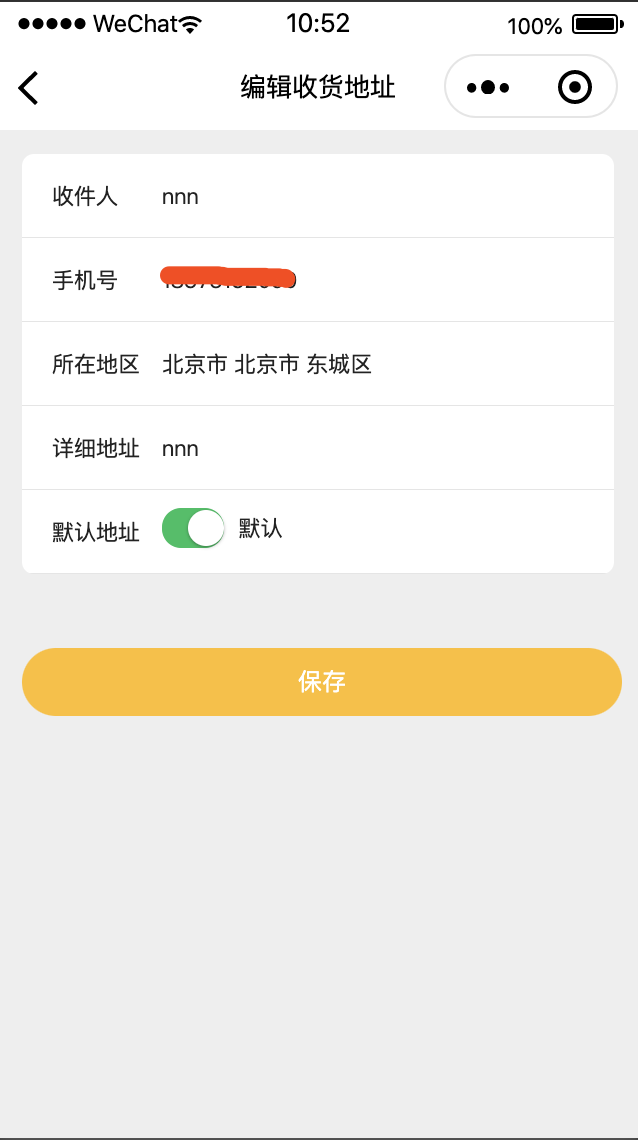
大致思路就是利用slot插件属性,在需要的地方去填充需要的内容
比如:在kz-cell中
   <view class="left-side-container">
        <slot name="before"></slot>
        <view class="title" style="{{titleStyle}}">{{title}}</view>
        <slot name="input"></slot>
    </view>
slot name = before的插槽,可以用放置cell最前端的控件,这里可以放image label 或者 其他自定义控件
slot name = input 这个插槽 同样可以用来放置任意控件, 上面编辑收货地址部分就用到了 用来放置input这个控件
尾端的slot定义
    <view class="right-side-container">
        <slot name="after"></slot>
        <!-- 是否显示右箭头 -->
        <view wx:if="{{arrow}}">
            <image class="right-arrow" src="/images/icon_arrow_forward.png" mode="widthFix"></image>
        </view>
    </view>
cell末尾是可用放置箭头的,这里默认显示箭头,如果不想用,可以通过设置arrow= "{{false}}" 来取消显示
slot name = after 这个插槽可以在箭头前面额外增加一个组件,一般用来做标题的补充,在个人中心列表中,after这个插槽就被用来放置手机号码
对应的代码
// components/kz-cell-group/kz-cell-group.js
Component({
  options: {
    addGlobalClass: false,
    multipleSlots: true
  },
  relations: {
    '../kz-cell-item/kz-cell-item': {
      type: 'child', // 关联的目标节点应为父节点
      linked: function (target) {
        // 每次有kz-cell-group被插入时执行,target是该节点实例对象,触发在该节点attached生命周期之后
      },
      linkChanged: function (target) {
        // 每次有kz-cell-group被移动后执行,target是该节点实例对象,触发在该节点moved生命周期之后
      },
      unlinked: function (target) {
        // 每次有kz-cell-group被移除时执行,target是该节点实例对象,触发在该节点detached生命周期之后
      }
    }
  },
  /**
   * 组件的属性列表
   */
  properties: {
  },

  /**
   * 组件的初始数据
   */
  data: {

  },

  /**
   * 组件的方法列表
   */
  methods: {
    _getAllLi: function () {
      // 使用getRelationNodes可以获得nodes数组,包含所有已关联的custom-li,且是有序的
      var nodes = this.getRelationNodes('../kz-cell-item/kz-cell-item')
      try {
        const node = nodes.pop();
        if(node){
          node.setData({ splitLine: false });
        }
      } catch (error) {
        console.log(error);
      }
    }
  },
  ready: function () {
    this._getAllLi()
  }
})


<!--components/kz-cell-group/kz-cell-group.wxml-->
<view>
<slot></slot>
</view>

// components/kz-cell-item/kz-cell-item.js
Component({
  //开启多slot支持
  options: {
    multipleSlots: true, // 在组件定义时的选项中启用多slot支持
    addGlobalClass: false
  },

  relations: {
    '../kz-cell-group/kz-cell-group': {
      type: 'parent', // 关联的目标节点应为子节点
      linked: function (target) {
        // 每次有kz-cell-item被插入时执行,target是该节点实例对象,触发在该节点attached生命周期之后
      },
      linkChanged: function (target) {
        // 每次有kz-cell-item被移动后执行,target是该节点实例对象,触发在该节点moved生命周期之后
      },
      unlinked: function (target) {
        // 每次有kz-cell-item被移除时执行,target是该节点实例对象,触发在该节点detached生命周期之后
      }
    }
  },
  /**
   * 组件的属性列表
   */
  properties: {
    title: {
      type: String,
      value: ''
    },
    titleSize:{
      type:Number,
      value:28
    },
    titleColor:{
      type:String,
      value:"#222"
    },
    arrow: {
      type: Boolean,
      value: true
    },
    height: {
      type: Number,
      value: 100,
    },
    titleWidth: {
      type: Number,
      value: 0,
    },
    backgroundColor: {
      type: String,
      value: '#fff'
    },
    splitLine: {
      type: Boolean,
      value: true
    }
  },

  lifetimes: {
    attached: function () {
      //重设style
      var { cellStyle, titleStyle, height, titleWidth, splitLine, backgroundColor,titleSize,titleColor} = this.data;
      cellStyle = `height:${height}rpx;line-height:${height}rpx;background-color:${backgroundColor};border-bottom:${splitLine ? '1rpx solid rgba(0,0,0,0.1)' : 'none'};`;
      titleStyle = `width:${titleWidth === 0 ? 'auto' : titleWidth}rpx;font-size:${titleSize}rpx;color:${titleColor}`;
      this.setData({ cellStyle, titleStyle });
    }
  },

  /**
   * 组件的初始数据
   */
  data: {
    cellStyle: '',
    titleStyle: '',
  },

  /**
   * 组件的方法列表
   */
  methods: {
    onCellItemTap(e){
      this.triggerEvent("onItemTap");
    }
  }
})

<!-- components/kz-cell-item/kz-cell-item.wxml -->

<view class="kz-cell-item" style="{{cellStyle}}" catch:tap="onCellItemTap">
    <!-- 最前面slot 可以是title Image -->
    <view class="left-side-container">
        <slot name="before"></slot>
        <view class="title" style="{{titleStyle}}">{{title}}</view>
        <slot name="input"></slot>
    </view>
    <view class="right-side-container">
        <slot name="after"></slot>
        <!-- 是否显示右箭头 -->
        <view wx:if="{{arrow}}">
            <image class="right-arrow" src="/images/icon_arrow_forward.png" mode="widthFix"></image>
        </view>
    </view>
</view>

/* components/kz-cell-item/kz-cell-item.wxss */
.kz-cell-item {
  display: flex;
  justify-content: space-between;
  align-items: center;
  background-color: white;
  padding-left: 28rpx;
  padding-right: 28rpx;
}
.kz-cell-item .left-side-container {
  display: flex;
  align-items: center;
}
.kz-cell-item .left-side-container .title {
  margin-left: 10rpx;
  margin-right: 10rpx;
  text-align: left;
  color: #333;
  font-size: 28rpx;
  flex-shrink: 0;
}
.kz-cell-item .right-side-container {
  display: flex;
}
.kz-cell-item .right-side-container .right-arrow {
  margin-left: 10rpx;
  width: 20rpx;
}
使用方法
<view class="container" style="display:flex;flex-direction:column;">
    <kz-cell-group class="m-top m-left m-right radius">
        <kz-cell-item title="收件人" titleWidth="{{120}}" arrow="{{false}}">
            <input slot="input" bindinput="onInputTextChanged" data-tag="consignee" value="{{model.consignee}}" type="text" placeholder="请填写收件人" style="width:450rpx;"></input>
        </kz-cell-item>
        <kz-cell-item title="手机号" titleWidth="{{120}}" arrow="{{false}}">
            <input slot="input" bindinput="onInputTextChanged" data-tag="mobile" value="{{model.mobile}}" type="number" placeholder="请输入手机号" style="width:450rpx;"></input>
        </kz-cell-item>
        <kz-cell-item title="所在地区" titleWidth="{{120}}" arrow="{{false}}">
            <view slot="input" width="{{}}">
                <picker mode="region" bindchange="bindRegionChange" style="width:450rpx;">
                    <view wx:if="{{model.detail_pcd}}" class="picker">{{model.detail_pcd}}</view>
                    <view wx:else style="color:gray;">请选择地区</view>
                </picker>
            </view>
        </kz-cell-item>
        <kz-cell-item title="详细地址" titleWidth="{{120}}" arrow="{{false}}">
            <input slot="input" bindinput="onInputTextChanged" data-tag="address" value="{{model.address}}" type="text" placeholder="请填写详细地址" style="width:450rpx;"></input>
        </kz-cell-item>
        <kz-cell-item title="默认地址" titleWidth="{{120}}" arrow="{{false}}">
            <view slot="input" class="switch-container" style="display:flex">
                <switch class="" checked="{{model.is_default === 1 ? true : false}}" type="switch" bindchange="onSwitchChaned" style="zoom:0.6"></switch>
                <view class="m-left-10">默认</view>
            </view>
        </kz-cell-item>
    </kz-cell-group>
    <view class="submit {{isActive ? 'active' : ''}}" bind:tap="{{isActive ? 'onSubmit' : ''}}">
        保存
    </view>
</view>

.submit{
   background-color:var(--color-thingray);
   font-size:30rpx;
   text-align:center;
   height:80rpx;
   line-height:80rpx;
   margin-left: 30rpx;
   margin-right: 20rpx;
   border-radius: 40rpx;
   margin-top: 60rpx;
   color: white;
}

.submit.active{
    background-color:var(--color-orange);
}


m-top m-left m-right radius为定义的通过css
view,
scroll-view,
swiper,
button,
input,
textarea,
label,
navigator,
image {
	box-sizing: border-box;
}

kz-cell-group {
	display: flex;
	flex-direction: column;
}

.m-top-0 {
	margin-top: 0;
}

.m-top-10 {
	margin-top: 10rpx;
}

.m-top-20 {
	margin-top: 20rpx;
}

.m-top {
	margin-top: 30rpx;
}

.m-right-0 {
	margin-right: 0;
}

.m-right-10 {
	margin-right: 10rpx;
}

.m-right-20 {
	margin-right: 20rpx;
}

.m-right {
	margin-right: 30rpx;
}

.m-bottom-0 {
	margin-bottom: 0;
}

.m-bottom-10 {
	margin-bottom: 10rpx;
}

.m-bottom-20 {
	margin-bottom: 20rpx;
}

.m-bottom {
	margin-bottom: 30rpx;
}

.m-left-0 {
	margin-left: 0;
}

.m-left-10 {
	margin-left: 10rpx;
}

.m-left-20 {
	margin-left: 20rpx;
}

.m-left {
	margin-left: 30rpx;
}

.p-top-0 {
	padding-top: 0;
}

.p-top-10 {
	padding-top: 10rpx;
}

.p-top-20 {
	padding-top: 20rpx;
}

.p-top {
	padding-top: 30rpx;
}

.p-right-0 {
	padding-right: 0;
}

.p-right-10 {
	padding-right: 10rpx;
}

.p-right-20 {
	padding-right: 20rpx;
}

.p-right {
	padding-right: 30rpx;
}

.p-bottom-0 {
	padding-bottom: 0;
}

.p-bottom-10 {
	padding-bottom: 10rpx;
}

.p-bottom-20 {
	padding-bottom: 20rpx;
}

.p-bottom {
	padding-bottom: 30rpx;
}

.p-left-0 {
	padding-left: 0;
}

.p-left-10 {
	padding-left: 10rpx;
}

.p-left-20 {
	padding-left: 20rpx;
}

.p-left {
	padding-left: 30rpx;
}

.radius {
	border-radius: 16rpx;
	overflow     : hidden;
}
