

CSS float
float脱离文档流,浮动在其他元素之上
float后像一个行内块级元素inline_block,可设置宽高,宽度自动调整为元素中内容的宽度
a1没有float
<style type="text/css">
.a1{background-color:rgba(0,187,255,0.5);}
.a2{background-color:rgba(255,0,0,0.5); padding-top:50px;}
</style>

<div class="a1">11111111</div>
<div class="a2">22222222</div>
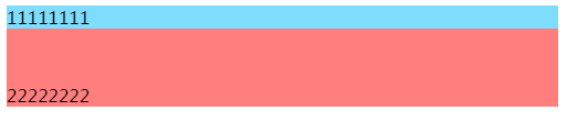
a1float后
<style type="text/css">
.a1{background-color:rgba(0,187,255,0.5); float:left;}
.a2{background-color:rgba(255,0,0,0.5); padding-top:50px;}
</style>

<div class="a1">11111111</div>
<div class="a2">22222222</div>

<style type="text/css">
img { float:right;}
.container{ border: 1px solid #000;}
.clear{clear: both;}
</style>

<div class="container">
111111
<img src="/i/eg_smile.gif" />
</div>
显示结果:
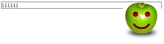
图片浮动之后,container高度只剩下“111111”文字的高度,container不能被img撑开了
要想撑开container,要么清除浮动,要么叫container也浮动
1、清除浮动
<style type="text/css">
img{ float:right;}
.container{ border: 1px solid #000;}
.clear{ clear: both;}
</style>

<div class="container">
111111
<img src="/i/eg_smile.gif" />
<div class="clear"></div>
</div>
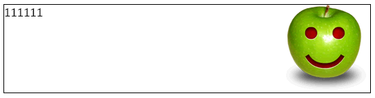
2、container也浮动,宽度100%
<style type="text/css">
img{ float:right;}
.container{ border: 1px solid #000; float: left; width: 100%;}
.clear{ clear: both;}
</style>
<div class="container">
111111
<img src="/i/eg_smile.gif" />
</div>

float布局 和 inline-block布局
不同:对元素设置display:inline-block ,元素不会脱离文本流,而float就会使得元素脱离文本流,且还有父元素高度坍塌的效果
相同:能在某程度上达到一样的效果
