
奇怪的css
下面这个css 保证背景图填充满容器,并且是拉伸
.bg{
        position: absolute;
        top: 0;
        left: 0;
        width: 100%;
        height: 100%;
        background-color: #eee;
        background-size: 100% 100%;
        background-attachment: fixed;
        background-image: url(./img/1.jpg);
}
两列布局
.left{
    float: left;
    width: 200px;
    height: 300px;
    background-color: #ccc;
}
.auto-right{
    margin-left: 200px;
    height: 300px;
    background-color: #198610;
}
<div>
    <div class="left"></div>
    <div class="auto-right"></div>
</div>
三列布局
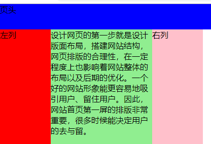
#herder{
    height:50px;
    background:blue;
}
#main{
    width:400px;
    position:relative;
}
#main .main-left{
    width:100px;
    height:800px;
    background:red;
    position:absolute;
    left:0;
    top:0;
}
#main .main-center{
    height:800px;
    background:lightgreen;
    margin:0 100px 0 100px;
}
#main .main-right{
    width:100px;
    height:800px;
    background:pink;
    position:absolute;
    right:0;
    top:0;
}
#footer{
    height:50px;
    background:gray;
}

<div id="herder">页头</div>
<div id="main">
    <div class="main-left">
    左列
  </div>
    <div class="main-center">
    设计网页的第一步就是设计版面布局,搭建网站结构,网页排版的合理性,在一定程度上也影响着网站整体的布局以及后期的优化。
    一个好的网站形象能更容易地吸引用户、留住用户。因此,网站首页第一屏的排版非常重要,很多时候能决定用户的去与留。
  </div>
    <div class="main-right">右列</div>
</div>
<div id="footer">页脚</div>

 浙公网安备 33010602011771号