

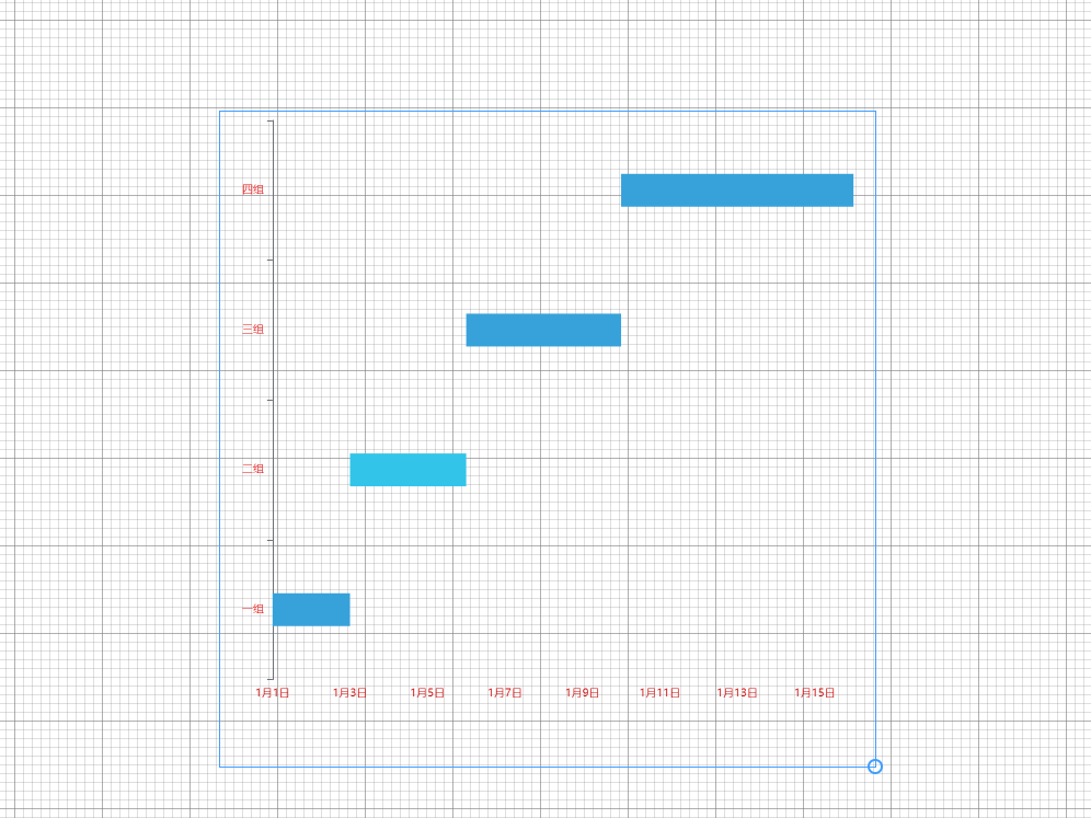
echarts 以时间为Y轴的图标配置
option 配置如下:
1 2 3 4 5 6 7 8 9 10 11 12 13 14 15 16 17 18 19 20 21 22 23 24 25 26 27 28 29 30 31 32 33 34 35 36 37 38 39 40 41 42 43 44 45 46 47 48 49 50 51 52 53 54 55 56 57 58 59 60 61 62 63 64 65 66 67 68 69 70 71 72 73 74 75 76 77 78 79 80 81 82 83 84 85 86 87 88 89 90 91 92 93 94 95 96 97 98 99 100 101 102 103 104 105 106 107 108 | color: colors, legend: { //图例 show: this.legendShow, data: state, selectedMode: true, // 图例设为不可点击 left: this.left, bottom: this.bottom, textStyle: { color: this.legendColor, }, }, grid: { //绘图网格 left: "3%", right: "3%", top: "1%", bottom: "10%", containLabel: true, }, xAxis: { type: "time", interval: 3600 * 1000, //以一个小时递增 // min: '2009/6/1 1:00', //将data里最小时间点 axisLabel: { formatter: function (value) { var date = new Date(value); return getmd(date); function getmd(date) { const y = date.getFullYear().toString(); const m = (date.getMonth() + 1).toString(); const d = date.getDate().toString(); return m + "月" + d + "日"; } }, color: this.xaxisLabelColor, fontSize: this.axisLabelFont, rotate: this.xaxisLabelRotate, }, nameTextStyle: { color: this.xaxisLabelColor, }, splitLine: { show: this.splitLine, lineStyle: { type: "dashed", //设置网格线类型 dotted:虚线 solid:实线 color: this.splitLineColor, width: this.splitLineWidth, lineDash: [this.splitLineDash], }, }, }, yAxis: { data: state, nameTextStyle: { color: this.yaxisLabelColor, }, axisLabel: { color: this.yaxisLabelColor, fontSize: this.axisLabelFont, rotate: this.yaxisLabelRotate, }, }, series: [ // 用空bar来显示三个图例 { name: state[0], type: "bar", data: [] }, { name: state[1], type: "bar", data: [] }, { name: state[2], type: "bar", data: [] }, { name: state[3], type: "bar", data: [] }, { type: "custom", // 自定义 renderItem: function (params, api) { //开发者自定义的图形元素渲染逻辑,是通过书写 renderItem 函数实现的 var categoryIndex = api.value(0); //这里使用 api.value(0) 取出当前 dataItem 中第一个维度的数值。 var start = api.coord([api.value(1), categoryIndex]); // 这里使用 api.coord(...) 将数值在当前坐标系中转换成为屏幕上的点的像素值。 var end = api.coord([api.value(2), categoryIndex]); return { type: "rect", // 表示这个图形元素是矩形。还可以是 'circle', 'sector', 'polygon' 等等。 shape: echarts.graphic.clipRectByRect( { // 矩形的位置和大小。 x: start[0], y: start[1] - barWidth / 2, width: end[0] - start[0], height: barWidth, }, { // 当前坐标系的包围盒。 x: params.coordSys.x, y: params.coordSys.y, width: params.coordSys.width, height: params.coordSys.height, } ), style: api.style(), }; }, labelLine: { show: true, }, encode: { x: [1, 2], // data 中『维度1』和『维度2』对应到 X 轴 y: 0, // data 中『维度0』对应到 Y 轴 }, data: data, }, ], |


【推荐】国内首个AI IDE,深度理解中文开发场景,立即下载体验Trae
【推荐】编程新体验,更懂你的AI,立即体验豆包MarsCode编程助手
【推荐】抖音旗下AI助手豆包,你的智能百科全书,全免费不限次数
【推荐】轻量又高性能的 SSH 工具 IShell:AI 加持,快人一步
· 被坑几百块钱后,我竟然真的恢复了删除的微信聊天记录!
· 【自荐】一款简洁、开源的在线白板工具 Drawnix
· 没有Manus邀请码?试试免邀请码的MGX或者开源的OpenManus吧
· 园子的第一款AI主题卫衣上架——"HELLO! HOW CAN I ASSIST YOU TODAY
· 无需6万激活码!GitHub神秘组织3小时极速复刻Manus,手把手教你使用OpenManus搭建本