

css3圆角矩形、盒子阴影
css3圆角矩形

        div{
            width: 200px;
            height: 200px;
            border: #f00 solid 1px;
            margin-bottom: 10px;
        }
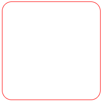
1、设置 border-radius: 20px;
        div:first-of-type{
            border-radius: 20px;
        }
2、设置 border-radius: 20px 40px;
        div:nth-of-type(2){
            border-radius: 20px 40px;
        }
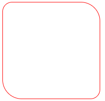
3、设置 border-radius: 20px 40px;
        div:nth-of-type(3){
            border-radius: 20px 40px 60px;/*上-左右-下*/
        }
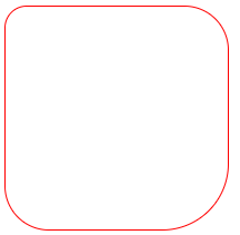
4、设置 border-radius: 20px 40px 60px 80px;
        div:nth-of-type(4){
            border-radius: 20px 40px 60px 80px;/*上-右-下-左*/
        }

5、设置扇形
        div:nth-of-type(5){
            border-radius: 0px 0px 200px;
        }

6、设置圆形
        div:nth-of-type(6){
            border-radius: 100px;
        }
        div:nth-of-type(7){
            border-radius: 50%;
        }
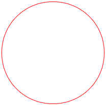 推荐使用border-radius: 50%;
盒子阴影
语法:
box-shadow:水平阴影、垂直阴影、羽化值、阴影大小、阴影颜色、阴影类别【内阴影、外阴影】
        #con{
            width: 200px;
            height: 200px;
            border: #000 solid 1px;
            border-radius: 10px;
            box-shadow: 3px 3px 3px 3px #666;/*水平阴影、垂直阴影、羽化值、阴影大小、阴影颜色*/
        }

box-shadow: 3px 3px 3px 3px #666 inset;/*水平阴影、垂直阴影、羽化值、阴影大小、阴影颜色、内阴影*/
案例:
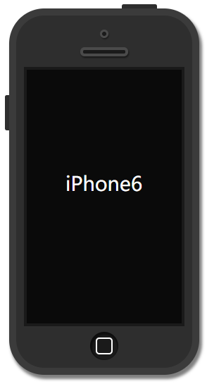
    <div id="phone">
        <div id="camera"></div>
        <div id="headphone"></div>
        <div id="screen">
            <p>iPhone6</p>
        </div>
        <div id="btn"></div>
    </div>
css代码:
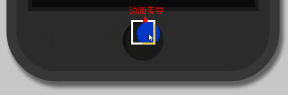
        #phone{
            width: 250px;
            height: 500px;
            background: #2e2e2e;
            margin: 60px auto;
            border: #3b3b3b solid 10px;
            border-radius: 50px;
            box-shadow: 3px 5px 5px 1px rgba(0, 0, 0, 0.5);
            position: relative;
        }
        #phone::before{
            content: '';
            width: 50px;
            height: 6px;
            background-color: #2e2e2e;
            display: block;
            position: absolute;
            top: -16px;
            left: 150px;
            border-radius: 3px 3px 0px 0px;
        }
        #phone::after{
            content: '';
            width: 6px;
            height: 50px;
            background-color: #2e2e2e;
            display: block;
            position: absolute;
            top: 113px;
            left: -16px;
            border-radius: 3px 0px 0px 3px;
        }
        #camera{
            width: 6px;
            height: 6px;
            border: #4a4a4a solid 3px;
            margin: 20px auto 0px;
            background-color: #1a1a1a;
            border-radius: 50%;
            box-shadow: 1px 2px 2px rgba( 0, 0, 0, 0.5);
        }
        #headphone{
            width: 60px;
            height: 5px;
            border: #4a4a4a solid 4px;
            margin: 13px auto;
            background-color: #1a1a1a;
            border-radius: 10px;
            box-shadow: 1px 2px 2px rgba( 0, 0, 0, 0.5);
        }
        #screen{
            width: 220px;
            height: 360px;
            margin: 15px auto 0px;
            background-color: #0a0a0a;
            border: #1a1a1a solid 4px;
        }
        #screen p{
            color: #fff;
            text-align: center;
            line-height: 266px;
            font-size: 28px;

        }
        #btn{
            width: 40px;
            height: 40px;
            background-color: #1a1a1a;
            margin: 8px auto 0px;
            border-radius: 50%;
            box-shadow: 1px 2px 2px 2px rgba(0, 0, 0, 0.5) inset;
            overflow: hidden;/*阻止边界传导*/
        }
        #btn::before{
            content: '';
            width: 20px;
            height: 20px;
            border: #fff solid 2px;
            display: block;
            margin: 8px auto;
            border-radius: 5px;
        }
|
如果子盒子(内部盒子)有上边距,父盒子是空的,子盒子的上边距会传导到父盒子,整合盒子往下来。 不想让它传导,在父盒子样式上加overflow: hidden; |

 浙公网安备 33010602011771号