vue 使用 echart ,自定义样式案例
1、vue 安装 echart 库
npm install echarts --save
2、vue代码
引入
let echarts = require("echarts/lib/echarts");
require("echarts/lib/chart/line");
// 以下的组件按需引入
require("echarts/lib/component/tooltip"); // tooltip组件
require("echarts/lib/component/title"); //  title组件
require("echarts/lib/component/legend"); // legend组件
html 代码
<div id="myChart" style="width: 725px;height: 300px"></div>
js代码
 mounted(){
    this.drawLine();
  },
  methods: {
    drawLine(){
      // 基于准备好的dom,初始化echarts实例
      let myChart = echarts.init(document.getElementById('myChart'));
      // 绘制图表
      myChart.setOption({
        title: {
          text: '',
          subtext: ''
        },
        tooltip: {
          trigger: 'axis'
        },
        color:['#78d528','#fa7371'],
        legend: {
          data:[
            {
              name:"舒张压",
              textStyle: {
                color:'#78d528'
              }
            },{
              name: "收缩压",
              textStyle: {
                color:'#fa7371'
              }
            }
          ]
        },
        toolbox: {
          show: true,
          feature: {
            dataZoom: {
              yAxisIndex: 'none'
            },
            dataView: {readOnly: false},
            magicType: {type: ['line', 'bar']},
            restore: {},
            saveAsImage: {}
          }
        },
        xAxis:  {
          type: 'category',
          boundaryGap: false,
          data: [

            '07:00',
            '08:00',
            '09:00',
            '10:00',
            '11:00',
            '12:00',
            '13:00',
            '14:00',
            '15:00',
            '16:00',
            '17:00',
            ]
        },
        yAxis: {
          type: 'value',
            splitLine: {
              show: true,
              lineStyle:{
                type:'dashed'
              }
              },
          axisLabel: {
            formatter: '{value}'
          }
        },
        series: [
          {
            name:'舒张压',
            type:'line',
            stack: '总量',
            lineStyle:{
              normal:{
                color:'#78d528'
              }
            },
            data:[
              120,
              132,
              101,
              134,
              12,
              45,
              56,
              34,
              76,
              134,
              90,
              230,
              210
            ]
          },
          {
            name:'收缩压',
            type:'line',
            lineStyle:{
              normal:{
                color:'#fa7371'
              }
            },
            stack: '总量',
            data:[
              55,
              32,
              11,
              32,
              12,
              45,
              56,
              34,
              76,
              134,
              90,
              43,
              54
            ]
          },
        ]
      });
    },
}
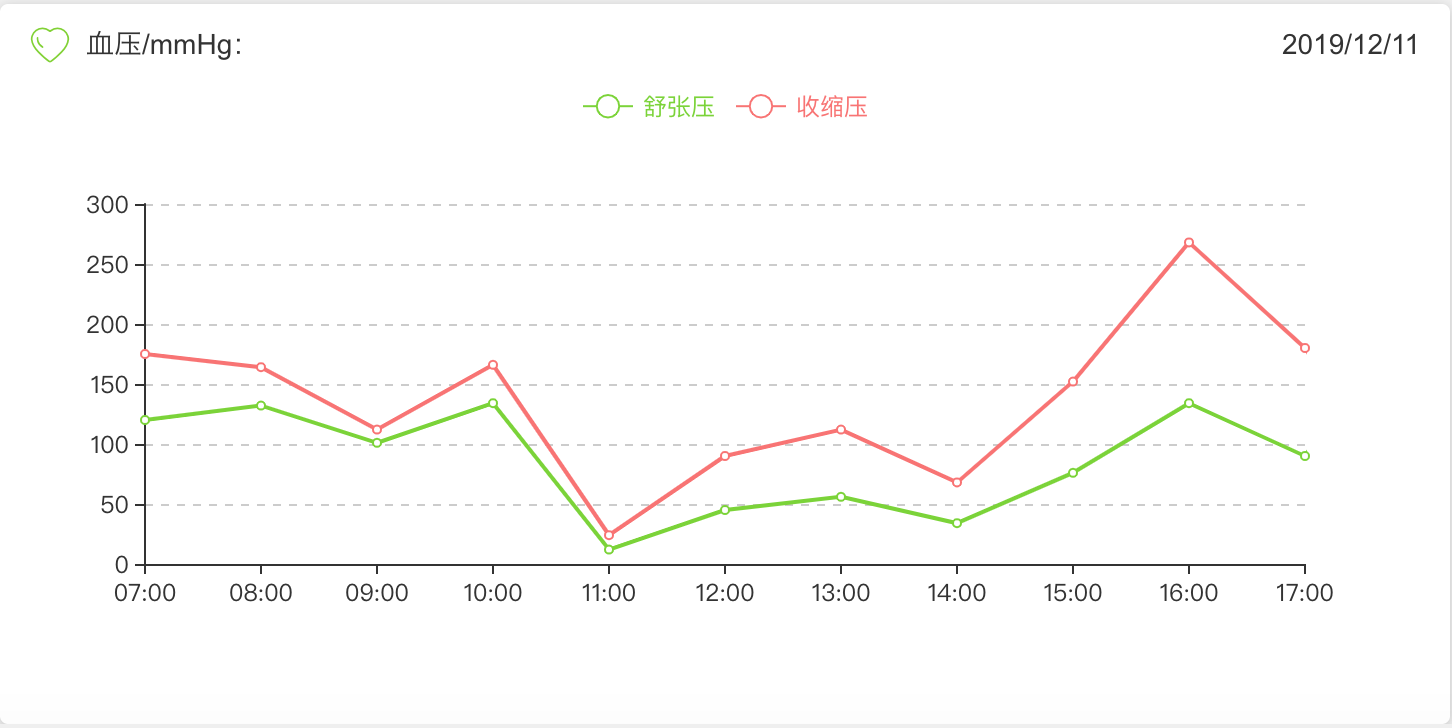
整体效果:
3、重点来了-定义样式
虚线:
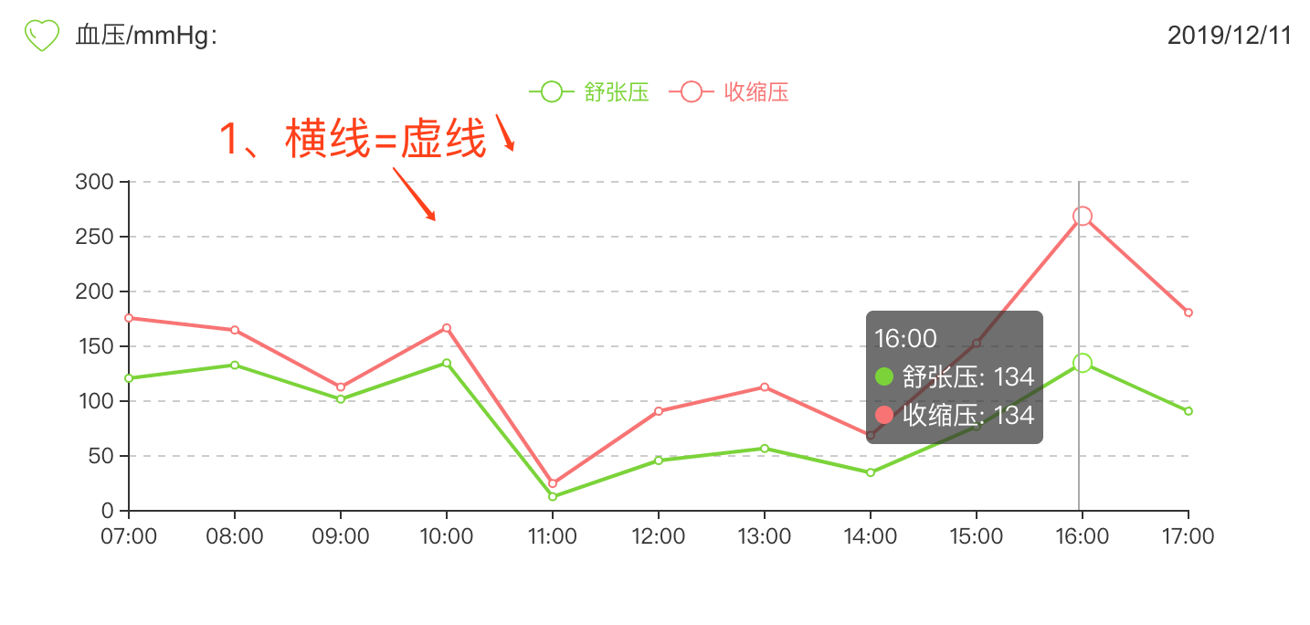
yAxis: {
          type: 'value',
      /********定义样式开始********/
            splitLine: {
              show: true,
              lineStyle:{
                type:'dashed' //定义样式=虚线
              }
              },
    /********结束********/
          axisLabel: {
            formatter: '{value}'
          }
        },
4、改变legend的样式
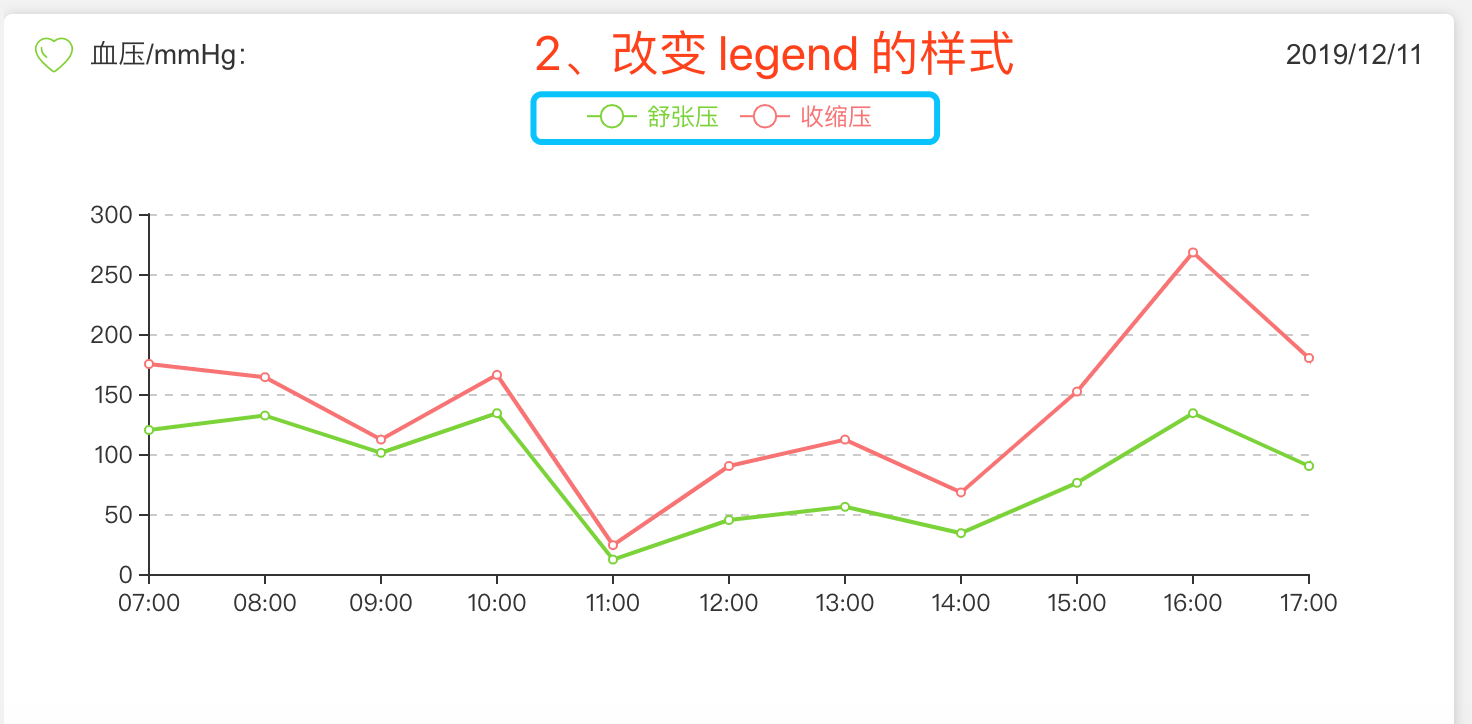
代码:
 1 color:['#78d528','#fa7371'], //分别定义第一个legend和第二个legend的icon颜色
 2         legend: {
 3           data:[
 4             {
 5               name:"舒张压",
 6               textStyle: {
 7                 color:'#78d528' //定义 legend 的字体颜色
 8               }
 9             },{
10               name: "收缩压",
11               textStyle: {
12                 color:'#fa7371' //定义 legend 的字体颜色
13               }
14             }
15           ]
16         },
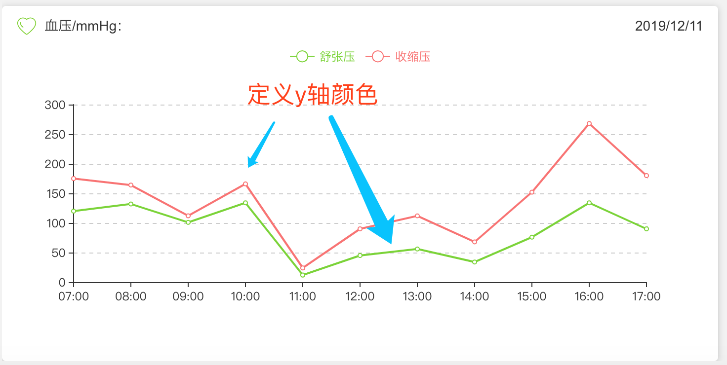
5、定义x轴线条的颜色
series: [
          {
            name:'舒张压',
            type:'line',
            stack: '总量',
            lineStyle:{
              normal:{
                color:'#78d528' //线条颜色
              }
            },
//数据
            data:[
              120,
              132,
              101,
              134,
              12,
              45,
              56,
              34,
              76,
              134,
              90,
              230,
              210
            ]
          },
          {
            name:'收缩压',
            type:'line',
            lineStyle:{
              normal:{
                color:'#fa7371'//线条颜色
              }
            },
            stack: '总量',
//数据
            data:[
              55,
              32,
              11,
              32,
              12,
              45,
              56,
              34,
              76,
              134,
              90,
              43,
              54
            ]
          },

 浙公网安备 33010602011771号