CSS(十八):圆角边框
圆角边框
border-radius属性用于设置元素的外边框圆角
-
语法
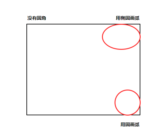
border-radius: length;原理:(椭)圆与边框的相交形成的圆角效果
-
说明
-
参数值可以是数值或百分比的形式
-
如果是正方形,想要把盒子设置为一个圆,把数值改为高度或宽度的一半即可,或直接写为50%
-
如果是个矩形,设置为高度的一半既可做圆角矩形
-
该属性是一个简写,可以跟1到4个值
- 1个值:设置四个角
- 2个值:按对角线设置,设置 左上右下 和 右上左下
- 3个值:依次设置 左上,右上右下,左下
- 4个值:依次设置左上,右上,右下,左下
-
分开写(不常用),
属性 说明 border-top-left-radius 左上 border-top-right-radius 右上 border-bottom-right-radius 右下 border-bottom-left-radius 左下
-
-
示例
<!DOCTYPE html>
<html lang="en">

<head>
    <meta charset="UTF-8">
    <meta http-equiv="X-UA-Compatible" content="IE=edge">
    <meta name="viewport" content="width=device-width, initial-scale=1.0">
    <title>圆角边框</title>
    <style>
        .box1 {
            width: 200px;
            height: 200px;
            border: 1px solid purple;
            background-color: purple;
            border-radius: 12px;
        }

        .box2 {
            width: 200px;
            height: 200px;
            background-color: purple;
            /* border-radius: 100px; */
            border-radius: 50%;
        }

        .box3 {
            width: 300px;
            height: 100px;
            background-color: purple;
            border-radius: 50px;
        }

        .box4 {
            width: 200px;
            height: 200px;
            background-color: purple;
            border-radius: 10px 40px;
            border-radius: 10px 20px 30px;
            /* border-radius: 10px 20px 30px 40px; */
        }

        .box5 {
            width: 200px;
            height: 200px;
            background-color: purple;
            border-top-left-radius: 10px;
        }
    </style>
</head>

<body>
    1. 简单应用
    <div class="box1"></div>
    2. 画圆
    <div class="box2"></div>
    3. 圆角矩形
    <div class="box3"></div>
    4. 可以设置不同的圆角
    <div class="box4"></div>
    5. 分开写
    <div class="box5"></div>
</body>

</html>

 浙公网安备 33010602011771号