
聊天会话框气泡
方法1.使用border属性实现
我们将一个div的width、height、font-size设置为0,给它一个border-width值,border-color给定四种不同的颜色,此时我们会看到该div由四个三角形组成的,由此我们可以根据需要保留需要的三角形,其他三个三角形定义为透明transparent,最后使用定位。实现代码如下:
HTML:
<div class="contain">
    <div class="angle"></div>
</div>
CSS:
<style>
*{
padding:0;
margin: 0;
}
body{
background-color: #aaa;
}
.contain{
margin: 20px auto;
position: relative;
width: 200px;
height: 100px;
border: 1px solid #aaa;
background-color: #fff;
}
.angle {
width:0;
height:0;
font-size:0;
border:solid 10px;
border-color:transparent #fff transparent transparent;
position: absolute;
top: 30px;
left: -20px;
}
</style>
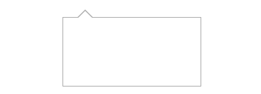
效果图:
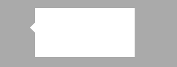
方法2.使用伪类实现
思路::before三角形的背景颜色设为边框颜色,:after三角形背景颜色设置为白色,通过覆盖留下1px的边
<!DOCTYPE html>
<html lang="en">
<head>
    <meta charset="UTF-8">
    <title>三角形</title>
    <style>
        *{
            padding: 0;
            margin: 0;
        }
        .box{
            position: relative;
            margin: 30px auto;
            width: 200px;
            height: 100px;
            border: 1px solid #aaa;
        }
        .box::before{
            content: '';
            margin-top: -24px;
            position: absolute;
            top: 0;
            left: 20px;
            border: 12px solid transparent;
            border-bottom-color: #aaa;
        }
        .box::after{
            content: '';
            margin-top: -22px;
            position: absolute;
            top: 0;
            left: 20px;
            border:12px solid transparent;
            border-bottom-color: #fff;
        }
    </style>
</head>
<body>
    <div class="box"></div>
</body>
</html>