

学习狂神说CSS
2024-06-15
1.CSS快速入门示例及CSS导入及行内样式、本文件内style定义、外部css定义样式的优先级(就近原则)
CSS文件:
h1{
    color: red;
}
HTML文件:
<!DOCTYPE html>
<html lang="en">
<head>
    <meta charset="UTF-8">
    <title>Title</title>
    <style>
        /* 标签选择器
         样式定义格式:
         声明1;
         声明2;*/
        h1{
            color: blue;
        }
    </style>
    <link rel="stylesheet" href="css/style.css"/>
    <!-- 行内样式、当前页面内定义style样式、外部引入style里定义样式
    这3种优先级:就近原则
     指 样式代码和这<h1>代码在物理上的远近
     行内样式 肯定最近
     本例子中,外部样式link标签在当前页面的<style>标签下面,
     更靠近<h1>所以本例中外部样式的优先级高于内部<style>样式 -->
</head>
<body>
<!--<h1 style="color: green;">我是标题</h1>-->
<h1>我是标题</h1>
</body>
</html>
2.三种基本选择器及优先级
<!DOCTYPE html>
<html lang="en">
<head>
    <meta charset="UTF-8">
    <title>Title</title>
  <style>
    p{
        color: red;
    }
    .practice-class{
        color: blue;
    }
    #practice-id{
        color: green;
    }
  </style>
</head>
<body>
<p>段落1</p>
<p class="practice-class">段落2</p>
<!--<p id="practice-id">段落3</p>-->
<!-- 3种基本选择器优先级:
 id选择器>类选择器>标签选择器 -->
<p id="practice-id" class="practice-class">段落3</p>
</body>
</html>
2024-06-16
1.层次选择器
hierarchical /ˌhaɪəˈrɑː.kɪ.kəl/ 按等级划分的
<!DOCTYPE html>
<html lang="en">
<head>
    <meta charset="UTF-8">
    <title>Title</title>
    <style>
        /* 不用id选择器、类选择器,来进行选择 */
        /* 层次选择器 */
        /* 1.后代选择器:选择所有后代:
        太爷 爷爷 爸爸 孙子
        对太爷来说,爷爷 爸爸 孙子 全是其后代 */
        /*body p{
            background: green;
        }*/
        /*ul p{
            background: blue;
        }*/
        /* 2.子选择器:选直接后代
        太爷 爷爷 爸爸 孙子
        对太爷来说,爷爷是其直接后代 */
        /*body>p{
            background: red;
        }*/
        /* 3.相邻兄弟选择器
         我备注:也可以理解为相邻弟弟选择器,
         选择直接相邻的那个弟弟 */
        /*.practice-class + p{
            background: orange;
        }*/
        /* 4.通用选择器
         我备注:也可以理解为全部弟弟选择器 */
        .practice-class ~ p{
            background: brown;
        }
    </style>
</head>
<body>
    <p>p0</p>
    <p>p1</p>
    <p class="practice-class">p2</p>
    <p>p3</p>
    <ul>
        <li>
            <p>p4</p>
        </li>
        <li>
            <p>p5</p>
        </li>
        <li>
            <p>p6</p>
        </li>
    </ul>
    <p>p7</p>
</body>
</html>
2024-06-17
1.结构伪类选择器
伪类:条件
<!DOCTYPE html>
<html lang="en">
<head>
    <meta charset="UTF-8">
    <title>Title</title>
    <style>
        /* 结构伪类选择器
         伪类:条件
          结构伪类选择器,
          即在结构的基础上,
          伪类 即条件 去选择 */

        /* 在不用id、class选择器的基础上进行练习 */

        /* 选择ul第一个子元素 */
        ul li:first-child{
            background: brown;
        }

        /* 选择ul最后一个子元素 */
        ul li:last-child{
            background: green;
        }

        /* 选中p1:
         定位到父元素,
         选择当前的第一个(子)元素。
          注意:这个有个隐含条件是
         要选的元素必须是p标签,
         否则选不上,
          即假设p的父级下的第一个元素为div,
          则该div不会被选中 */
        p:nth-child(1){
            background: burlywood;
        }

        /* 选中p2:
        定位到父元素,
        选择当前的第二个类型为p的(子)元素,
         即必须是其父元素的所有类型为p标签的元素
         构成的列表中的第二个元素,
         若没有这元素(例如父元素总共也没有两个p标签子元素),
         则不会选中*/
        p:nth-of-type(2){
            background: blue;
        }

        /* 超链接鼠标移上去变色 */
        a:hover{
            background: darkorange;
        }
    </style>
</head>
<body>
    <a href="#">验证鼠标效果</a>
    <p>p1</p>
    <p>p2</p>
    <p>p3</p>
    <ul>
        <li>l1</li>
        <li>l2</li>
        <li>l3</li>
    </ul>
</body>
</html>
2024-06-18
1.属性选择器(重要)
<!DOCTYPE html>
<html lang="en">
<head>
    <meta charset="UTF-8">
    <title>Title</title>
  <style>
    /* .test a 后代选择器 */
    .test a{
      background: dodgerblue;
      border-radius: 170px;
      /* 我一开始不会将其变成球
       要设置浮动,否则是不会变成球的
       float: left,向左浮动*/
      float: left;
      width: 170px;
      height: 170px;
      /* 文字居中 */
      text-align: center;
      color: red;
      /* 去掉下划线 */
      text-decoration: none;
      /*font-style: italic; 斜体*/
      /*font-variant: 这个不会,不用它*/
      /*font-weight: bold;*/
      /*font-stretch: 不会,不用它*/
      font-size: large;
      /*line-height: 50px; 行高*/
      /*font-family: Arial;字体*/
      /* 我一开始写font: solid 10px 楷体;是错误的
       font的顺序是:
       下列字号font-size和font-family这俩是必须的
       其余均可选
       字号和行高用/分隔
       1.font-style: italic; 斜体
       2.font-weight: bold; 加粗
       3.font-size: 50px; 字号 / line-height: 170px; 行高
       4.font-family: Arial; 字体*/
      font: italic bold 50px/170px Arial;
      /* 外边距提供间距 */
      margin-left: 17px;
    }


    /*属性选择器:重要*/
    /* 属性类似于id+class*/
    /* 根据dom元素的属性,选择dom元素*/

    /*1.选择含有id属性的*/
    a[id]{
      background: yellow;
    }
    /*2.选择class属性值为first的 = */
    /* (完全等于)*/
     /*下面这个选不到,
    因为没有class完全等于first的*/
      /*a[class='first']{
        background: green;
      }*/
    /* 这个能选到 */
    /*a[class='links item first']{
      background: green;
    }*/
    /*3.选择class属性值包含first的 *= */
    a[class*='first']{
      background: darkorange;
    }
    /*4.选择href属性以http开头的 ^= */
    a[href^='http']{
      background: brown;
    }
    /*5.选择href属性以.pdf结尾的 $= */
    a[href$='.pdf']{
      background: darkorchid;
    }
  </style>
</head>
<body>
  <p class="test">
    <a class="links item first">1</a>
    <a href="#" class="links item" id="second">2</a>
    <a href="http://www.cnblog.com" class="links item">3</a>
    <a href="https://www.baidu.com" class="links item">4</a>
    <a href="test.doc" class="links item">5</a>
    <a href="test.pdf" class="links item">6</a>
    <a href="test.jpg" class="links item">7</a>
    <a href="practice.pdf" class="links item">8</a>
    <a href="study.txt" class="links item">9</a>
    <a href="http://test.org" class="links item">10</a>
  </p>
</body>
</html>
2024-06-27
1.span标签及文字样式
<!DOCTYPE html>
<html lang="en">
<head>
    <meta charset="UTF-8">
    <title>Title</title>
    <style>
      .span-big{
        /* font-weight粗细。bold加粗 */
        font-weight: bold;
        /* font-family字体 */
        /* 逗号分隔的,
        Centaur是英文字体则用于英文,
         楷体则应用于中文 */
        font-family: Centaur,'楷体';
        /* font-size大小 */
        font-size: 50px;
        /* color颜色 */
        /*color: red;*/
        /* rgb 红绿蓝 */
        /*color: #00ff00;*/
        /*color: rgb(0, 255, 0);*/
        /* rgba a:透明度,取值0~1,由浅变深 */
        color: rgba(0, 255, 0, 0.5);
      }
    </style>
</head>
<body>
<!-- span通用标签,类似于div这种 -->
欢迎学习<span class="span-big">CSS课程</span>。
</body>
</html>
2024-06-28
1.文本样式:对齐方式
<!DOCTYPE html>
<html lang="en">
<head>
    <meta charset="UTF-8">
    <title>Title</title>
    <style>
      /* 文本样式:
       对齐方式:text-align */
      .first-p{
        text-align: center;
        /*text-align: left;*/
        /*text-align: right;*/
        font-size: 50px;
      }
    </style>
</head>
<body>
  <!--对齐方式-->
  <h1>CSS基础</h1>
  <div>
    <p class="first-p">在Vue中,当你在模板中监听一个自定义事件时,通常你不需要在事件处理函数后面加上括号(),除非你想要在触发事件时立即执行某个方法并传递额外的参数(这通常不是从子组件传递的参数)。</p>
  </div>
</body>
</html>
2024-06-29
1.文本样式:首行缩进
<!DOCTYPE html>
<html lang="en">
<head>
    <meta charset="UTF-8">
    <title>Title</title>
    <style>
      /* 首行缩进:text-indent
       1em为(当前样式下)一个字的大小 */
      .practice-text-indent{
          text-indent: 2em;
          font-size: 50px;
      }
    </style>
</head>
<body>
  <h1>CSS基础</h1>
  <div>
    <p class="practice-text-indent">Tomcat使用这个目录来编译JSP页面和存放临时文件。删除work目录会清除所有编译的JSP页面和临时文件,这通常有助于解决一些运行时问题,尤其是与JSP相关的问题。</p>
  </div>
</body>
</html>
2024-06-30
1.文本样式:设置行高等于区域高度从而竖直方向居中、修饰(上中下划线)、两元素保持在水平方向上对齐
<!DOCTYPE html>
<html lang="en">
<head>
    <meta charset="UTF-8">
    <title>Title</title>
    <style>
      /* 文本样式:
       对齐方式:text-align */
      .first-p{
        text-align: center;
        /*text-align: left;*/
        /*text-align: right;*/
        font-size: 50px;
      }
      /* 首行缩进:text-indent
       1em为(当前样式下)一个字的大小 */
      .practice-text-indent{
          text-indent: 2em;
          font-size: 50px;
      }
      /* 文本竖直方向上居中:
       通过设置
       行高line-height等于当前区域高度
       来实现*/
      .practice-line-height{
          background: chartreuse;
          height: 500px;
          line-height: 500px;
          font-size: 50px;
      }
      /* 修饰:下、中、上划线
      text-decoration
      text-decoration: underline:下划线
      text-decoration: line-through:中划线
      text-decoration: overline:上划线
       */
      .text-decoration-underline{
          text-decoration: underline;
          font-size: 50px;
      }
      .text-decoration-line-through{
          text-decoration: line-through;
          font-size: 50px;
      }
      .text-decoration-overline{
          text-decoration: overline;
          font-size: 50px;
      }
      /* 实现两元素在水平方向上对齐
      img,span 要对齐的两个元素
      vertical-align: middle;
      */
      img,span{
          vertical-align: middle;
      }
    </style>
</head>
<body>
  <h1>CSS基础</h1>
  <div>
    <p class="first-p">在Vue中,当你在模板中监听一个自定义事件时,通常你不需要在事件处理函数后面加上括号(),除非你想要在触发事件时立即执行某个方法并传递额外的参数(这通常不是从子组件传递的参数)。</p>
    <p class="practice-text-indent">Tomcat使用这个目录来编译JSP页面和存放临时文件。删除work目录会清除所有编译的JSP页面和临时文件,这通常有助于解决一些运行时问题,尤其是与JSP相关的问题。</p>
    <p class="practice-line-height">从您提供的代码片段来看,您确实在第一次调用 this.$f7router.navigate 方法时遗漏了将 props 选项作为路由导航的第二个参数传递。在Framework7中(或类似的路由系统中),props 选项通常用于将自定义属性传递给路由的目标组件。</p>
    <p class="text-decoration-underline">修饰-下划线</p>
    <p class="text-decoration-line-through">修饰-中划线</p>
    <p class="text-decoration-overline">修饰-上划线</p>
    <p>
        <img src="images/sea.png" style="width: 100px; height: 100px;"/>
        <span>您错误地将 props 对象放在了字符串拼接的末尾,而不是作为 navigate 方法的第二个参数。这导致了 props 对象没有被正确地传递到路由中。</span>
    </p>
  </div>
</body>
</html>
2024-07-01
1.超链接伪类
a:hovor 当鼠标悬停时的样式
<!DOCTYPE html>
<html lang="en">
<head>
    <meta charset="UTF-8">
    <title>Title</title>
    <style>
      .book-img{
        width: 200px;
        height: 300px;
      }
      /* 去掉超链接下划线
      text-decoration: none;*/
      a{
        text-decoration: none;
        color: #000000;
      }
      /* 超链接伪类,
      当鼠标悬停时的样式
      a:hover */
      a:hover{
        color: orange;
        font-size: 50px;
      }
    </style>
</head>
<body>
  <a href="#">
    <img class="book-img" src="images/sea.png"/>
  </a>
  <p>
    <a href="#">码出高效</a>
  </p>
  <p>
    <a href="#">作者:孤尽老师</a>
  </p>
  <p>
    ¥99
  </p>
</body>
</html>
2024-07-02
1.文本阴影
<!DOCTYPE html>
<html lang="en">
<head>
    <meta charset="UTF-8">
    <title>Title</title>
    <style>
      /* 文本阴影
      text-shadow
      参数(h-shadow, v-shadow, blur, color)
      h-shadow x轴偏移
      v-shadow y轴偏移
      blur 模糊距离(模糊半径)
        模糊半径越小越清楚
        越大越模糊
      color 阴影颜色
      备注:
      偏移,方向定义:
      以窗口左上角为原点,
      原点水平向右为x轴正向,
      原点竖直向下为y轴正向 */
      #price{
          text-shadow: 50px 10px 3px red;
      }
    </style>
</head>
<body>
  <p id="price">
    ¥99
  </p>
</body>
</html>
2024-07-03
1.列表样式
页面:index.html:
<!DOCTYPE html> <html lang="en"> <head> <meta charset="UTF-8"> <title>Title</title> <link href="css/style.css" rel="stylesheet"/> </head> <body> <div id="nav"> <h2 class="title">全部商品分类</h2> <ul> <li><a href="#">图书</a> <a href="#">音像</a> <a href="#">数字商品</a></li> <li><a href="#">家用电器</a> <a href="#">手机</a> <a href="#">数码</a></li> <li><a href="#">电脑</a> <a href="#">办公</a> <li><a href="#">家居</a> <a href="#">家装</a> <a href="#">厨具</a></li> <li><a href="#">服装鞋帽</a> <a href="#">个护化妆</a> <li><a href="#">礼品箱包</a> <a href="#">钟表</a> <a href="#">珠宝</a></li> <li><a href="#">食品饮料</a> <a href="#">保健食品</a> <li><a href="#">彩票</a> <a href="#">旅行</a> <a href="#">充值</a> <a href="#">票务</a></li> </ul> </div> </body> </html>
样式:css/style.css:
/* 通用规范是样式从最外层到内层写,
 外层样式写在上方,
 内层样式写在下方 */
#nav{
    width: 300px;
    background: darkgray;
}

.title{
    font-size: 18px;
    /* 加粗 */
    font-weight: bold;
    text-indent: 1em;
    line-height: 35px;
    background: red;
}

/*ul{*/
/*    background: darkgray;*/
/*}*/

/* 选中所有ul下的li
 层次选择器里
 的后代选择器ul li{}

 列表项前‘.’的样式
 list-style: none;不展示
 list-style: circle;空心圆
 list-style: decimal;(有序)数字
 list-style: square;正方形*/
ul li{
    /* height给个列表项之间的间距 */
    height: 25px;
    list-style: none;
    font-size: 14px;
    text-indent: 1em;
}

a{
    color: #000;
    /* 去下划线 */
    text-decoration: none;
}

a:hover{
    color: orange;
    text-decoration: underline;
}
2024-07-04
1.背景(图片)
<!DOCTYPE html>
<html lang="en">
<head>
    <meta charset="UTF-8">
    <title>Title</title>
    <style>
      /* border
      设置边框
      参数分别为:
      边框粗细、边框样式、边框颜色
      solid:实线*/
      /* background-image
       设置背景图片*/
      div{
        width: 1200px;
        height: 800px;
        border: 1px solid red;
        background-image: url("images/touXiang.png");
        /* 默认是平铺,平铺满整个区域 */
        /*background-repeat: repeat;*/
      }
      .div1{
        /* 水平平铺 */
        background-repeat: repeat-x;
      }
      .div2{
        /* 竖直平铺 */
        background-repeat: repeat-y;
      }
      .div3{
        /* 不平铺(只显示一个) */
        background-repeat: no-repeat;
      }
    </style>
</head>
<body>
  <div class="div1"></div>
  <div class="div2"></div>
  <div class="div3"></div>
</body>
</html>
2024-07-05
1.接昨天代码,背景(图片),向菜单列表嵌入向下向右箭头图片,补充偏移相关内容:
style.css:
/* 菜单列表分别加向下和向右的箭头*/
.title{
    font-size: 18px;
    /* 加粗 */
    font-weight: bold;
    text-indent: 1em;
    line-height: 35px;
    /* css中都是用空格,而不是逗号分隔
    直接合起来写background:
     参数顺序:
     background-color
     background-image
        url里../ 取上一层目录
     background-position
        即position-x、position-y
        相对于(左上角)原点的
        水平(x)、竖直(y)偏移量
     background-repeat
     repeat意思是重复*/
    background: red url("../images/down.png") 260px 4px no-repeat;
}

ul li{
    /* height给个列表项之间的间距 */
    height: 25px;
    list-style: none;
    font-size: 14px;
    text-indent: 1em;
    /* 分开写background:
    url里../ 取上一层目录
     background-position
     相对于(左上角)原点的偏移量*/
    background-image: url("../images/right.png");
    background-position: 221px 2px;
    background-repeat: no-repeat;
}
2024-07-06
1.border边框
<!DOCTYPE html>
<html lang="en">
<head>
    <meta charset="UTF-8">
    <title>Title</title>
    <style>
        /* 盒子模型
        border设置边框
        参数顺序:
        粗细、样式、颜色
        粗细,例如2px;
        样式,例如solid实线,
        dashed,类似于带间隔的线样式*/
        #box{
            width: 300px;
            border: 1px solid red;
            /*border: 1px dashed red;*/
        }
    </style>
</head>
<body>
    <div id="box">
        <h2>用户登录</h2>
        <form action="#">
            <div>
                <span>用户名:</span>
                <input type="text" id="username"/>
            </div>
            <div>
                <span>密码:</span>
                <input type="text" id="pwd"/>
            </div>
            <div>
                <span>邮箱:</span>
                <input type="text" id="email"/>
            </div>
        </form>
    </div>
</body>
</html>
2024-07-07
1.接昨天的border边框,及新内容:margin外边距、padding内边距
<!DOCTYPE html>
<html lang="en">
<head>
    <meta charset="UTF-8">
    <title>Title</title>
    <style>
        /* 去掉body默认的
        8px的外边距 */
        body{
            margin: 0;
        }
        h2{
            font-size: 16px;
            background: cadetblue;
            margin: 0;
        }
        /* 盒子模型
        border设置边框
        参数顺序:
        粗细、样式、颜色
        粗细,例如2px;
        样式,例如solid实线,
        dashed,类似于带间隔的线样式

        margin的一个妙用:
        用于居中对齐
        margin: 0 auto;

         margin和padding都是:
         两个参数则:上下 左右
         四个参数则:
         顺时针 上右下左 */
        #box{
            width: 300px;
            border: 1px solid red;
            /*border: 1px dashed red;*/
            margin: 0 auto;
        }
        form{
            background: cadetblue;
        }
        /* 层次选择器:后代选择器 */
        .username-div input{
            border: 2px dashed black;
        }
        .pwd-div input{
            border: 2px solid darkorchid;
        }
        .email-div input{
            border: 2px solid darkorange;
        }
    </style>
</head>
<body>
    <div id="box">
        <h2>用户登录</h2>
        <form action="#">
            <div class="username-div">
                <span>用户名:</span>
                <input type="text" id="username"/>
            </div>
            <div class="pwd-div">
                <span>密码:</span>
                <input type="text" id="pwd"/>
            </div>
            <div class="email-div">
                <span>邮箱:</span>
                <input type="text" id="email"/>
            </div>
        </form>
    </div>
</body>
</html>
2024-07-08
1.圆角边框
<!DOCTYPE html>
<html lang="en">
<head>
    <meta charset="UTF-8">
    <title>Title</title>
  <style>
    .circle{
      width: 500px;
      height: 500px;
      border: 10px solid red;
      /* border-radius
       圆角边框
       参数 顺时针
       4个:左上 右上 右下 左下
       2个:左上(及右下) 右上(及左下)
       1个:所有
       border-radius值
       设置的是圆角的半径
       当父级是正方形,
       且border-radius等于
       父级长宽一半时,就是个圆
       border-radius: 250px;圆*/
      /*border-radius: 30px 60px 40px 80px;*/
      /*border-radius: 30px 80px;*/
      border-radius: 250px;
    }
    /* (上)半圆 */
    .banYuan{
      width: 500px;
      height: 250px;
      border: 5px solid blue;
      border-radius: 250px 250px 0 0;
    }
    /* (右下)四分之一圆 */
    .siFenZhiYiYuan{
      width: 250px;
      height: 250px;
      border: 5px solid green;
      border-radius: 0 0 250px 0;
    }
  </style>
</head>
<body>
  <div class="circle"></div>
  <div class="banYuan"></div>
  <div class="siFenZhiYiYuan"></div>
</body>
</html>
2024-07-09
1.盒子阴影
<!DOCTYPE html>
<html lang="en">
<head>
    <meta charset="UTF-8">
    <title>Title</title>
    <style>
      div{
        width: 800px;
        height: 500px;
        border: 5px solid red;
        /* 盒子阴影box-shadow
        参数:水平偏移 垂直偏移 模糊半径 阴影颜色
        模糊半径越大,阴影越模糊 */
        box-shadow: 80px 30px 2px yellow;
      }
    </style>
</head>
<body>
  <div></div>
</body>
</html>
2024-07-10
1.display 块级元素 行内元素
<!DOCTYPE html>
<html lang="en">
<head>
    <meta charset="UTF-8">
    <title>Title</title>
    <style>
      /* 块级元素:独占一行:
      h1~h6 div p ul li

      行内元素:不独占一行:
      span a input

      块级元素内可以
      嵌套行内元素,
      但行内元素不能
      嵌套行内元素。

      display: block;
        设置为块级元素
      display: inline;
        设置为行内元素
      display: inline-block;
        设置为
          保持块级元素(的高度等)
          且不独占一行
      display: none;
        设置为不显示*/
      div{
        width: 500px;
        height: 400px;
        border: 2px solid red;
        /*display: block;*/
        display: inline-block;
      }
      span{
        width: 500px;
        height: 400px;
        border: 2px dashed blue;
        /*display: block;*/
        display: inline-block;
      }
    </style>
</head>
<body>
  <div>div内容</div>
  <span>span内容</span>
</body>
</html>
2024-07-11
1.float浮动
index.html:
<!DOCTYPE html>
<html lang="en">
<head>
    <meta charset="UTF-8">
    <title>Title</title>
    <link rel="stylesheet" href="css/style.css"/>
</head>
<body>
    <div id="father">
        <div class="div1">
            <img src="images/car2.png"/>
        </div>
        <div class="div2">
            <img id="sea" src="images/sea.png"/>
        </div>
        <div class="div3">
            <img src="images/touXiang.png"/>
        </div>
        <div class="div4">
            <span>handleName(),Vue会尝试在渲染时就执行它,而不是在事件被触发时</span>
        </div>
    </div>
</body>
</html>
style.css:
div{
    margin: 10px;
    padding: 5px;
}

#father{
    border: 1px solid black;
}

/* float:浮动
left向左浮动
right向右浮动

clear: both;
清除浮动:
保持浮动的同时,
使其有块元素的效果。*/
.div1{
    border: 1px dashed red;
    /*display: inline-block;*/
    float: left;
    clear: both;
}

.div2{
    border: 1px dashed blue;
    /*display: inline-block;*/
    float: right;
    clear: both;
}

.div3{
    border: 1px dashed green;
    /*display: inline-block;*/
    float: left;
    clear: both;
}

.div4{
    border: 1px dashed darkmagenta;
    /*display: inline-block;*/
    float: left;
    clear: both;
}

#sea{
    width: 200px;
    height: 400px;
}
2024-07-12
1.float浮动:浮动的盒子可以向左浮动,也可以向右浮动,直到它的外边缘碰到包含框或另一个浮动盒子为止
2.解决父级边框塌陷(共四种方法,这里先列出前两种)
index.html:
<!DOCTYPE html>
<html lang="en">
<head>
    <meta charset="UTF-8">
    <title>Title</title>
    <link rel="stylesheet" href="css/style.css"/>
</head>
<body>
    <div id="father">
        <div class="div1">
            <img src="images/car2.png"/>
        </div>
        <div class="div2">
            <img id="sea" src="images/sea.png"/>
        </div>
        <div class="div3">
            <img src="images/touXiang.png"/>
        </div>
        <div class="div4">
            <span>浮动的盒子可以向左浮动,也可以向右浮动,直到它的外边缘碰到包含框或另一个浮动盒子为止</span>
        </div>
        <div class="clear"></div>
    </div>
</body>
</html>
style.css:
div{
    margin: 10px;
    padding: 5px;
}

#father{
    border: 1px solid black;
    /*height: 1000px;*/
}

/* float:浮动
left向左浮动
right向右浮动

浮动的盒子可以
向左浮动,也可以
向右浮动,
直到它的外边缘碰到
包含框或
另一个浮动盒子为止

clear: both;
清除浮动:
保持浮动的同时,
使其有块元素的效果。*/

/* 解决父级边框塌陷的方法:
1.给父级边框足够的高度
#father{
    border: 1px solid black;
    height: 1000px;
}
2.设置空的div,
且div设置如下3点:
(1)左右清除浮动,
(2)margin为0,
(3)padding为0

备注:
clear: left;清除左侧浮动
clear: right;清除右侧浮动
clear: both;清除两侧浮动
clear: none;不清除浮动
常用的是clear: both;
*/
.div1{
    border: 1px dashed red;
    /*display: inline-block;*/
    float: left;
    clear: both;
}

.div2{
    border: 1px dashed blue;
    /*display: inline-block;*/
    float: right;
    clear: both;
}

.div3{
    border: 1px dashed green;
    /*display: inline-block;*/
    float: left;
    clear: both;
}

.div4{
    border: 1px dashed darkmagenta;
    /*display: inline-block;*/
    float: left;
    clear: both;
}

#sea{
    width: 200px;
    height: 400px;
}

.clear{
    clear: both;
    margin: 0;
    padding: 0;
}
2024-07-13
1.解决父级边框塌陷的第三种方式:设置父级元素overflow: hidden
<!DOCTYPE html>
<html lang="en">
<head>
    <meta charset="UTF-8">
    <title>Title</title>
    <style>
      img{
        /*float: left;*/
      }
      #content{
        border: 1px solid black;
        width: 200px;
        height: 100px;
        /* 解决父级边框塌陷的第三种方式:设置父级元素overflow: hidden */
        overflow: hidden;
        /* overflow: scroll; 滚动*/
        /*overflow: scroll;*/
      }
    </style>
</head>
<body>
  <div id="content">
    <img src="images/car2.png"/>
    <div>哈哈,指一个人发出的笑声,高兴开心欢乐时的状态,抒发快乐的心情,表现一个人很开心快乐的状态。也指人通常用来开玩笑。一种很逗的心情。</div>
  </div>
</body>
</html>
2024-07-14
1.解决父级边框塌陷的第四种方式,也是最推荐的方式:对父级元素设置伪类
#father:after{
    content: '';
    display: block;
    clear: both;
}
解决父级边框塌陷四种方式完整代码:
index.html:
<!DOCTYPE html>
<html lang="en">
<head>
    <meta charset="UTF-8">
    <title>Title</title>
    <link rel="stylesheet" href="css/style.css"/>
</head>
<body>
    <div id="father">
        <div class="div1">
            <img src="images/car2.png"/>
        </div>
        <div class="div2">
            <img id="sea" src="images/sea.png"/>
        </div>
        <div class="div3">
            <img src="images/touXiang.png"/>
        </div>
        <div class="div4">
            <span>浮动的盒子可以向左浮动,也可以向右浮动,直到它的外边缘碰到包含框或另一个浮动盒子为止</span>
        </div>
<!--        <div class="clear"></div>-->
    </div>
</body>
</html>
style.css:
div{
    margin: 10px;
    padding: 5px;
}

#father{
    border: 1px solid black;
    /*height: 1000px;*/
    /*overflow: hidden;*/
}


/* float:浮动
left向左浮动
right向右浮动

浮动的盒子可以
向左浮动,也可以
向右浮动,
直到它的外边缘碰到
包含框或
另一个浮动盒子为止

clear: both;
清除浮动:
保持浮动的同时,
使其有块元素的效果。*/

/* 解决父级边框塌陷的方法:
1.给父级边框足够的高度
#father{
    border: 1px solid black;
    height: 1000px;
}
2.设置空的div,
且div设置如下3点:
(1)左右清除浮动,
clear: both;
(2)margin为0,
(3)padding为0

备注:
clear: left;清除左侧浮动
clear: right;清除右侧浮动
clear: both;清除两侧浮动
clear: none;不清除浮动
常用的是clear: both;

3.设置父级元素overflow: hidden

4.对父元素设置伪类
这是最好的方式
#father:after{
    content: '';
    display: block;
    clear: both;
}
*/
.div1{
    border: 1px dashed red;
    /*display: inline-block;*/
    float: left;
    clear: both;
}

.div2{
    border: 1px dashed blue;
    /*display: inline-block;*/
    float: right;
    clear: both;
}

.div3{
    border: 1px dashed green;
    /*display: inline-block;*/
    float: left;
    clear: both;
}

.div4{
    border: 1px dashed darkmagenta;
    /*display: inline-block;*/
    float: left;
    clear: both;
}

#sea{
    width: 200px;
    height: 400px;
}

.clear{
    clear: both;
    margin: 0;
    padding: 0;
}

#father:after{
    content: '';
    display: block;
    clear: both;
}
2024-07-15
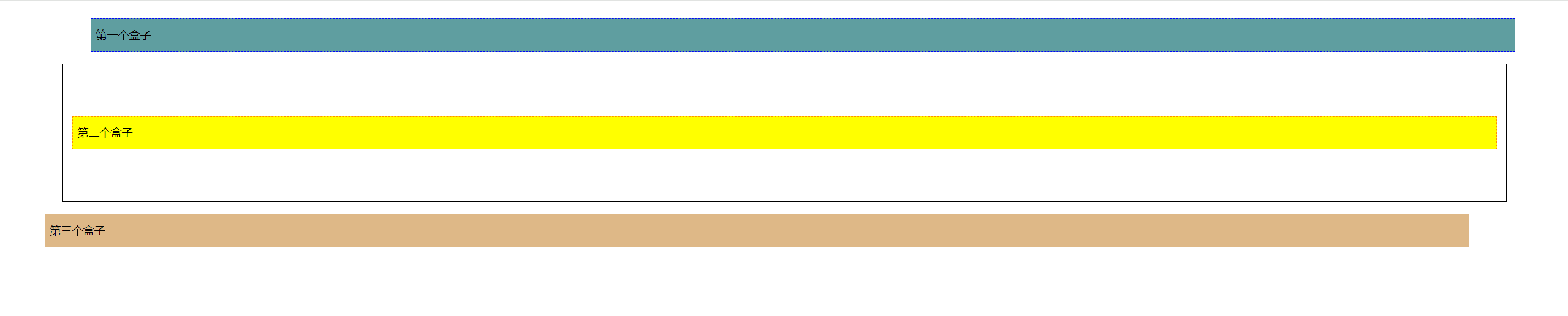
1.开始学习定位:相对定位、绝对定位、z-index
今天先是最开始的默认情况:index.html:
<!DOCTYPE html>
<html lang="en">
<head>
    <meta charset="UTF-8">
    <title>Title</title>
    <style>
      div{
        margin: 10px;
        padding: 5px;
        font-size: 12px;
        line-height: 25px;
      }
      #father{
        border: 1px solid black;
        padding: 0;
      }
      #first{
        background-color: cadetblue;
        border: 1px dashed blue;
      }
      #second{
        background-color: yellow;
        border: 1px dashed darkorange;
      }
      #third{
        background-color: burlywood;
        border: 1px dashed brown;
      }
    </style>
</head>
<body>
  <div id="father">
    <div id="first">第一个盒子</div>
    <div id="second">第二个盒子</div>
    <div id="third">第三个盒子</div>
  </div>
</body>
</html>
2024-07-16
1.相对定位:
相对定位:相对于该元素原来的位置进行偏移
position: relative;
元素仍在文档流中,其原始位置仍被保留。
(所以示例中div3已经向下偏移出父级div了。但因为其原始位置仍被保留了,所以没出现父级边框塌陷
<!DOCTYPE html>
<html lang="en">
<head>
  <meta charset="UTF-8">
  <title>Title</title>
  <style>
    body{
      padding: 50px;
    }
    div{
      margin: 10px;
      padding: 5px;
      font-size: 12px;
      line-height: 25px;
    }
    #father{
      border: 1px solid black;
      padding: 0;
    }
    /* 相对定位:相对于该元素原来的位置进行偏移
    position: relative;
    元素仍在文档流中,其原始位置仍被保留。
    (所以示例中div3已经向下偏移出父级div了。但因为其原始位置仍被保留了,所以没出现父级边框塌陷)
    top right bottom left*/
    #first{
      background-color: cadetblue;
      border: 1px dashed blue;
      position: relative;
      top: -60px;
      left: 20px;
    }
    #second{
      background-color: yellow;
      border: 1px dashed darkorange;
    }
    #third{
      background-color: burlywood;
      border: 1px dashed brown;
      position: relative;
      right: 30px;
      bottom: -60px;
    }
  </style>
</head>
<body>
<div id="father">
  <div id="first">第一个盒子</div>
  <div id="second">第二个盒子</div>
  <div id="third">第三个盒子</div>
</div>
</body>
</html>
示例中div3已经向下偏移出父级div了。但因为其原始位置仍被保留了,所以没出现父级边框塌陷。效果:
2024-07-17
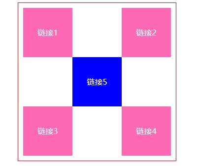
1.相对定位练习
<!DOCTYPE html>
<html lang="en">
<head>
    <meta charset="UTF-8">
    <title>Title</title>
    <style>
      #father{
        text-align: center;
      }
      #sequar{
        border: 1px solid red;
        width: 300px;
        margin: 0 auto;
        padding: 10px;
        /* 直接设置父级边框高度,来解决父级边框塌陷 */
        height: 300px;
      }
      /* 父级正方形设置伪类,解决父级边框塌陷。但这里测试不好使。
      改为直接设置父级边框高度,来解决父级边框塌陷 */
      /*#sequar:after{
          content: '';
          display: block;
          clear: both;
      }*/
      a{
        width: 100px;
        height: 100px;
        background-color: hotpink;
        color: white;
        /*display: inline-block;解决原默认inline设置width、height失效问题。
        同时又因为通过设置父级高度解决了父级边框塌陷问题,
        所以就不用担心我一开始练习时用block导致整体5行,不会解决父级塌陷的问题了。
        而inline-block,左右会有间距。所以这里就用block。*/
        display: block;
        line-height: 100px;
        text-decoration: none;
      }
      a:hover{
        background-color: blue;
      }
      #a2{
          position: relative;
          top: -100px;
          left: 200px;
      }
      #a4{
          position: relative;
          top: -100px;
          left: 200px;
      }
      #a5{
          position: relative;
          top: -300px;
          left: 100px;
      }
    </style>
</head>
<body>
  <div id="father">
    <div id="sequar">
      <!-- a标签一定要写上href="",才能有超链接(小手)效果 -->
      <a id="a1" href="#">链接1</a>
      <a id="a2" href="#">链接2</a>
      <a id="a3" href="#">链接3</a>
      <a id="a4" href="#">链接4</a>
      <a id="a5" href="#">链接5</a>
    </div>
  </div>
</body>
</html>
效果:
2024-07-18
1.绝对定位:position: absolute;
1.1相对于已定位的父级元素位置进行定位,如果没有已定位的父级元素,则相对于浏览器定位。
1.2脱离标准文档流,其在文档流中的原始位置不会被保留。
<!DOCTYPE html>
<html lang="en">
<head>
  <meta charset="UTF-8">
  <title>Title</title>
  <style>
    div{
      margin: 10px;
      padding: 5px;
      font-size: 12px;
      line-height: 25px;
    }
    #father{
      border: 1px solid black;
      padding: 0;
      position: relative;
    }
    #first{
      background-color: cadetblue;
      border: 1px dashed blue;
    }
    /* 绝对定位:position: absolute;
    1.相对于已定位的父级元素位置进行定位,如果没有已定位的父级元素,则相对于浏览器定位。
    2.脱离标准文档流,其在文档流中的原始位置不会被保留。*/
    #second{
      background-color: yellow;
      border: 1px dashed darkorange;
      position: absolute;
      /*left: 100px;*/
      /*top: 300px;*/
      right: 300px;
    }
    #third{
      background-color: burlywood;
      border: 1px dashed brown;
    }
  </style>
</head>
<body>
<div id="father">
  <div id="first">第一个盒子</div>
  <div id="second">第二个盒子</div>
  <div id="third">第三个盒子</div>
</div>
</body>
</html>
2024-07-19
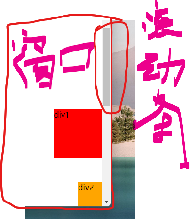
1.positon: fixed;固定定位。
1.1这里div1绝对定位因为所有父级都没有定位,所以根据浏览器定位,但浏览器有滚动效果,基于浏览器定位的绝对定位是受滚动条影响的。 随着页面滚动,该div1的位置也会动。
1.2position: fixed;固定定位。根据之前上网查,我的理解是可以认为是相对于浏览器的(可视)窗口进行定位。其不受页面是否有滚动影响。div2都会固定在浏览器可视窗口的最右下角。
<!DOCTYPE html>
<html lang="en">
<head>
    <meta charset="UTF-8">
    <title>Title</title>
    <style>
      /* 这里将body高度设为高于屏幕实际高度,目的是测试滚动条对绝对定位、固定定位的影响。从而更好的理解两种定位。 */
      body{
        height: 1000px;
      }
      /* 这里div1绝对定位因为所有父级都没有定位,所以根据浏览器定位,但浏览器有滚动效果,基于浏览器定位的绝对定位是受滚动条影响的。
       随着页面滚动,该div1的位置也会动。*/
      div:nth-of-type(1){
        width: 100px;
        height: 100px;
        background-color: red;
        position: absolute;
        right: 0;
        bottom: 0;
      }
      /* position: fixed;固定定位。根据之前上网查,我的理解是可以认为是相对于浏览器的(可视)窗口进行定位
      其不受页面是否有滚动影响。div2都会固定在浏览器可视窗口的最右下角。*/
      div:nth-of-type(2){
        width: 50px;
        height: 50px;
        background-color: orange;
        position: fixed;
        right: 0;
        bottom: 0;
      }
    </style>
</head>
<body>
  <div>div1</div>
  <div>div2</div>
</body>
</html>
效果:
2024-07-20
1.z-index设置图层高度,opacity设置透明度,取值在0~1之间
index.html:
<!DOCTYPE html>
<html lang="en">
<head>
    <meta charset="UTF-8">
    <title>Title</title>
    <link href="css/style.css" rel="stylesheet">
</head>
<body>
  <div id="content">
    <ul>
      <li><img src="images/SpringBootBackground.jpg"/></li>
      <li class="tipBackground"></li>
      <li class="tipText">学SpringBoot,找狂神说</li>
      <li>时间:2099-01-01</li>
      <li>地点:火星基地</li>
    </ul>
  </div>
</body>
</html>
style.css:
#content{
    margin: 0;
    padding: 0;
    font-size: 12px; /* 字体12px,行高25px是常用的一个选择组合 */
    line-height: 25px;
    border: 1px solid #000000;
    width: 140px;
}
ul{
    margin: 0;
    padding: 0;
    list-style: none; /* 去掉列表项前符号 */
    position: relative; /* 给url一个定位,用于子元素li“学SpringBoot,找狂神说"可以绝对定位 */
}
img{
    width: 141px;
    height: 117px;
}
.tipText, .tipBackground{
    position: absolute;
    top: 90px;
    width: 140px;
    height: 25px;
}
.tipText{
    z-index: 999; /* z-index设置图层高度 */
    color: white;
}
.tipBackground{
    background: #000000;
    opacity: 1; /* 透明度,取值在0~1之间 */
}
至此狂神说CSS教程已学完。

