echarts柱状图之渐变色
修改Echarts的动态排序柱状图(https://echarts.apache.org/examples/zh/editor.html?c=bar-race)
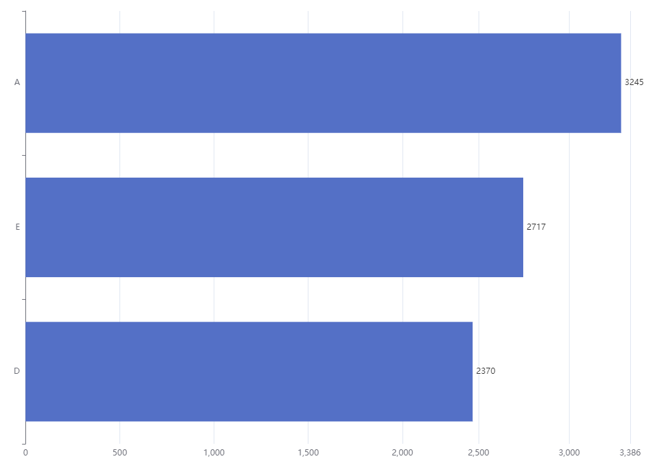
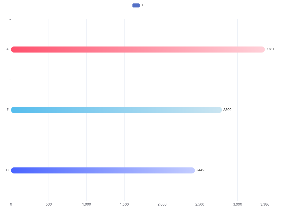
修改后
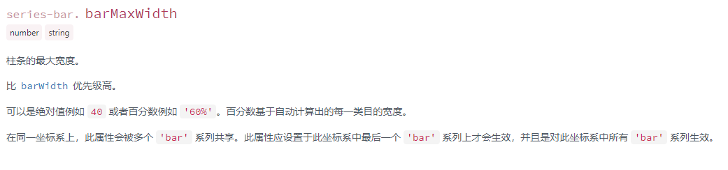
一、修改其柱状图的大小(barWidth)
① 进入其Echarts的官网https://echarts.apache.org/zh/index.html
② 在文档的配置项手册中,可搜索到你需要的配置
③ 我们修改的是柱状图,找到如图中的series下面type为bar

④ 来自于官网的配置项文档该配置的描述
二、修改柱状的颜色为渐变色(全部柱状颜色相同)
在series属性中添加以下代码
itemStyle:{
        // 设置柱状渐变色
         color:new echarts.graphic.LinearGradient(0, 0, 1, 1, [
            {
              offset: 0,
              color: '#3861fb'
            },
            {
              offset: 1,
              color: '#2fc0d2'
            }
         ]),
    // 设置柱状圆角
    barBorderRadius:10,

}
三、修改柱状的颜色为渐变色(柱状颜色不相同)
在series属性中添加以下代码,colorList的颜色可随自己所需修改
itemStyle:{
        // 设置柱状渐变色
        normal:{
          // 设置柱状圆角
          barBorderRadius:10,
          // 设置每根柱状的颜色不一样且为渐变色
          color:function(params){
            let colorList = [
              ['#FF516D', '#FFD1D9'],
              ['#DF67F5', '#F4C7FC'],
              ['#7245FF', '#D6C9FF'],
              ['#4964FF', '#C4CDFF'],
              ['#56BDED', '#CBE5F1'],
              ['#4EE0B6', '#B7EBDC'],
              ['#6AE34C', '#CAF3C0'],
              ['#FFD140', '#FFEEBA'],
              ['#FA8941', '#FED1B4'],
              ['#FF2B2B', '#FFC4C4']
            ]
            let index = params.dataIndex;
            if(index >= colorList.length){
              index = params.dataIndex - colorList.length;
            }
            return new echarts.graphic.LinearGradient(0,0,1,1, [
              {
                offset: 0,
                color: colorList[index][0]
              },
              {
                offset: 1,
                color: colorList[index][1]
              }
            ])
          }
        }
      }
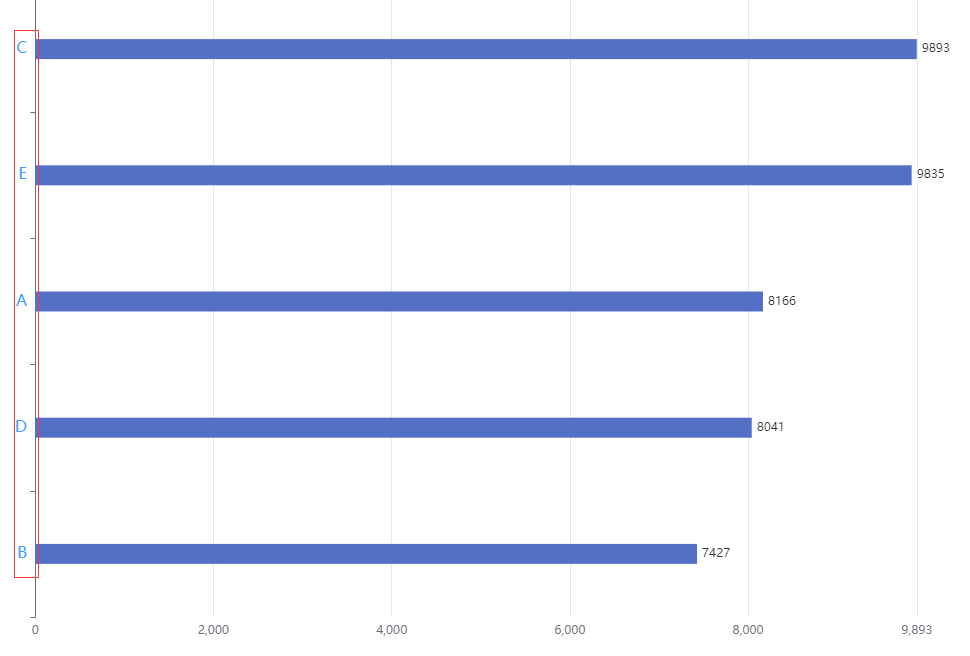
四、修改坐标轴上面的字体大小及其颜色(以纵坐标为例,横坐标理同)
在xAxis(横)或者yAxis(纵),添加属性axisLabel修改其样式
yAxis: {
    type: 'category',
    data: ['A', 'B', 'C', 'D', 'E'],
    inverse: true,
    animationDuration: 300,
    animationDurationUpdate: 300,
    max: 4, // only the largest 3 bars will be displayed
    axisLabel:{
      // 修改字体样式
      textStyle: {
        color: '#409eff'
      },
      // 修改字体大小
      fontSize:16
    }
 },
修改后纵坐标字体样式:
注:该文档为个人理解所写,有误可建议修改

 浙公网安备 33010602011771号