【小程序】自定义组件:列表goodsList
教程请查看小程序开发文档:https://developers.weixin.qq.com/miniprogram/dev/framework/custom-component/
自定义组件:自定义组件可以将不同页面具有共同样式的布局独立开来,减少代码的重复冗余,也能更好的维护组件。
例:自定义弹框,自定义加载,自定义列表等等,自定义弹框网上教程很多,此处就讲讲自定义列表,原理大同小异,细节需要多加注意。
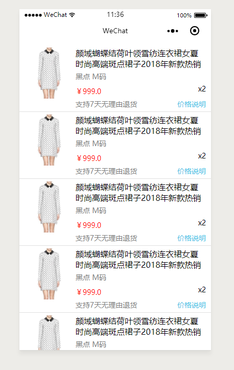
最终效果:
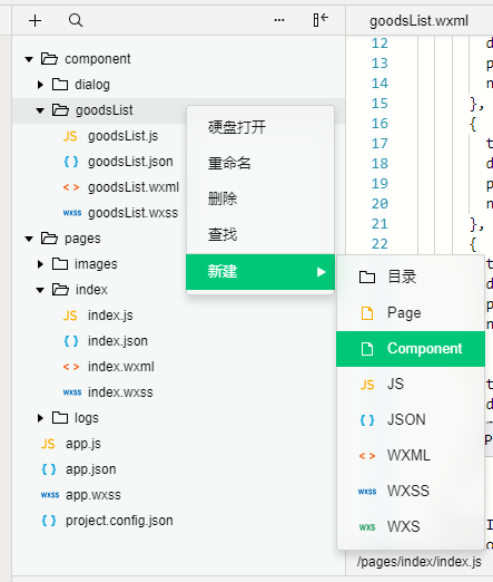
1.建立component文件夹,专门存放自定义组件 如:goodsList 自定义组件
2,编写自定义组件基本样式,即列表中的一个item
goodsList.wxml
<!--component/goodsList/goodsList.wxml-->
<view class='list-group'>
  <view class='list-left'>
    <image src='/pages/images/goods.png' class='img' mode="widthFix"></image>
  </view>
  <view class='list-right'>
    <view class='title'>{{title}}</view>
    <view class='desc'>{{desc}}</view>
    <view class='price-box'>
      <text class='price'>{{price}}</text>
      <text class='num'>x{{num}}</text>
    </view>
    <view class='illustrate'>
      <text>支持7天无理由退货</text>
      <a class='more'>价格说明</a>
    </view>
  </view>
</view>
goodsList.wxss 此处使用 :host选择器,:host选择器主要作用于组件整体,不针对组件内部样式。需要注意的是:组件本身不是block,需要先设置为block后,相应的样式才会生效。
其他选择器:(建议使用class选择器)
#a { } /* 在组件中不能使用 */
[a] { } /* 在组件中不能使用 */
button { } /* 在组件中不能使用 */
.a > .b { } /* 除非 .a 是 view 组件节点,否则不一定会生效 */
/* component/goodsList/goodsList.wxss */
:host{
  display: block;
  border-bottom: 1px solid #e0e0e0;
}
.list-group{
  display: flex;
  padding:5px 10px;
}
 .img{
   width:100%;
}
.list-left{
  flex:0 0 100px;
}
.list-right{
  flex:1;
}
.title{
  font-size:16px;
  display: -webkit-box;
  overflow: hidden;
  -webkit-line-clamp: 2;
  text-overflow: ellipsis;
  -webkit-box-orient: vertical;
}
.desc{
  font-size:14px;
  color:#7a7a7a;
  margin-top:5px;
}
.price-box{
  margin-top:5px;
}
.price{
  font-size:14px;
  color:red;
}
.num{
  font-size:14px;
  float: right;
}
.illustrate{
  font-size:14px;
  margin-top:5px;
  color:#7a7a7a;
}
.more{
  float: right;
  color:rgb(67,197,230);
}
goodsList.js
// component/goodsList/goodsList.js
Component({
  /**
   * 组件的属性列表
   */
  properties: {
    title: {            // 属性名
      type: String,     // 类型(必填),目前接受的类型包括:String, Number, Boolean, Object, Array, null(表示任意类型)
      value: '标题'     // 属性初始值(可选),如果未指定则会根据类型选择一个
    },
    desc: {
      type: String,
      value: '描述'
    },
    price: {
      type: String,
      value: '价格'
    },
    num: {
      type: Number,
      value: 2
    }
  },

  /**
   * 组件的初始数据
   */
  data: {

  },

  /**
   * 组件的方法列表
   */
  methods: {

  }
})
goosList.josn ( 必须启用,否则自定义组件不能被识别 )
{
  "component": true,
  "usingComponents": {}
}
3,在index中引入自定义组件
index.wxml
<!--goodsList自定义组件引用  -->
<goodsList id="goodsList"  wx:for="{{goodsArray}}" wx:key="unique"
  title="{{item.title}}"
  desc="{{item.desc}}"
  price="{{item.price}}"
  num="{{item.num}}">
</goodsList>
index.js
Page({
  data: {
    goodsArray: [
      {
        title: '颜域蝴蝶结荷叶领雪纺连衣裙女夏时尚高端斑点裙子2018年新款热销',
        desc: '黑点 M码',
        price: '¥999.0',
        num: '2'
      },
      {
        title: '颜域蝴蝶结荷叶领雪纺连衣裙女夏时尚高端斑点裙子2018年新款热销',
        desc: '黑点 M码',
        price: '¥999.0',
        num: '2'
      },
      {
        title: '颜域蝴蝶结荷叶领雪纺连衣裙女夏时尚高端斑点裙子2018年新款热销',
        desc: '黑点 M码',
        price: '¥999.0',
        num: '2'
      },
      {
        title: '颜域蝴蝶结荷叶领雪纺连衣裙女夏时尚高端斑点裙子2018年新款热销',
        desc: '黑点 M码',
        price: '¥999.0',
        num: '2'
      },
      {
        title: '颜域蝴蝶结荷叶领雪纺连衣裙女夏时尚高端斑点裙子2018年新款热销',
        desc: '黑点 M码',
        price: '¥999.0',
        num: '2'
      }
    ]
  },
  canvasIdErrorCallback: function (e) {
    console.error(e.detail.errMsg)
  },
  onReady: function (e) {
    this.goodsList = this.selectComponent("#goodsList");
  }
})
index.json ( 必须引入自定义组件,否则无法使用 )
{
  "usingComponents": {
    "goodsList": "/component/goodsList/goodsList"
  }
}
以上,一个自定义列表组件基本完成,还有一些事件处理,类似于vue中的事件派发,官网教程示例:
按照个人理解,此处的事件类似于vue中,子组件向父组件派发事件,父组件监听事件,然后进行事件处理并执行。
Component({
  properties: {}
  methods: {
    onTap: function(){
      var myEventDetail = {} // detail对象,提供给事件监听函数
      var myEventOption = {} // 触发事件的选项
      this.triggerEvent('myevent', myEventDetail, myEventOption)
    }
  }
})
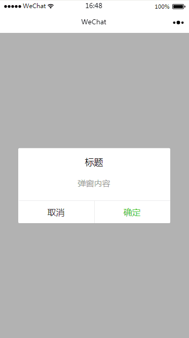
具体示例可以查看 https://www.jianshu.com/p/8a2a730d9e60,实现自定义弹框组件。
效果如图:

 浙公网安备 33010602011771号