css实现水平/垂直居中效果
一、如果是已知宽高的元素做水平/垂直居中效果的话,可以直接用具体的数值指定定位布局或偏移布局,这个就不过多讨论。这里主要介绍在不知宽高或需要弹性布局下的几种实现方式。
二、
1.table表格法
思路:显示设置父元素为:table,子元素为:cell-table,vertical-align: center
优点:父元素(parent)可以动态的改变高度(table元素的特性)
缺点:IE8以下不支持
代码实现:
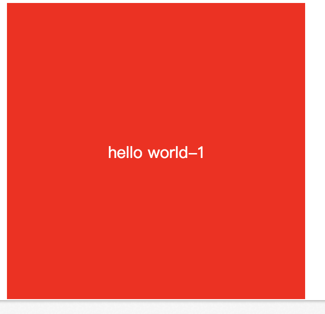
.parent1{
    display: table;
    height:300px;
    width: 300px;
    background-color: red;
}
.parent1 .child{
    display: table-cell;
    vertical-align: middle;
    text-align: center;
    color: #fff;
    font-size: 16px;
}

</style>
<body>
    <div class="parent1">
        <div class="child">hello world-1</div>
    </div>
</body>
效果:
2.空元素法
思路:使用一个空标签span设置他的vertical-align基准线为中间,并且让他为inline-block,宽度为0
缺点:多了一个没用的空标签,display:inline-blockIE 6 7是不支持的(添加上:_zoom1;*display:inline)。当然也可以使用伪元素来代替span标签,不过IE支持也不好
代码实现:
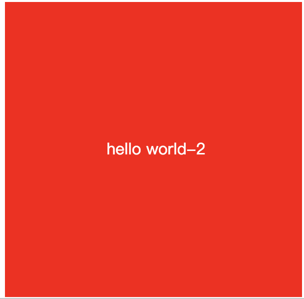
<style>
.parent2{
    height:300px;
    width: 300px;
    text-align: center;
    background: red;
}
.parent2 span{
    display: inline-block;;
    width: 0;
    height: 100%;
    vertical-align: middle;
    zoom: 1;/*BFC*/
    *display: inline;
}
.parent2 .child{
    display: inline-block;
    color: #fff;
    zoom: 1;/*BFC*/
    *display: inline;
}

</style>
<body>

    <div class="parent2">
        <span></span>
        <div class="child">hello world-2</div>
    </div>
</body>
效果:
3.-50%定位法
思路:子元素绝对定位,距离顶部 50%,左边50%,然后使用css3 transform:translate(-50%; -50%)
优点:高大上,可以在webkit内核的浏览器中使用
缺点:不支持IE9以下不支持transform属性
代码实现:
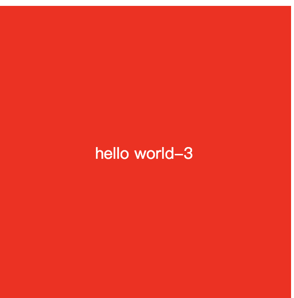
<style>
.parent3{
    position: relative;
    height:300px;
    width: 300px;
    background: red;
}
.parent3 .child{
    position: absolute;
    top: 50%;
    left: 50%;
    color: #fff;
    transform: translate(-50%, -50%);
}
</style>
<body>
<div class="parent3">
        <div class="child">hello world-3</div>
    </div>
</body>
效果:
4.思路:使用css3 flex布局法
优点:简单 快捷
缺点:低端pc浏览器和低版本的安卓设备不支持,不过现在应该很少用了
代码实现:
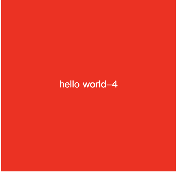
<style>
.parent4{
    display: flex;
    justify-content: center;
    align-items: center;
    width: 300px;
    height:300px;
    background: red;
}
.parent4 .child{
    color:#fff;
}
</style>
<body>
    <div class="parent4">
        <div class="child">hello world-4</div>
    </div>
</body>
效果:
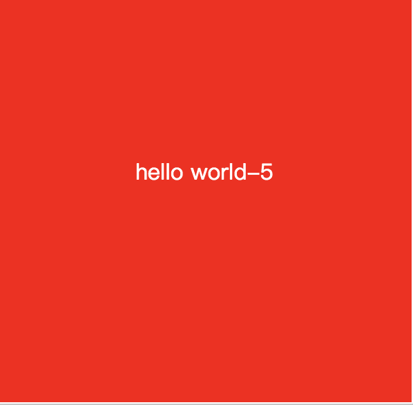
5.绝对定位法
思路:父元素使用定位(相对/绝对都行),子元素设置position:absolute; top: 0; left: 0; bottom: 0; right: 0; margin:auto;
优点:兼容性好,父元素宽高可变,使用非常灵活,在做全屏居中的时候很好
缺点:子元素还是要指定宽高,可以用百分比
代码实现:
.parent5{
    position:absolute;
    width: 300px;
    height:300px;
    background: red;
}
.parent5 .child{
    color:#fff;
    margin: auto;
    position:absolute;
    top:0;
    left:0;
      right:0;
      bottom:0;
      text-align:center;
      width:50%;
    height:20%;
}
</style>
<body>
    <div class="parent5">
        <div class="child">hello world-5</div>
    </div>
</body>
效果:
三、在追逐性能时代,现在基本都是webkit内核了,拥抱css3弹性布局,个人比较推荐用4、5方法,4.flex布局法适合在局部使用。5.绝对定位法适合在全屏场景使用,比如弹框中。
关注公众号“云海生活”获取更多技术分享


 浙公网安备 33010602011771号