页面中常用到的小样式
1、标签

.i{
  background:red;
  width:40px;
  height:20px;
  position:relative;
  color:white;
}
.i:after{
  content:'';
  position: absolute;
  display: inline-block;
  right: -12px;
  border: 10px solid red;
  border-width: 10px 6px;
  border-right-color: transparent;
  z-index: -1;
}
<div class="i"></div>

.hot {
  position: absolute;
  font-size: 9px;
  line-height: 13px;
  color: #fff;
  height: 13px;
  padding: 1px 4px;
  text-align: center;
  top: 5px;
  white-space: nowrap;
  background-image: linear-gradient(-270deg, #de00e0 0%, #ff3434 96%);
  border-top-left-radius: 6px;
  border-bottom-right-radius: 6px;
}
<div class="hot">HOT</div>

.quan{
  background:linear-gradient(-270deg, #f81818 0%, #ff3434 96%);;
  width:24px;
  height:25px;
  position:relative;
  border-radius:3px;
  color:#fff;
  line-height:25px;
  text-align:center;
  font-size:13px;
}

.quan:before{
  content:'';
  width:3px;
  height:3px;
  background:#fff;
  position:absolute;
  top:50%;
  left:0;
  margin-top:-2px;
  border-radius:1px;
}

.quan:after{
  content:'';
  width:3px;
  height:3px;
  background:#fff;
  position:absolute;
  top:50%;
  right:0;
  margin-top:-2px;
  border-radius:1px;
}
<div class="quan">券</div>

.index-c-badge:before{
    content: '';
    display: inline-block;
    height: 13px;
    width: 3px;
    margin: 0 1px 0 2px;
    background-image: linear-gradient(29deg, #ff9917 6%, #ff4f39 93%);
    border-radius: 100px;
    -webkit-transform: rotateZ(30deg);
    -moz-transform: rotateZ(30deg);
    -ms-transform: rotateZ(30deg);
    -o-transform: rotateZ(30deg);
    transform: rotateZ(30deg);
}
.index-c-badge:after {
    content: '';
    display: inline-block;
    height: 13px;
    width: 3px;
    margin: 0 1px 0 2px;
    background-image: linear-gradient(-30deg, #a23cee 12%, #663de8 94%);
    border-radius: 100px;
    -webkit-transform: rotateZ(30deg);
    -moz-transform: rotateZ(30deg);
    -ms-transform: rotateZ(30deg);
    -o-transform: rotateZ(30deg);
    transform: rotateZ(30deg);
}
<i class='index-c-badge'></i> 标题 <i class='index-c-badge'</i>
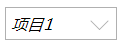
i{
  position: relative;
  padding:5px;
  display:block;
  width:100px;
  border:1px solid #b0b0b0;
}
i:after{
  content: '';
  position: absolute;
  width: 12px;
  height: 12px;
  top: 50%;
  right: 10px;
  border: 1px solid #b0b0b0;
  border-width: 0 1px 1px 0;
  -webkit-transform: translateY(-50%) rotate(45deg);
  transform: translateY(-50%) rotate(45deg);
  -webkit-transition: all .2s;
  transition: all .2s;
  margin-top: -3px;
}
i.active:after{
  -webkit-transform: translateY(-50%) rotate(-135deg);
   transform: translateY(-50%) rotate(-135deg);
}
<i>项目1</i>

.a{
  height: 16px;
  width:50px;
  display:inline-block;
  -webkit-border-radius: 2px 2px 0 2px;
  border-radius: 2px 2px 0 2px;
  background-color: #ff6565;
  position:relative;
  color:#fff;
  padding:2px;
  line-height:16px;
}
.a:before{
  content:'';
  position:absolute;
  right: -7px;
  bottom: -7px;
  display: inline-block;
  vertical-align: top;
  width: 0;
  height: 0;
  overflow: hidden;
  border: 7px dashed transparent;
  border-left-style: solid;
  border-left-color: #fd7676;;
}
.a:after{
  content:'';
  position:absolute;
  right: 0;
  bottom: 0;
  display: inline-block;
  width: 7px;
  height: 7px;
  overflow: hidden;
  background:#ff6565;
}
<i class='a'>text</i>

.text{
    position: relative;
    display: inline-block;
    padding: 0 5px;
    line-height: 15px;
    font-size: 15px;
    color: #ccc;
    margin-left:100px;
}
.text:before,
.text:after{
    content: "";
    display: block;
    position: absolute;
    height: 1px;
    width: 65px;
    top: 50%;
    margin-top: -1px;
}
.text:before {
    left: -65px;
    background: linear-gradient(90deg,rgba(242,242,242,0) 0%,#ccc 100%);
}
.text:after {
    right: -65px;
    background: linear-gradient(-90deg,rgba(242,242,242,0) 0%,#ccc 100%);
}

<span class='text'>title</span>

 浙公网安备 33010602011771号