


css中rem,em
名词解释,rem是使用的重点
1.rem的定义理解: 通过设置 根元素<html>的font-size的大小,来控制整个html文档内的字体大小、元素宽高、内外边距等,

2.rem(font size of the root element)是指相对于根元素的字体大小的单位。
 em(font size of the element)是指相对于父元素的字体大小的单位。
 它们之间其实很相似,只不过一个计算的规则是依赖根元素一个是依赖父元素计算。
demo
<!DOCTYPE html>
<html lang="en" style="font-size:100px;">
<head>
<meta charset="UTF-8">
<meta name="viewport" content="width=device-width, initial-scale=1.0">
<title>Document</title>
</head>
<style>
.direction{
width:800px;
height:300px;
margin:auto;
text-align: center;
border:1px solid #ff0000;
}
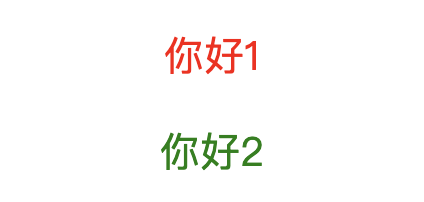
.direction p:nth-of-type(1){
font-size:0.2rem;
color:red;
}
.direction p:nth-of-type(2){
font-size:20px;
color:green;
}
</style>
<body>
<div class="direction">
<p>你好1</p>
<p>你好2</p>
</div>
</body>
</html>
相信坚持的力量,日复一日的习惯.
分类:
css3


【推荐】国内首个AI IDE,深度理解中文开发场景,立即下载体验Trae
【推荐】编程新体验,更懂你的AI,立即体验豆包MarsCode编程助手
【推荐】抖音旗下AI助手豆包,你的智能百科全书,全免费不限次数
【推荐】轻量又高性能的 SSH 工具 IShell:AI 加持,快人一步
· 无需6万激活码!GitHub神秘组织3小时极速复刻Manus,手把手教你使用OpenManus搭建本
· C#/.NET/.NET Core优秀项目和框架2025年2月简报
· Manus爆火,是硬核还是营销?
· 终于写完轮子一部分:tcp代理 了,记录一下
· 【杭电多校比赛记录】2025“钉耙编程”中国大学生算法设计春季联赛(1)
2019-05-09 php-fpm 重启
2019-05-09 text-overflow:ellipsis;