


无限级树状图css实现

<style>
    .tree{
        width:1000%;
    }
    .tree ul {
    padding-top: 20px; position: relative;
    transition: all 0.5s;
    -webkit-transition: all 0.5s;
    -moz-transition: all 0.5s;
    }

.tree li {
    float: left; text-align: center;
    list-style-type: none;
    position: relative;
    padding: 20px 5px 0 5px;

    transition: all 0.5s;
    -webkit-transition: all 0.5s;
    -moz-transition: all 0.5s;
}

/*We will use ::before and ::after to draw the connectors*/

.tree li::before, .tree li::after{
    content: '';
    position: absolute; top: 0; right: 50%;
    border-top: 1px solid #ccc;
    width: 50%; height: 20px;
}
.tree li::after{
    right: auto; left: 50%;
    border-left: 1px solid #ccc;
}

/*We need to remove left-right connectors from elements without
any siblings*/
.tree li:only-child::after, .tree li:only-child::before {
    display: none;
}

/*Remove space from the top of single children*/
.tree li:only-child{ padding-top: 0;}

/*Remove left connector from first child and
right connector from last child*/
.tree li:first-child::before, .tree li:last-child::after{
    border: 0 none;
}
/*Adding back the vertical connector to the last nodes*/
.tree li:last-child::before{
    border-right: 1px solid #ccc;
    border-radius: 0 5px 0 0;
    -webkit-border-radius: 0 5px 0 0;
    -moz-border-radius: 0 5px 0 0;
}
.tree li:first-child::after{
    border-radius: 5px 0 0 0;
    -webkit-border-radius: 5px 0 0 0;
    -moz-border-radius: 5px 0 0 0;
}

/*Time to add downward connectors from parents*/
.tree ul ul::before{
    content: '';
    position: absolute; top: 0; left: 50%;
    border-left: 1px solid #ccc;
    width: 0; height: 20px;
}

.tree li a{
    border: 1px solid #ccc;
    padding: 5px 10px;
    text-decoration: none;
    color: #666;
    font-family: arial, verdana, tahoma;
    font-size: 11px;
    display: inline-block;

    border-radius: 5px;
    -webkit-border-radius: 5px;
    -moz-border-radius: 5px;

    transition: all 0.5s;
    -webkit-transition: all 0.5s;
    -moz-transition: all 0.5s;
}

/*Time for some hover effects*/
/*We will apply the hover effect the the lineage of the element also*/
.tree li a:hover, .tree li a:hover+ul li a {
    background: #c8e4f8; color: #000; border: 1px solid #94a0b4;
}
/*Connector styles on hover*/
.tree li a:hover+ul li::after,
.tree li a:hover+ul li::before,
.tree li a:hover+ul::before,
.tree li a:hover+ul ul::before{
    border-color:  #94a0b4;
}
</style>
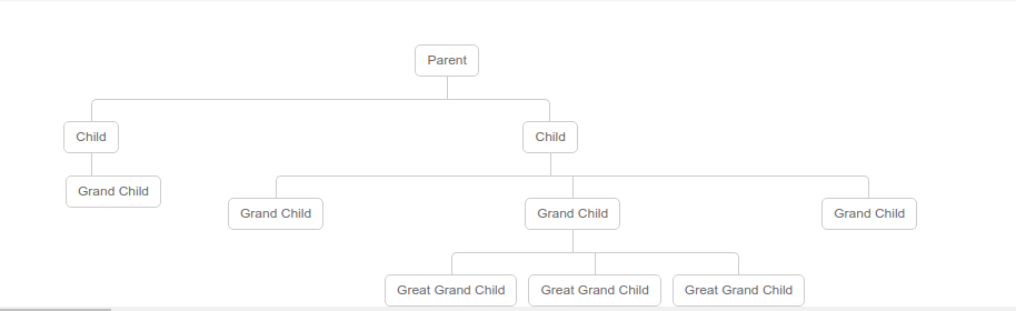
<ul>
    <li>
        <a href="#">Parent</a>
        <ul>
            <li>
                <a href="#">Child</a>
                <ul>
                    <li><a href="#">Grand Child</a></li>
                </ul>
            </li>
            <li>
                <a href="#">Child</a>
                <ul>
                    <li><a href="#">Grand Child</a></li>
                    <li>
                        <a href="#">Grand Child</a>
                        <ul>
                            <li><a href="#">Great Grand Child</a></li>
                            <li><a href="#">Great Grand Child</a></li>
                            <li><a href="#">Great Grand Child</a></li>
                        </ul>
                    </li>
                    <li><a href="#">Grand Child</a></li>
                </ul>
            </li>
        </ul>
    </li>
</ul>
相信坚持的力量,日复一日的习惯.


【推荐】国内首个AI IDE,深度理解中文开发场景,立即下载体验Trae
【推荐】编程新体验,更懂你的AI,立即体验豆包MarsCode编程助手
【推荐】抖音旗下AI助手豆包,你的智能百科全书,全免费不限次数
【推荐】轻量又高性能的 SSH 工具 IShell:AI 加持,快人一步
· Linux系列:如何用heaptrack跟踪.NET程序的非托管内存泄露
· 开发者必知的日志记录最佳实践
· SQL Server 2025 AI相关能力初探
· Linux系列:如何用 C#调用 C方法造成内存泄露
· AI与.NET技术实操系列(二):开始使用ML.NET
· 无需6万激活码!GitHub神秘组织3小时极速复刻Manus,手把手教你使用OpenManus搭建本
· C#/.NET/.NET Core优秀项目和框架2025年2月简报
· Manus爆火,是硬核还是营销?
· 终于写完轮子一部分:tcp代理 了,记录一下
· 【杭电多校比赛记录】2025“钉耙编程”中国大学生算法设计春季联赛(1)