基础控件
import QtQuick 2.0
import QtQuick.Controls 2.5
import QtGraphicalEffects 1.12
Button {
id: container
// 提供对外字段属性
property string bckcolor: "#1AAD19"
property string bckHoverColor: Qt.lighter(bckcolor, 0.8)
property int backRadius: 2
// 设置字体
font.family: "Microsoft Yahei"
font.pixelSize: 20
implicitWidth: text.contentWidth + 24
implicitHeight: text.contentHeight + 8
contentItem: Text {
id: text
text: container.text
font: container.font
color: "#fff"
horizontalAlignment: Text.AlignHCenter
verticalAlignment: Text.AlignVCenter
}
background: Rectangle {
anchors.fill: parent
radius: backRadius
color: container.down ? bckcolor :
container.hovered ? bckHoverColor : bckcolor
layer.enabled: true
layer.effect: DropShadow {
color: bckcolor
}
}
}
 RowLayout {
        spacing: 20
        BaseButton {
            text: "Blue"
            Layout.preferredHeight: 28
            Layout.preferredWidth: 78
            font.pixelSize:  14
            backRadius: 4
            bckcolor: "#4785FF"
        }

        BaseButton {
            bckcolor: "#EC3315"
            Layout.preferredHeight: 28
            Layout.preferredWidth: 78
            font.pixelSize:  14
            backRadius: 4
            text: "Red"

        }

        BaseButton {
            text: "Yellow"
            Layout.preferredHeight: 28
            Layout.preferredWidth: 78
            font.pixelSize:  14
            backRadius: 4
            bckcolor: "#ED9709"
        }
    }

1.02 文本按钮、标准按钮、填充按钮、开关按钮、进度按钮、加载按钮、图标按钮、下拉按钮、Radio按钮
git:https://github.com/zhuzichu520/FluentUI
1.02 CheckBox
CheckBox {
text: "勾选框"
tristate: true
checkState: allChildrenChecked ? Qt.Checked :
anyChildChecked ? Qt.PartiallyChecked : Qt.Unchecked
nextCheckState: function() {
if (checkState === Qt.Checked)
return Qt.Unchecked
else
return Qt.Checked
}
onCheckStateChanged: {
console.log(checkState)
}
}
// 指定为同一个组,只能有一个能选中
ButtonGroup{
    id : btnGroup
    exclusive: true
}

Column {
    CheckBox {
        checked: true
        text: qsTr("First")
        ButtonGroup.group: btnGroup
    }
    CheckBox {
        ButtonGroup.group: btnGroup
        text: qsTr("Second")
    }
    CheckBox {
        ButtonGroup.group: btnGroup
        text: qsTr("Third")
    }
}
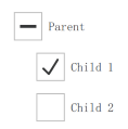
// 树形结构勾选组合
Column {
    ButtonGroup {
        id: childGroup
        exclusive: false
        checkState: parentBox.checkState
    }

    CheckBox {
        id: parentBox
        text: qsTr("Parent")
        checkState: childGroup.checkState
    }

    CheckBox {
        checked: true
        text: qsTr("Child 1")
        leftPadding: indicator.width
        ButtonGroup.group: childGroup
    }

    CheckBox {
        text: qsTr("Child 2")
        leftPadding: indicator.width
        ButtonGroup.group: childGroup
    }
}
1.03 CheckBox
ComboBox{
width: 200
displayText: currentText
model: [
"Banana" ,
"Apple" ,
"Coconut"
]
onAccepted: {
if (find(editText) === -1)
model.append({text: editText})
}
onCurrentIndexChanged: {
console.log(currentIndex)
}
onCurrentTextChanged: {
console.log(currentText)
}
}
ComboBox {
   y: 200
     textRole: "key"
     model: ListModel {
         ListElement { key: "First"; value: 123 }
         ListElement { key: "Second"; value: 456 }
         ListElement { key: "Third"; value: 789 }
     }
}
ComboBox {
	model: 10
	editable: true
	validator: RegExpValidator {
		regExp:/[0-9A-Z]+[.][0-9]/
	}
	onAcceptableInputChanged: {
		console.log(acceptableInput)
	}
}
1.04 TextInput
允许用户输入一行文本。元素支持输入约束,如validator、inputMask、echoMode.
可以在文本输入中单击以更改焦点。使用KeyNavigation属性可以通过键盘更改焦点.
1.05 TextEdit


【推荐】国内首个AI IDE,深度理解中文开发场景,立即下载体验Trae
【推荐】编程新体验,更懂你的AI,立即体验豆包MarsCode编程助手
【推荐】抖音旗下AI助手豆包,你的智能百科全书,全免费不限次数
【推荐】轻量又高性能的 SSH 工具 IShell:AI 加持,快人一步
· 全程不用写代码,我用AI程序员写了一个飞机大战
· MongoDB 8.0这个新功能碉堡了,比商业数据库还牛
· 记一次.NET内存居高不下排查解决与启示
· DeepSeek 开源周回顾「GitHub 热点速览」
· 白话解读 Dapr 1.15:你的「微服务管家」又秀新绝活了