
css水平垂直居中的12种方式
如何实现元素的水平垂直居中?这是一道常见面试题,本篇文章将就两种情形解答这一问题
(1)居中元素固定尺寸
(2)居中元素不定尺寸
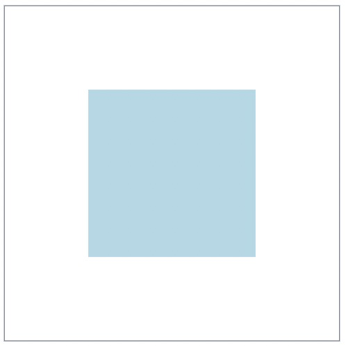
.container {
    position: relative;
    width: 500px;
    height: 500px;
    border: 1px solid #465468;
}
.box {
    position: absolute;
    top: 50%;
    left: 50%;
    width: 250px;
    height: 250px;
    margin-top: -125px;  /* 设置为高度的一半 */
    margin-left: -125px; /* 设置为宽度的一半 */
    background-color: lightblue;
}
<div class="container">
<div class="box"></div>
</div>
效果图:
.container {
    position: relative;
    width: 500px;
    height: 500px;
    border: 1px solid #465468;
}
.box {
    position: absolute;
    top: 0;
    right: 0;
    bottom: 0;
    left: 0;
    width: 250px;
    height: 250px;
    margin: auto;
    background-color: lightblue;
}
<div class="container">
<div class="box"></div>
</div>
效果图:
.container {
    position: relative;
    width: 500px;
    height: 500px;
    border: 1px solid #465468;
}
.box {
    position: absolute;
    top: calc(50% - 125px);
    left: calc(50% - 125px);
    width: 250px;
    height: 250px;
    background-color: lightblue;
}
<div class="container">
<div class="box"></div>
</div>
效果图:
1. position + absolute (依赖 translate 2d 的兼容性)
.father {
    position: relative;
    width: 500px;
    height: 500px;
    border: 1px solid #465468;
}
.box {
    position: absolute;
    top: 50%;
    left: 50%;
    transform: translate(-50%, -50%);
    background-color: lightblue;
}
<div class="father">
<div class="box">
<img
style="width: 300px; height: 200px;"
src="https://tenfei02.cfp.cn/creative/vcg/800/new/VCG211314245608.jpg"
>
</div>
</div>
效果图:

2. flex + justify-content + align-items
.father {
    display: flex;
    width: 500px;
    height: 500px;
    border: 1px solid #465468;
    justify-content: center;
    align-items: center;
}
<div class="father">
<div class="box">
<img
style="width: 300px; height: 200px;"
src="https://tenfei02.cfp.cn/creative/vcg/800/new/VCG211314245608.jpg"
>
</div>
</div>
效果图:
.father {
    display: flex;
    width: 500px;
    height: 500px;
    border: 1px solid #465468;
}
.box {
    margin: auto;
}
<div class="father">
<div class="box">
<img
style="width: 300px; height: 200px;"
src="https://tenfei02.cfp.cn/creative/vcg/800/new/VCG211314245608.jpg"
>
</div>
</div>
效果图:
.father {
    display: grid;
    width: 500px;
    height: 500px;
    border: 1px solid #465468;
}
.box {
    justify-self: center;
    align-self: center;
}
<div class="father">
<div class="box">
<img
style="width: 300px; height: 200px;"
src="https://tenfei02.cfp.cn/creative/vcg/800/new/VCG211314245608.jpg"
>
</div>
</div>
效果图:
5. 行内块元素 + line-height (元素内容为文字时生效)
.father {
    width: 500px;
    height: 500px;
    line-height: 500px;
    border: 1px solid #465468;
    text-align: center;
}
.box {
    display: inline-block;
    vertical-align: middle;
    line-height: inherit;
}
<div class="father">
<div class="box">
不定尺寸
</div>
</div>
效果图:
.father {
    width: 500px;
    height: 500px;
    border: 1px solid #465468;
    text-align: center;
    font-size: 0px;
}
.box {
    display: inline-block;
    vertical-align: middle;
}
/* 辅助元素 */
.father::after {
    content: "";
    display: inline-block;
    height: 100%;
    vertical-align: middle;
}
<div class="father">
<div class="box">
<img
style="width: 300px; height: 200px;"
src="https://tenfei02.cfp.cn/creative/vcg/800/new/VCG211314245608.jpg"
>
</div>
</div>
效果图:
.father {
    width: 500px;
    height: 500px;
    border: 1px solid #465468;
    display: table-cell;
    text-align: center;
    vertical-align: middle;
}
.box {
    display: inline-block;
}
<div class="father">
<div class="box">
<img
style="width: 300px; height: 200px;"
src="https://tenfei02.cfp.cn/creative/vcg/800/new/VCG211314245608.jpg"
>
</div>
</div>
效果图:
.father {
    width: 500px;
    height: 500px;
    border: 1px solid #465468;
    text-align: center;
}
.box {
    display: inline-block;
}
<table>
<tbody>
<tr>
<td class="father">
<div class="box">
<img
style="width: 300px; height: 200px;"
src="https://tenfei02.cfp.cn/creative/vcg/800/new/VCG211314245608.jpg"
>
</div>
</td>
</tr>
</tbody>
</table>
效果图:
.father {
    width: 500px;
    height: 500px;
    border: 1px solid #465468;
    text-align: center;
    writing-mode: vertical-lr;
    text-align: center;
}
.inner {
    display: inline-block;
    width: 100%;
    writing-mode: horizontal-tb;
    text-align: center;
}
.box {
    display: inline-block;
    margin: auto;
}
<div class="father">
<div class="inner">
<div class="box">
<img
style="width: 300px; height: 200px;"
src="https://tenfei02.cfp.cn/creative/vcg/800/new/VCG211314245608.jpg"
>
</div>
</div>
</div>
效果图:
总结
- PC端有兼容性要求,宽高固定,推荐absolute + 负margin
- PC端有兼容要求,宽高不固定,推荐css-table
- PC端无兼容性要求,推荐flex
- 移动端推荐使用flex

 浙公网安备 33010602011771号