
Flex 布局(弹性盒子、弹性布局)
简介
Flex 布局(Flexible布局,弹性盒子)是在开发中常用的布局方式;
- 开启了 flex 布局的元素叫 flex container
- flex container 里面的直接元素叫做 flex items
- 设置 display 属性为 flex 或者 inline-flex 的元素可以成为 flex container
- 属性设置为 flex ,flex container 以 black-level 的形式存在
- 属性设置为 inline-flex ,flex container 以 inline-level 的形式存在
Flex 布局模型

应用在 flex container 上的 CSS 属性
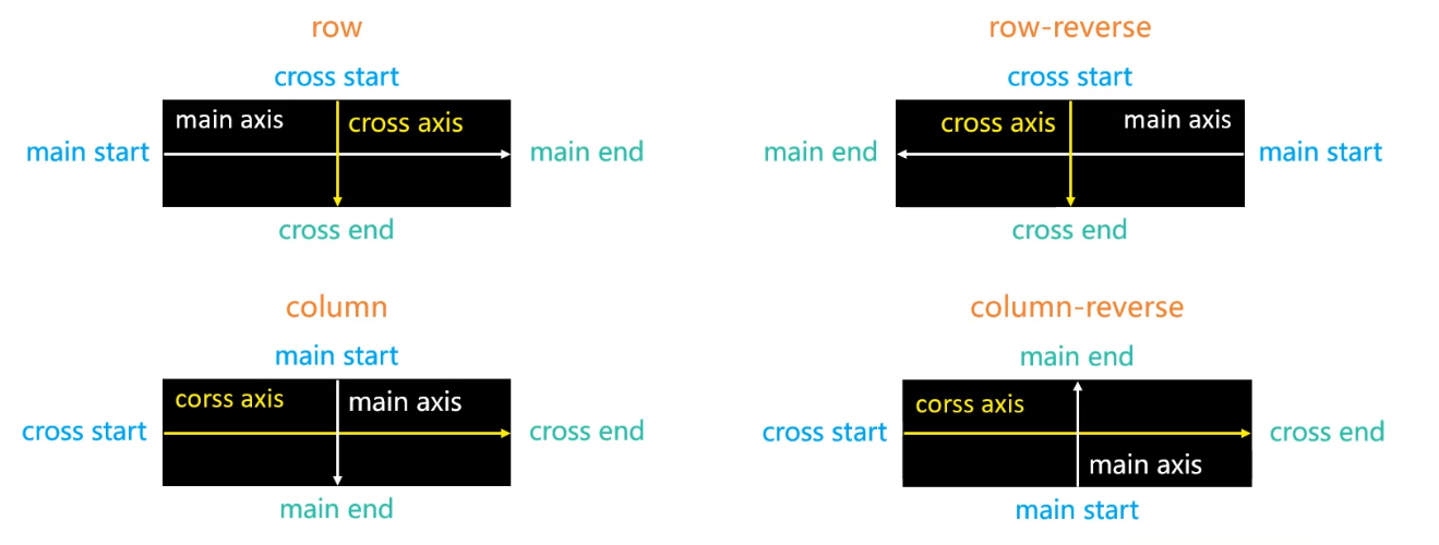
flex-direction
flex items 默认都是沿着 main axis(主轴) 从 main start 开始往 main end 方向排布;
flex-direction 决定了 main axis 的方向,有4个值:
row(默认值), row-reverse, column, column-reverse
flex-wrap
flex-wrap 决定了 flex container 是单行还是多行
- nowrap(默认):单行
- wrap: 多行
- wrap-reverse: 多行(对比 wrap, cross start 与 cross end 相反)
flex-flow
flex-flow 是 flex-direction || flex-wrap 的简写
- 比如
flex-flow: row wrap就等价于flex-direction: row;flex-wrap: wrap;
justify-content
justify-content 决定了 flex items 在 main axis 上的对齐方式;
- flex-start (默认值):与 main start 对齐;
- flex-end: 与 main-end 对齐;
- center: 居中对齐;
- space-between:
- flex items 之间的距离相等;
- 与main start, main end 两端对齐;
- space-around:
- flex items 之间的距离相等;
- flex items 与 main start, main end 两端的距离是 flex items 之间距离的一半;

align-items
align-items 决定了 flex items 在 cross axis 上的对齐方式;
- stretch(默认值):当 flex items 在 cross axis 方向的 size 为 auto 时,会自动拉伸至 flex container
- flex-start: 与 cross start 对齐
- flex-end: 与 cross end 对齐
- conter: 居中对齐
- baseline: 与基准线对齐

align-content
align-content 决定了多行 flex items 在 cross axis 上的对齐方式,用法与 justify-content 类似;
- stretch(默认值):与 align-item 的 stretch 类似
- flex-start: 与 cross start 对齐
- flex-end: 与 cross end 对齐
- conter: 居中对齐
- space-between:
- flex items 之间的距离相等;
- flex items 与 main start, main end 两端对齐;
- space-around:
- flex items 之间的距离相等;
- flex items 与 main start, main end 之间的距离是 flex items 之间距离的一半;

应用在 flex items 上的 CSS 属性
order
order 决定了 flex items 的排布顺序
- 默认值是 0;
- 可以设置任意整数 (正整数,负整数, 0),值越小越排在前面;
flex-grow
flex-grow 决定了 flex-items 如何扩展
- 可以设置任何非负数数字(正小数,正整数,0),默认值是0;
- 当 flex container 在 main axis 方向上有剩余 size 时,flex-grow 属性才有效;
- 如果所有 flex items 的 flex-grow 总和 sum 超过 1,每个 flex item 扩展的 size 为:
flex container 的剩余 size * flex-grow / sum; - 如果所有 flex items 的 flex-grow 总和不超过 1,每个 flex item 扩展的 size 为:
flex container 的剩余 size * flex-grow - flex items 扩展后的最终 size 不能超过 max-width\max-height
flex-shrink
flex-shrink 决定了 flex items 如何收缩;
- 可以设置任意非负数字(正小数、正整数、0),默认值是 1;
- flex items 在 main axis 方向上超过了 flex container 的 size , flex-shrink 属性才会有效
每个 flex items 收缩的 size 为: - flex items 超出 flex container 的 size * 收缩比例 / 所有 flex items 的收缩比例之和
(详解)如果所有 flex items 的 flex-shrink 总和超过 1 ,每个 flex item 收缩的 size 为: - flex items 超出 flex container 的 size * 收缩比例 / 所有 flex items 的收缩比例之和
(详解)如果所有 flex items 的 flex-shrink 总和 sum 不超过 1 ,每个 flex item 收缩的 size 为 - flex items 超出 flex container 的 size * sum * 收缩比例 / 所有 flex items 的收缩比例之和
收缩比例 = flex-shrink * flex item 的 base size - base size 就是 flex item 放入 flex container 之前的 size
- flex items 收缩后的最终 size 不能小于 min-width \ min-height
flex-basis
flex-basis 用来设置 flex items 在 main axis 方向上的 base size
- auto (默认值)、content :取决于内容本身的 size
决定 flex items 最终 base size 的因素,从优先级高到低
- max-width \ max-height \ min-width \ min height
- flex-basis
- width\height
- 内容本身的 size
flex
flex 是 flex-grow flex-shrink? || flex-basis 的简写
- 默认值是 0 1 auto
- none: 0 0 auto
align-self
flex-items 可以通过 align-self 覆盖 flex container 设置的 align-items;
- auto(默认值): 遵从 flex container 的 align-items 设置;
- stretch, flex-start, flex-end, center, baseline 效果和 align-items 效果一致;
总结:
- 应用在 flex container 上的属性
1. flex-direction: 设置主轴(main axis)的方向
2. flex-warp: 设置 flex-items 是否可以换行
3. flex-flow: flex-direction flex-warp 属性连写
4. justify-content: 设置 flex items 在主轴(main axis)上的对齐方式
5. align-items: 设置 flex items 在交叉轴上的对齐方式(一般针对单行)
6. align-content: 设置 flex items 在交叉轴上的对齐方式(一般针对多行)- 应用在 flex items 上的属性
1. order: 设置 flex items 的排列顺序
2. flex-grow: 决定了 flex items 在主轴方向上如何扩展
3. flex-shrink: 决定了 flex items 在主轴方向上如何收缩
4. flex-basis: 设置 flex items 在主轴上的 base size
5. flex: flex-grow flex-shrink? || flex-basis 连写
6. align-self: 允许 flex items 覆盖 flex-container 设置的 align-items 属性

 浙公网安备 33010602011771号