一、仿照小米横向特效
<!DOCTYPE html>
<html>
<head lang="en">
    <meta charset="UTF-8">
    <title>仿小米横向特效</title>
    <style>
        .box{
            width: 200px;
            height: 300px;
            background-color: orchid;
            position: relative;
        }
        .hidden{
            display: none;
            width: 400px;
            height: 300px;
            background-color: orangered;
            position: absolute;
            top: 0;
            left: 100%;
        }
        .box:hover .hidden{
            display: block;
        }
    </style>
</head>
<body>
    <div  class="box">
        <div  class="hidden"></div>
    </div>
</body>
</html>
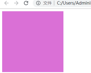
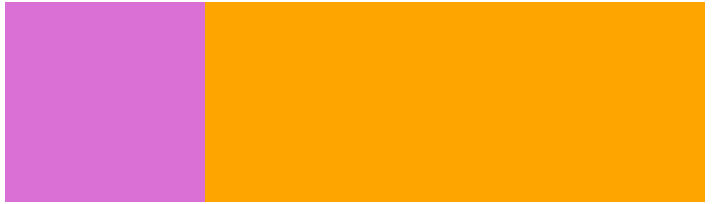
实现效果:(鼠标移动到上面之后弹出橙色区域部分)
二、弹出二维码
<!DOCTYPE html>
<html lang="en">
<head>
    <meta charset="UTF-8">
    <title>二维码弹出</title>
    <style>
    .box{
        width:200px;
        margin:220px;
        position:relative;
        text-align:center;
        background:#eea;
    }
    .hidden{
        width:200px;
        height:200px;
        display:none;
        position:absolute;
        bottom:100%;
        left:0px;
    }
    .box:hover .hidden{
        display:inline-block;
    }
    </style>
</head>
<body>
    <div class="box">百度二维码
        <div class="hidden"><img src="baidu.jpg"></div>
    </div>
</body>
</html>
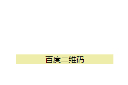
实现效果:(鼠标移动到上面之后弹出百度的二维码)

之所以能实现弹出效果,是因为为子元素设置 display:none 属性
display:none —— 不为隐藏的对象保留其原来的位置,使其在页面上消失;
然后使用:hover属性当鼠标悬停在父元素 .box 上时设置子元素.hidden的样式为display:block 使子元素出现在页面。
