WPF 笔记 七
ControlTemplate 外观定制
Style只能改变控件的已有属性值(比如颜色字体)来定制控件,但控件模板可以改变控件的内部结构(VisualTree,视觉树)来完成更为复杂的定制,比如我们可以定制这样的按钮:在它的左办部分显示一个小图标而它的右半部分显示文本。
要替换控件的模板,我们只需要声明一个ControlTemplate对象,并对该ControlTemplate对象做相应的配置,然后将该ControlTemplate对象赋值给控件的Template属性就可以了。
ControlTemplate包含两个重要的属性:
1,VisualTree,该模板的视觉树,其实我们就是使用这个属性来描述控件的外观的
2,Triggers,触发器列表,里面包含一些触发器Trigger,我们可以定制这个触发器列表来使控件对外界的刺激发生反应,比如鼠标经过时文本变成粗体等。
控件(Button)的一些属性,比如高度、宽度、文本等如何在新定义的外观中表现出来呢?
我们使用TemplateBinding 将控件的属性与新外观中的元素的属性关联起来Width="{TemplateBinding Button.Width}" ,这样我们就使得椭圆的宽度与按钮的宽度绑定在一起而保持一致,同理我们使用Text="{TemplateBinding Button.Content}"将TextBlock的文本与按钮的Content属性绑定在一起
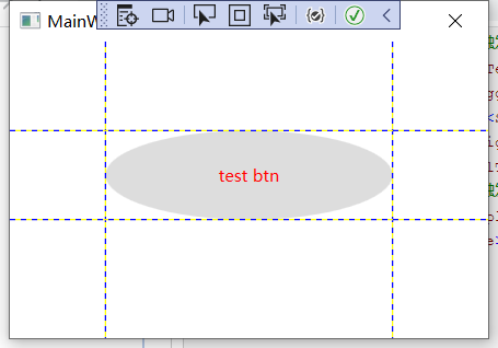
<Grid ShowGridLines="True">

        <Grid.ColumnDefinitions>
            <ColumnDefinition Width="0.2*"/>
            <ColumnDefinition Width="0.6*"/>
            <ColumnDefinition Width="0.2*"/>
        </Grid.ColumnDefinitions>
        <Grid.RowDefinitions>
            <RowDefinition Height="0.3*"/>
            <RowDefinition Height="0.3*"/>
            <RowDefinition Height="0.4*"/>
        </Grid.RowDefinitions>

        <Button Content="test btn" Grid.Column="1" Grid.ColumnSpan="1" Grid.Row="1" Grid.RowSpan="1"  >
            <Button.Template>
                <ControlTemplate>
                    <!--定义视觉树-->
                    <Grid>
                        <Ellipse Name="faceEllipse" Width="{TemplateBinding Button.Width}" Height="{TemplateBinding Control.Height}"  Fill="{TemplateBinding Button.Background}"/>
                        <TextBlock Name="txtBlock" Margin="{TemplateBinding Button.Padding}" VerticalAlignment="Center"  HorizontalAlignment="Center"  Text="{TemplateBinding Button.Content}" />
                    </Grid>
                    <!--定义视觉树_end-->
                    <!--定义触发器-->
                    <ControlTemplate.Triggers>
                        <Trigger  Property="Button.IsMouseOver"  Value="True">
                            <Setter Property="Button.Foreground" Value="Red" />
                        </Trigger>
                    </ControlTemplate.Triggers>
                    <!--定义触发器_End-->
                </ControlTemplate>
            </Button.Template>
        </Button>

    </Grid>
改写:为该ControlTemplate命名,定义为资源,写在Resource下面


    <Window.Resources>
        <ControlTemplate TargetType="Button" x:Key="ButtonTemplate">
            <!--定义视觉树-->
            <Grid>
                <Ellipse Name="faceEllipse" Width="{TemplateBinding Button.Width}" Height="{TemplateBinding Control.Height}"  Fill="{TemplateBinding Button.Background}"/>
                <TextBlock Name="txtBlock" Margin="{TemplateBinding Button.Padding}" VerticalAlignment="Center"  HorizontalAlignment="Center"  Text="{TemplateBinding Button.Content}" />
            </Grid>
            <!--定义视觉树_end-->
            <!--定义触发器-->
            <ControlTemplate.Triggers>
                <Trigger  Property="Button.IsMouseOver"  Value="True">
                    <Setter Property="Button.Foreground" Value="Red" />
                </Trigger>
            </ControlTemplate.Triggers>
            <!--定义触发器_End-->
        </ControlTemplate>
    </Window.Resources>
    <Grid ShowGridLines="True">

        <Grid.ColumnDefinitions>
            <ColumnDefinition Width="0.2*"/>
            <ColumnDefinition Width="0.6*"/>
            <ColumnDefinition Width="0.2*"/>
        </Grid.ColumnDefinitions>
        <Grid.RowDefinitions>
            <RowDefinition Height="0.3*"/>
            <RowDefinition Height="0.3*"/>
            <RowDefinition Height="0.4*"/>
        </Grid.RowDefinitions>

        <Button Template="{StaticResource ButtonTemplate}" Content="test btn" Grid.Column="1" Grid.ColumnSpan="1" Grid.Row="1" Grid.RowSpan="1"  >

        </Button>

    </Grid>
ControlTemplate绘制RadioButton

<Window.Resources> <Style TargetType="RadioButton" x:Key="NavTabButtonStyle"> <Setter Property="FontSize" Value="15"/> <Setter Property="Foreground" Value="#DDD"/> <Setter Property="Padding" Value="10,5"/> <Setter Property="Margin" Value="5,0"/> <Setter Property="Background" Value="Transparent"/> <Setter Property="Template" > <Setter.Value> <ControlTemplate TargetType="RadioButton"> <Border Background="{TemplateBinding Background}" CornerRadius="5,5,0,0"> <Grid> <Grid.ColumnDefinitions> <ColumnDefinition Width="auto"/> <ColumnDefinition/> </Grid.ColumnDefinitions> <TextBlock Text="{TemplateBinding Tag}" FontFamily="Assets/Fonts/#iconfont" FontSize="14" VerticalAlignment="Center" HorizontalAlignment="Center" Margin="10,0,0,0"/> <ContentPresenter Grid.Column="1" VerticalAlignment="{TemplateBinding VerticalContentAlignment}" HorizontalAlignment="{TemplateBinding HorizontalContentAlignment}" Margin="{TemplateBinding Padding}"/> </Grid> </Border> </ControlTemplate> </Setter.Value> </Setter> <Style.Triggers> <Trigger Property="IsChecked" Value="True"> <Setter Property="Foreground" Value="White"/> <Setter Property="Background" Value="#FF6800"/> </Trigger> </Style.Triggers> </Style> </Window.Resources> <Grid> <StackPanel Orientation="Horizontal" VerticalAlignment="Top" Margin="70,0,0,0"> <RadioButton Content="系统监控" Tag="" Style="{StaticResource NavTabButtonStyle}" IsChecked="True"/> <RadioButton Content="实时曲线" Tag="" Style="{StaticResource NavTabButtonStyle}"/> <RadioButton Content="历史曲线" Tag="" Style="{StaticResource NavTabButtonStyle}"/> <RadioButton Content="控制策略" Tag="" Style="{StaticResource NavTabButtonStyle}"/> <RadioButton Content="系统操作" Tag="" Style="{StaticResource NavTabButtonStyle}"/> <RadioButton Content="报警管理" Tag="" Style="{StaticResource NavTabButtonStyle}"/> <RadioButton Content="报表管理" Tag="" Style="{StaticResource NavTabButtonStyle}"/> </StackPanel> </Grid>
动画
入门例子
    <StackPanel Margin="20">

        <Rectangle Name="MyRectangle"
      Width="100"
      Height="100">
            <Rectangle.Fill>
                <SolidColorBrush x:Name="MySolidColorBrush" Color="Blue" />
            </Rectangle.Fill>
            <Rectangle.Triggers>
                <EventTrigger RoutedEvent="Page.Loaded">
                    <BeginStoryboard>
                        <Storyboard RepeatBehavior="Forever" AutoReverse="True">
                            <DoubleAnimation
                Storyboard.TargetName="MyRectangle"
                Storyboard.TargetProperty="Width"
                From="100" To="200" Duration="0:0:1" />
                        </Storyboard>
                    </BeginStoryboard>
                </EventTrigger>
            </Rectangle.Triggers>
        </Rectangle>
    </StackPanel>
<Storyboard RepeatBehavior="Forever" AutoReverse="True">
保证动画不停往复运动,
宽度和颜色同时变化
  <StackPanel Margin="20">

    <Rectangle Name="MyRectangle"
      Width="100"
      Height="100">
      <Rectangle.Fill>
        <SolidColorBrush x:Name="MySolidColorBrush" Color="Blue" />
      </Rectangle.Fill>
      <Rectangle.Triggers>
        <EventTrigger RoutedEvent="Page.Loaded">
          <BeginStoryboard>
            <Storyboard RepeatBehavior="Forever" AutoReverse="True">
              <DoubleAnimation
                Storyboard.TargetName="MyRectangle"
                Storyboard.TargetProperty="Width"
                From="100" To="200" Duration="0:0:1" />
              <ColorAnimation
                Storyboard.TargetName="MySolidColorBrush"
                Storyboard.TargetProperty="Color"
                From="Blue" To="Red" Duration="0:0:1" />
            </Storyboard>
          </BeginStoryboard>
        </EventTrigger>
      </Rectangle.Triggers>
    </Rectangle>
  </StackPanel>
Storyboard可以看做是Animation的容器,它包含了若干的简单动画来完成一个复杂动画。

 浙公网安备 33010602011771号