实例 -- CSS3 弹性盒模型
使用CSS3的弹性盒模型完成 响应式表格:
- 代码:
- HTML
<!DOCTYPE html>
<html lang="en">
<head>
    <meta charset="UTF-8">
    <link rel="stylesheet" type="text/css" href="CSS/begin.css">
    <title>响应式表格</title>
</head>
<body>
<h1>Student Schema</h1>
<table class="responsive">
    <thead>
        <tr>
            <th>NAME</th>
            <th>AGE</th>
            <th>OPTION</th>
        </tr>
    </thead>
    <tbody>
        <tr>
            <td class="name">Sue</td>
            <td class="age">5</td>
            <td class="action">
                <a href="#">edit</a>
                <a href="#">delete</a>
            </td>
        </tr>
        <tr>
            <td class="name">Tom</td>
            <td class="age">6</td>
            <td class="action">
                <a href="#">edit</a>
                <a href="#">delete</a>
            </td>
        </tr>
        <tr>
            <td class="name">Anne</td>
            <td class="age">4</td>
            <td class="action">
                <a href="#">edit</a>
                <a href="#">delete</a>
            </td>
        </tr>
    </tbody>
</table>
</body>
</html> - CSS
h1{
    font-size: 30px;
    text-align: center;
    color: gray;
}
table.responsive{
    width: 98%;
    margin: 0 auto;
    border: 1px solid gray;
}
table.responsive th, table.responsive td{
    border: 1px solid gray;
    padding: .5em 1em;
}
table.responsive th{
    color: white;
    background-color: green;
}
table.responsive .action a{
    color: orange;
    text-decoration: none;
    padding: 0 4px;
}
table.responsive .name, table.responsive .action{
    text-align: center;
}
/*当页面大小小于780px时*/
@media screen and (max-width: 780px) {
    table.responsive{
        border: none;
    }
    table.responsive thead{
        display: none;
    }
    table.responsive tr, table.responsive td{
        display: block;
        border: 1px solid gray;
        position: relative;
    }
    table.responsive .name{
        color: white;
        background-color: green;
        text-align: left;
        padding-left: 28%;
    }
    table.responsive .name::before{
        content: "NAME";
        position: absolute;
        left: .5em;
        top: .5em;
        font-weight: bold;
    }
    table.responsive .age{
        text-align: left;
        padding-left: 28%;
    }
    table.responsive .age::before{
        content: "AGE";
        position: absolute;
        left: .5em;
        top: .5em;
        font-weight: bold;
    }
    table.responsive .action{
        position: absolute;
        right: 0;
        top: 0;
    }
}
- HTML
- 效果:
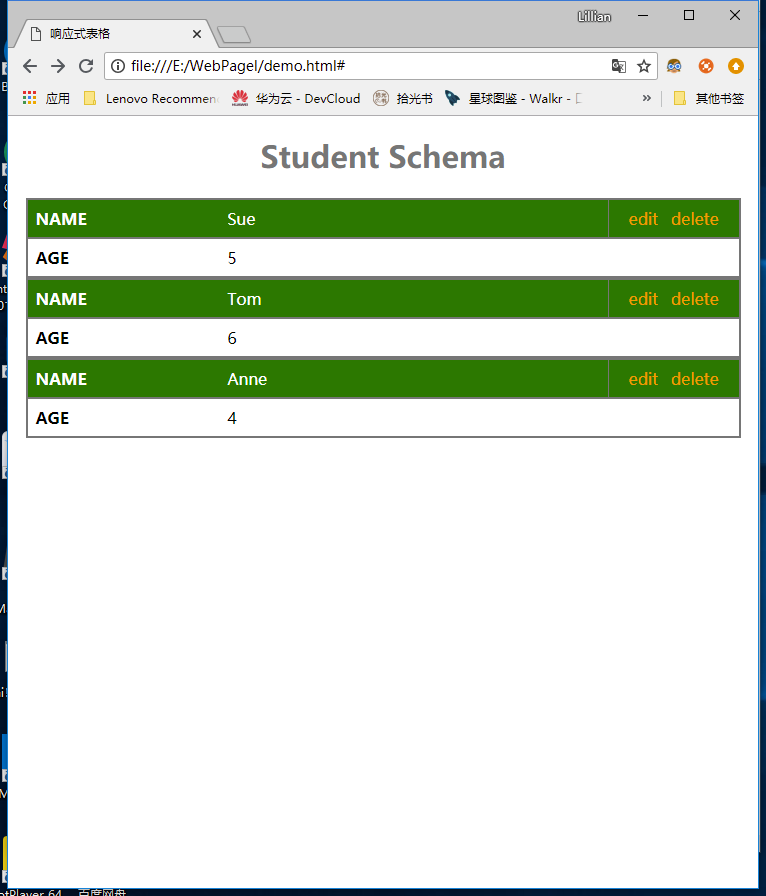
- SCREEN<780px
![]()
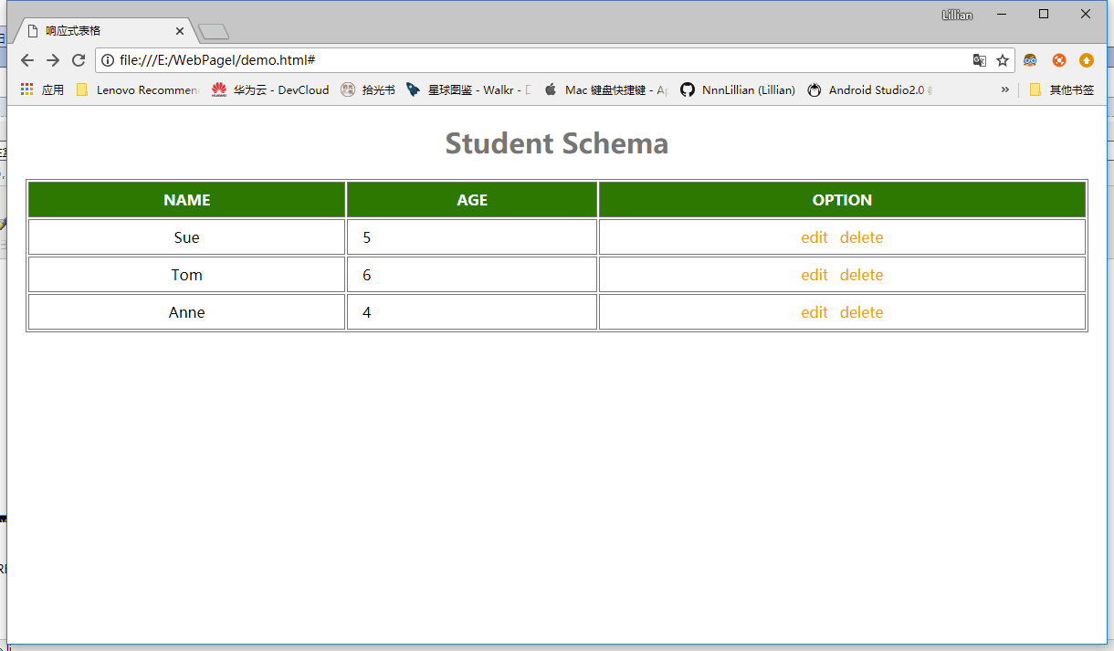
- SCREEN>780px
![]()

 浙公网安备 33010602011771号