太极图
<!DOCTYPE HTNL>
<html lang="en">
<html>
<mate charset="utf-8">
<head>
<title></title>
<style>
*{padding:0;
margin:0;}

div{
width:200px;
height:200px;
background-image: linear-gradient(90deg,red 50%,white 50%);
position:relative;
border-radius:50%;
margin:200px auto;
animation:zhuan 2s infinite linear;

}
div:before{
            content:"";
            width: 40px;
            height: 40px;
            background-color: white;
            border:30px solid red;
            position:absolute;
            left:50px;
            border-radius:50%;


        }
        div:after{
            content:"";
            width: 40px;
            height: 40px;
            background-color:red;
            border:30px solid white;
            position:absolute;
            left:50px;
            top:100px;
            border-radius:50%;


        }
 @keyframes zhuan{from{transform:rotate(0deg);}to{transform:rotate(360deg);}}

</style>
</head>
<body style="background-color:black;">
<div></div>
</body>

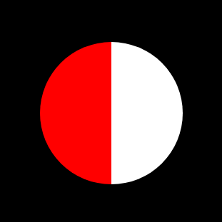
太极图可以理解为一个一半黑一半白的半圆,上面放置着两个圆形,一个黑色边框白色芯,一个白色边框黑色芯。
1、实现黑白各半的圆形。
代码:
width:200px;
height:200px;
background-image: linear-gradient(90deg,red 50%,white 50%);
border-radius:50%;
margin:200px auto;
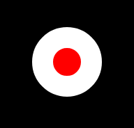
2、用:before伪类实现一个黑红色边框白色芯圆。
div:before{
            content:"";
            width: 40px;
            height: 40px;
            background-color: white;
            border:30px solid red;
            position:absolute;
            left:50px;
            border-radius:50%;


        }

3、用:after伪类实现一个白色边框红色芯的圆。
div:after{
            content:"";
            width: 40px;
            height: 40px;
            background-color:red;
            border:30px solid white;
            position:absolute;
            left:50px;
            top:100px;
            border-radius:50%;
        }