bootstrap学习笔记(1)基础段落,表格的实现
1. 标题
bootstrap中添加了h1, h2....h6类,可以直接使用div表示标题
<!DOCTYPE HTML>
<html>
<head>
<meta charset="utf-8">
<title>标题(一)</title>
<link rel="stylesheet" href="https://cdn.bootcss.com/bootstrap/4.0.0-beta.2/css/bootstrap.min.css">
</head>

<body>
<!--Bootstrap中的标题-->
<h1>Bootstrap标题一</h1>
<h2>Bootstrap标题二</h2>


<!--Bootstrap中让非标题元素和标题使用相同的样式-->
<div class="h1">Bootstrap标题一</div>
<div class="h2">Bootstrap标题二</div>


</body>
</html>
2.副标题 通过small实现
<!DOCTYPE html>
<html lang="en">
<head>
    <meta charset="UTF-8">
    <meta http-equiv="Content-Type" content="text/html; charset=utf-8">
    <title>Title</title>
    <!--引入bootstrap-->
    <link href="../../css/bootstrap.css" rel="stylesheet" type="text/css">
</head>
<body>
    <div class="jumbotron">
        <div class="h1">Bootstrap标题一<small>副标题1</small></div>
        <div class="h2">Bootstrap标题二<small>副标题2</small></div>

    </div>
</body>
</html>
3. 段落,强调内容
bootstrap中利用<p>表示段落, 如果需要突出强调段落的内容,则需要加入lead类
<!DOCTYPE html>
<html lang="en">
<head>
    <meta charset="UTF-8">
    <meta http-equiv="Content-Type" content="text/html; charset=utf-8">
    <title>Title</title>
    <!--引入bootstrap-->
    <link href="../../css/bootstrap.css" rel="stylesheet" type="text/css">
</head>
<body>
    <p>这是一个段落</p>
    <P class="lead">这是需要强调的内容</P>
</body>
</html>
<strong>表示对文本的内容进行强调,利用<em>表示斜体字
<!DOCTYPE html>
<html lang="en">
<head>
    <meta charset="UTF-8">
    <meta http-equiv="Content-Type" content="text/html; charset=utf-8">
    <title>Title</title>
    <!--引入bootstrap-->
    <link href="../../css/bootstrap.css" rel="stylesheet" type="text/css">
</head>
<body>
    <p>这是<strong>一个</strong>段落</p>
    <P class="lead">这是需要<strong>强调</strong>的内容</P>
    <p>This is a <em>good story</em></p>
</body>
</html>
4. 强调相关的类
除了使用标签<strong>、<em>等说明正文某些字词、句子的重要性,Bootstrap还定义了一套类名,这里称其为强调类名(类似前面说的“.lead”),这些强调类都是通过颜色来表示强调,具本说明如下:
text-muted:提示,使用浅灰色(#999)
text-primary:主要,使用蓝色(#428bca)
text-success:成功,使用浅绿色(#3c763d)
text-info:通知信息,使用浅蓝色(#31708f)
text-warning:警告,使用黄色(#8a6d3b)
text-danger:危险,使用褐色(#a94442)
<!DOCTYPE html>
<html lang="en">
<head>
    <meta charset="UTF-8">
    <meta http-equiv="Content-Type" content="text/html; charset=utf-8">
    <title>Title</title>
    <!--引入bootstrap-->
    <link href="../../css/bootstrap.css" rel="stylesheet" type="text/css">
</head>
<body>
    <div class="text-muted">这是一段提示文字</div>
    <div class="text-danger">危险警告</div>
    <p class="text-info">这是一段通知信息</p>
    <p class="text-primary">这是主要的信息</p>
</body>
</html>
5. 文本对齐
在html中,文本对齐需要通过css的text-align属性来进行设置,bootstrap中为了简化,直接使用div通过引入定义的类来实现文本的对齐:
text-left:左对齐
text-center:居中对齐
ext-right:右对齐
text-justify:两端对齐
而且可以和上面的信息一起结合使用:
例如:
<!DOCTYPE html>
<html lang="en">
<head>
<meta charset="UTF-8">
<meta http-equiv="Content-Type" content="text/html; charset=utf-8">
<title>Title</title>
<!--引入bootstrap-->
<link href="../../css/bootstrap.css" rel="stylesheet" type="text/css">
</head>
<body>
<div class="text-muted text-left">这是一段提示文字</div>
<div class="text-danger text-right">危险警告</div>
<p class="text-info text-center">这是一段通知信息</p>
<p class="text-primary text-justify">这是主要的信息</p>
</body>
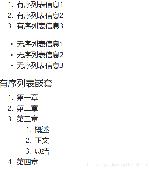
</html>6. bootstrap中的列表
html中常用的有有序列表,无序列表:
<!DOCTYPE html>
<html lang="en">
<head>
    <meta charset="UTF-8">
    <meta http-equiv="Content-Type" content="text/html; charset=utf-8">
    <title>Title</title>
    <!--引入bootstrap-->
    <link href="../../css/bootstrap.css" rel="stylesheet" type="text/css">
</head>
<body>
    <ol>
        <!--有序的列表-->
        <li>有序列表信息1</li>
        <li>有序列表信息2</li>
        <li>有序列表信息3</li>
    </ol>
    <ul>
        <!--无序列表-->
        <li>无序列表信息1</li>
        <li>无序列表信息2</li>
        <li>无序列表信息3</li>
    </ul>
    <div class="h5">有序列表嵌套</div>
    <ol>
        <li>第一章</li>
        <li>第二章</li>
        <li>
            第三章
            <ol>
                <li>概述</li>
                <li>正文</li>
                <li>总结</li>
            </ol>
        </li>
        <li>第四章</li>
    </ol>
</body>
</html>
显示效果:
boootstrap也定义了以下几种列表:
普通列表
有序列表
去点列表 class = list-unstyled
内联列表 class = list-inline 将列表中的数据显示到一行中
描述列表
水平描述列表 class = dl-horizontal水平显示
<!DOCTYPE html>
<html lang="en">
<head>
    <meta charset="UTF-8">
    <meta http-equiv="Content-Type" content="text/html; charset=utf-8">
    <title>Title</title>
    <!--引入bootstrap-->
    <link href="../../css/bootstrap.css" rel="stylesheet" type="text/css">
</head>
<body>
    <ul>
        <li>
            项目列表
            <ol>     <!--有序列表-->
                <li>一期项目</li>
                <li>二期项目</li>
                <li>三期项目</li>
            </ol>
        </li>
        <li>
            项目列表
            <ol class="list-unstyled">   <!--有序列表去序号-->
                <li>一期项目</li>
                <li>二期项目</li>
                <li>三期项目</li>
            </ol>
        </li>
        <li>
            项目列表
            <ul>       <!--无序列表-->
                <li>一期项目</li>
                <li>二期项目</li>
                <li>三期项目</li>
            </ul>
        </li>
        <li>
            项目列表
            <ul class="list-unstyled">       <!--无序列表去点号-->
                <li>一期项目</li>
                <li>二期项目</li>
                <li>三期项目</li>
            </ul>
        </li>

    </ul>
    <!--内联列表-->
    <ul class="list-inline">
        <li>csdn</li>
        <li>QQ</li>
        <li>wechat</li>
    </ul>
    <dl>
        <dt>甘肃省</dt>
        <dd>平凉市</dd>
        <dd>兰州市</dd>
        <dt>陕西省</dt>
        <dd>西安市</dd>
        <dd>榆林市</dd>
    </dl>
</body>
</html>
7. 代码风格:
一般博客中需要用到,用以显示博客中插入的代码的风格:
<code>:一般是针对于单个单词或单个句子的代码
<pre>:一般是针对于多行代码(也就是成块的代码)
<kbd>:一般是表示用户要通过键盘输入的内容
在<pre>中,如果代码块比较大,又不想让代码块占用太多的空间,可以添加pre-scrollable属性,使得代码块可以沿着y轴滚动
<!DOCTYPE html>
<html lang="en">
<head>
    <meta charset="UTF-8">
    <meta http-equiv="Content-Type" content="text/html; charset=utf-8">
    <title>Title</title>
    <!--引入bootstrap-->
    <link href="../../css/bootstrap.css" rel="stylesheet" type="text/css">
</head>
<body>
    <pre class="pre-scrollable">
        #include <iostream>
        #include <string>
        #include <string>
        #include <string>
        #include <string>
        int main()
        {
            cout << "Hello world" << endl;
            cout << "Hello world" << endl;
            cout << "Hello world" << endl;
            cout << "Hello world" << endl;
            cout << "Hello world" << endl;
            cout << "Hello world" << endl;
            cout << "Hello world" << endl;
            cout << "Hello world" << endl;
            cout << "Hello world" << endl;pre-scrollable
            cout << "Hello world" << endl;
            cout << "Hello world" << endl;
            cout << "Hello world" << endl;
            cout << "Hello world" << endl;
            cout << "Hello world" << endl;
            cout << "Hello world" << endl;
            cout << "Hello world" << endl;
            cout << "Hello world" << endl;
            cout << "Hello world" << endl;
        }
    </pre>
</body>
</html>
8.表格
表格是Bootstrap的一个基础组件之一,Bootstrap为表格提供了1种基础样式和4种附加样式以及1个支持响应式的表格。在使用Bootstrap的表格过程中,只需要添加对应的类名就可以得到不同的表格风格
table:基础表格
table-striped:斑马线表格 无边框的表格
table-bordered:带边框的表格 有边框的表格
table-hover:鼠标悬停高亮的表格 鼠标停留在某一格的时候单元格会显示高亮
table-condensed:紧凑型表格 单元格没内距或者内距较其他表格的内距更小
table-responsive:响应式表格 在现实区域过小而不能显示全部的表格的时候,表格会出现横滚条
而且还提供了表格行的装饰类:
<!DOCTYPE html>
<html lang="en">
<head>
    <meta charset="UTF-8">
    <meta http-equiv="Content-Type" content="text/html; charset=utf-8">
    <title>Title</title>
    <!--引入bootstrap-->
    <link href="../../css/bootstrap.css" rel="stylesheet" type="text/css">
</head>
<body>
    <div class="h3">基础表格</div>
    <table class="table">
        <!--表头-->
        <thead>
            <tr class="info">
                <th>姓名</th>
                <th>年龄</th>
                <th>编号</th>
            </tr>
        </thead>
        <tbody>
            <tr class="danger">
                <th>张三</th>
                <th>56</th>
                <th>125</th>
            </tr>
            <tr class="active">
                <th>李四</th>
                <th>34</th>
                <th>453</th>
            </tr>
        </tbody>
    </table>

    <!--table striped-->
    <table class="table table-bordered">
        <!--表头-->
        <thead>
        <tr>
            <th>姓名</th>
            <th>年龄</th>
            <th>编号</th>
        </tr>
        </thead>
        <tbody>
        <tr>
            <th>张三</th>
            <th>56</th>
            <th>125</th>
        </tr>
        <tr>
            <th>李四</th>
            <th>34</th>
            <th>453</th>
        </tr>
        </tbody>
    </table>

</body>
</html>
响应式表格需要将表格放到一个容器中:
<!DOCTYPE html>
<html lang="en">
<head>
    <meta charset="UTF-8">
    <meta http-equiv="Content-Type" content="text/html; charset=utf-8">
    <title>Title</title>
    <!--引入bootstrap-->
    <link href="../../css/bootstrap.css" rel="stylesheet" type="text/css">
</head>
<body>
    <div class="table-responsive">    <!--响应式表格的容器-->
        <table class="table-bordered">
            <thead>
                <tr>
                    <th>姓名</th>
                    <th>年龄</th>
                    <th>编号</th>
                    <th>地址</th>
                    <th>籍贯</th>
                </tr>
            </thead>
            <tbody>
                <tr>
                    <th>Tom</th>
                    <th>eleven</th>
                    <th>13456</th>
                    <th>NewYork</th>
                    <th>America</th>
                </tr>
            </tbody>
        </table>
    </div>
</body>
</html>
-----------------------------------------------------------------------------------------------------------------

 浙公网安备 33010602011771号