
React+ts+stories实现简单的切换按钮【ToggleBotton/ToggleBox]
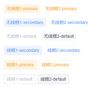
Demo效果:
组件实现:
import React from 'react';
import clsx from 'clsx';
import { makeStyles } from '@material-ui/core/styles';
import { Box, Typography } from '@vvwork/atoms';

const useStyles = makeStyles(() => ({
  root: {
    display: 'inline-flex',
    color: '#BCC1CD',
    fontSize: '12px',
    borderRadius: '4px',
    '&:hover, &:focus': {
      color: '#2A2F3C',
      backgroundColor: 'rgba(246,247,248,0.8)',
    },
  },
  outlined: {
    border: '1px solid rgba(188,193,205,0.6)',
  },
  outlinedPrimary: {
    border: '1px solid #FFE8CB',
  },
  outlinedSecondary: {
    border: '1px solid #EEF4FE',
  },
  colorPrimary: {
    color: '#FFA22D',
    '&:hover, &:focus': {
      color: '#FFA22D',
      backgroundColor: 'rgba(255, 245, 232, 0.8)',
    },
  },
  colorSecondary: {
    color: '#5590F6',
    '&:hover, &:focus': {
      color: '#5590F6',
      backgroundColor: 'rgba(238,244,254, 0.8)',
    },
  },
  disabled: {
    color: 'rgb(188, 193, 205)',
  },
  clickable: {
    cursor: 'pointer',
  },
  selected: {
    color: '#2A2F3C',
    backgroundColor: 'rgba(246,247,248, 1)',
  },
  selectedPrimary: {
    backgroundColor: 'rgba(255, 245, 232, 1)',
  },
  selectedSecondary: {
    backgroundColor: 'rgba(238,244,254, 1)',
  },
}));

export interface DataProps {
  label: string;
  key: string;
}

export interface TagProps {
  children?: null;
  clickable?: boolean;
  color?: 'default' | 'primary' | 'secondary';
  disabled?: boolean;
  data?: DataProps[];
  value?: string;
  onClick?: (nowSelect: string) => void;
  onChange?: React.EventHandler<any>;
  variant?: 'default' | 'outlined';
  className?: string;
}

export default function ToggleBox(props: TagProps) {
  const {
    data = [],
    variant = 'default',
    color = 'default',
    disabled = false,
    clickable = true,
    value = '',
    className = '',
    onChange = () => {},
    ...rest
  } = props;
  const classes = useStyles();
  const [select, setSelect] = React.useState(value || (data && data[0].label));
  const handleToggle = (nowSelect: DataProps) => () => {
    onChange(nowSelect);
    setSelect(nowSelect.label);
  };

  return (
    <Box>
      {data &&
        data.map(item => {
          return (
            <Box
              {...rest}
              paddingX={1}
              paddingY={0.5}
              marginX={0.5}
              key={item.key}
              className={clsx(
                classes.root,
                {
                  [classes.outlined]: variant === 'outlined',
                  [classes.outlinedPrimary]: variant === 'outlined' && color === 'primary',
                  [classes.outlinedSecondary]: variant === 'outlined' && color === 'secondary',
                  [classes.colorPrimary]: color === 'primary',
                  [classes.colorSecondary]: color === 'secondary',
                  [classes.disabled]: disabled,
                  [classes.clickable]: clickable,
                  [classes.selected]: select === item.label && color === 'default',
                  [classes.selectedPrimary]: select === item.label && color === 'primary',
                  [classes.selectedSecondary]: select === item.label && color === 'secondary',
                },
                className,
              )}
              onClick={handleToggle(item)}
            >
              <Typography>{item.label}</Typography>
            </Box>
          );
        })}
    </Box>
  );
}
Demo:
import React from 'react';
import Theme from '../../Theme';
import { Box } from '@vvwork/atoms';
import ToggleBox from '../';
export default function Demo() {
return (
<Theme>
{/* 1 */}
<Box pl={2} pt={2}>
<ToggleBox
data={[
{ label: '无线框1-primary', key: 'first' },
{ label: '无线框2-primary', key: 'second' },
]}
variant="default"
color="primary"
disabled={false}
clickable={true}
value="无线框1-primary"
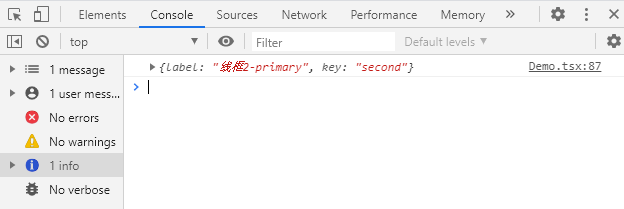
onChange={data => {
console.log(data);
}}
/>
</Box>
{/* 2 */}
<Box pl={2} pt={2}>
<ToggleBox
data={[
{ label: '无线框1-secondary', key: 'first' },
{ label: '无线框2-secondary', key: 'second' },
]}
variant="default"
color="secondary"
disabled={false}
clickable={true}
onChange={data => {
console.log(data);
}}
/>
</Box>
{/* 3 */}
<Box pl={2} pt={2}>
<ToggleBox
data={[
{ label: '无线框1-default', key: 'first' },
{ label: '无线框2-default', key: 'second' },
]}
variant="default"
disabled={false}
clickable={true}
value="无线框2-default"
onChange={data => {
console.log(data);
}}
/>
</Box>
{/* 4 */}
<Box pl={2} pt={2}>
<ToggleBox
data={[
{ label: '线框1-secondary', key: 'first' },
{ label: '线框2-secondary', key: 'second' },
]}
variant="outlined"
color="secondary"
disabled={false}
clickable={true}
onChange={data => {
console.log(data);
}}
/>
</Box>
{/* 5 */}
<Box pl={2} pt={2}>
<ToggleBox
data={[
{ label: '线框1-primary', key: 'first' },
{ label: '线框2-primary', key: 'second' },
]}
variant="outlined"
color="primary"
disabled={false}
clickable={true}
value="线框1-primary"
onChange={data => {
console.log(data);
}}
/>
</Box>
{/* 6 */}
<Box pl={2} pt={2}>
<ToggleBox
data={[
{ label: '线框1-default', key: 'first' },
{ label: '线框2-default', key: 'second' },
]}
variant="outlined"
color="default"
disabled={false}
clickable={true}
onChange={data => {
console.log(data);
}}
/>
</Box>
</Theme>
);
}
README.md:
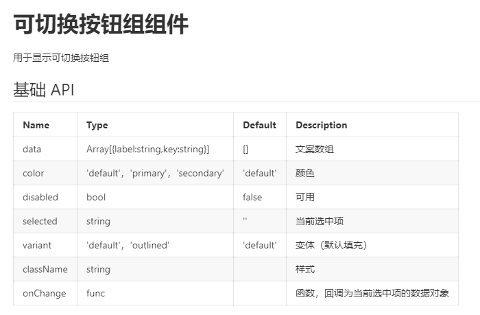
# 可切换按钮组组件

用于显示可切换按钮组

## 基础 API

| Name      | Type                              | Default   | Description                      |
| :-------- | :-------------------------------- | :-------- | :------------------------------- |
| data      | Array[{label:string,key:string}]  | []        | 文案数组                         |
| color     | 'default','primary','secondary' | 'default' | 颜色                             |
| disabled  | bool                              | false     | 可用                             |
| selected  | string                            | ''        | 当前选中项                       |
| variant   | 'default','outlined'             | 'default' | 变体(默认填充)                 |
| className | string                            |           | 样式                             |
| onChange  | func                              |           | 函数,回调为当前选中项的数据对象 |
index.stories.tsx:
import React from 'react';
import { storiesOf } from '@storybook/react';
import README from './README.md';
import Demo from './Demo';
// eslint-disable-next-line import/no-webpack-loader-syntax
import DemoRaw from '!!raw-loader!./Demo';

storiesOf('公共组件|ToggleButton', module)
  .addParameters({
    notes: README,
  })
  .add('示例', () => <Demo />, {
    jsx: {
      onBeforeRender: () => DemoRaw,
    },
  });

 浙公网安备 33010602011771号