Vue 实现图片下拉选择控件
 vue 图片下拉选择控件

element-ui 的组件库中没有图片下拉选择组件,基于 el-select 组件做的改动并不能完全满足需求,因此决定重写一个。
从头到尾做下来收获很多,我决定把实现过程中遇到的问题记录一下。
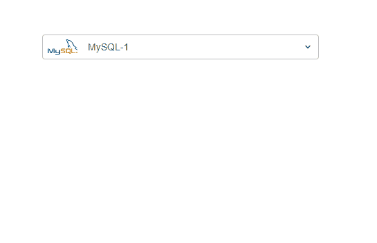
效果图
设计要点
接下来将上面代码中的关键部分拆分介绍
1. 回显选中的图片和 label
下拉选项组件的本质是一个 input,毕竟下拉选择也是为了快速 input 嘛。那我们的设计理念就是 "以 input 为中心",input 左侧留出固定的宽度回显选择的图片,input 的右侧留出固定宽度显示 icon,提醒用户支持下拉/搜索。
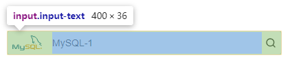
为了在输入框左侧显示图片,我们设置图片元素为 position: absolute; input 元素通过设置 padding-left 和 padding-right 将 image 和 icon 的空间预留出。
右侧默认显示下拉 icon,当显示下拉选项时切换为搜索 icon,提示用户输入框支持搜索功能。
<div class="input-wrapper">
    <div class="input-prefix-icon-container">
        <img class="input-prefix-icon" :src="selectedOption.icon" />
    </div>
    <input v-model="inputContent" class="input-text" />
    <div class="input-postfix-icon">
        <!-- 这里显示下拉选择的 icon -->
        <!-- 这里显示搜索的 icon -->
    </div>
</div>
2. 下拉选项
点击选择控件时显示下拉选项,选择某个选项或者点击页面空白处时隐藏下拉选项。
下拉选项中依次显示选项的 image、选项的 label,选项的 category。
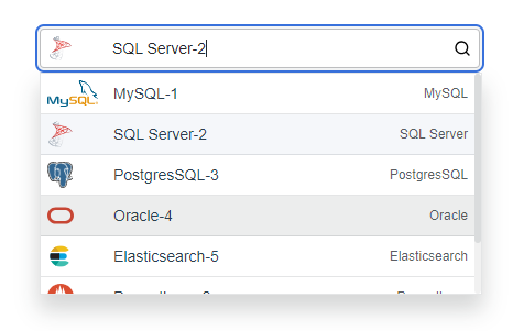
已选中的选项要区别于未选中的选项,这里用到了动态 css 绑定,通过比较 selectedOption.key 和 option.key 是否相等来判断选中状态。
<div class="select-option-list" v-show="showSelectOptions">
    <div v-for="option in (showAllOptions ? options : filteredOptions)" :key="option.key"
        @click="selectOption(option)" class="select-option"
        :class="{ 'selected-option': option.key === selectedOption.key }">
        <div class="select-option-icon-container">
            <img v-if="option.icon" :src="option.icon" :alt="option.label" class="select-option-icon" />
        </div>
        <div class="flex-between fill-content">
            <div class="select-option-name">{{ option.label }}</div>
            <div class="select-option-label">{{ option.type }}</div>
        </div>
    </div>
</div>
.selected-option {
    background-color: #f5f7fa;
}
为了保证每个 image 占据相同的宽度,label 有相同的缩进,为 image 设置了 max-width 和 min-width 为相同值:
.select-option-icon-container {
    min-width: 60px;
    max-width: 60px;
    height: 100%;
}
下拉选项 list 要设置 max-height 和 overflow-y:auto,防止选项较多时占据太多页面空间。微调滚动条的显示样式:
/* 滚动条整体样式 */
.select-option-list::-webkit-scrollbar {
    width: 6px;
}
/* 滚动条轨道样式 */
.select-option-list::-webkit-scrollbar-track {
    background: #f1f1f1;
    border-radius: 6px;
}
/* 滚动条滑块样式 */
.select-option-list::-webkit-scrollbar-thumb {
    background: #dadcdd;
    border-radius: 6px;
}
/* 滑块 hover 样式 */
.select-option-list::-webkit-scrollbar-thumb:hover {
    background: #999;
}
3. 支持搜索
当用户输入了搜索内容时(@input),希望显示过滤后的选项以快速定位;当我们点击控件时,一般是有选项切换的需求,此时需要显示全部的选项,通过 showAllOptions 来控制是否显示全部的选项。
<div class="input-wrapper" @click="showSelectOptions=true;">
    <div class="input-prefix-icon-container">
        <img class="input-prefix-icon" :src="selectedOption.icon" />
    </div>
    <input v-model="inputContent" @focus="showAllOptions=true" @input="showAllOptions=false" class="input-text" />
    <div class="input-postfix-icon" @click="showAllOptions=true">
        <!-- 这里显示下拉选择的 icon -->
        <!-- 这里显示搜索的 icon -->
    </div>
</div>
4. 组件数据传递
父组件传递 options 选项给子组件,子组件将选中的选项通知给父组件:
export default {
    props: {
        // 父组件传递来的所有选项
        options: {
            type: Array,
            required: true
        }
    },
    data () {
        return {
            // 选择的选项
            selectedOption: this.options[0]
        }
    },
    methods: {
        // 点击某个选项时
        selectOption (option) {
            this.selectedOption = option
            this.showSelectOptions = false
            this.inputContent = option.label
            // 将选择的选项通知给父组件
            // v-model 默认监听input事件
            this.$emit('input', option)
        }
    }
}
完整实现
ImgSelect.vue
<template>
    <div class="img-select">
        <div class="input-wrapper" @click="showSelectOptions = true;">
            <div class="input-prefix-icon-container">
                <img class="input-prefix-icon" v-if="selectedOption.icon" :src="selectedOption.icon" :alt="selectedOption.label" />
            </div>
            <input v-model="inputContent" @focus="showAllOptions = true" @input="showAllOptions = false" class="input-text" />
            <div class="input-postfix-icon" @click="showAllOptions = true">
                <svg v-show="!showSelectOptions" xmlns="http://www.w3.org/2000/svg" viewBox="0 0 24 24" width="16" height="16" class="css-1d3xu67-Icon">
                    <path d="M17,9.17a1,1,0,0,0-1.41,0L12,12.71,8.46,9.17a1,1,0,0,0-1.41,0,1,1,0,0,0,0,1.42l4.24,4.24a1,1,0,0,0,1.42,0L17,10.59A1,1,0,0,0,17,9.17Z"></path>
                </svg>
                <svg v-show="showSelectOptions" xmlns="http://www.w3.org/2000/svg" viewBox="0 0 24 24" width="16" height="16" class="css-1d3xu67-Icon">
                    <path d="M21.71,20.29,18,16.61A9,9,0,1,0,16.61,18l3.68,3.68a1,1,0,0,0,1.42,0A1,1,0,0,0,21.71,20.29ZM11,18a7,7,0,1,1,7-7A7,7,0,0,1,11,18Z"></path>
                </svg>
            </div>
        </div>
        <div class="select-option-list" v-show="showSelectOptions">
            <div v-for="option in (showAllOptions ? options : filteredOptions)" :key="option.key"
                @click="selectOption(option)" class="select-option"
                :class="{ 'selected-option': option.key === selectedOption.key }">
                <div class="select-option-icon-container">
                    <img v-if="option.icon" :src="option.icon" :alt="option.label" class="select-option-icon" />
                </div>
                <div class="flex-between fill-content">
                    <div class="select-option-name">{{ option.label }}</div>
                    <div class="select-option-label">{{ option.type }}</div>
                </div>
            </div>
        </div>
    </div>
</template>
<script>
export default {
    props: {
        options: {
            type: Array,
            required: true
        }
    },
    data () {
        return {
            // 是否显示下拉选项
            showSelectOptions: false,
            // 显示全部的选项,还是过滤后的选项
            showAllOptions: false,
            // 选择的选项
            selectedOption: this.options[0],
            // 输入的搜索内容
            inputContent: this.options[0].label
        }
    },
    computed: {
        filteredOptions () {
            return this.options.filter(item => {
                return item.label.toLowerCase().includes(this.inputContent.toLowerCase())
            })
        }
    },
    methods: {
        selectOption (option) {
            this.selectedOption = option
            this.showSelectOptions = false
            this.inputContent = option.label
            // 将选择的选项通知给父组件
            this.$emit('input', option)
        },
        // 点击空白处选项列表消失
        handleClickOutside (event) {
            const inputWrapper = this.$el.querySelector('.input-wrapper')
            const selectOptionList = this.$el.querySelector('.select-option-list')
            if (inputWrapper && !inputWrapper.contains(event.target)) {
                if (selectOptionList && !selectOptionList.contains(event.target)) {
                    this.showSelectOptions = false
                }
            }
        }
    },
    mounted () {
        document.addEventListener('click', this.handleClickOutside)
    },
    beforeDestroy () {
        document.removeEventListener('click', this.handleClickOutside)
    }
}
</script>
<style scoped>
.img-select {
    position: relative;
    width: 400px;
}

.input-wrapper {
    display: flex;
    align-items: center;
    position: relative;
    height: 32px;
}

.input-prefix-icon {
    width: 100%;
    z-index: 1;
}

.input-prefix-icon-container {
    position: absolute;
    padding: 5px 8px;
    height: 100%;
    display: flex;
    justify-content: flex-start;
    box-sizing: border-box;
}

.input-prefix-icon-container:hover {
    cursor: pointer;
}

.input-postfix-icon {
    height: 100%;
    padding-left: 8px;
    padding-right: 8px;
    position: absolute;
    top: 0px;
    right: 0px;
    z-index: 1;
    display: flex;
    align-items: center;
}

.input-postfix-icon:hover {
    cursor: pointer;
}

.input-text {
    padding-left: 65px;
    padding-right: 28px;
    background: rgb(255, 255, 255);
    line-height: 1.57143;
    font-size: 14px;
    color: rgb(36, 41, 46);
    border: 1px solid rgba(36, 41, 46, 0.3);
    flex-grow: 1;
    border-radius: 4px;
    height: 100%;
    width: 100%;
    z-index: 0;
}

.input-text:focus {
    outline: unset;
    box-shadow: rgb(244, 245, 245) 0px 0px 0px 2px, rgb(56, 113, 220) 0px 0px 0px 4px;
}

.select-option-list {
    display: flex;
    flex-direction: column;
    box-shadow: rgba(24, 26, 27, 0.18) 0px 13px 20px 1px;
    max-height: 200px;
    width: 400px;
    overflow-y: auto;
    border: 1px solid rgba(36, 41, 46, 0.12);
    position: absolute;
    top: 38px;
}

.select-option {
    display: flex;
    align-items: center;
    height: 24px;
    padding: 6px;
    cursor: pointer;
    background-color: #ffffff;
    border-bottom: 1px solid rgba(36, 41, 46, 0.12);
}

.select-option:hover {
    background-color: #eceded;
}

.selected-option {
    background-color: #f5f7fa;
}

.select-option-icon-container {
    min-width: 60px;
    max-width: 60px;
    height: 100%;
}

.select-option-icon {
    height: 100%;
    display: flex;
}

.select-option-name {
    white-space: nowrap;
    font-size: 14px;
}

.select-option-label {
    font-size: 12px;
    color: rgba(36, 41, 46, 0.75);
    white-space: nowrap;
}

.flex-between {
    display: flex;
    align-items: center;
    justify-content: space-between;
    gap: 10px;
}

.fill-content {
    width: 100%;
    height: 100%;
}

/* 滚动条整体样式 */
.select-option-list::-webkit-scrollbar {
    width: 6px;
}
/* 滚动条轨道样式 */
.select-option-list::-webkit-scrollbar-track {
    background: #f1f1f1;
    border-radius: 6px;
}
/* 滚动条滑块样式 */
.select-option-list::-webkit-scrollbar-thumb {
    background: #dadcdd;
    border-radius: 6px;
}
/* 滑块 hover 样式 */
.select-option-list::-webkit-scrollbar-thumb:hover {
    background: #999;
}
</style>
在父组件中使用:
<template>
    <div id="app">
        <img-select v-model="selectedDatasource" :options="datasourceOptions"></img-select>
    </div>
</template>
<script>
import ImgSelect from './components/ImgSelect'

export default {
    name: 'App',
    components: {
        ImgSelect
    },
    data () {
        return {
            datasourceOptions: [
                {
                    key: '1',
                    label: 'MySQL-1',
                    type: 'MySQL',
                    icon: require('@/assets/images/mysql_logo.svg')
                },
                {
                    key: '2',
                    label: 'PostgresSQL-2',
                    type: 'PostgresSQL',
                    icon: require('@/assets/images/postgresql_logo.svg')
                },
                {
                    key: '3',
                    label: 'Oracle-3',
                    type: 'Oracle',
                    icon: require('@/assets/images/oracle_logo.svg')
                },
            ],
            selectedDatasource: {}
        }
    }
}
</script>


【推荐】国内首个AI IDE,深度理解中文开发场景,立即下载体验Trae
【推荐】编程新体验,更懂你的AI,立即体验豆包MarsCode编程助手
【推荐】抖音旗下AI助手豆包,你的智能百科全书,全免费不限次数
【推荐】轻量又高性能的 SSH 工具 IShell:AI 加持,快人一步
· 震惊!C++程序真的从main开始吗?99%的程序员都答错了
· 【硬核科普】Trae如何「偷看」你的代码?零基础破解AI编程运行原理
· 单元测试从入门到精通
· 上周热点回顾(3.3-3.9)
· winform 绘制太阳,地球,月球 运作规律