
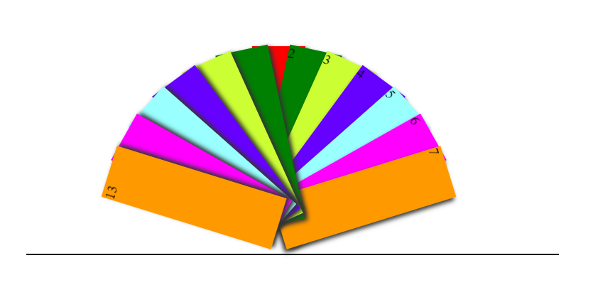
10.扇子打开闭合效果---动图
HTML:


 1 <!DOCTYPE html>
 2 <head>
 3     <meta charset="utf-8"/>
 4     <title>demo005</title>
 5     <link type="text/css" href="E:\htmltest1\demo1\demo005.css" rel="stylesheet">
 6 </head>
 7 <body>
 8     <div class="zs">
 9         <div>1</div>
10         <div>2</div>
11         <div>3</div>
12         <div>4</div>
13         <div>5</div>
14         <div>6</div>
15         <div>7</div>
16         <div>8</div>
17         <div>9</div>
18         <div>10</div>
19         <div>11</div>
20         <div>12</div>
21         <div>13</div>
22     </div>
23 </body>
CSS:
 1 *{margin:0;padding:0;}
 2 .zs{
 3     width:600px;
 4     height:340px;
 5     margin:100px auto;
 6     border-bottom:2px solid black;
 7 }
 8 .zs div{
 9     width:60px;
10     height:200px;
11     position:absolute;
12     left:47%;
13     top:206px;
14     transform-origin:bottom center;
15     box-shadow:3px 3px 5px #333;
16     transition: all 2s linear;
17 }
18
19 .zs div:nth-of-type(1){background:red;}
20 .zs div:nth-of-type(2){background:green;}
21 .zs div:nth-of-type(3){background:#CCFF33;}
22 .zs div:nth-of-type(4){background:#6600FF;}
23 .zs div:nth-of-type(5){background:#99FFFF;}
24 .zs div:nth-of-type(6){background:#FF00FF;}
25 .zs div:nth-of-type(7){background:#FF9900;}
26 .zs div:nth-of-type(8){background:green;}
27 .zs div:nth-of-type(9){background:#CCFF33;}
28 .zs div:nth-of-type(10){background:#6600FF;}
29 .zs div:nth-of-type(11){background:#99FFFF;}
30 .zs div:nth-of-type(12){background:#FF00FF;}
31 .zs div:nth-of-type(13){background:#FF9900;}
32
33 .zs:hover div:nth-of-type(2){transform:rotate(15deg)}
34 .zs:hover div:nth-of-type(3){transform:rotate(30deg)}
35 .zs:hover div:nth-of-type(4){transform:rotate(45deg)}
36 .zs:hover div:nth-of-type(5){transform:rotate(60deg)}
37 .zs:hover div:nth-of-type(6){transform:rotate(75deg)}
38 .zs:hover div:nth-of-type(7){transform:rotate(90deg)}
39 .zs:hover div:nth-of-type(8){transform:rotate(-15deg)}
40 .zs:hover div:nth-of-type(9){transform:rotate(-30deg)}
41 .zs:hover div:nth-of-type(10){transform:rotate(-45deg)}
42 .zs:hover div:nth-of-type(11){transform:rotate(-60deg)}
43 .zs:hover div:nth-of-type(12){transform:rotate(-75deg)}
44 .zs:hover div:nth-of-type(13){transform:rotate(-90deg)}
效果:


【推荐】国内首个AI IDE,深度理解中文开发场景,立即下载体验Trae
【推荐】编程新体验,更懂你的AI,立即体验豆包MarsCode编程助手
【推荐】抖音旗下AI助手豆包,你的智能百科全书,全免费不限次数
【推荐】轻量又高性能的 SSH 工具 IShell:AI 加持,快人一步
· TypeScript + Deepseek 打造卜卦网站:技术与玄学的结合
· 阿里巴巴 QwQ-32B真的超越了 DeepSeek R-1吗?
· 【译】Visual Studio 中新的强大生产力特性
· 【设计模式】告别冗长if-else语句:使用策略模式优化代码结构
· AI与.NET技术实操系列(六):基于图像分类模型对图像进行分类