CSS面试题总结
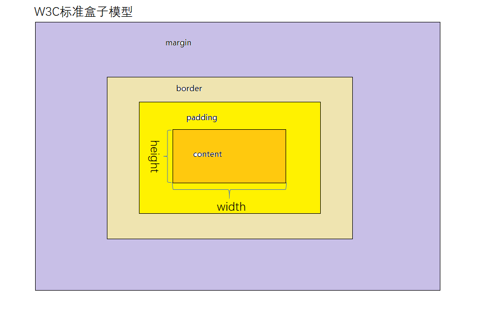
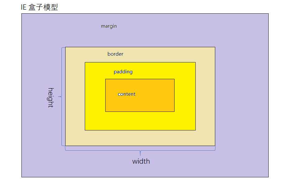
1. 两种盒模型说一下?
- 在标准的盒子模型(默认)中,width指content部分的宽度
- 在IE盒子模型中,width表示content+padding+border这三个部分的宽度
- 想要切换盒模型也很简单,使用css3的 box-sizing 属性:
box-sizing: content-box 是W3C盒子模型
box-sizing: border-box 是IE盒子模型
2. 如何水平垂直居中?
这里我介绍三种:
1) 定位 + 负边距 View Code<style> html, body { width: 100%; height: 100%; padding: 0; margin: 0; background-color: #ccc; } div { width: 400px; height: 400px; background-color: red; position: absolute; /*脱离文档流*/ top: 50%; left: 50%; margin-top: -200px; margin-left: -200px; /*transform: translate(-50%, -50%);*/ /* 这步操作相当于上面两步 */ } </style> <body> <div></div> </body>
2) display: flex 弹性布局
这种方式需要给父元素做 display: flex
View Code<style> html, body { width: 100%; height: 100%; padding: 0; margin: 0; background-color: #ccc; } body { display: flex; align-items: center; justify-content: center; } div { width: 400px; height: 400px; background-color: red; } </style> <body> <div></div> </body>
3) display: table-cellView Code<style> html, body { width: 100%; height: 100%; padding: 0; margin: 0; background-color: #ccc; } body { display: table; } .dv1 { display: table-cell; vertical-align: middle; } .dv2 { width: 400px; height: 400px; background-color: red; } </style> <body> <div class="dv1"> <div class="dv2"></div> </div> </body>
4) 绝对居中
原理是当top,bottom为0时,margin-top&bottom设置auto的话会无限延伸沾满空间并平分,当left,right为0时,margin-left&right设置auto会无限延伸占满空间并平分
View Code<!DOCTYPE html> <html lang="en"> <head> <meta charset="UTF-8"> <title>Document</title> <style> * { padding: 0; margin: 0; } .box { width: 800px; height: 800px; background-color: #ccc; position: relative; margin: 0 auto; } .inner { width: 300px; height: 300px; background-color: red; position: absolute; left: 0; right: 0; top: 0; bottom: 0; margin: auto; } </style> </head> <body> <div class="box"> <div class="inner"> </div> </div> </body> </html>

3. flex怎么用?常用的属性有哪些?详情参考
flex可用作弹性布局。布局的传统解决方案,基于盒状模型,依赖 display属性 + position属性 + float属性。它对于那些特殊布局非常不方便,比如,垂直居中就不容易实现。
常用的属性:
- flex-direction--->决定主轴的方向;
- flex-wrap--->决定如何换行;
- flex-flow--->flex-direction属性和flex-wrap属性的简写形式;
- justify-content--->定义了项目在主轴上的对齐方式;
- align-items--->定义项目在交叉轴上如何对齐;
- align-content--->定义了多根轴线的对齐方式;
4. BFC是什么?详情参考
BFC 即 Block Formatting Context (块格式化上下文), 是Web页面的可视化CSS渲染的一部分,是块盒子的布局过程发生的区域,也是浮动元素与其他元素交互的区域。
简单来说就是一个封闭的黑盒子,里面元素的布局不会影响外部。
下列方式会创建块格式化上下文:
- 根元素(
<html>)- 浮动元素(元素的
float不是none)- 绝对定位元素(元素的
position为absolute或fixed)- 行内块元素(元素的
display为inline-block)- 表格单元格(元素的
display为table-cell,HTML表格单元格默认为该值)- 表格标题(元素的
display为table-caption,HTML表格标题默认为该值)- 匿名表格单元格元素(元素的
display为table、table-row、table-row-group、table-header-group、table-footer-group(分别是HTML table、row、tbody、thead、tfoot的默认属性)或inline-table)overflow值不为visible的块元素display值为flow-root的元素contain值为layout、content或 paint 的元素- 弹性元素(
display为flex或inline-flex元素的直接子元素)- 网格元素(
display为grid或inline-grid元素的直接子元素)- 多列容器(元素的
column-count或column-width不为auto,包括column-count为1)column-span为all的元素始终会创建一个新的BFC,即使该元素没有包裹在一个多列容器中(标准变更,Chrome bug)。
5. 说一说 CSS 选择器优先级
选择器按优先级先后排列:!important>内联>id>class = 属性 = 伪类 >标签 = 伪元素 > 通配符(*)
- important声明 1,0,0,0
- ID选择器 0,1,0,0
- 类选择器 0,0,1,0
- 伪类选择器 0,0,1,0
- 属性选择器 0,0,1,0
- 标签选择器 0,0,0,1
- 伪元素选择器 0,0,0,1
- 通配符选择器 0,0,0,0
6. 你会几种清除浮动的写法?
1) 额外标签法
View Code<!DOCTYPE html> <html lang="en"> <head> <meta charset="UTF-8"> <title>Title</title> <style> * { padding: 0; margin: 0; } .father { border: 1px solid red; width: 500px; } .big { width: 100px; height: 100px; background-color: purple; float: left; } .small { width: 80px; height: 80px; background-color: blue; float: left; } .clear { clear: both; /*如果清除了浮动, 父亲去自动检测孩子的高度 以最高的为准*/ } .footer { width: 400px; height: 150px; background-color: pink; } </style> </head> <body> <div class="father"> <div class="big"></div> <div class="small"></div> <div class="clear"></div> <!--最后一个浮动标签的后面,新添加一个标签 清除浮动--> </div> <div class="footer"></div> </body> </html>
2)父级添加 overflow: hidden 方法
View Code<!DOCTYPE html> <html lang="en"> <head> <meta charset="UTF-8"> <title>Title</title> <style> * { padding: 0; margin: 0; } .father { border: 1px solid red; width: 500px; overflow: hidden; /*别加错位置了, 给父亲加*/ /*不是所有浮动都需要清除 谁影响布局就清除谁*/ } .big { width: 100px; height: 100px; background-color: purple; float: left; } .small { width: 80px; height: 80px; background-color: blue; float: left; } .footer { width: 400px; height: 150px; background-color: pink; } </style> </head> <body> <div class="father"> <div class="big"></div> <div class="small"></div> </div> <div class="footer"></div> </body> </html>
3)after伪元素清除浮动
View Code<!DOCTYPE html> <html lang="en"> <head> <meta charset="UTF-8"> <title>Document</title> <style> .clearfix:after { /*正常浏览器 清除浮动*/ content: ""; display: block; height: 0; clear: both; visibility: hidden; } .clearfix { *zoom: 1; /*zoom 1 就是ie6 清除浮动方式 * ie7以下的版本才能识别 其他浏览器都不执行(略过)*/ } .father { border: 1px solid red; width: 300px; } .big { width: 100px; height: 100px; background-color: purple; float: left; } .small { width: 80px; height: 80px; background-color: blue; float: left; } .footer { width: 400px; height: 100px; background-color: pink; } </style> </head> <body> <div class="father clearfix"> <div class="big"></div> <div class="small"></div> </div> <div class="footer"></div> </body> </html>
4)before和after双伪元素清除浮动
View Code<!DOCTYPE html> <html lang="en"> <head> <meta charset="UTF-8"> <title>Document</title> <style> .clearfix:before, .clearfix:after { content: ""; display: table; } .clearfix:after { clear: both; } .clearfix { *zoom: 1; } .father { border: 1px solid red; width: 300px; } .big { width: 100px; height: 100px; background-color: purple; float: left; } .small { width: 80px; height: 80px; background-color: blue; float: left; } .footer { width: 400px; height: 100px; background-color: pink; } </style> </head> <body> <div class="father clearfix"> <div class="big"></div> <div class="small"></div> </div> <div class="footer"></div> </body> </html>
7. 纯CSS画三角形/梯形/圆
利用CSS border 属性
- 三角形
div {
  width: 0;
  height: 0;
  border-left: 50px solid transparent;/* transparent是将border设置透明的意思 */
  border-right: 50px solid transparent;
  border-bottom: 100px solid blue;
}
- 梯形
div {
  width: 100px;
  height: 0;
  border-left: 50px solid transparent;/* transparent是将border设置透明的意思 */
  border-right: 50px solid transparent;
  border-bottom: 100px solid blue;
}
- 圆
div {
  width: 0;
  height: 0;
  border: 100px solid red;
  border-radius: 100px;
}
8. 边距塌陷
边距折叠发生在同一BFC的块级元素之间,上下边距是边距较大值而不是边距之和。
会发生边距折叠的三种情况:
- 相邻元素之间
毗邻的两个元素之间的外边距会折叠(除非后一个元素需要清除之前的浮动)。
View Code<!DOCTYPE html> <html lang="en"> <head> <meta charset="UTF-8"> <meta name="viewport" content="width=device-width, initial-scale=1.0"> <title>Document</title> </head> <body> <style> html *{ padding: 0; margin: 0; } div { width: 200px; height: 200px; background-color: red; margin: 200px; } </style> <div class="left"></div> <div class="right"></div> </body> </html>
- 父元素与其第一个或最后一个子元素之间
如果在父元素与其第一个子元素之间不存在边框、内边距、行内内容,也没有创建块格式化上下文、或者清除浮动将两者的
margin-top分开;或者在父元素与其最后一个子元素之间不存在边框、内边距、行内内容、height、min-height、max-height将两者的margin-bottom分开,那么这两对外边距之间会产生折叠。此时子元素的外边距会“溢出”到父元素的外面。如果在父元素与其第一个子元素之间不存在边框、内边距、行内内容,也没有创建块格式化上下文、或者清除浮动将两者的margin-top分开;或者在父元素与其最后一个子元素之间不存在边框、内边距、行内内容、height、min-height、max-height将两者的margin-bottom分开,那么这两对外边距之间会产生折叠。此时子元素的外边距会“溢出”到父元素的外面。View Code<!DOCTYPE html> <html lang="en"> <head> <meta charset="UTF-8"> <meta name="viewport" content="width=device-width, initial-scale=1.0"> <title>Document</title> </head> <body> <style> html *{ padding: 0; margin: 0; } .father { width: 100%; height: 400px; background-color: red; } .son { height: 50%; width: 100%; background-color: green; margin-top: 100px; /* 这一步导致父级div和子级div一同移动 */ } </style> <div class="father"> <div class="son"></div> </div> </body> </html>
- 空的块级元素
如果一个块级元素中不包含任何内容,并且在其
margin-top与margin-bottom之间没有边框、内边距、行内内容、height、min-height将两者分开,则该元素的上下外边距会折叠。View Code<!DOCTYPE html> <html lang="en"> <head> <meta charset="UTF-8"> <meta name="viewport" content="width=device-width, initial-scale=1.0"> <title>Document</title> </head> <body> <style> html * { padding: 0; margin: 0; } .first { width: 100%; height: 100px; background-color: red; margin-bottom: 0; } .third { width: 100%; height: 100px; background-color: red; margin-top: 0; } .second { margin-top: 100px; margin-bottom: 200px; /* 理论上这块儿的白色区域高应该为100px+200px=300px, 实际上只有200px,.second的height为0,上下边距融合,选取margin-top和margin-bottom中的最大值 */ } </style> <div class="first">下边距100px</div> <div class="second"></div> <div class="third">上边距100px</div> </body> </html>
9. 文字截断
单行文本截断 text-overflow
div {
  white-space: nowrap;
  overflow: hidden;
  text-overflow: ellipsis;
}
10. 响应式布局
1. 允许网页宽度自适应
<meta name="viewport" content="width=device-width,initial-scale=1" />
// viewport是网页默认的宽度和高度,网页宽度默认等于屏幕宽度,原始缩放比例为1.0,网页初始大小占屏幕面积的100%
2. 不使用绝对宽度
不指定像素宽度,指定百分比宽度。或者width:auto
3. 字体不使用绝对大小px,使用相对大小em
4. 流式布局。让各个区块的位置都是浮动的,不是固定不变的。
浮动的好处是,如果宽度太小,放不下两个元素,后面的元素会自动滚动到前面元素的下方,不会再水平方向溢出,避免了水平滚动条的出现。
5. 选择加载CSS
自动探测屏幕宽度,然后加载相应的CSS文件
<link rel="stylesheet" type="text/css"
    media="screen and (max-device-width: 400px)"
    href="tinyScreen.css" />

@import url("tinyScreen.css") screen and (max-device-width: 400px);
6. CSS的@media规则
同一个CSS文件中,也可以根据不同的屏幕分辨率,选择应用不同的CSS规则。
@media screen and (max-device-width: 400px) {
    .column {
      float: none;
      width:auto;
    }

    #sidebar {
      display:none;
    }
}
上面的代码意思是,如果屏幕宽度小于400像素,则column块取消浮动(float:none)、宽度自动调节(width:auto),sidebar块不显示(display:none)。
7. 图片自适应
img { max-width: 100%;}
11. display: none 与 visibility: hidden 区别
display: none 可以隐藏某个元素,且隐藏的元素不会占用任何空间,也就是说该元素不但被隐藏了,而且原本占用的空间也会从页面布局中消失。
visibility: hidden 可以隐藏某个元素,单隐藏的元素仍需占用与未隐藏之前一样的空间,也就是说该元素虽然被隐藏了,但仍然会影响布局。
12. 隐藏页面中某个元素的方法
- display:none;
- visibility:hidden;
- opacity: 0;
- position移动到外部
- z-index涂层遮盖
13. display:table 和 本身的table有什么区别?
display:table; 的CSS声明能够让一个HTML元素和它的子节点像table元素一样。使用基于表格的CSS布局,使我们能够轻松定义一个单元格的边界、背景等样式,而不会产生因为使用了table那样的制表标签所导致的语义化问题。
为什么不用table系元素,取而代之用div+css?
- 用DIV+CSS编写出来的文件k数比用table写出来的要小;
- table必须在页面完全加载后才显示,没有加载完毕前,table为一片空白,也就是说,需要页面完毕才显示,而div是逐行显示,不需要页面完全加载完毕,就可以一边加载一边显示;
- 非表格内容用table来装,不符合标签语义化要求,不利于SEO
- table的嵌套性太多,用DIV代码会比较简洁
14. 实现三栏布局
- 方法一:左右浮动布局
这种布局方式,必须先写浮动部分,最后再写中间部分,否则右浮动块会掉到下一行。
浮动布局优点:就是比较简单,兼容性也比较好。浮动布局缺点:具是有局限性的,浮动元素是脱离文档流,会带来很多问题,比如父容器高度塌陷等。<!DOCTYPE html> <html lang="en"> <head> <meta charset="UTF-8"> <meta name="viewport" content="width=device-width, initial-scale=1.0"> <title>Document</title> <style> .left { float: left; width: 250px; height: 200px; background-color: red; } .center { height: 200px; background-color: green; } .right { float: right; width: 250px; height: 200px; background-color: blue; } </style> </head> <body> <div class="box"> <div class="left"></div> <div class="right"></div> <div class="center"></div> </div> </body> </html>
- 方法二:绝对定位布局
绝对定位布局优点:快捷以及设置简单,而且也不容易出问题。绝对定位布局缺点:容器脱离了文档流,后代元素也脱离了文档流,高度未知的时候,会有问题,这就导致了这种方法的有效性和可使用性是比较差的。
<!DOCTYPE html>
<html lang="en">

<head>
  <meta charset="UTF-8">
  <meta name="viewport" content="width=device-width, initial-scale=1.0">
  <title>Document</title>
  <style>
    .box {
      position: relative;
    }

    .left {
      width: 250px;
      height: 200px;
      background-color: red;
      position: absolute;
      left: 0;

    }

    .center {
      height: 200px;
      background-color: green;
      position: absolute;
      left: 250px;
      right: 250px;
      /* 离左侧 右侧的距离都需设置; */
    }

    .right {
      width: 250px;
      height: 200px;
      background-color: blue;
      position: absolute;
      right: 0;
    }
  </style>
</head>

<body>
  <div class="box">
    <div class="left"></div>
    <div class="right"></div>
    <div class="center"></div>
  </div>
</body>

</html>
- 方法三:flex布局
需要注意要将中间块放在前面,通过
order来控制位置,实际高度会根据内容自适应,三栏高度统一。对父元素用display: flex之后子元素的宽度会失效,也就是无法设置子元素的宽度,可以通过改变flex值来改变宽度。
Flex布局的优点:在移动端比较常见,布局灵活,兼容性也还可以,基本能满足大多数需求。Flex布局的缺点:IE10才开始支持<!DOCTYPE html> <html lang="en"> <head> <meta charset="UTF-8"> <meta name="viewport" content="width=device-width, initial-scale=1.0"> <title>Document</title> <style> .box { display: flex; } .left { flex: 1; order: 1; /* width: 250px; */ /* 宽度会失效 */ background-color: red; } .center { flex: 1; order: 2; height: 200px; background-color: green; } .right { flex: 1; order: 3; background-color: blue; } </style> </head> <body> <div class="box"> <div class="left"></div> <div class="right"></div> <div class="center"></div> </div> </body> </html>
- 方法四:Grid布局
Grid布局优点:创建网格布局最强大和最简单的工具。实际高度会根据内容自适应,三栏高度统一。Grid布局缺点:唯一的缺点就是兼容性不太好。<!DOCTYPE html> <html lang="en"> <head> <meta charset="UTF-8"> <meta name="viewport" content="width=device-width, initial-scale=1.0"> <title>Document</title> <style> .box { display: grid; grid-template-columns: 250px auto 250px; grid-template-rows: 150px; width: 100%; } .left { background-color: red; } .center { background-color: green; } .right { background-color: blue; } </style> </head> <body> <div class="box"> <div class="left"></div> <div class="center"></div> <div class="right"></div> </div> </body> </html>
- 方法五:表格布局
- 表格布局优点:兼容性很好,在
Flex布局不兼容的时候(一般情况下很少不兼容),可以尝试表格布局。当内容溢出时会自动撑开父元素。- 表格布局缺点:
- 无法设置栏边距
- 对
seo不友好- 当其中一个单元格高度超出的时候,两侧的单元格也是会跟着一起变高的,然而有时候这并不是我们想要的效果。
<!DOCTYPE html>
<html lang="en">

<head>
  <meta charset="UTF-8">
  <meta name="viewport" content="width=device-width, initial-scale=1.0">
  <title>Document</title>
  <style>
    .box {
      display: table;
      height: 200px;
      width: 100%;
      /* 需要设置宽高 */
    }

    .left {
      display: table-cell;
      width: 250px;
      background-color: red;
    }

    .center {
      display: table-cell;
      background-color: green;
    }

    .right {
      display: table-cell;
      width: 250px;
      background-color: blue;
    }
  </style>
</head>

<body>
  <div class="box">
    <div class="left"></div>
    <div class="center"></div>
    <div class="right"></div>
  </div>
</body>

</html>
15. CSS3有哪些新特性?
1.CSS3边框:
- border-radius:CSS3圆角边框。在 CSS2 中添加圆角矩形需要技巧,我们必须为每个圆角使用不同的图片,在 CSS3 中,创建圆角是非常容易的,在 CSS3 中,border-radius 属性用于创建圆角。border:2px solid;
- box-shadow:CSS3边框阴影。在 CSS3 中,box-shadow 用于向方框添加阴影。box-shadow:10px 10px 5px #888888;
- border-image:CSS3边框图片。通过 CSS3 的 border-image 属性,您可以使用图片来创建边框。border-image:url(border.png) 30 30 round;
2.CSS3背景:
- background-size: 属性规定背景图片的尺寸。在 CSS3 之前,背景图片的尺寸是由图片的实际尺寸决定的。在 CSS3 中,可以规定背景图片的尺寸,这就允许我们在不同的环境中重复使用背景图片。您能够以像素或百分比规定尺寸。如果以百分比规定尺寸,那么尺寸相对于父元素的宽度和高度。
- background-origin :属性规定背景图片的定位区域。背景图片可以放置于 content-box、padding-box 或 border-box 区域。
3.CSS3文字效果:
- text-shadow:在 CSS3 中,text-shadow 可向文本应用阴影。text-shadow:5px 5px 5px #FFFFFF;
- word-wrap :单词太长的话就可能无法超出某个区域,允许对长单词进行拆分,并换行到下一行:p{word-wrap:break-word;}
4.CSS3 2D转换:
transform:通过 CSS3 转换,我们能够对元素进行移动、缩放、转动、拉长或拉伸。
- translate():元素从其当前位置移动,根据给定的 left(x 坐标) 和 top(y 坐标) 位置参数:transform:translate(50px,100px);值 translate(50px,100px) 把元素从左侧移动 50 像素,从顶端移动 100 像素。
- rotate():元素顺时针旋转给定的角度。允许负值,元素将逆时针旋转。transform:rotate(30deg);值 rotate(30deg) 把元素顺时针旋转 30 度。
- scale():元素的尺寸会增加或减少,根据给定的宽度(X 轴)和高度(Y 轴)参数:transform:scale(2,4);值 scale(2,4) 把宽度转换为原始尺寸的 2 倍,把高度转换为原始高度的 4 倍。
- skew():元素转动给定的角度,根据给定的水平线(X 轴)和垂直线(Y 轴)参数:transform:skew(30deg,20deg);值 skew(30deg,20deg) 围绕 X 轴把元素转动 30 度,围绕 Y 轴转动 20 度。
- matrix() :
matrix() 方法把所有 2D 转换方法组合在一起。
matrix() 方法需要六个参数,包含数学函数,允许您:旋转、缩放、移动以及倾斜元素。
5.CSS3 3D转换:
- rotateX():元素围绕其 X 轴以给定的度数进行旋转。transform:rotateX(120deg);
- rotateY():元素围绕其 Y 轴以给定的度数进行旋转。transform:rotateY(120deg);
6.CSS3 过渡:当元素从一种样式变换为另一种样式时为元素添加效果。
7.CSS3动画:通过 CSS3,我们能够创建动画,这可以在许多网页中取代动画图片、Flash 动画以及 JavaScript。
8.CSS3多列:
- column-count:属性规定元素应该被分隔的列数。
- column-gap:属性规定列之间的间隔。
- column-rule :属性设置列之间的宽度、样式和颜色规则。
9.CSS3用户界面:
- resize:属性规定是否可由用户调整元素尺寸。
- box-sizing:属性允许您以确切的方式定义适应某个区域的具体内容。
- outline-offset :属性对轮廓进行偏移,并在超出边框边缘的位置绘制轮廓。
