

css
删除关闭按钮的动画
    transform: rotate(0deg);
    transition: 0.5s
鼠标hover
        transform: rotate(180deg);
// text-underline-offset属性可以用来设置下划线偏移位置

text-decoration: underline;
text-underline-offset: 1.3vh;
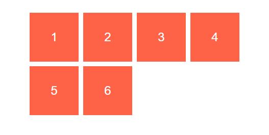
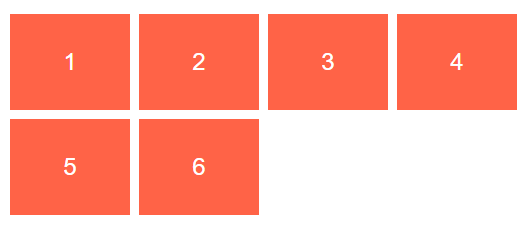
<!DOCTYPE html>
<html lang="en">
<head>
  <meta charset="UTF-8">
  <title>Title</title>
  <style>
      .wrapper {
          display: flex;
          margin: 50px auto;
          width: 800px;
          overflow: hidden;
          border-radius: 8px;
          padding: 15px ;
          box-shadow: 20px 20px 60px #bebebe,
          -20px -20px 60px #ffffff;
      }
      .text {
          font-size: 20px;
          overflow: hidden;
          text-overflow: ellipsis;
          text-align: justify;
          /* display: flex; */
          /*   display: -webkit-box;
            -webkit-line-clamp: 3;
            -webkit-box-orient: vertical; */
          position: relative;
          line-height: 1.5;
          max-height: 4.5em;
          transition: .3s max-height;
      }
      .text::before {
          content: '';
          height: calc(100% - 26px);
          float: right;
      }
      .text::after {
          content: '';
          width: 100%;
          height: 100%;
          position: absolute;
          background: #fff;
      }
      .btn{
          position: relative;
          float: right;
          clear: both;
          margin-left: 20px;
          font-size: 16px;
          padding: 0 8px;
          background: #3F51B5;
          line-height: 24px;
          border-radius: 4px;
          color:  #fff;
          cursor: pointer;
      }
      .btn::after{
          content:'展开'
      }
      .exp{
          display: none;
      }
      .exp:checked+.text{
          max-height: 200px;
      }
      .exp:checked+.text::after{
          visibility: hidden;
      }
      .exp:checked+.text .btn::before{
          visibility: hidden;
      }
      .exp:checked+.text .btn::after{
          content:'收起'
      }
      .btn::before{
          content: '...';
          position: absolute;
          left: -5px;
          color: #333;
          transform: translateX(-100%)
      }

  </style>
</head>
<body>
<div class="wrapper">
  <input id="exp1" class="exp"  type="checkbox">
  <div class="text">
    <label class="btn" for="exp1"></label>
    浮动元素是如何定位的
    正如我们前面提到的那样,当一个元素浮动之后,它会被移出正常的文档流,然后向左或者向右平移,一直平移直到碰到了所处的容器的边框,或者碰到另外一个浮动的元素。
    在下面的图片中,有三个红色的正方形。其中有两个向左浮动,一个向右浮动。要注意到第二个向左浮动的正方形被放在第一个向左浮动的正方形的右边。如果还有更多的正方形这样浮动,它们会继续向右堆放,直到填满容器一整行,之后换行至下一行。
  </div>
</div>

<div class="wrapper">
  <input id="exp2"  class="exp"  type="checkbox">
  <div class="text">

    <label class="btn" for="exp2"></label>
    浮动元素是如何定位的
    正如我们前面提到的那样,当一个元素浮动之后,它会被移出正常的文档流,然后向左或者向右平移,一直平移直到碰到了所处的容器的边框,或者碰到另外一个浮动的元素。
  </div>
</div>
</body>
</html>
p{文字内容$} *3
p:nth-child(3)  1.必须是p元素,2.p是子元素中的第三个
Grid
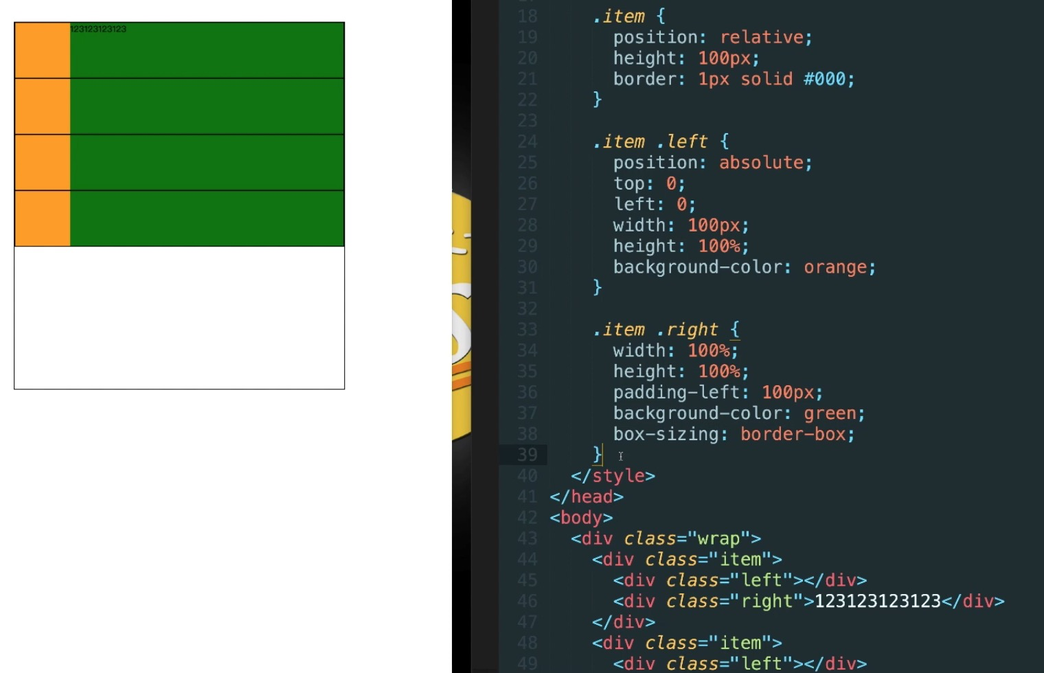
容器属性
justify-content
整个内容区域在容器里面的水平位置

align-content

justify-items
设置单元格内容的水平位置

align-items

grid-auto-columns

grid-template-areas


项目属性
grid-area
grid-column-start
justify-self
设置单元格内容的水平  跟justify-items属性的用法完全一致 但只作用于单个项目


// 实战
grid-template-columns: repeat(auto-fit, 200px)
表示福鼎列宽200px,数量是自适应的,只要容纳的下,就会往上排列


repeat+auto-fit+minmax 去掉右侧空白
上面看到的效果中,右侧通常会留下空白,这是我们不希望看到的。如果列的宽度也能在某个范围内自适应就好了。minmax() 函数就帮助我们做到了这点
将 grid-template-columns: repeat(auto-fit, 200px) 改成 grid-template-columns: repeat(auto-fit, minmax(200px, 1fr)) 表示列宽至少 200px,如果还有空余则一起等分

repeat+auto-fit+minmax-span-dense 解决空缺问题
似乎一切进行得很顺利,但是某天 UI 来说,每个网格元素的长度可能不相同,这也简单,通过 span 关键字进行设置网格项目的跨度,grid-column-start: span 3,表示这个网格项目跨度为 3
右边布局自动
<div class="parent">
    <div class="child-1">
      left
      <span>我是左边的数据</span>
    </div>
    <div class="child-2">
      right
    </div>
</div>
--------------------------------
.parent{
  display: flex;
  border: 1px solid red;
}
.parent .child-2{
  margin-left : auto
}
topIn
<div class="target topIn">
  topIn从上往下进入
</div>

.target{
  width: 100px;
  height:100px;
  background: pink
}
.topIn{
  animation: topIn 1s ease
}
@keyframes topIn {
  from {
    transform: translateY(-50px);
    opacity: 0
  }
  to {
    transform: translateY(0px);
    opacity: 1
  }
}
粒子动效按钮
.particle_button {
  display: inline-block;
  background-color: #3bb4ff;
  color: #fff;
  border-radius: 4px;
  border: none;
  cursor: pointer;
  position: relative;
  box-shadow: 0 2px 25px rgba(59, 180, 255, 0.8);
  outline: 0;
  transition: transform ease-in 0.1s, background-color ease-in 0.1s,  box-shadow ease-in 0.25s;
}
.particle_button::before{
  position: absolute;
  content: '';
  left: -2em;
  right: -2em;
  top: -2em;
  bottom: -2em;
  pointer-events: none;
  transition: ease-in-out .5s;
  background-repeat: no-repeat;
  background-image: radial-gradient(circle, #3BB4FF 20%, transparent 20%),
  radial-gradient(circle, #3BB4FF 20%, transparent 20%),
  radial-gradient(circle, #3BB4FF 20%, transparent 20%),
  radial-gradient(circle, #3BB4FF 20%, transparent 20%),
  radial-gradient(circle, #3BB4FF 20%, transparent 20%),
  radial-gradient(circle, #3BB4FF 20%, transparent 20%),
  radial-gradient(circle, #3BB4FF 20%, transparent 20%),
  radial-gradient(circle, #3BB4FF 20%, transparent 20%),
  radial-gradient(circle, #3BB4FF 20%, transparent 20%),
  radial-gradient(circle, #3BB4FF 20%, transparent 20%),
  radial-gradient(circle, #3BB4FF 20%, transparent 20%),
  radial-gradient(circle, #3BB4FF 20%, transparent 20%),
  radial-gradient(circle, #3BB4FF 20%, transparent 20%),
  radial-gradient(circle, #3BB4FF 20%, transparent 20%),
  radial-gradient(circle, #3BB4FF 20%, transparent 20%),
  radial-gradient(circle, #3BB4FF 20%, transparent 20%);
  background-size: 10% 10%, 20% 20%, 15% 15%, 20% 20%, 18% 18%, 10% 10%, 15% 15%, 10% 10%, 18% 18%,
  15% 15%, 20% 20%, 18% 18%, 20% 20%, 15% 15%, 10% 10%, 20% 20%;
  background-position: 18% 40%, 20% 31%, 30% 30%, 40% 30%, 50% 30%, 57% 30%, 65% 30%, 80% 32%, 15% 60%,
  83% 60%, 18% 70%, 25% 70%, 41% 70%, 50% 70%, 64% 70%, 80% 71%;
  animation: bubbles ease-in-out .75s forwards;
}

.particle_button:active {
  transform: scale(0.95);
  background-color: #3BB4FF;
  box-shadow: 0 2px 25px rgba(233, 30, 99, 0.5);
}
.particle_button:active::before {
  animation: none;
  background-size: 0;
}
@keyframes bubbles {
  0% {
    background-position: 18% 40%, 20% 31%, 30% 30%, 40% 30%, 50% 30%, 57% 30%, 65% 30%, 80% 32%, 15% 60%,
    83% 60%, 18% 70%, 25% 70%, 41% 70%, 50% 70%, 64% 70%, 80% 71%;
  }
  50% {
    background-position: 10% 44%, 0% 20%, 15% 5%, 30% 0%, 42% 0%, 62% -2%, 75% 0%, 95% -2%, 0% 80%,
    95% 55%, 7% 100%, 24% 100%, 41% 100%, 55% 95%, 68% 96%, 95% 100%;
  }
  100% {
    background-position: 5% 44%, -5% 20%, 7% 5%, 23% 0%, 37% 0, 58% -2%, 80% 0%, 100% -2%, -5% 80%,
    100% 55%, 2% 100%, 23% 100%, 42% 100%, 60% 95%, 70% 96%, 100% 100%;
    background-size: 0% 0%;
  }
}
grid:
auto-fit
现在,栅格将会根据容器的宽度调整其数量。它会尝试在容器中容纳尽可能多的 100px 宽的列。但如果我们将所有列硬写为 100px,我们将永远没法获得所需的弹性,因为它们很难填充整个宽度。正如你在上图看到的,网格通常在右侧留有空白。
minmax()
为了解决上述问题,我们需要minmax()。我们将 100px 替换为 minmax(100px, 1fr),代码如下:

注意:所有响应都发生在一行css代码中
正如你所见,效果完美。minmax()函数定义的范围大于或等于 min, 小于或等于 max。因此,现在每列将至少为 100px。但如果有更多的可用空间,栅格布局将简单地将其均分给每列,因为这些列变成了 fraction 单位,而不是 100px。
有图片的
object=fit: cover
使用@import简化页面多文件导入
<link rel="stylesheet" href=""></link>

@import url(common.css) all;
@import url(screen.css) screen;
@import url(print.css) print;
-----------
注意加载顺序
@import url(small.css) only screen and (min-width:768px)
@import url(big.css) only screen and (min-width:960px)
@import url(big.css) only screen and (min-width:1200px)
单独给导航设置样式
.navbar{ ... }
如果在屏幕小于600px
@media screen and (max-width:600px){
....
}
屏幕最小宽度768px,包含768px时候,底线最小为768
<style media="screen and (min-width:768px)">
</style>
或者在横屏时候,style用逗号,来表示或者
<style media="screen and (orientation: landscape), screen and (min-width:768px)">
</style>
文字变化
.customBreath{
    animation-name: customBreath;
    animation-timing-function: linear;
    animation-fill-mode: forwards;
    animation-iteration-count: infinite;
  }

  .animated-2s {
    -webkit-animation-duration: 2s;
    animation-duration: 2s;
  }

  @keyframes customBreath{
    0% {
      -webkit-transform: scale(1);
      transform: scale(1);
      color: #fff;
    }

    50% {
      -webkit-transform: scale(1);
      transform: scale(1);
      color: #e65015;
      text-shadow: 0 0 3px #fff;
    }
    100% {
      -webkit-transform: scale(1);
      transform: scale(1);
      color: #fff;
    }
  }
css变量
:root {
  --main-color: #06c;
  --accent-color: #999;
}

h1, h2, h3 {
  color: var(--main-color);
}
a[href]:not([class]),
p,
footer span{
 color: var(--accent-color);
}
<style lang="less">
.size{
  width: 100%;
  height: 100%;
}
html,body{
  .size;
  overflow: hidden;
  margin: 0;
  padding: 0;
}
#app {
  .size;
}
</style>
:not解决边框问题
.nav li:not(:last-child) {
    border-right: 1px solid #666;
}
中间竖线,高度可以控制
.action-btn-group {
            display: flex;
            height: 76upx;
            border-radius: 100px;
            overflow: hidden;
            box-shadow: 0 20upx 40upx -16upx #fa436a;
            box-shadow: 1px 2px 5px rgba(219, 63, 96, 0.4);
            background: linear-gradient(to right, #ffac30, #fa436a, #F56C6C);
            margin-left: 20upx;
            position: relative;

            &:after {
                content: '';
                position: absolute;
                top: 50%;
                right: 50%;
                transform: translateY(-50%);
                height: 40upx;
                width: 0;
                border-right: 1px solid rgba(255, 255, 255, .5);
            }
}
阴影效果
// 三角形阴影
.shadow-triangle{
    width: 0;
    height: 0;
    border-style: solid;
    border-width: 0 50px 50px 50px;
    border-color: transparent transparent rgb(245, 129, 127) transparent;
    filter:drop-shadow(10px 0px 10px  rgba(238, 125, 55,0.5));
}

// 缺圆投影
.circle-square{
    width:100px;
    height:50px;
    line-height: 50px;
    background: radial-gradient(circle at bottom right, transparent 20px, rgb(245, 129, 127) 15px);
    filter: drop-shadow(2px 2px 2px rgba(238, 132, 66, 0.9));
}

// 气泡阴影
.tip {
    width: 100px;
    height: 30px;
    line-height: 30px;
    border: 1px solid rgb(245, 129, 127);
    border-radius: 4px;
    position: relative;
    background-color: #fff;
    filter: drop-shadow(0px 2px 4px rgba(245, 129, 127, 0.9));
    &::before {
      content: "";
      width: 0;
      height: 0;
      border-style: solid;
      border-width: 0 10px 10px 10px;
      border-color: transparent transparent #fff transparent;
      position: absolute;
      top: -10px;
      left: 0;
      right: 0;
      margin: auto;
      z-index: 2;
    }
    &::after {
      content: "";
      width: 0;
      height: 0;
      border-style: solid;
      border-width: 0 10px 10px 10px;
      border-color: transparent transparent rgb(245, 129, 127) transparent;
      position: absolute;
      top: -11px;
      left: 0;
      right: 0;
      margin: auto;
      z-index: 1;
    }
}
时间轴
html结构
<div class="timeline-content">
  <div v-for='(item, index) in timeLine' :key='index' class="time-line">
    <div :class="`state-${item.state} state-icon`"></div>
    <div class="timeline-title">{{item.title}}</div>
  </div>
</div>

css样式

/** 时间轴 */
.timeline-content{
  display: flex;
  .time-line{
    padding: 10px 10px 10px 20px;
    position: relative;
    &::before{
      content: '';
      height: 1px;
      width: calc(100% - 34px);
      background: #EBEBEB;
      position: absolute;
      left: 24px;
      top: 0;
    }
  }
  .state-icon{
    width: 20px;
    height: 20px;
    position: absolute;
    top: -12px;
    left: 0;
  }
  .state-1{
    background: url('https://static.daojia.com/assets/project/tosimple-pic/fen-zu-7-copy-6bei-fen_1589266208621.png') no-repeat;
    background-size: cover;
  }
  .state-2{
    background: url('https://static.daojia.com/assets/project/tosimple-pic/12_1589266226040.png') no-repeat;
    background-size: cover;
  }
  .state-3{
    background: url('https://static.daojia.com/assets/project/tosimple-pic/fen-zu-7-copy-3_1589266140087.png') no-repeat;
    background-size: cover;
  }
}


calc()函数 用来计算css属性的值。

/** 属性:calc(expression)*/
宽度:calc(100% - 34px);
卡卷效果
.coupon{
  width: 300px;
  height: 100px;
  position: relative;
  background: radial-gradient(circle at right bottom, transparent 10px, #ffffff 0) top right /50% 51px no-repeat,
    radial-gradient(circle at left bottom, transparent 10px, #ffffff 0) top left / 50% 51px no-repeat,
    radial-gradient(circle at right top, transparent 10px, #ffffff 0) bottom right / 50% 51px no-repeat,
    radial-gradient(circle at left top, transparent 10px, #ffffff 0) bottom left / 50% 51px no-repeat;
  filter: drop-shadow(2px 2px 2px rgba(0,0,0,.2));
}
css3 filter
灰度: -webkit-filter: grayscale(1)
棕色度
饱和度
色相旋转
反色
~豆瓣文字颜色渐变
width: 94%;
        margin: 0 auto;
        height: 100rpx;
        line-height: 100rpx;
        font-weight: 900;
        color: #DD524D;
        font-size: 36rpx;
        background-image: -webkit-linear-gradient(left, #02ab6c, #DD524D 25%, #3499cd 50%, #DD524D 75%, #3499cd);
        -webkit-text-fill-color: transparent;
        -webkit-background-clip: text;
        -webkit-background-size: 200% 100%;
        -webkit-animation: masked-animation 1s infinite linear;
~ li:first-of-type {background: red} 从自己开始算起(同辈元素),即使li前面有span或者div 标签 li:first-child作为儿子的第一个元素
~element+element紧挨后面的元素
~属性选择器 div[aa^=aa] aa属性值开头的div div[aa*=aa] 只有包含有aa属性 div[aa$=aa] aa属性值结尾的div
应用场景:根据不同的后缀名,添加不同的图标 li a[title$=txt] { background: url(txt.jpg) no-repeat } li a[title$=zip] { background: url(zip.jpg) no-repeat }
~p~ul 表示p后面所有的ul
~text-shadow: 5px 5px 5px red 水平 垂直 模糊度 阴影的颜色
~选择图片作为边框的背景 border-image-source 切割图片 border-image-slice:19 border-image-repeat: round 铺满
scss中定义
// 定义
@mixin flex_center() {
    display: flex;
    justify-content: center;
    align-item: center;
}

// 调用
.class {
     @include flex_center
}
//禁用输入框number类型的默认箭头
input::-webkit-outer-spin-button,
input::-webkit-inner-spin-button {
  -webkit-appearance: none;
}
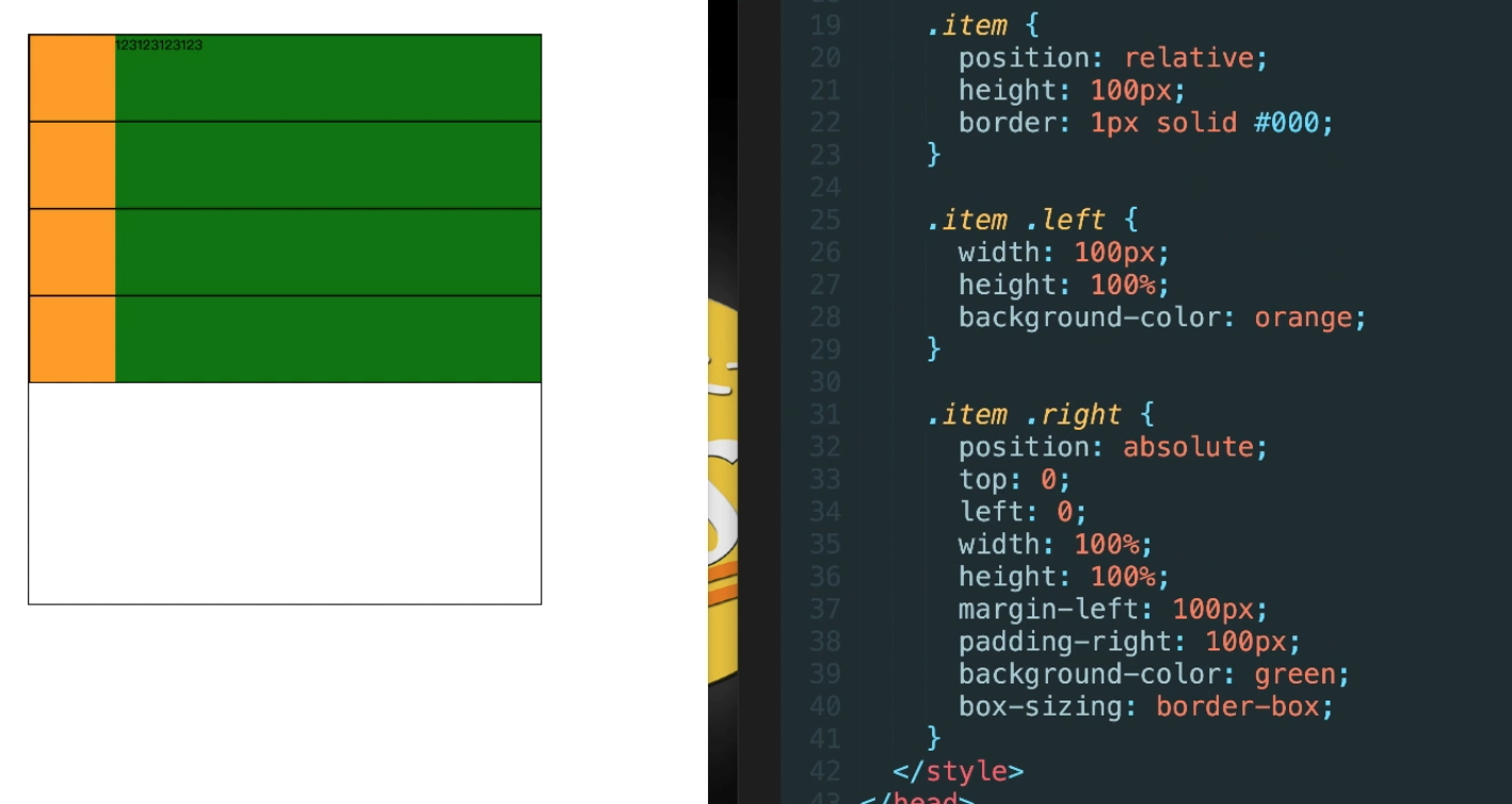
两栏布局
.wrap{overflow: hidden}
三栏布局
grid-template-columns:1fr 1fr 1fr 网格宽度三等分
grid-template-columns: 200px 1fr 1fr 1fr 如果有固定尺寸值,则划分剩余空间大小,4列,后面3列宽度是grid容器宽度减去200像素后的1/3大小
grid-template-columns: auto 1fr 1fr 1fr 如果和auto混用,当有设置fr尺寸,auto的尺寸表现为包裹,为内容宽度
grid-template是 grid-template-rows,grid-template-columns和grid-template-areas属性的缩写
flex布局
flex容器上属性:
1.flex-direction:(row | row-reverse | column | column | column -reverse)控制子项整体布局方向
2.flex-wrap:(nowrap | wrap | wrap-reverse)子项整体单行显示还是换行显示,如果换行,则下面一行是否反方向显示
3.flex-flow:()flex-direction和flex-wrap缩写表示flex布局的flow流动性
4.justify-content:(flex-start | flex-end | center | space-between | space-around | space-evenly) 水平方向子项的对齐和分布方式
5.align-items:(stretch | flex-start | flex-end | center | basline)子项相对于flex容器在垂直方向上的对齐方式,(顶部、底部、拉伸对齐)
6.align-content:()与justify-content相似且对立的属性
flex子项上属性:
1.order:(默认0)整数值,子项想要在最前面,设置比0小的整数
2.flex-grow:(默认是0)不支持负数可以是小数,不占用剩余空白间隙的前提下,拓展自己的宽度
3.flex-shrink:(默认值1)flex容器不足,单个元素的收缩比例
4.flex-basis:(默认值auto)分配剩余空间之前元素的默认大小,不建议子项使用width属性
5.flex:(0 1 auto)flex-grow、flex-shrink、flex-basis缩写
6.align-self:(auto | flex-start | flex-end | center | baseline | stretch
flex-grow:这个属性在移动端布局应用场景( main + footer),footer高度固定,main { flex-grow:1 } 扩展剩余高度
----------------------------------------------------------------------------------------------------------------------------------------------------------------------------------
垂直居中
定宽高的情况
(绝对定位和负margin值)
(绝对定位 + transform)
(绝对定位 + left/right/bottom/top + margin)
(flex布局)
(grid布局) 【
.parent {
display: grid;
place-items: center
}
】
(table-cell + vertical-align + inline-block/marign: auto)
不定宽高的情况
(flex布局)
(绝对定位 + transform) [
position: absolute;
transform: translate(-50%, -50%);
top: 50%;
left: 50%;
]
(table-cell)
(grid + flex布局 display: grid; align-self: center; justify-self: center)
(grid + margin布局 display: grid; margin: auto)
图片定高
(display: table-cell; text-aligin: center; vertical-align: middle)
(text-align: center; .box::after{ content: ''; display: inline-block; vertical-algin: middle; height: 100 % }; img{vertical: middle} )
三栏布局
.container{ display: flex} .left { flex-basis: 200px } .main{ flex: 1 } .right{ flex-basis: 200px }
<style>
        div {
            width: 400px;
            height: 150px;
            background-color: pink;
            /*1. transition: 要过渡的属性  花费时间  运动曲线  何时开始;*/
            /*2. 如果有多组属性,我们用逗号隔开*/
            transition: width 1s ease 0s, height 1s ease 0s, background-color 1s ease 0s;
            /*3. all 所有属性都会变化*/
            /*transition:  all 1s ease 0s;*/
            /*4. 过渡写到本身上*/
            /*transition: all 0.5s;*/
        }
        div:hover {
            width: 800px;
            height: 250px;
            background-color: purple;

        }
 </style>
属性选择器
/* 属性选择器使用方法 */
        /* 选择的是:  既是button 又有 disabled 这个属性的元素 */
        /* 属性选择器的权重是 10 */
        /* 1.直接写属性 */

        button[disabled] {
            cursor: default;
            font-size: 20px;
        }

        button {
            cursor: pointer;
        }
        /* 2. 属性等于值 */

        input[type="search"] {
            color: pink;
        }
        /* 3. 以某个值开头的 属性值 */

        div[class^="icon"] {
            color: red;
        }
        /* 4. 以某个值结尾的 */

        div[class$="icon"] {
            color: green;
        }
        /* 5. 可以在任意位置的 */

        div[class*="icon"] {
            color: blue;
        }
结构伪类选择器
/* n 可是关键词  even 是偶数  odd 是奇数 */
        /* ul li:nth-child(even) {
            background-color: pink;
        }

        ul li:nth-child(odd) {
            background-color: hotpink;
        } */
        /* n 是公式  但是 n 从0开始计算 */
        /* ul li:nth-child(n) {
            background-color: pink;
        } */
        /* 2n 偶数  类似于 even */
        /* ul li:nth-child(2n) {
            background-color: pink;
        } */
        /* 2n + 1  类似于 odd */
        /* ul li:nth-child(2n+1) {
            background-color: skyblue;
        } */
        /* 5n  选择第  0  5  10  15 ... */
        /* ul li:nth-child(5n) {
            background-color: pink;
        } */
        /* n+5 就是从第5个开始往后面选择 包含第5个 */
        /* ul li:nth-child(n+5) {
            background-color: pink;
        } */
        /* -n + 5 就是选择前面5个  */
css3伪元素选择器
before和after必须有content属性
before在内容的前面,after在内容的后面
before和after创建一个元素,但是属于行内元素
因为在dom里面看不见刚才创建的元素,所以我们成为伪元素,伪元素和表圈选择器一样,权重为1
div {
            width: 300px;
            height: 300px;
            border: 1px solid #000;
        }

        div::before {
            content: "我";
            display: inline-block;
            width: 100px;
            height: 100px;
            background-color: pink;
        }

        div::after {
            content: "小猪佩奇";
            display: inline-block;
            width: 100px;
            height: 100px;
            background-color: pink;
        }
2d转换 translate
移动:translate
旋转:rotate
缩放:scale
2d的移动主要是指 水平、垂直方向上的移动
translate最大的优点就是不影响其他元素的位置
translate中的100%单位,是相对于本身的宽度和高度来进行计算的
行内标签没有效果
移动盒子的位置:定位 盒子的外边距 2d转换移动
scale的优势之处:不会影响其他的盒子,而且可以设置缩放的中心点
animation动画
animation:动画名称 持续时间 运动曲线 何时开始 播放次数 是否反方向 起始与结束状态
animation:name duration timing-function delay iteration-count direction fill-mode
div: hover{ animation-play-state: paused }
1 定义动画
@keyframes move
2 调用动画 动画名称,持续时间
奔跑的熊
div {
            position: absolute;
            width: 200px;
            height: 100px;
            background: url(media/bear.png) no-repeat;
            /* 我们元素可以添加多个动画, 用逗号分隔 */
            animation: bear .4s steps(8) infinite, move 3s forwards;
        }

        @keyframes bear {
            0% {
                background-position: 0 0;
            }
            100% {
                background-position: -1600px 0;
            }
        }

        @keyframes move {
            0% {
                left: 0;
            }
            100% {
                left: 50%;
                /* margin-left: -100px; */
                transform: translateX(-50%);
            }
        }
速度曲线步长
div {
            overflow: hidden;
            font-size: 20px;
            width: 0;
            height: 30px;
            background-color: pink;
            /* 让我们的文字强制一行内显示 */
            white-space: nowrap;
            /* steps 就是分几步来完成我们的动画 有了steps 就不要在写 ease 或者linear 了 */
            animation: w 4s steps(10) forwards;
        }

        @keyframes w {
            0% {
                width: 0;
            }
            100% {
                width: 200px;
            }
        }
----------------------------------------------------------------------------------------------------------------------------------------------------------------------------------
1px方案
移动端需求的前端肯定是避免不了处理 1px 细线问题
使用伪类 + transform
.border_bottom {
    overflow: hidden;
    position: relative;
    border: none!important;
}
.border_bottom:after {
    content: ".";
    position: absolute;
    left: 0;
    bottom: 0;
    width: 100%;
    height: 1px;
    background-color: #d4d6d7;
    -webkit-transform-origin: 0 0;
    transform-origin: 0 0;
    -webkit-transform: scaleY(0.5);
    transform: scaleY(0.5);
}
两端对齐
// html
<div>姓名</div>
<div>手机号码</div>
<div>账号</div>
<div>密码</div>

// css
div {
    margin: 10px 0;
    width: 100px;
    border: 1px solid red;
    text-align: justify;
    text-align-last:justify
}
div:after{
    content: '';
    display: inline-block;
    width: 100%;
}
-----------------------------------------------------------------------
less中想要继承别的样式
demo:
       .page{
           p{
               font-size:15px;
               //...
           }
       }

       .book{
           .ok{
           //这里我想引用  .page下的p标签的样式,写法应该是怎样的?
            }
       }

.page{
  p{
   font-size:15px;
   //...
   }
}

.book{
 .ok{
 //尝试下继承嵌套选择器,能否满足你的需求
 &:extend(.page p);
 }
}
文字渐变

background-image: -webkit-gradient(linear, 0 0, 0 bottom, from(#FFDD85), to(#D89C3A));
-webkit-background-clip: text;
-webkit-text-fill-color: transparent;
