
Flex布局
布局的传统解决方法,主要依赖display、position、float等属性实现,但是对于一些特殊布局的实现特别不方便;
flex布局是W3C在2009年提出的,它可以简便、完整、响应式的实现各种页面布局,现在几乎所有的浏览器都支持,可以愉快的使用它了!
下面举例常见的一些布局实现:
1:基本网格布局(平均分布)
<!DOCTYPE html>
<html lang="en">
    <head>
        <meta charset="utf-8">
        <style>
            .Grid {
              display: -webkit-flex;
              display: flex;
            }

            .Grid-cell {
              flex: 1;
            }
        </style>
    </head>
    <body>
        <div class="Grid">
            <div class="Grid-cell">...</div>
            <div class="Grid-cell">...</div>
            <div class="Grid-cell">...</div>
        </div>
    </body>
</html>
2:百分比布局

某个网格的宽度为固定的百分比,其余网格平均分配剩余的空间
<!DOCTYPE html>
<html lang="en">
    <head>
        <meta charset="utf-8">
        <style>
            .Grid {
                 display: -webkit-flex;
              display: flex;
            }

            .Grid-cell {
              flex: 1;
            }

            .Grid-cell.u-1of3 {
              flex: 0 0 33.3333%;
            }

            .Grid-cell.u-1of4 {
              flex: 0 0 25%;
            }
        </style>
    </head>
    <body>
        <div class="Grid">
            <div class="Grid-cell u-1of4">...</div>
            <div class="Grid-cell">...</div>
            <div class="Grid-cell u-1of3">...</div>
        </div>
    </body>
</html>
3:圣杯布局
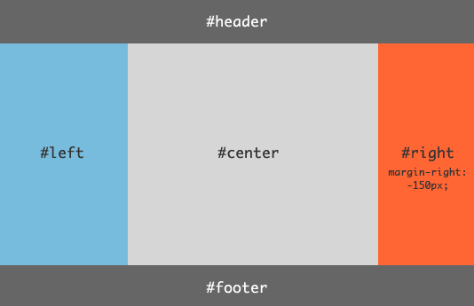
<!DOCTYPE html>
<html lang="en">
    <head>
        <meta charset="utf-8">
        <style>
            .HolyGrail {
                display: -webkit-flex;
                display: flex;
                min-height: 100px;
                flex-direction: column;
            }

            header,
            footer {
                flex: 1;
                background: #ccc;
            }

            .HolyGrail-body {
                display: -webkit-flex;
                display: flex;
                flex: 1;
            }

            .HolyGrail-content {
                flex: 1;
                background: pink;
            }

            .HolyGrail-nav, .HolyGrail-ads {
                /* 两个边栏的宽度不放大也不缩小设为固定12em */
                flex: 0 0 12em;
            }

            .HolyGrail-nav {
                /* 导航放到最左边 */
                order: -1;
            }
            @media (max-width: 768px) {
              .HolyGrail-body {
                flex-direction: column;
                flex: 1;
              }
              .HolyGrail-nav,
              .HolyGrail-ads,
              .HolyGrail-content {
                flex: auto;
              }
            }
        </style>
    </head>
    <body class="HolyGrail">
        <header>...</header>
        <div class="HolyGrail-body">
            <main class="HolyGrail-content">...</main>
            <nav class="HolyGrail-nav">...</nav>
            <aside class="HolyGrail-ads">...</aside>
        </div>
        <footer>...</footer>
    </body>
</html>
flex-direction属性决定项目的排列方向,它有4个值:
row(默认值):主轴为水平方向,起点在左端。row-reverse:主轴为水平方向,起点在右端。column:主轴为垂直方向,起点在上沿。column-reverse:主轴为垂直方向,起点在下沿。
align-items属性定义项目在交叉轴上如何对齐,它有5个值:
flex-start:交叉轴的起点对齐。flex-end:交叉轴的终点对齐。center:交叉轴的中点对齐。baseline: 项目的第一行文字的基线对齐。stretch(默认值):如果项目未设置高度或设为auto,将占满整个容器的高度。
order属性定义项目的排列顺序。数值越小,排列越靠前,默认为0。
flex属性是flex-grow, flex-shrink 和 flex-basis的简写,默认值为0 1 auto。后两个属性可选。
flex-grow属性定义项目的放大比例,默认为0,即如果存在剩余空间,也不放大。如果所有项目的flex-grow属性都为1,则它们将等分剩余空间(如果有的话)。
flex-shrink属性定义了项目的缩小比例,默认为1,即如果空间不足,该项目将缩小。如果所有项目的flex-shrink属性都为1,当空间不足时,都将等比例缩小。
flex-basis属性定义了在分配多余空间之前,项目占据的主轴空间(main size)。浏览器根据这个属性,计算主轴是否有多余空间。它的默认值为auto,即项目的本来大小。它可以设为跟width或height属性一样的值(比如350px),则项目将占据固定空间。
4:输入框的布局
<!DOCTYPE html>
<html lang="en">
    <head>
        <meta charset="utf-8">
        <style>
            .InputAddOn {
              display: -webkit-flex;
              display: flex;
            }

            .InputAddOn-field {
              flex: 1;
            }
        </style>
    </head>
    <body>
        <div class="InputAddOn">
          <span class="InputAddOn-item">...</span>
          <input class="InputAddOn-field">
          <button class="InputAddOn-item">...</button>
        </div>
    </body>
</html>
5:悬挂式布局
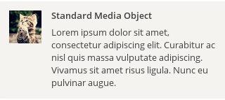
<!DOCTYPE html>
<html lang="en">
    <head>
        <meta charset="utf-8">
        <style>
            .Media {
              display: -webkit-flex;
              display: flex;
              align-items: flex-start;
            }

            .Media-figure {
              margin-right: 1em;
            }

            .Media-body {
              flex: 1;
            }
        </style>
    </head>
    <body>
        <div class="Media">
          <img class="Media-figure" src="erweima.png" height="100" width="100">
          <p class="Media-body">...</p>
        </div>
    </body>
</html>
6:固定的底栏
有的时候页面内容太少,无法充满整屏,这个时候底栏就会抬高到页面的中间,可以使用flex布局让底栏总是出现在页面的底部。
<!DOCTYPE html>
<html lang="en">
    <head>
        <meta charset="utf-8">
        <style>
            .Site {
              display: -webkit-flex;
              display: flex;
              min-height: 100vh;/*1vh表示浏览器高度的1%,100vh为浏览器高度,感觉这个挺好的*/
              flex-direction: column;
            }

            .Site-content {
              flex: 1;
              background: #0099ff;
            }
        </style>
    </head>
    <body class="Site">
        <header>...</header>
        <main class="Site-content">...</main>
        <footer>...</footer>
    </body>
</html>
7:总结写法举例:
/* ============================================================
   flex:定义布局为盒模型
   flex-v:盒模型垂直布局
   flex-1:子元素占据剩余的空间
   flex-align-center:子元素垂直居中
   flex-pack-center:子元素水平居中
   flex-pack-justify:子元素两端对齐
   兼容性:ios 4+、android 2.3+、winphone8+
   ============================================================ */
.flex{display:-webkit-box;display:-webkit-flex;display:-ms-flexbox;display:flex;}
.flex-v{-webkit-box-orient:vertical;-webkit-flex-direction:column;-ms-flex-direction:column;flex-direction:column;}
.flex-1{-webkit-box-flex:1;-webkit-flex:1;-ms-flex:1;flex:1;}
.flex-align-center{-webkit-box-align:center;-webkit-align-items:center;-ms-flex-align:center;align-items:center;}
.flex-pack-center{-webkit-box-pack:center;-webkit-justify-content:center;-ms-flex-pack:center;justify-content:center;}
.flex-pack-justify{-webkit-box-pack:justify;-webkit-justify-content:space-between;-ms-flex-pack:justify;justify-content:space-between;}
案列1
<div class="flex flex-align-center flex-pack-center flex-pack-justify flex-v">
  <span class="item">定位</span>
  <span class="item">定位</span>
</div>
案例2
<div class="flex flex-align-center">
  <span class="item"><img src="erweima.png" width="100"></span>
  <div class="flex-1">
    <h4>标题标题标题标题</h4>
    <p>内容内容内容内容内容内容内容内容内容内容内容内容</p>
  </div>
</div>

 浙公网安备 33010602011771号