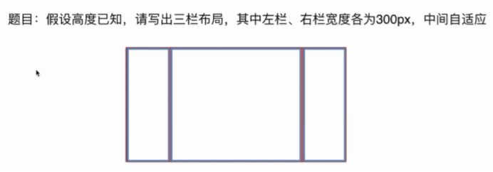
页面布局
方法1:浮动
方法2:绝对定位
方法3:flex布局
方法4:display table-cell
方法5:grid布局
<!DOCTYPE html>
<html lang="en">
<head>
<meta charset="UTF-8" />
<title>layout</title>
<style media="screen">
html *{
margin:0;
padding: 0;
}
.layout{
margin-top:10px;
}
.layout article div{
min-height: 100px;
}
</style>
</head>
<body>
<section class="layout float">
<style media="screen">
.layout.float .left{
width:300px;
float:left;
background: red;
}
.layout.float .right{
width: 300px;
float:right;
background: blue;
}
.center{
background: yellow;
}
</style>
<article class="left-right-center">
<div class="left"></div>
<div class="right"></div>
<div class="center">
<h1>浮动解决方案</h1>
<h1>这是中间部分这是中间部分这是中间部分这是中间部分这是中间部分这是中间部分这是中间部分</h1>
</div>
</article>
</section>
//注意:不能是左中右结构
<section class="layout absolute">
<style>
.layout.absolute .left-center-right div{
position: absolute;
}
.layout.absolute .left{
width:300px;
left:0;
background: red;
}
.layout.absolute .right{
width: 300px;
right:0;
background: blue;
}
.center{
left:300px;
right: 300px;
background: yellow;
}
</style>
<article class="left-center-right">
<div class="left"></div>
<div class="center">
<h1>绝对定位解决方案</h1>
<h1>这是中间部分这是中间部分这是中间部分这是中间部分这是中间部分这是中间部分这是中间部分</h1>
</div>
<div class="right"></div>
</article>
</section>
方法3:flexbox解决方案
<section class="layout flexbox">

<article class="left-center-right">
<div class="left"></div>
<div class="center">
<h1>flexbox解决方案</h1>
</div>
<div class="right"></div>
</article>
</section>
</body>
</html>
方法4 表格布局


方法5 grid网格布局


grid布局主要属性:
grid-template-columns://竖向排列
grid-template-rows://横向排列
1.每个方法优缺点,五个方案的比较
浮动:缺点要清除浮动,优点:兼容性比较好
绝对定位:好处是快捷,缺点是:脱离了文档流,要处理好周围所有元素的关系,而且所有的子元素也必须脱离文档流。
flex布局:比较完美的一个,常用在移动端,css3 IE11兼容
table布局:兼容性非常好,缺点:当其中某个单元格高度超出的时候,其它两个也会跟着超出高度。
grid布局:新出的布局,代码量简化
2.如果高度未知,需要高度一致,哪种方案还能使用
flex布局和table布局可用,其它三种不可用
题目:上下高度固定,中间自适应
方法1:绝对定位
方法2:flex布局
.HolyGrail {
display: flex;
min-height: 100vh; /*相对于视口的高度。视口被均分为100单位的vh*/
flex-direction: column;
}
header,
footer {
flex: 0 0 100px;
background: blue;
}
.HolyGrail-body {
flex: 1;
background: red;
}
<body class="HolyGrail">
<header>header</header>
<div class="HolyGrail-body">body</div>
<footer>footer</footer>
</body>
方法3:grid布局
<style>
.container{
min-height: 100vh;
display: grid;
grid-template-rows: 100px auto 100px;
}
.top{
background: blue;
}
.center{
background: yellow;
}
.bottom{
background: red;
}
</style>
<div class="container">
<div class="top">top</div>
<div class="center">center</div>
<div class="bottom">bottom</div>
</div>