


保险推销用户行为分析
一、选题的背景
当今社会时代下,人们生活中有时遇到一些意外事故,比如车祸,伤病等,而随之发展起来针对这些意外事故做保护的各种保险产业,应运而生。保险行业的出现创造了许多的就业岗位,因为销售提成的原因也有不少年轻人选择进入这个行业。当前受疫情等因素影响,经济增长缓慢,个人收入降低;但同样,增加了许多人为自己和家人购买保险的想法,所以如何选择及把握目标用户群体,是许多保险推销员思考的问题。
二、大数据分析设计方案
1.本数据集的数据内容与数据特征分析
1.1数据集内容:
1.2 数据分析的课程设计方案概述
三、数据分析步骤
1.数据源
本次课程设计的数据集来自爱数科平台
网址:http://www.idatascience.cn/dataset-detail?table_id=182
2.数据清洗
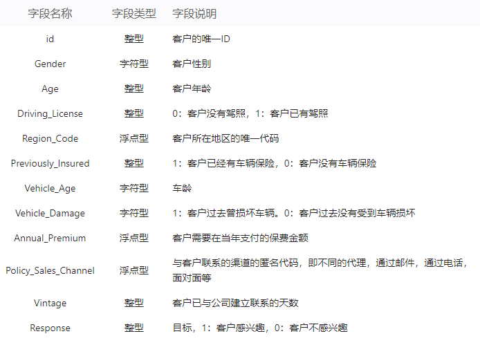
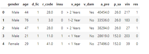
# 读取数据
data = pd.read_csv('健康保险交叉销售预测数据集.csv')
# 数据维度
print('data数据维度', data.shape)

# 查看前十行数据
data.head(10)
显示结果如下:
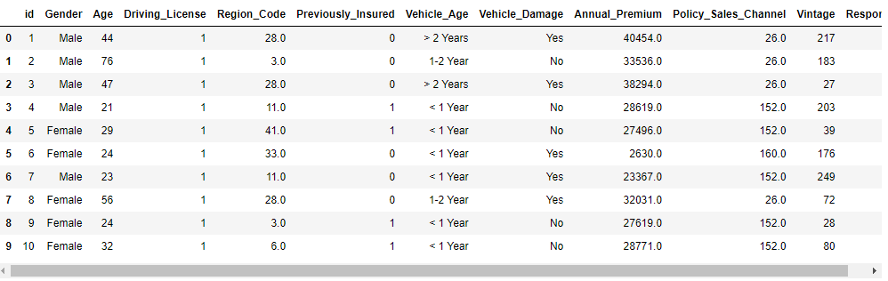
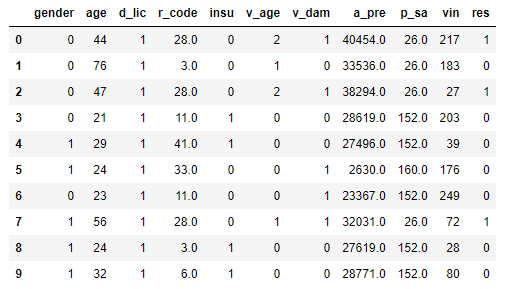
# 删除无用列
del data['id']
# 缩写列名
print('修改前的列名: \n', data.columns)
data.columns=['gender', 'age', 'd_lic', 'r_code', 'insu', 'v_age', 'v_dam', 'a_pre', 'p_sa', 'vin', 'res']
print('修改后的列名: \n', data.columns)
data.head(10)
显示结果如下:
3、数据预处理

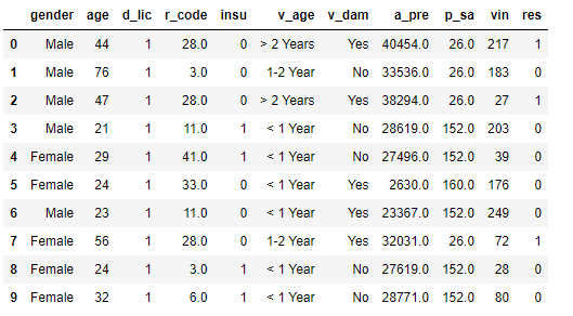
#探索数据结构

data.info()

# 统计缺失值
data.isna().sum().sum()

# 统计重复值
data.duplicated().sum()

# 删除重复值
data.drop_duplicates(inplace=True)
# 删除重复值后的数据维度
print('删除重复值后的数据维度:', data.shape)
data.head(5)

删除重复值后的数据维度: (380840, 11)
显示结果如下:
4.大数据分析过程及采用的算法
# k最近邻分类算法
5.数据可视化
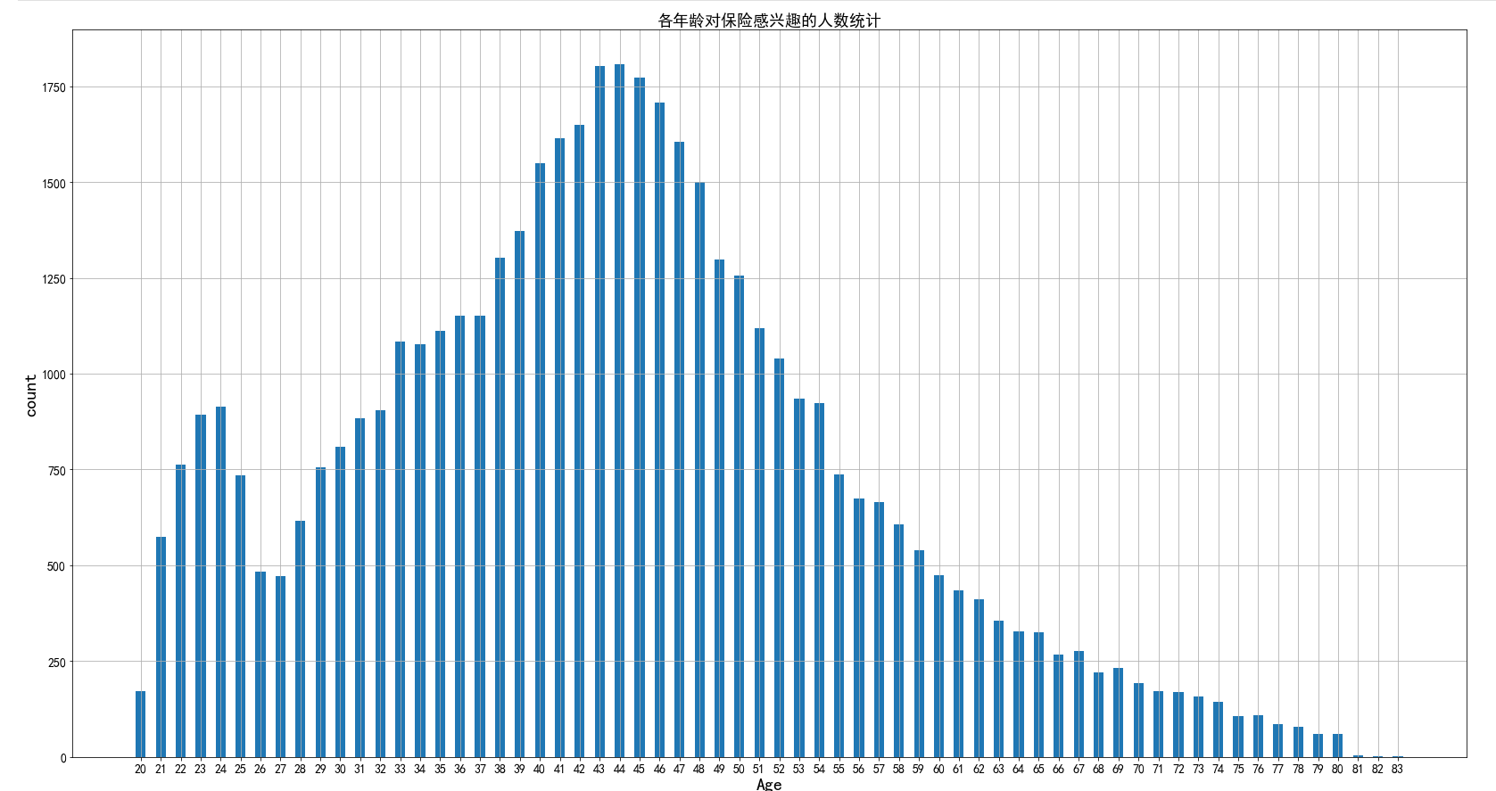
绘制年龄是否对购买保险有决定影响
# copy一遍data数据
data3 = data.copy()
# 查看数据前五行
data3.head()
data3_1 = data3[data3['res'] == 0].groupby('age').agg({'res': 'count'})
data3_1.reset_index(inplace=True)

plt.figure(figsize=(28,12))
plt.bar(range(len(data3_1)), data3_1['res'], tick_label=data3_1['age'], width=0.5)
plt.xlabel('Age', fontsize=20)  # 设置x轴标签
plt.ylabel('count', fontsize=20)  # 设置y轴标签
plt.title('各年龄对保险不感兴趣的人数统计', fontsize=18)
plt.xticks(fontsize=14) # 设置x轴大小
plt.yticks(fontsize=14) # 设置y轴大小
plt.grid() # 显示网格线
plt.savefig('./image/各年龄对保险不感兴趣的人数统计.png')
plt.show()

data3_1_1 = data3[data3['res'] == 1].groupby('age').agg({'res': 'count'})
data3_1_1.reset_index(inplace=True)

plt.figure(figsize=(28,15))
plt.bar(range(len(data3_1_1)), data3_1_1['res'], tick_label=data3_1_1['age'], width=0.5)
plt.xlabel('Age', fontsize=20)  # 设置x轴标签
plt.ylabel('count', fontsize=20)  # 设置y轴标签
plt.title('各年龄对保险感兴趣的人数统计', fontsize=18)
plt.xticks(fontsize=14) # 设置x轴大小
plt.yticks(fontsize=14) # 设置y轴大小
plt.grid() # 显示网格线
plt.savefig('./image/各年龄对保险感兴趣的人数统计.png')
plt.show()
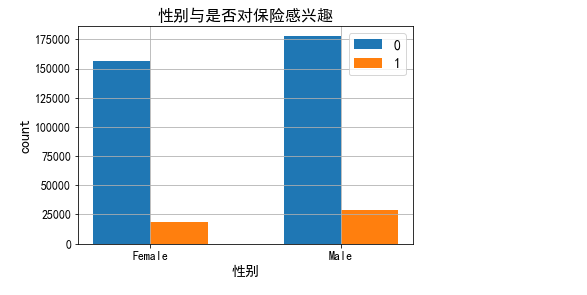
性别与是否对保险感兴趣
# 利用vin列统计对保险是否感兴趣
data3_2 = data3.groupby(['gender', 'res']).agg({'vin': 'count'})
data3_2.reset_index(inplace=True)
x1 = data3_2[data3_2['res'] == 0]
x2 = data3_2[data3_2['res'] == 1]

plt.bar(np.arange(len(x1)), x1['vin'], width=0.3, label='0')
plt.bar(np.arange(len(x2)) + 0.3, x2['vin'], width=0.3, label='1')

plt.title('性别与是否对保险感兴趣', fontsize=16) # 设置标题
plt.xticks(np.arange(x1.shape[0])+0.3/2, x1['gender'], fontsize=12) # 使两个柱状条的中心位于轴点上
plt.xlabel('性别', fontsize=14)  # 设置x轴标签
plt.ylabel('count', fontsize=14)  # 设置y轴标签
plt.yticks(fontsize=12) # 设置y轴大小
# plt.gcf().autofmt_xdate() # 自适应刻度线密度
plt.legend(fontsize=14)  # 显示图例
plt.grid() # 显示网格线
plt.savefig('./image/性别与是否对保险感兴趣.png')
plt.show()
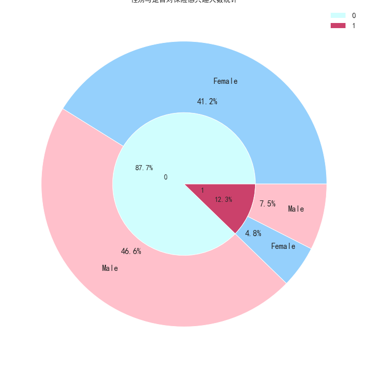
性别与是否对保险感兴趣的嵌套拼图
data3_3 = data3.copy()
inner_x=data3_3['res'].value_counts().values
inner_label=data3_3['res'].value_counts().index
plt.figure(figsize=(10,10))
plt.pie(inner_x,
labels=inner_label,
radius=0.5,
autopct='%.1f%%',
labeldistance=0.25,
textprops={'size':14},
colors=['#d0fefe','#cb416b','grey'],
wedgeprops=dict(width=0.5,edgecolor='white'))
plt.tight_layout() # 子图自适应位置

# 使用groupby函数分组计算是否感兴趣的人数
data3_3_1 = data3.groupby(['res', 'gender']).agg({'vin': 'count'})
data3_3_1.reset_index(inplace=True)
outer_x=data3_3_1['vin']
outer_label=data3_3_1['gender']
plt.pie(outer_x,
labels=outer_label,
radius=1,
labeldistance=0.75,
autopct='%.1f%%',
textprops={'size':16},
colors=['#95d0fc','pink','#95d0fc','pink'],
wedgeprops=dict(width=0.5,edgecolor='white'))
plt.title('性别与是否对保险感兴趣人数统计', fontsize=14)
plt.legend(inner_label,fontsize=15)
plt.savefig('./image/性别与是否对保险感兴趣人数统计.png')
plt.show()
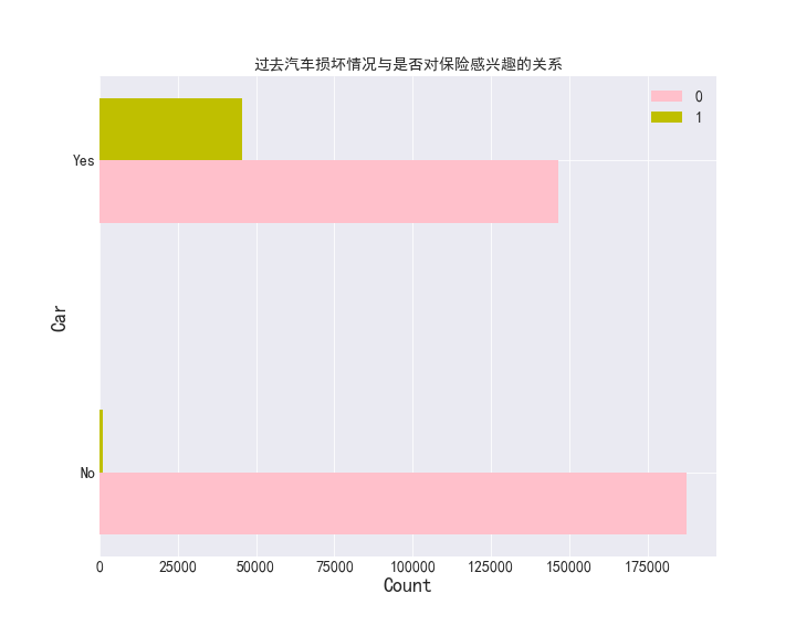
过去汽车损坏情况与是否对保险感兴趣的关系
data3_4 = data3.groupby(['v_dam', 'res']).agg({'vin': 'count'})
data3_4.reset_index(inplace=True)

plt.figure(figsize=(10,8))
plt.barh(np.arange(len(data3_4[data3_4['res'] == 0])), data3_4[data3_4['res'] == 0]['vin'],
tick_label=data3_4[data3_4['res'] == 0]['vin'], height=0.2, label='0', color='pink')
plt.barh(np.arange(len(data3_4[data3_4['res'] == 1])) + 0.2, data3_4[data3_4['res'] == 1]['vin'], height=0.2,
label='1', color='y')
plt.title('过去汽车损坏情况与是否对保险感兴趣的关系', fontsize=14)
plt.xlabel('Count', fontsize=18)
plt.ylabel('Car', fontsize=18)
plt.legend(fontsize=14)
plt.yticks(np.arange(data3_4[data3_4['res'] == 1].shape[0]) + 0.2 / 2, data3_4[data3_4['res'] == 1]['v_dam'], fontsize=14) # 使两个柱状条的中心位于轴点上
plt.xticks(fontsize=14)
plt.grid()
plt.savefig('./image/过去汽车损坏情况与是否对保险感兴趣的关系.png')
plt.show()
6.特征工程
data4 = data.copy()
data4.shape

# 车辆是否损坏
data4['v_dam'].replace({'Yes': 1, 'No': 0}, inplace=True)

# 替换车龄数据
data4['v_age'].replace({'> 2 Years': 2, '1-2 Year': 1, '< 1 Year': 0}, inplace=True)

# 替换性别数据
data4['gender'].replace({'Male': 0, 'Female': 1}, inplace=True)
# 查看前十列数据
data4.head(10)
显示结果如下:
7.模型建立
# 复制一遍数据
data5 = data4.copy()
data5.shape
(380840, 11)
X = data5.drop('res', axis=1)

y = data5['res']
# 按照3:7的比例划分训练集测试集
X_train, X_test, y_train, y_test = train_test_split(X, y, test_size=0.3, random_state=10000)

# 消除量纲的影响
from sklearn.preprocessing import MinMaxScaler
Scaler = MinMaxScaler()
X_train = Scaler.fit_transform(X_train)
X_test = Scaler.fit_transform(X_test)

y_train = y_train.ravel()
y_test = y_test.ravel()

print('', X_train.shape)
print(X_test.shape)
print(y_train.shape)
print(y_test.shape)
 (266588, 10)
(114252, 10)
(266588,)
(114252,)
# k最近邻分类算法
knn_model = KNeighborsClassifier()
# 逻辑回归
reg = LinearRegression()
# 朴素叶贝斯分类
clf = GaussianNB()
# 决策树
tree = DecisionTreeClassifier()
# 训练模型
knn_model.fit(X_train, y_train)
clf.fit(X_train, y_train)
reg.fit(X_train, y_train)
tree.fit(X_train, y_train)
print('KNN模型准确度:', round(knn_model.score(X_test, y_test), 5))
print('逻辑回归模型准确度:', round(reg.score(X_test, y_test), 5))
print('朴素叶贝斯模型准确度:', round(clf.score(X_test, y_test), 5))
print('决策树模型准确度:', round(tree.score(X_test, y_test), 5))
KNN模型准确度: 0.85641
逻辑回归模型准确度: 0.14619
朴素叶贝斯模型准确度: 0.63763
决策树模型准确度: 0.8215
- 根据模型的预测的准确度来看,逻辑回归模型不拟合,所以本次预测使用精度最高的模型:K最近邻分类算法
8.参数调优
from sklearn.model_selection import GridSearchCV
from sklearn.neighbors import KNeighborsClassifier

estimator = KNeighborsClassifier()

param = {'n_neighbors':[i for i in range(1,11)]} # n_neighbors为超参数的名称,里面的k值是从1到10的列表

gc = GridSearchCV(estimator,param_grid=param,cv=2)# 实例化对象

# estimator为预估器对象
# param_grid是估计器参数,也就是我们要找的超参数范围
# cv为表示几折交叉验证,也就是将训练集分为几等份

gc.fit(X_train,y_train) # 此时gc继承了预估器estimator的API

# 预测准确率
print('在测试集上的准确率:',gc.score(X_test,y_test))
# 输出最优超参数k在交叉验证中的准确率
print('在交叉验证当中的最好结果:',gc.best_score_)
# 输出模型参数,包括选出的最优K值
print('选择最好的模型是:',gc.best_estimator_)
在测试集上的准确率: 0.8721860448832406
在交叉验证当中的最好结果: 0.8708456494665926
选择最好的模型是: KNeighborsClassifier(n_neighbors=10)
# k最近邻分类算法
knn_model = KNeighborsClassifier(n_neighbors=10)
# 训练模型
knn_model.fit(X_train, y_train)
print('KNN模型准确度:', knn_model.score(X_train, y_train))
KNN模型准确度: 0.8838582381802632
# 预测结果
knn_pre = knn_model.predict(X_test)
print(knn_pre)
[0 0 0 ... 0 0 0]
9.模型评估
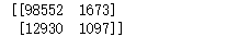
from sklearn.metrics import confusion_matrix
# 混淆矩阵
print(confusion_matrix(y_test, knn_pre))
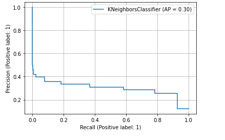
#模型评估
from sklearn.metrics import classification_report,roc_auc_score,plot_roc_curve
from sklearn.metrics import average_precision_score,plot_precision_recall_curve
result = classification_report(y_test, knn_pre)
knn_prob = knn_model.predict_proba(X_test)[:,1]

#输出AUC的值
auc_score = roc_auc_score(y_true=y_test,y_score=knn_prob)
#输出AP值
ap_score = average_precision_score(y_true=y_test,y_score=knn_prob)

#画出PR曲线
plot_precision_recall_curve(estimator=knn_model,X=X_test,y=y_test,pos_label=1)
plt.legend()
plt.grid()
plt.show()
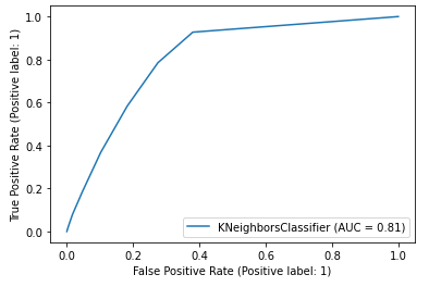
#画出ROC曲线
plot_roc_curve(estimator=knn_model,X=X_test,y=y_test,pos_label=1)
plt.legend()
plt.show()
附上完整程序源码:
1 2 3 4 5 6 7 8 9 10 11 12 13 14 15 16 17 18 19 20 21 22 23 24 25 26 27 28 29 30 31 32 33 34 35 36 37 38 39 40 41 42 43 44 45 46 47 48 49 50 51 52 53 54 55 56 57 58 59 60 61 62 63 64 65 66 67 68 69 70 71 72 73 74 75 76 77 78 79 80 81 82 83 84 85 86 87 88 89 90 91 92 93 94 95 96 97 98 99 100 101 102 103 104 105 106 107 108 109 110 111 112 113 114 115 116 117 118 119 120 121 122 123 124 125 126 127 128 129 130 131 132 133 134 135 136 137 138 139 140 141 142 143 144 145 146 147 148 149 150 151 152 153 154 155 156 157 158 159 160 161 162 163 164 165 166 167 168 169 170 171 172 173 174 175 176 177 178 179 180 181 182 183 184 185 186 187 188 189 190 191 192 193 194 195 196 197 198 199 200 201 202 203 204 205 206 207 208 209 210 211 212 213 214 215 216 217 218 219 220 221 222 223 224 225 226 227 228 229 230 231 232 233 234 235 236 237 238 239 240 241 242 243 244 245 246 247 248 249 250 251 252 253 254 255 256 257 258 259 260 261 262 263 264 | import os# 打开数据的路径os.chdir(r'../基于健康保险交叉销售预测')# 创建文件夹# os.makedirs('image')# os.makedirs('tmp')import pandas as pdimport matplotlib.pyplot as pltfrom sklearn.model_selection import train_test_splitfrom sklearn.neighbors import KNeighborsClassifierfrom sklearn.linear_model import LinearRegressionfrom sklearn.naive_bayes import GaussianNBfrom sklearn.tree import DecisionTreeClassifier# 读取数据data = pd.read_csv('健康保险交叉销售预测数据集.csv')# 数据维度print('data数据维度', data.shape)# 查看前十行数据data.head(10)# 删除无用列del data['id']# 缩写列名print('修改前的列名: \n', data.columns)#读取需要的列名data.columns=['gender', 'age', 'd_lic', 'r_code', 'insu', 'v_age', 'v_dam', 'a_pre', 'p_sa', 'vin', 'res']print('修改后的列名: \n', data.columns)#读取前十行数据data.head(10)data.info()# 统计缺失值data.isna().sum().sum()# 重复值统计data.duplicated().sum()# 删除重复值data.drop_duplicates(inplace=True)# 删除重复值后的数据维度print('删除重复值后的数据维度:', data.shape)#读取前五行数据data.head(5)# copy一遍data数据data3 = data.copy()# 查看数据前五行data3.head()data3_1 = data3[data3['res'] == 0].groupby('age').agg({'res': 'count'})data3_1.reset_index(inplace=True)plt.figure(figsize=(28,12))plt.bar(range(len(data3_1)), data3_1['res'], tick_label=data3_1['age'], width=0.5) # 设置x轴标签plt.xlabel('Age', fontsize=20)# 设置y轴标签plt.ylabel('count', fontsize=20) # 设置标题plt.title('各年龄对保险不感兴趣的人数统计', fontsize=18)# 设置x轴大小plt.xticks(fontsize=14)# 设置y轴大小plt.yticks(fontsize=14)# 显示网格线plt.grid()plt.savefig('./image/各年龄对保险不感兴趣的人数统计.png')plt.show()data3_1_1 = data3[data3['res'] == 1].groupby('age').agg({'res': 'count'})data3_1_1.reset_index(inplace=True)plt.figure(figsize=(28,15))plt.bar(range(len(data3_1_1)), data3_1_1['res'], tick_label=data3_1_1['age'], width=0.5) # 设置x轴标签plt.xlabel('Age', fontsize=20) # 设置y轴标签plt.ylabel('count', fontsize=20)# 设置标题plt.title('各年龄对保险感兴趣的人数统计', fontsize=18)# 设置x轴大小plt.xticks(fontsize=14)# 设置y轴大小plt.yticks(fontsize=14)# 显示网格线plt.grid()plt.savefig('./image/各年龄对保险感兴趣的人数统计.png')plt.show()# 利用vin列统计对保险是否感兴趣data3_2 = data3.groupby(['gender', 'res']).agg({'vin': 'count'})data3_2.reset_index(inplace=True)x1 = data3_2[data3_2['res'] == 0]x2 = data3_2[data3_2['res'] == 1]plt.bar(np.arange(len(x1)), x1['vin'], width=0.3, label='0')plt.bar(np.arange(len(x2)) + 0.3, x2['vin'], width=0.3, label='1')# 设置标题plt.title('性别与是否对保险感兴趣', fontsize=16) # 使两个柱状条的中心位于轴点上plt.xticks(np.arange(x1.shape[0])+0.3/2, x1['gender'], fontsize=12) # 设置x轴标签plt.xlabel('性别', fontsize=14)# 设置y轴标签plt.ylabel('count', fontsize=14) # 设置y轴大小plt.yticks(fontsize=12)# plt.gcf().autofmt_xdate() # 自适应刻度线密度# 显示图例plt.legend(fontsize=14) # 显示网格线plt.grid()plt.savefig('./image/性别与是否对保险感兴趣.png')plt.show()data3_3 = data3.copy()inner_x=data3_3['res'].value_counts().valuesinner_label=data3_3['res'].value_counts().indexplt.figure(figsize=(10,10))plt.pie(inner_x, labels=inner_label, radius=0.5, autopct='%.1f%%', labeldistance=0.25, textprops={'size':14}, colors=['#d0fefe','#cb416b','grey'], wedgeprops=dict(width=0.5,edgecolor='white'))# 子图自适应位置plt.tight_layout() #性别与是否对保险感兴趣人数统计# 使用groupby函数分组计算是否感兴趣的人数data3_3_1 = data3.groupby(['res', 'gender']).agg({'vin': 'count'})data3_3_1.reset_index(inplace=True)outer_x=data3_3_1['vin']outer_label=data3_3_1['gender']plt.pie(outer_x, labels=outer_label, radius=1, labeldistance=0.75, autopct='%.1f%%', textprops={'size':16}, colors=['#95d0fc','pink','#95d0fc','pink'], wedgeprops=dict(width=0.5,edgecolor='white'))plt.title('性别与是否对保险感兴趣人数统计', fontsize=14)plt.legend(inner_label,fontsize=15)plt.savefig('./image/性别与是否对保险感兴趣人数统计.png')plt.show()data3_4 = data3.groupby(['v_dam', 'res']).agg({'vin': 'count'})data3_4.reset_index(inplace=True)#过去汽车损坏情况与是否对保险感兴趣的关系plt.figure(figsize=(10,8))plt.barh(np.arange(len(data3_4[data3_4['res'] == 0])), data3_4[data3_4['res'] == 0]['vin'], tick_label=data3_4[data3_4['res'] == 0]['vin'], height=0.2, label='0', color='pink')plt.barh(np.arange(len(data3_4[data3_4['res'] == 1])) + 0.2, data3_4[data3_4['res'] == 1]['vin'], height=0.2, label='1', color='y')plt.title('过去汽车损坏情况与是否对保险感兴趣的关系', fontsize=14)plt.xlabel('Count', fontsize=18)plt.ylabel('Car', fontsize=18)plt.legend(fontsize=14)plt.yticks(np.arange(data3_4[data3_4['res'] == 1].shape[0]) + 0.2 / 2, data3_4[data3_4['res'] == 1]['v_dam'], fontsize=14)plt.xticks(fontsize=14)plt.grid()plt.savefig('./image/过去汽车损坏情况与是否对保险感兴趣的关系.png')plt.show()data4 = data.copy()data4.shape# 车辆是否损坏data4['v_dam'].replace({'Yes': 1, 'No': 0}, inplace=True)# 替换车龄数据data4['v_age'].replace({'> 2 Years': 2, '1-2 Year': 1, '< 1 Year': 0}, inplace=True)# 替换性别数据data4['gender'].replace({'Male': 0, 'Female': 1}, inplace=True)# 查看前十列数据data4.head(10)# 查看后十列数据data4.tail(10)# 复制一遍数据data5 = data4.copy()data5.shapeX = data5.drop('res', axis=1)y = data5['res']# 按照3:7的比例划分训练集测试集X_train, X_test, y_train, y_test = train_test_split(X, y, test_size=0.3, random_state=10000)# 消除量纲的影响from sklearn.preprocessing import MinMaxScalerScaler = MinMaxScaler()X_train = Scaler.fit_transform(X_train)X_test = Scaler.fit_transform(X_test)y_train = y_train.ravel()y_test = y_test.ravel()print('', X_train.shape)print(X_test.shape)print(y_train.shape)print(y_test.shape)# k最近邻分类算法knn_model = KNeighborsClassifier()# 逻辑回归reg = LinearRegression()# 朴素叶贝斯分类clf = GaussianNB()# 决策树tree = DecisionTreeClassifier()# 训练模型knn_model.fit(X_train, y_train)clf.fit(X_train, y_train)reg.fit(X_train, y_train)tree.fit(X_train, y_train)print('KNN模型准确度:', round(knn_model.score(X_test, y_test), 5))print('逻辑回归模型准确度:', round(reg.score(X_test, y_test), 5))print('朴素叶贝斯模型准确度:', round(clf.score(X_test, y_test), 5))print('决策树模型准确度:', round(tree.score(X_test, y_test), 5))import pandas as pdimport matplotlib.pyplot as pltfrom sklearn.model_selection import GridSearchCVfrom sklearn.neighbors import KNeighborsClassifierestimator = KNeighborsClassifier()param = {'n_neighbors':[i for i in range(1,11)]} # n_neighbors为超参数的名称,里面的k值是从1到10的列表gc = GridSearchCV(estimator,param_grid=param,cv=2)# 实例化对象# estimator为预估器对象# param_grid是估计器参数,也就是我们要找的超参数范围# cv为表示几折交叉验证,也就是将训练集分为几等份gc.fit(X_train,y_train) # 此时gc继承了预估器estimator的API# 预测准确率print('在测试集上的准确率:',gc.score(X_test,y_test))# 输出最优超参数k在交叉验证中的准确率print('在交叉验证当中的最好结果:',gc.best_score_)# 输出模型参数,包括选出的最优K值print('选择最好的模型是:',gc.best_estimator_)# k最近邻分类算法knn_model = KNeighborsClassifier(n_neighbors=10)# 训练模型knn_model.fit(X_train, y_train)print('KNN模型准确度:', knn_model.score(X_train, y_train))# 预测结果knn_pre = knn_model.predict(X_test)print(knn_pre)from sklearn.metrics import confusion_matrix# 混淆矩阵print(confusion_matrix(y_test, knn_pre))#模型评估from sklearn.metrics import classification_report,roc_auc_score,plot_roc_curvefrom sklearn.metrics import average_precision_score,plot_precision_recall_curve result = classification_report(y_test, knn_pre)knn_prob = knn_model.predict_proba(X_test)[:,1]#输出AUC的值auc_score = roc_auc_score(y_true=y_test,y_score=knn_prob)#输出AP值ap_score = average_precision_score(y_true=y_test,y_score=knn_prob)#画出PR曲线plot_precision_recall_curve(estimator=knn_model,X=X_test,y=y_test,pos_label=1)plt.legend()plt.grid()#输出数据图plt.show()#画出ROC曲线plot_roc_curve(estimator=knn_model,X=X_test,y=y_test,pos_label=1)plt.legend()#输出数据图plt.show() |


【推荐】国内首个AI IDE,深度理解中文开发场景,立即下载体验Trae
【推荐】编程新体验,更懂你的AI,立即体验豆包MarsCode编程助手
【推荐】抖音旗下AI助手豆包,你的智能百科全书,全免费不限次数
【推荐】轻量又高性能的 SSH 工具 IShell:AI 加持,快人一步
· 无需6万激活码!GitHub神秘组织3小时极速复刻Manus,手把手教你使用OpenManus搭建本
· Manus爆火,是硬核还是营销?
· 终于写完轮子一部分:tcp代理 了,记录一下
· 别再用vector<bool>了!Google高级工程师:这可能是STL最大的设计失误
· 单元测试从入门到精通