直方图和密度图
1.Set up the notebook
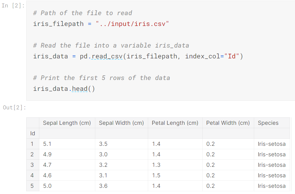
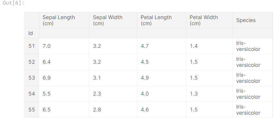
2.Load and examine the data
3.Histograms
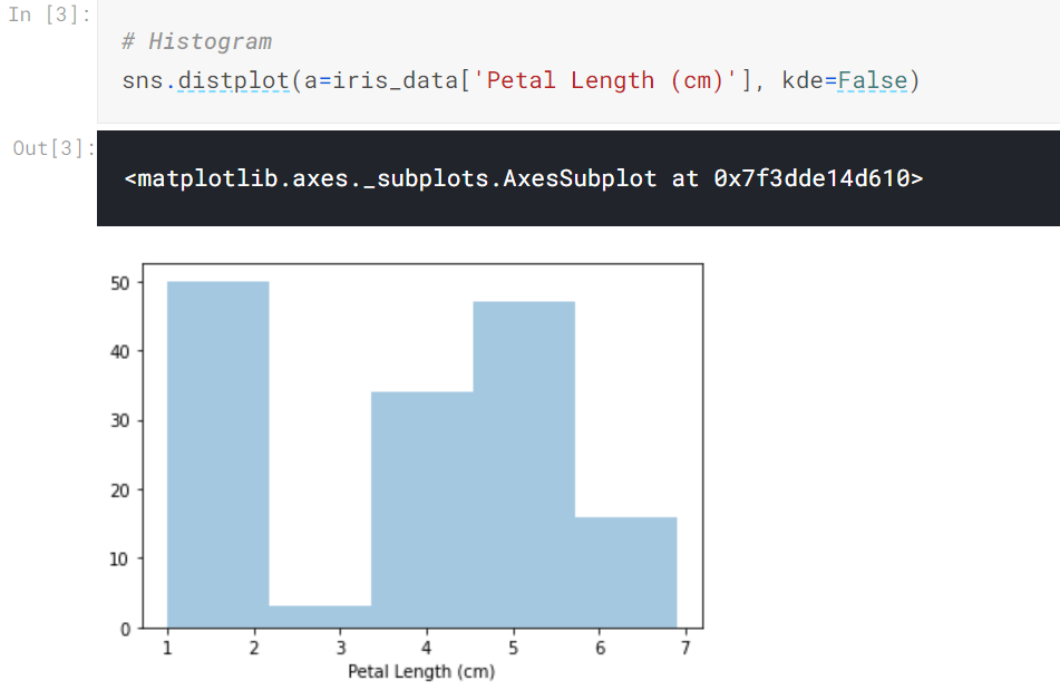
a= chooses the column we'd like to plot (in this case, we chose 'Petal Length (cm)').
kde=False is something we'll always provide when creating a histogram, as leaving it out will create a slightly different plot.
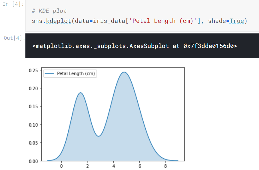
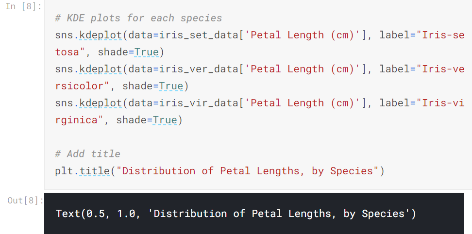
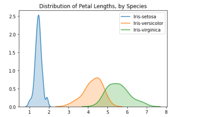
4.Density plots
5.2D KDE plots
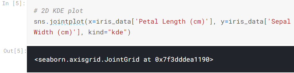
the curve at the top of the figure is a KDE plot for the data on the x-axis (in this case, iris_data['Petal Length (cm)']), and
the curve on the right of the figure is a KDE plot for the data on the y-axis (in this case, iris_data['Sepal Width (cm)']).
6.Color-coded plots

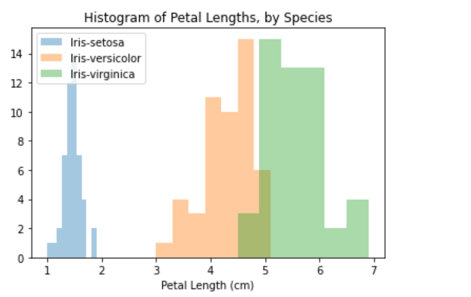
In this case, the legend does not automatically appear on the plot. To force it to show (for any plot type), we can always use plt.legend().
posted on 2020-11-03 17:01 Mint-Tremor 阅读(269) 评论(0) 收藏 举报


 浙公网安备 33010602011771号