散点图
1.Set up the notebook
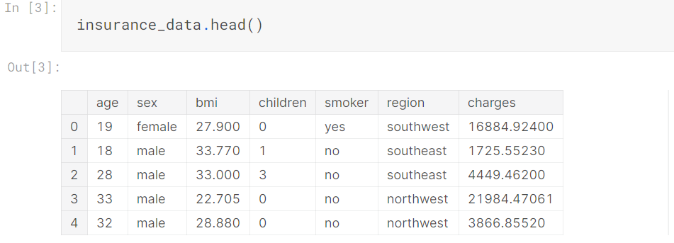
2.Load and examine the data
3.Scatter plots
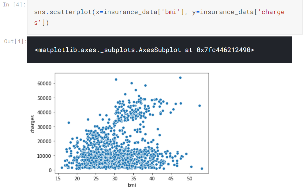
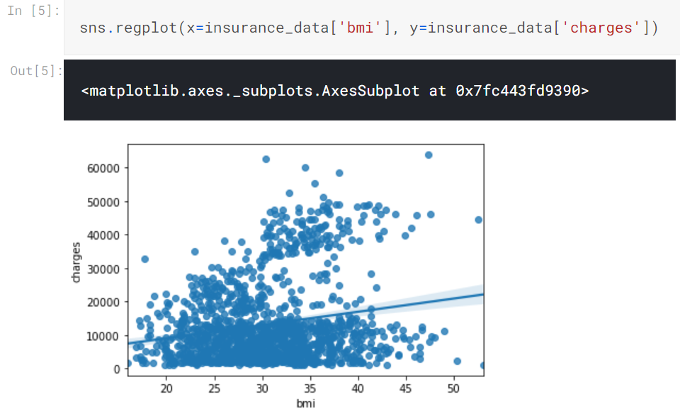
To double-check the strength of this relationship, you might like to add a regression line, or the line that best fits the data. We do this by changing the command to sns.regplot
4.Color-coded scatter plots
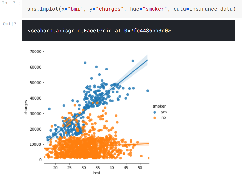
To double-check the strength of this relationship, you might like to add a regression line, or the line that best fits the data. We do this by changing the command to sns.regplot
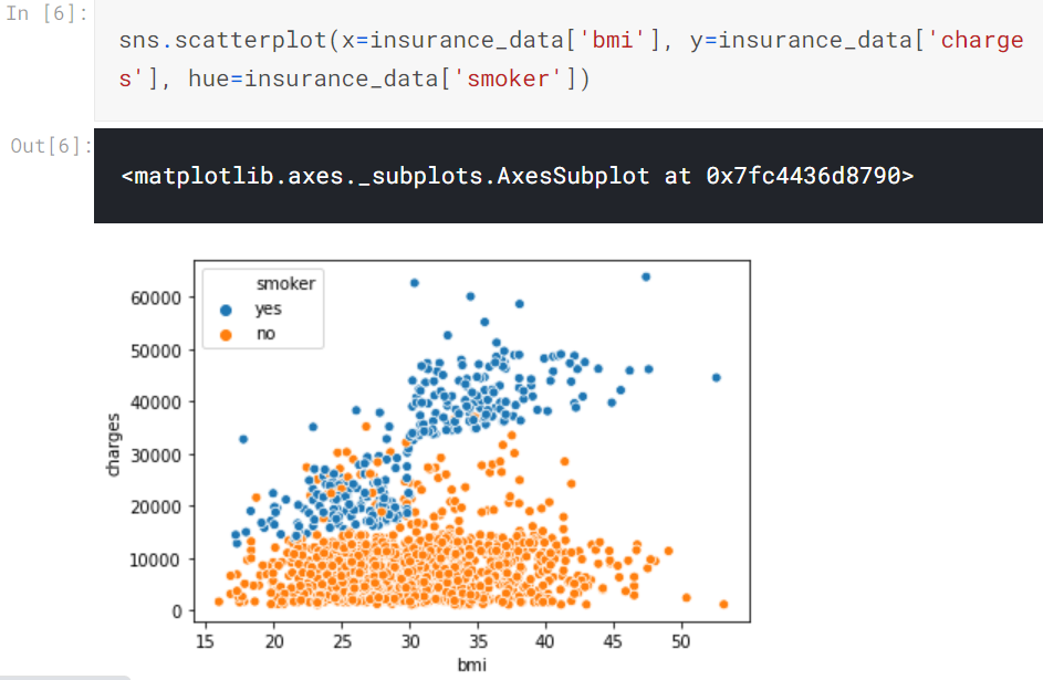
However, we can adapt the design of the scatter plot to feature a categorical variable (like "smoker") on one of the main axes. We'll refer to this plot type as a categorical scatter plot, and we build it with the sns.swarmplot command.

posted on 2020-11-03 16:46 Mint-Tremor 阅读(88) 评论(0) 收藏 举报


 浙公网安备 33010602011771号