
Python(饼图)
一、简单饼图
代码:
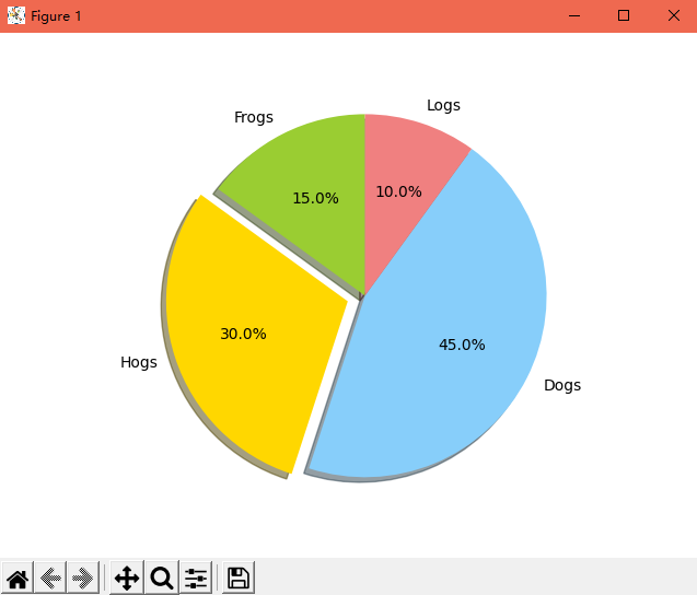
 1 import matplotlib.pyplot as plt
 2
 3 # The slices will be ordered and plotted counter-clockwise.
 4 labels = 'Frogs', 'Hogs', 'Dogs', 'Logs'
 5 sizes = [15, 30, 45, 10]
 6 colors = ['yellowgreen', 'gold', 'lightskyblue', 'lightcoral']
 7 explode = (0, 0.1, 0, 0)  # only "explode" the 2nd slice (i.e. 'Hogs')
 8
 9 plt.pie(sizes, explode=explode, labels=labels, colors=colors,
10         autopct='%1.1f%%', shadow=True, startangle=90)
11
12 plt.axis('equal')
13
14 plt.show()
效果:
参考链接:python利用matplotlib库绘制饼图的方法示例
二、复合饼图
代码:
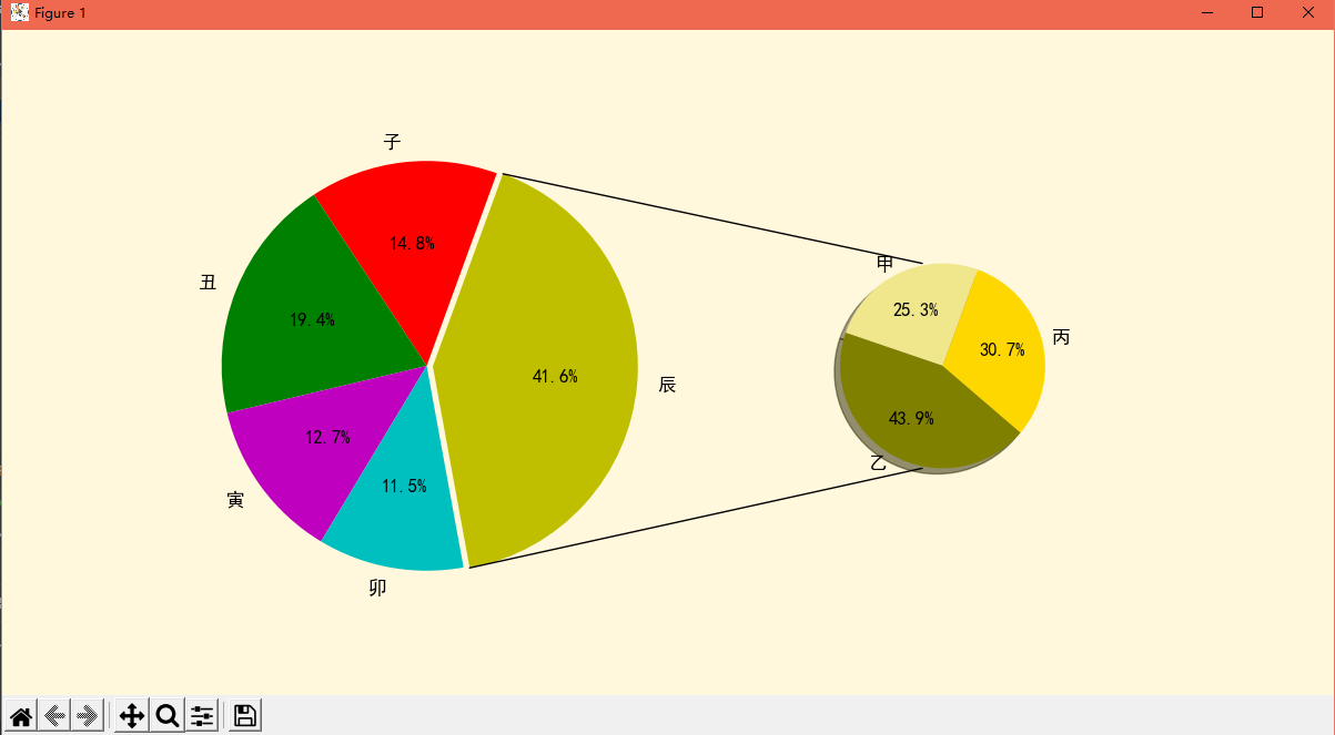
 1 import matplotlib as mpl
 2 import matplotlib.pyplot as plt
 3 import numpy as np
 4 from matplotlib.patches import ConnectionPatch
 5
 6 # 使图表元素中正常显示中文
 7 mpl.rcParams['font.sans-serif'] = 'SimHei'
 8 # 使坐标轴刻度标签正常显示负号
 9 mpl.rcParams['axes.unicode_minus'] = False
10
11 # 画布
12 fig = plt.figure(figsize=(12, 6), facecolor='cornsilk')
13 ax1 = fig.add_subplot(121)
14 ax2 = fig.add_subplot(122)
15 fig.subplots_adjust(wspace=0)
16
17 # 定义数据
18 data = {'category': ['子', '丑', '寅', '卯', '辰'], 'quantity': [138, 181, 118, 107, 387]}
19 others = {'category': ['甲', '乙', '丙'], 'quantity': [98, 170, 119]}
20
21 # 大饼图
22 labs = data['category']
23 quantity = data['quantity']
24 explode = (0, 0, 0, 0, 0.03)  # 分裂距离
25
26 ax1.pie(x=quantity,
27         colors=['r', 'g', 'm', 'c', 'y'],
28         explode=explode,
29         autopct='%1.1f%%',
30         startangle=70,
31         labels=labs,
32         textprops={'color': 'k', 'fontsize': 12, }
33         )
34
35 # 小饼图
36 labs2 = others['category']
37 quantity_2 = others['quantity']
38
39 ax2.pie(x=quantity_2,
40         colors=['khaki', 'olive', 'gold'],
41         autopct='%1.1f%%',
42         startangle=70,
43         labels=labs2,
44         radius=0.5,
45         shadow=True,
46         textprops={'color': 'k', 'fontsize': 12, },
47         )
48
49 # 用 ConnectionPatch 画出两个饼图的间连线
50 ## 饼图边缘的数据
51 theta1 = ax1.patches[-1].theta1
52 theta2 = ax1.patches[-1].theta2
53 center = ax1.patches[-1].center
54 r = ax1.patches[-1].r
55
56 width = 0.2
57 # 上边缘的连线
58 x = r * np.cos(np.pi / 180 * theta2) + center[0]
59 y = np.sin(np.pi / 180 * theta2) + center[1]
60 con_a = ConnectionPatch(xyA=(-width / 2, 0.5), xyB=(x, y),
61                         coordsA='data', coordsB='data',
62                         axesA=ax2, axesB=ax1
63                         )
64
65 # 下边缘的连线
66 x = r * np.cos(np.pi / 180 * theta1) + center[0]
67 y = np.sin(np.pi / 180 * theta1) + center[1]
68 con_b = ConnectionPatch(xyA=(-width / 2, -0.5), xyB=(x, y),
69                         coordsA='data', coordsB='data',
70                         axesA=ax2, axesB=ax1
71                         )
72
73 for con in [con_a, con_b]:
74     con.set_linewidth(1)  # 连线宽度
75     con.set_color = ([0, 0, 0])  # 连线颜色
76     ax2.add_artist(con)  # 添加连线
77
78 plt.show()
效果:

 浙公网安备 33010602011771号