(转)如何实现 Cut-Out Effect
原文地址:Thinking About The Cut-Out Effect: CSS or SVG?
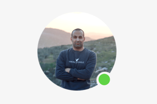
Cut-Out Effect,就是 月牙效果,或者叫,咬一口效果
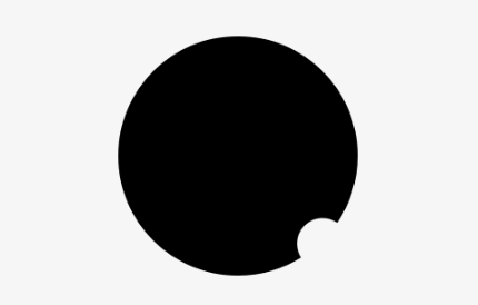
1. User Avatar 月牙效果
1. 1 - Clip Path
Pros
Cross-browser, works on all major versions of Chrome, Edge, Firefox, and Safari.
Good for very basic examples. It can get complex with borders or shadows.
Cons
To remove the cut-out effect, we need to change the path. This can be hard to do in a component with different states.
It needs some experience in dealing with merging shapes in a design app.
<div class="avatar">
  <img class="item-2" src="https://ishadeed.com/assets/shadeed.jpg" alt="" />
  <span class="badge"></span>
</div>

<svg class="svg">
  <defs>
    <clipPath id="my-clip-path" clipPathUnits="objectBoundingBox">
      <path d="M0.5,0 C0.776,0,1,0.224,1,0.5 C1,0.603,0.969,0.7,0.915,0.779 C0.897,0.767,0.876,0.76,0.853,0.76 C0.794,0.76,0.747,0.808,0.747,0.867 C0.747,0.888,0.753,0.908,0.764,0.925 C0.687,0.972,0.597,1,0.5,1 C0.224,1,0,0.776,0,0.5 C0,0.224,0.224,0,0.5,0"></path>
    </clipPath>
  </defs>
</svg>
.avatar {
    position: relative;
    --size: 175px;
    width: var(--size);
    height: var(--size);
    margin: 1rem auto;

    &:after {
        content: "";
        position: absolute;
        left: 0;
        top: 0;
        width: 100%;
        height: 100%;
        border-radius: 50%;
        border: 1px solid;
        opacity: 0.2;
        clip-path: url("#my-clip-path");
    }
}

.item-2 {
    display: block;
    width: 100%;
    height: 100%;
    object-fit: cover;
    border-radius: 50%;
    clip-path: url("#my-clip-path");
}

*,
*:before,
*:after {
    box-sizing: border-box;
}
1.2 - CSS Mask
Pros
Cross-browser, but needs the vendor prefix all browsers except Firefox.
Cons
Can be limited or complex in other examples
<img class="item" src="https://ishadeed.com/assets/shadeed.jpg" alt="" />
.item {
  display: block;
  width: 200px;
  height: 200px;
  -webkit-mask-image: radial-gradient(
    circle 20px at calc(100% - 30px) calc(100% - 30px),
    transparent 30px,
    #000 0
  );
  object-fit: cover;
  border-radius: 50%;
  margin: 2rem auto;
}

*,
*:before,
*:after {
  box-sizing: border-box;
}
1.3 - SVG Mask
Pros
A simple solution.
Great cross-browser support.
Can be maintained.
Cons
I can’t think of any cons for this solution except that it can be a bit hard for a person who doesn’t know SVG
<div class="test-2">
  <svg role="none">
    <mask id="test2">
      /* white black 做差集,white white 做并集,类似于css的mask-composite */
      <circle fill="white" cx="100" cy="100" r="100"></circle>
      <circle fill="black" cx="86%" cy="86%" r="18"></circle>
    </mask>
    <g mask="url(#test2)">
      <image x="0" y="0" height="100%" preserveAspectRatio="xMidYMid slice" width="100%" xlink:href="https://ishadeed.com/assets/shadeed.jpg"></image>
      <circle fill="none" cx="100" cy="100" r="100" stroke="rgba(0,0,0,0.1)" stroke-width="2"></circle>
    </g>
  </svg>
</div>
.test-2 {
  width: 200px;
  height: 200px;
  margin: 2rem auto;

  svg {
    width: 100%;
    height: 100%;
  }

  img {
    max-width: 100%;
  }
}
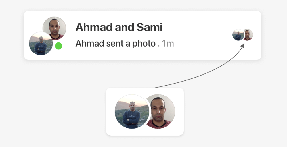
2. Seen Avatars 头像重叠
2.1 - css mask
/* 椭圆裁切,30.5用于消除锯齿 */
.item {
    -webkit-mask-image: radial-gradient(ellipse 54px 135px at 11px center, #0000 30px, #000 30.5px);
}

/* 椭圆图片,渐变全背景,两个mask进行差集裁切 */
.item {
    -webkit-mask-image: url(oval.svg), linear-gradient(#000, #000);
    -webkit-mask-repeat: no-repeat;
    -webkit-mask-position: -26px 54%, 100% 100%;;
    -webkit-mask-size: 80px 140px, 100% 100%;
    mask-composite: exclude;
    -webkit-mask-composite: destination-out;
}
2.2 - SVG
核心思路,svg两个圆差集,black圆cx用负值,盖住white圆,white圆差去和black圆重叠部分,就形成月牙
<svg role="none" class="avatar-wrapper">
    <mask id="cut">
        <circle cx="50" cy="50" r="50" fill="white"></circle>
        <circle fill="black" cx="-30" cy="50" r="50"></circle>
    </mask>
    <g mask="url(#cut)">
        <image x="0" y="0" height="100%" width="100%" xlink:href="shadeed.jpg"></image>
        <circle fill="none" stroke="rgba(0,0,0,0.1)" stroke-width="2"></circle>
    </g>
</svg>
完整代码
<div class="wrapper">
  <div class="card">
    <div class="card__content">
      <div class="seen-group">
        <svg role="none" class="avatar-wrapper">
          <style>
            <style>.avatar-wrapper circle {
              cx: calc(var(--size) / 2);
              cy: calc(var(--size) / 2);
              r: calc(var(--size) / 2);
            }
          </style>
          </style>
          <mask id="test2">
            <circle fill="white"></circle>
          </mask>
          <g mask="url(#test2)">
            <image x="0" y="0" height="100%" preserveAspectRatio="xMidYMid slice" width="100%" xlink:href="https://ishadeed.com/assets/shadeed.jpg"></image>
            <circle fill="none" stroke="rgba(0,0,0,0.1)" stroke-width="2"></circle>
          </g>
        </svg>
        <svg role="none" class="avatar-wrapper">
          <style>
            <style>.avatar-wrapper circle {
              cx: calc(var(--size) / 2);
              cy: calc(var(--size) / 2);
              r: calc(var(--size) / 2);
            }
          </style>
          </style>
          <mask id="test3">
            <circle fill="white"></circle>
            <circle fill="black" cx="-30"></circle>
          </mask>
          <g mask="url(#test3)">
            <image x="0" y="0" height="100%" preserveAspectRatio="xMidYMid slice" width="100%" xlink:href="https://ishadeed.com/assets/shadeed.jpg"></image>
            <circle fill="none" stroke="rgba(0,0,0,0.1)" stroke-width="2"></circle>
          </g>
        </svg>
      </div>
    </div>
  </div>
.seen-group {
  display: flex;

  > * + * {
    margin-left: calc(var(--size) / 5.5 * -1);

    circle[fill="black"] {
      cx: calc(var(--size) / 4 * -1);
      cy: calc(var(--size) / 2);
      r: calc(var(--size) / 2);
    }
  }
}

.wrapper {
  max-width: 344px;
  margin: 2rem auto;
}

.card {
  --primary-text: #050505;
  --secondary-text: #65676b;
  --bg-color: #fff;

  position: relative;
  background-color: var(--bg-color);
  padding: 8px 12px 8px 8px;
  border-radius: 7px;
  box-shadow: 0 3px 15px 0 rgba(#000, 0.05);
}

.card__content {
  display: flex;
  justify-content: center;
}

.avatar-wrapper {
  --size: 100px;
  width: var(--size);
  height: var(--size);
}

body {
  font-family: "Helvetica";
  line-height: 1.4;
  padding: 1rem;
  background-color: #f7f7f7;
}

*,
*:before,
*:after {
  box-sizing: border-box;
}
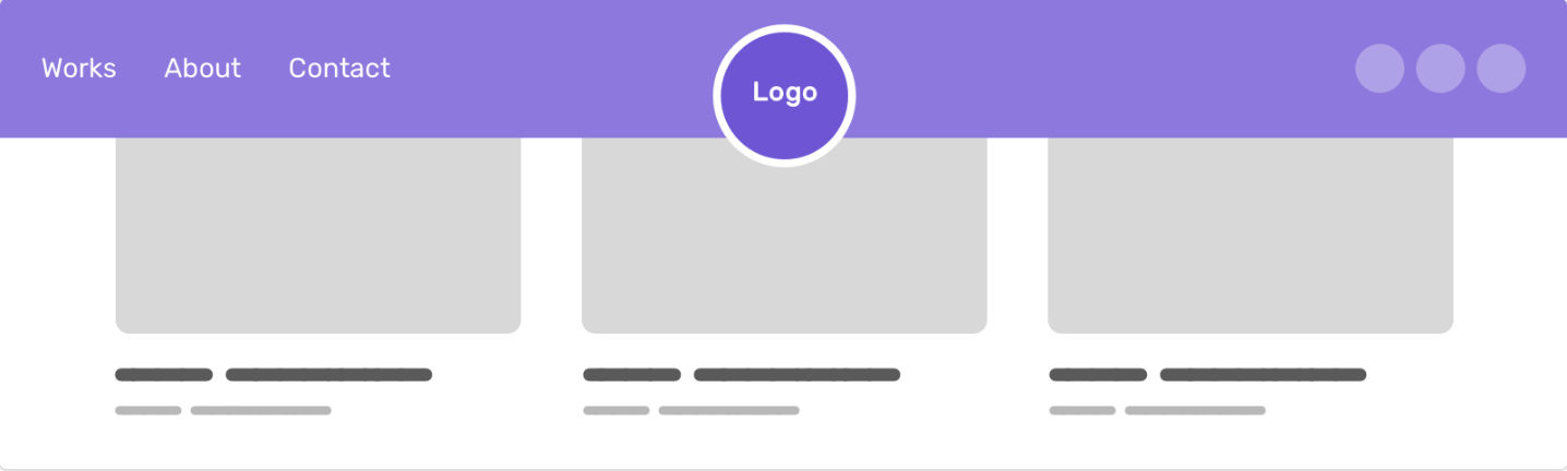
3. Website Header
3.1 - CSS Radial Gradient
background用radial-gradient挖洞,logo盖在上面即可
:root {
    --header-height: 100px;
    --radius: clamp(48px, 4vw, 60px);
    --logo-size: calc(calc(var(--radius) * 2) - 8px);
}

.logo {
    display: block;
    position: relative;
    top: calc(var(--header-height) * 0.7 - var(--radius) + 2px);
    width: var(--logo-size);
    margin-left: auto;
    margin-right: auto;
}

.site-header {
  background: radial-gradient(
    circle at 50% 70%,
    rgba(0, 0, 0, 0) var(--radius),
    #95a57f var(--radius),
    #95a57f 100%
  );
}
3.2 - SVG Mask
svg挖个洞,作为mask,盖住header即可
<header class="site-header">
    <img src="assets/logo.svg" alt="" />
    <svg role="none" height="80">
        <defs>
            <mask id="hole">
                <rect width="100%" height="100%" fill="white" />
                <circle cx="50%" cy="80%" r="58" fill="black"></circle>
            </mask>
        </defs>

        <rect width="100%" height="100%" mask="url(#hole)" />
    </svg>
</header>
.site-header {
    position: relative;
}

.site-header svg {
    position: absolute;
    left: 0;
    top: 0;
    width: 100%;
    height: 100%;
}

 浙公网安备 33010602011771号